It is often helpful to supply the user with visual feedback as to what toolbar buttons have been previously selected. This is generally true when you need the user to select from a set of options. You learned in Chapter 3 how to provide visual cues in menu systems. Use checked menu items to display checkmarks next to items that have been selected. Use radio menu items to enable the user to select one, and only one, option from a group. Both types of item provide a visual indicator of selected options.
You can provide the same type of functionality on your toolbars if
you use the SWT.CHECK or
SWT.RADIO style when you create a
ToolItem instance.
As with all widgets, you can change the appearance and functionality
of ToolItem objects simply by changing the style.
Consider the following code:
final ToolItem sep2 = new ToolItem(bar, SWT.SEPARATOR);

final ToolItem checkItem = new ToolItem(bar, SWT.CHECK);
  checkItem.setText("Check");
final ToolItem sep3 = new ToolItem(bar, SWT.SEPARATOR);

final ToolItem radioItem1 = new ToolItem(bar, SWT.RADIO);
  radioItem1.setText("Radio 1");
final ToolItem radioItem2 = new ToolItem(bar, SWT.RADIO);
  radioItem2.setText("Radio 2");
final ToolItem sep4 = new ToolItem(bar, SWT.SEPARATOR);
final ToolItem radioItem3 = new ToolItem(bar, SWT.RADIO);
  radioItem3.setText("Radio 3");
final ToolItem radioItem4 = new ToolItem(bar, SWT.RADIO);
  radioItem4.setText("Radio 4");
Adding this code to the version of
ToolbarShellExample created by Example 4-1 results in the window shown in Figure 4-4.
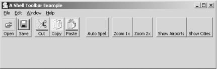
When this window opens, all the toolbar buttons will be in their unselected state, as shown in Figure 4-4. Clicking a Check button will result in the button remaining depressed, as shown in Figure 4-5.
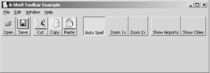
This provides a visual indication to the user that the option represented by the button has been selected. Clicking the button a second time returns it to its unselected state.
The behavior for radio buttons is different from that of check
buttons. With radio buttons, only one member of the group can be
selected at any given time. Buttons that are immediately adjacent to
each other are considered to be part of a group. If another
ToolItem is created between two radio
buttons—even a separator—they will reside in two
different groups.
In Figure 4-4, there are two radio groups. The
buttons labeled in the code Radio
1 and Radio
2 are in one group, while those labeled
Radio
3 and
Radio
4 are in a second group.
You may select either Radio One or Radio Two, and either Radio Three
or Radio Four, but you may not select Radio One
and Radio Two, or Radio Three
and Radio Four.
Get SWT: A Developer's Notebook now with the O’Reilly learning platform.
O’Reilly members experience books, live events, courses curated by job role, and more from O’Reilly and nearly 200 top publishers.

