Several ASP.NET server controls allow the user to select a value or values:
CheckBoxAllows selection of Boolean data
CheckBoxListA group of
CheckBoxcontrols that can be dynamically created and bound to a data sourceRadioButtonAllows only a single option to be selected from a group
RadioButtonListA group of
RadioButtoncontrols that can be dynamically created and bound to a data sourceListBoxAllows selection of one or more items from a predefined list
DropDownListSimilar to a
ListBox, but allows only a single selection and displays the list only once the user has clicked itBulletedListFormatted with bullets and can be simple text or a link
All of these controls derive from the WebControl class, as shown in Figure 3-8 in Chapter 3. The RadioButton derives further from the CheckBox class, and the list controls all derive from the abstract ListControl class. We consider each of these controls and their AJAX Control Toolkit extenders in detail in upcoming sections. Also included in this section are two standalone AJAX controls, the Slider and Rating controls, which also allow you to select a value.
A CheckBox control provides a means for a user to select Boolean data (i.e., Yes/No or True/False). If you have several checkboxes arranged together (not to be confused with a CheckBoxList, discussed next), you can select multiple options. No option is mutually exclusive of another.
The CheckBox and RadioButton controls implement the ICheckBoxControl interface. This interface provides for a single property called Checked, and a single event called CheckedChanged.
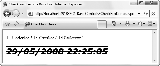
To demonstrate the Checked property and CheckedChanged event with respect to a CheckBox control, add to the C4_BasicControls website a new web form called CheckBoxDemo.aspx. It uses one of three CheckBox controls to control the appearance of a Label control, as shown in Figure 4-11. Clicking any of the checkboxes in this example—Underline?, Overline?, or Strikeout?—imposes that font attribute on the text string in the Label control.
The markup for CheckBoxDemo.aspx is shown in Example 4-20.
Example 4-20. CheckBoxDemo.aspx
<%@ Page Language="C#" AutoEventWireup="true" CodeFile="CheckBoxDemo.aspx.cs" Inherits="CheckBoxDemo" %> <!DOCTYPE html PUBLIC "-//W3C//DTD XHTML 1.0 Transitional//EN" "http://www.w3.org/TR/xhtml1/DTD/xhtml1-transitional.dtd"> <html xmlns="http://www.w3.org/1999/xhtml"> <head runat="server"> <title>Checkbox Demo</title> </head> <body> <form id="form1" runat="server"> <div><asp:CheckBox ID="chkUnderline" runat="server"Text="Underline?" AutoPostBack="true"oncheckedchanged="chkUnderline_CheckedChanged" /><asp:CheckBox ID="chkOverline" runat="server"Text="Overline?" AutoPostBack="true"oncheckedchanged="chkOverline_CheckedChanged" /><asp:CheckBox ID="chkStrikeout" runat="server"Text="Strikeout?" AutoPostBack="true"oncheckedchanged="chkStrikeout_CheckedChanged" /><br /><br /><asp:Label ID="lblTime" runat="server"oninit="lblTime_Init" /></div> </form> </body> </html>
Each ASP.NET server control in this example, the Label and the three CheckBox controls, has an event handler. The Init event for the Label is handled to set the common format and content (the current date and time) of the label every time the page is posted. The CheckBox controls have their default CheckedChanged event handled.
This event passes a standard EventArgs argument, which does not expose any properties.
All these event handler methods are contained in the code-behind file listed in Example 4-21.
Example 4-21. Event handlers in CheckBoxDemo.aspx.cs
using System;

public partial class CheckBoxDemo : System.Web.UI.Page
{
   protected void lblTime_Init(object sender, EventArgs e)
   {
      lblTime.Font.Name = "Verdana";
      lblTime.Font.Size = 20;
      lblTime.Font.Bold = true;
      lblTime.Font.Italic = true;
      lblTime.Text = DateTime.Now.ToString();
   }
   protected void chkUnderline_CheckedChanged
      (object sender, EventArgs e)
   {
      lblTime.Font.Underline = chkUnderline.Checked;
   }

   protected void chkOverline_CheckedChanged
      (object sender, EventArgs e)
   {
      lblTime.Font.Overline = chkOverline.Checked;
   }

   protected void chkStrikeout_CheckedChanged
      (object sender, EventArgs e)
   {
      lblTime.Font.Strikeout = chkStrikeout.Checked;
   }
}
When you run CheckBoxDemo.aspx, you’ll see that each time you check or uncheck a CheckBox, the page will post back, and the text displayed will refresh with the new time and will be underlined, overlined, or ruled through depending on the state of each CheckBox.
Like all controls derived from WebControl, CheckBox controls have an ID property. But as the sample code in Example 4-20 shows, several other properties are not inherited from WebControl. These are listed in Table 4-11. Some, such as AutoPostBack and Text, are common to several other controls. Checked and TextAlign, meanwhile, are specific to the CheckBox class. All are read/write. Table 4-12 lists the CheckBox events.
Table 4-11. CheckBox properties not inherited from WebControl
Name | Type | Values | Description |
|---|---|---|---|
| Boolean |
| Determines whether automatic postback to the server will occur if the user changes the contents of the control. If |
| Boolean |
| Indicates whether the |
| String | The text label associated with the | |
|
|
| Dictates whether the text label is on the left or right of the |
The AJAX Control Toolkit contains two extender controls that specifically target CheckBox controls:
ToggleButtonExtenderAllows you to replace the checkbox graphic with your own custom graphics to indicate whether it has been checked or not
MutuallyExclusiveCheckBoxExtenderAllows you to specify a group of
CheckBoxes from which only one can be selected at any time
To demonstrate how you can use these together, the next example extends CheckBoxDemo.aspx, replacing the Strikeout? checkbox with our own graphics and making the Underline? and Overline? checkboxes mutually exclusive. Figure 4-12 shows the net result.
Add to the C4_BasicControls website a new AJAX web form called CheckBoxDemoWithAJAX.aspx. Add the highlighted code from Example 4-20 to CheckBoxDemoWithAJAX.aspx under the ScriptManager control, and add all the event handler code highlighted in Example 4-21 to CheckBoxDemoWithAJAX.aspx.cs.
To use the ToggleButtonExtender, you’ll need to add to the website one graphic to represent an unchecked CheckBox and another to represent a checked CheckBox. If you have none on hand, try using ToggleButton_Checked.gif and ToggleButton_Unchecked.gif from the AJAX Control Toolkit sample website in the ToggleButton directory. With that done, drag a ToggleButtonExtender onto the page beneath the three CheckBoxes. It has five mandatory properties to set, as listed in Table 4-13.
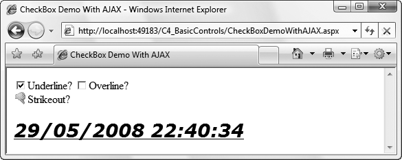
Table 4-13. ToggleButtonExtender mandatory properties
Name | Type | Description |
|---|---|---|
| String | The location of the image representing a checked |
| Integer | The height of the image |
| Integer | The width of the image |
| String | The ID of the |
| String | The location of the image representing an unchecked |
The ToggleButtonExtender has several more optional properties, listed in Table 4-14, which cover such circumstances as what happens when the CheckBox is disabled and alternative text for each image.
Table 4-14. ToggleButtonExtender optional properties
Name | Type | Description |
|---|---|---|
| String | Alternative text for screen readers describing the image for |
| String | The location of the image representing a checked |
| String | The location of the image representing an unchecked |
| String | Alternative text for screen readers describing the image for |
Set the ToggleControlExtender properties as highlighted in Example 4-22 and run the page to see how images now take the place of the standard checkbox.
Example 4-22. CheckBoxDemoWithAJAX.aspx
<%@ Page Language="C#" AutoEventWireup="true" CodeFile="CheckBoxDemoWithAJAX.aspx.cs" Inherits="CheckBoxDemoWithAJAX" %><%@ Register Assembly="AjaxControlToolkit"Namespace="AjaxControlToolkit" TagPrefix="cc1" %><!DOCTYPE html PUBLIC "-//W3C//DTD XHTML 1.0 Transitional//EN" "http://www.w3.org/TR/xhtml1/DTD/xhtml1-transitional.dtd"> <html xmlns="http://www.w3.org/1999/xhtml"> <head runat="server"> <title>CheckBox Demo With AJAX</title><script type="text/javascript">function pageLoad() {}</script></head> <body> <form id="form1" runat="server"> <div><asp:ScriptManager ID="ScriptManager1" runat="server" /><asp:CheckBox ID="chkUnderline" runat="server" Text="Underline?" AutoPostBack="true" oncheckedchanged="chkUnderline_CheckedChanged" /> <asp:CheckBox ID="chkOverline" runat="server" Text="Overline?" AutoPostBack="true" oncheckedchanged="chkOverline_CheckedChanged" /> <asp:CheckBox ID="chkStrikeout" runat="server" Text="Strikeout?" AutoPostBack="true" oncheckedchanged="chkStrikeout_CheckedChanged" /><cc1:ToggleButtonExtender ID="ToggleButtonExtender1"runat="server" TargetControlID="chkStrikeout"CheckedImageUrl="ToggleButton_Checked.gif"CheckedImageAlternateText="Disable Strikeout"UncheckedImageUrl="togglebutton_unchecked.gif"UncheckedImageAlternateText="Enable Strikeout"ImageWidth="19" ImageHeight="19" /><cc1:MutuallyExclusiveCheckBoxExtenderID="MutuallyExclusiveCheckBoxExtender1" runat="server"targetControlId="chkUnderline" Key="Decoration" /><cc1:MutuallyExclusiveCheckBoxExtenderID="MutuallyExclusiveCheckBoxExtender2" runat="server"targetControlId="chkOverline" Key="Decoration" /><br /> <br /> <asp:Label ID="lblTime" runat="server" OnInit="lblTime_Init" /> </div> </form> </body> </html>
Next, you need to make the chkOverline and chkUnderline boxes mutually exclusive using MutuallyExclusiveCheckBoxExtender (MECBE) controls. Drag an MECBE onto the page under the ToggleButtonExtender. Set its TargetControlID to chkUnderline. Now add a second MECBE to the page under the first. Set its TargetControlId to chkOverline. Make the two checkboxes mutually exclusive by giving both MECBEs the same Key value—it doesn’t actually matter what value you use as long as it isn’t the same as another Key group name on the page. In Example 4-22, it’s set to Decoration.
Now run the page. Note how you can’t add overlines and underlines to the label at the same time. Furthermore, if you do try to do so, the Label updates correctly when one box is checked, and the other is unselected automatically.
A RadioButton control is very similar to, and in fact is derived from, a CheckBox control. The essential difference between the two classes is that RadioButton controls are typically grouped using the GroupName property, and only one RadioButton in the group can be checked (i.e., its Checked property is true) at one time. Changing the Checked property of one RadioButton control in the group to true changes the Checked property of all other controls in the group to false. In addition, radio buttons typically display as round, as opposed to the square checkboxes.
Tip
If you compare and contrast a RadioButton with a CheckBox extended with an MECBE, you might not perceive any difference between the two. But consider the case where you have two groups of RadioButtons on a page and you need to ensure that a particular choice in one group precludes a selection in the other group while others do not. MECBEs can work across the RadioButton groups as required.
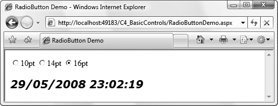
To demonstrate, add a new web form called RadioButtonDemo.aspx to your C4_BasicControls website. This page contains three RadioButton controls to set the font size of a label. Each radio button is part of the group grpSize and all are set to post back when selected. The markup for RadioButtonDemo.aspx is shown in Example 4-23.
Example 4-23. RadioButtonDemo.aspx
<%@ Page Language="C#" AutoEventWireup="true" CodeFile="RadioButtonDemo.aspx.cs" Inherits="RadioButtonDemo" %> <!DOCTYPE html PUBLIC "-//W3C//DTD XHTML 1.0 Transitional//EN" "http://www.w3.org/TR/xhtml1/DTD/xhtml1-transitional.dtd"> <html xmlns="http://www.w3.org/1999/xhtml"> <head runat="server"> <title>RadioButton Demo</title> </head> <body> <form id="form1" runat="server"> <div><asp:RadioButton ID="rdoSize10" runat="server" Text="10pt"GroupName="grpSize" AutoPostBack="true"OnCheckedChanged="grpSize_CheckedChanged" /><asp:RadioButton ID="rdoSize14" runat="server" Text="14pt"GroupName="grpSize" AutoPostBack="true"OnCheckedChanged="grpSize_CheckedChanged" /><asp:RadioButton ID="rdoSize16" runat="server" Text="16pt"GroupName="grpSize" AutoPostBack="true"OnCheckedChanged="grpSize_CheckedChanged" /><br /> <br /> <asp:Label ID="lblTime" runat="server" OnInit="lblTime_Init" /> </div> </form> </body> </html>
You can see in Example 4-23 that all three RadioButton controls name the same method, grpSize_CheckedChanged, to handle their CheckedChanged event. This method, plus another to set the text and initial font attributes for the Label control, is saved in the code-behind file for the page, RadioButtonDemo.aspx.cs, listed in Example 4-24.
Example 4-24. RadioButtonDemo.aspx.cs
using System;
using System.Web.UI;

public partial class RadioButtonDemo : Page
{
   protected void grpSize_CheckedChanged(object sender, EventArgs e)
   {
      if (rdoSize10.Checked)
         lblTime.Font.Size = 10;
      else if (rdoSize14.Checked)
         lblTime.Font.Size = 14;
      else
         lblTime.Font.Size = 16;
   }
   protected void lblTime_Init(object sender, EventArgs e)
   {
      lblTime.Font.Name = "Verdana";
      lblTime.Font.Size = 20;
      lblTime.Font.Bold = true;
      lblTime.Font.Italic = true;
      lblTime.Text = DateTime.Now.ToString();
   }
}
The result of running it is shown in Figure 4-13.
Note that the grpSize_CheckedChanged method uses an if…else block to change the text size depending on which button is selected, but there are several ways to achieve the same end here. For example, you could use a C# switch statement to make it easier to add additional radio buttons in the future:
protected void grpSize_CheckedChanged(object sender, EventArgs e)
{
   RadioButton rb = (RadioButton)sender;

   switch (rb.ID)
   {
      case "rdoSize10":
         lblTime.Font.Size = 10;
         break;
      case "rdoSize14":
         lblTime.Font.Size = 14;
         break;
      case "rdoSize16":
         lblTime.Font.Size = 16;
         break;
    }
}
You could even replace the switch statement in this example with a much shorter statement:
lblTime.Font.Size = new FontUnit(rb.Text);
However, this line works only because the Text property for the Checkbox controls has been set to values which are also valid as values for Font.Size.
ASP.NET provides five server controls for selecting single or multiple items from a list:
BulletedListCheckBoxListDropDownListListBoxRadioButtonList
All of these controls are derived from ListControl and have much in common:
The
ListItemobject (the object that encapsulates the information displayed by individual items in the list) works exactly the same way for all theListControlobjects, with aValueproperty and aTextproperty.The
Itemsproperty of the control contains the collection of all theListItems.ListItemobjects can be added to theItemscollection either statically, that is, declaratively in the content file, programmatically through theAddmethod, or from a data source.You can access the Data Source Configuration Wizard or the ListItem Collection Editor dialog box by clicking the control’s smart tag, the little icon in the upper-right corner of the control.
The
SelectedIndexandSelectedItemproperties of the control point to the selected item with the lowest index. For single-select controls, such as theDropDownList, theRadioButtonList, and theListBox(if theSelectionModeproperty is set toListSelectionMode.Single, the default value), the selected index is the lowest index by definition. For multiselect controls, such asCheckBoxListand theListBoxwith theSelectionModeproperty set toListSelectionMode.Multiple, these properties will refer to the selected item with the lowest index. To discover any other selected items, you’ll need to iterate through the control’sItemscollection and test theSelectedproperty of eachListItemtherein.The
SelectedValueproperty of the control retrieves or specifies the value of the selected item.The
AppendDataBoundItemsproperty of the control allows items added through data binding (described in Chapter 8) to be added to theItemscollection, rather than replacing theItemscollection, which is the default behavior. This is useful if you want to add a value statically—such as the text “(Select a value)”—and then add the remaining items by using data binding.All five controls raise and respond to the
SelectedIndexChangedevent.
The ListBox and DropDownList controls differ from the other list controls (BulletedList, CheckBoxList, and RadioButtonList) in that they appear to the user to be a single control (a listbox or a drop-down list) rather than a collection of links, buttons, or checkboxes. The ListBox and DropDownList controls lend themselves to longer lists because they scroll.
Table 4-15 summarizes the differences among the five list controls.
Table 4-15. Differences among the five list controls
Characteristic | BulletedList | CheckBoxList | RadioButtonList | DropDownList | ListBox |
|---|---|---|---|---|---|
Single selection only | x | x | x | ||
Able to select more than one item | x | x | |||
Displays the entire list by default | x | x | x | x (using a vertical scroll bar if necessary) | |
Displays a single item at a time, along with a button for seeing the entire list | x | ||||
Best for short lists | x | x | x | ||
Best for long lists | x | x |
The following sections describe the controls and objects related to selecting items from a list.
As mentioned earlier, all five server controls are derived from the ListControl class. A ListControl control contains a collection of ListItem objects called Items. Each ListItem object has four read/write properties, detailed in Table 4-16.
Table 4-16. Properties of the ListItem object
Name | Type | Description |
|---|---|---|
| Boolean | If set to |
| Boolean | A value indicating whether the item has been selected or not. |
| String | The text string displayed for a |
| String | A value associated with a |
When dealing with lists, displaying one thing to the user but passing something different to your code is common. For example, if you’re presenting your users with a list of states, the list might display state names, such as Massachusetts. But when your users select an item, the program will pass the selected item as MA. Massachusetts would be the ListItem object’s Text property, and MA would be the Value property. This comes in handy, for example, when translating the site into another language. In this case, you need only translate the contents of the Text property and leave the Value property alone:
<asp:ListItem value="air">By air</asp:ListItem>
<asp:ListItem value="air">Par avion</asp:ListItem>
<asp:ListItem value="air" text="Auf dem Luftweg" />
If only the Text property is set for a ListItem, the same value is also used for the Value property of the ListItem:
<asp:ListItem>Item 7</asp:ListItem>
<asp:ListItem text="Item 7"></asp:ListItem>
<asp:ListItem text="Item 7"/>
If both a Text property and inner HTML content are specified, the inner HTML content will be displayed. For example, consider the following line:
<asp:ListItem text="Item 7">Item 8</asp:ListItem>
If you used that line, “Item 8” would be displayed on the web page.
The CheckBoxList is a parent control containing a collection of CheckBox items. It is very similar to the group of CheckBox controls shown previously in CheckBoxDemo.aspx in Figure 4-11, except all the child checkboxes are handled as a group. The CheckBoxList control derives from ListControl rather than directly from WebControl.
The CheckBoxList control is better suited than individual checkboxes for creating a series of checkboxes out of data from a database, although either type of control can be bound to data. Chapter 8 discusses data binding.
There are three ways to add items to the Items collection of a CheckBoxList:
Declaratively using the
<asp:ListItem>control elementProgrammatically from an array or other collection
Dynamically from a data source such as a database
To demonstrate how to add list items declaratively in the content file, add a new web form called CheckBoxList-DeclarativeItems.aspx to your C4_BasicControls website. You’ll also use some of the CheckBoxList control’s properties to set its appearance and behavior.
Drag a CheckBoxList control onto the page from the Toolbox and then, in Source view, add six list items as shown in Example 4-25.
Example 4-25. CheckBoxList-DeclarativeItems.aspx
<%@ Page Language="C#" AutoEventWireup="true" CodeFile="CheckBoxList-DeclarativeItems.aspx.cs" Inherits="CheckBoxList_DeclarativeItems" %> <!DOCTYPE html PUBLIC "-//W3C//DTD XHTML 1.0 Transitional//EN" "http://www.w3.org/TR/xhtml1/DTD/xhtml1-transitional.dtd"> <html xmlns="http://www.w3.org/1999/xhtml"> <head runat="server"> <title>CheckBoxList Demo - Declaring Items Individually</title> </head> <body> <form id="form1" runat="server"> <div><asp:CheckBoxList ID="cblItems" runat="server"RepeatDirection="Horizontal" RepeatColumns="2"RepeatLayout="Flow"><asp:ListItem>Item 1</asp:ListItem><asp:ListItem>Item 2</asp:ListItem><asp:ListItem>Item 3</asp:ListItem><asp:ListItem>Item 4</asp:ListItem><asp:ListItem>Item 5</asp:ListItem><asp:ListItem>Item 6</asp:ListItem></asp:CheckBoxList></div> </form> </body> </html>
Because no events are handled in this page, and hence no event handlers, there are no additions to be made to the code-behind file, CheckBoxList-DeclarativeItems.aspx.cs. When you run the page, you’ll see that the six list items have been split alternately into two columns, as shown in Figure 4-14. This is because the list’s RepeatColumns property is set to 2 and the RepeatDirection property is set to Horizontal.
The CheckBoxList has a number of properties that determine how the items in the list are displayed on the page. These and other key read/write properties appear in Table 4-17.
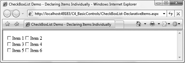
Table 4-17. Properties of the CheckBoxList control
Name | Type | Values | Description |
|---|---|---|---|
| Boolean |
| Determines whether automatic postback to the server will occur if the user changes the contents of the control. If |
| Integer | Integer | Distance in pixels between the border and contents of a cell. The default is |
| Integer | Integer | Distance in pixels between the border and contents of a cell. The default is |
| Object | Source that populates the control. | |
| Integer | Integer | Number of columns to display. |
|
|
| |
|
|
| |
| Boolean |
| Indicates that a list item has been selected. Default is |
| TextAlign |
| Dictates whether the text label is on the left or right of the checkboxes. Default is |
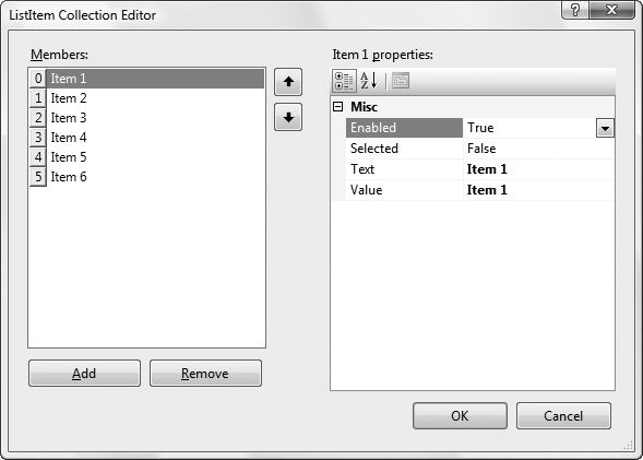
You can manually type the ListItem objects into the content file (IntelliSense will help minimize the typing), or you can use the Collection Editor. To use the Collection Editor, select the CheckBoxList in Design view, click the smart tag (the little icon in the upper-right corner of the control in Design view), and select Edit Items from the Smart Tag menu. The dialog box shown in Figure 4-15 will appear. Use this dialog box to add or remove ListItem objects and change their properties.
Sometimes you do not know at design time what checkboxes you want to create. For example, you may want your program to populate the list depending on the value of other controls on the page. In these cases, you need to be able to add items to the Items collection programmatically.
To demonstrate, add a new web form called CheckBoxList-ArrayItems.aspx to your C4_BasicControls website. In this example, ListItem objects are added both declaratively, just like the previous example, and programmatically in the code-behind page. Indeed, the markup for CheckBoxList-ArrayItems.aspx is exactly the same as the previous example, with the single exception of a new line, highlighted in Example 4-26.
Example 4-26. CheckBoxList-ArrayItems.aspx
<%@ Page Language="C#" AutoEventWireup="true"
CodeFile="CheckBoxList-ArrayItems.aspx.cs"
Inherits="CheckBoxList_ArrayItems" %>
<!DOCTYPE html PUBLIC "-//W3C//DTD XHTML 1.0 Transitional//EN"
"http://www.w3.org/TR/xhtml1/DTD/xhtml1-transitional.dtd">
<html xmlns="http://www.w3.org/1999/xhtml">
<head runat="server">
<title>CheckBoxListDemo - Populating Items From An Array</title>
</head>
<body>
<form id="form1" runat="server">
<div>
<asp:CheckBoxList ID="cblItems" runat="server"
RepeatDirection="Horizontal" RepeatColumns="2"
RepeatLayout="Flow"
oninit="cblItems_Init">
<asp:ListItem>Item 1</asp:ListItem>
<asp:ListItem>Item 2</asp:ListItem>
<asp:ListItem>Item 3</asp:ListItem>
<asp:ListItem>Item 4</asp:ListItem>
<asp:ListItem>Item 5</asp:ListItem>
<asp:ListItem>Item 6</asp:ListItem>
</asp:CheckBoxList>
</div>
</form>
</body>
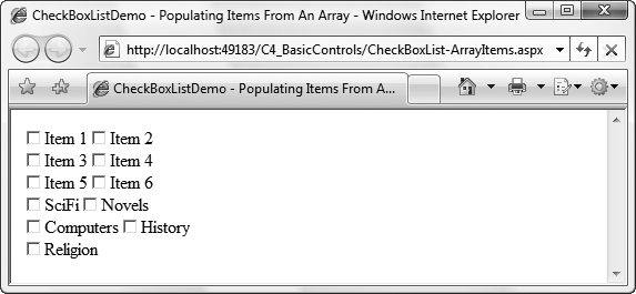
</html>This new line is the key to the page, assigning an event handler for the CheckBoxList control’s Init event which is implemented in the code-behind file, CheckBoxList-ArrayItems.aspx.cs, the highlighted code in Example 4-26. This method creates a string array of book categories to add to the list of checkboxes and then uses a foreach loop to iterate through the array to add them to the list. In each iteration of the loop, a new ListItem object is created and added to the Items collection of the CheckBoxList control. The code in full is highlighted in Example 4-27.
Example 4-27. The code-behind file, CheckBoxList-ArrayItems.aspx.cs
using System;
using System.Web.UI;
using System.Web.UI.WebControls;

public partial class CheckBoxList_ArrayItems : Page
{
   protected void cblItems_Init(object sender, EventArgs e)
   {
      // create an array of items to add
      string[] Categories =
         { "SciFi", "Fiction", "Computers", "History", "Religion" };
      foreach (string category in Categories)
      {
         cblItems.Items.Add(new ListItem(category));
      }
   }
}
When you run the page, you’ll see that the list items added programmatically come after those added declaratively, as shown in Figure 4-16.
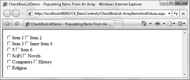
You can modify the code in Examples Example 4-26 and Example 4-27 to add Value properties for some of the ListItems created in the CheckBoxList declaration, as well as in all the ListItem objects created in the cblItems_Init event procedure. This is demonstrated in CheckBoxList-ArrayItemsAndValues.aspx, copied from CheckBoxList-ArrayItems.aspx and modified. The resultant web page is shown in Figure 4-17.
The markup for CheckBoxList-ArrayItemsAndValues.aspx is listed in Example 4-28; the highlighted lines of code are the ones that differ from Example 4-26.
Example 4-28. CheckBoxList-ArrayItemsAndValues.aspx
<%@ Page Language="C#" AutoEventWireup="true"CodeFile="CheckBoxList-ArrayItemsAndValues.aspx.cs"Inherits="CheckBoxList_ArrayItemsAndValues" %><!DOCTYPE html PUBLIC "-//W3C//DTD XHTML 1.0 Transitional//EN" "http://www.w3.org/TR/xhtml1/DTD/xhtml1-transitional.dtd"> <html xmlns="http://www.w3.org/1999/xhtml"> <head runat="server"> <title> CheckBoxListDemo - Populating Items and Values From An Array </title> </head> <body> <form id="form1" runat="server"> <div> <asp:CheckBoxList ID="cblItems" runat="server" RepeatDirection="Horizontal" RepeatColumns="2" RepeatLayout="Flow" oninit="cblItems_Init"><asp:ListItem Value="1">Item 1</asp:ListItem><asp:ListItem Value="2" Text="Item 2" /><asp:ListItem Text="Item 3" /><asp:ListItem Text="Item 4">Inner Item 4</asp:ListItem><asp:ListItem Value="5"></asp:ListItem><asp:ListItem>Item 6</asp:ListItem> </asp:CheckBoxList> </div> </form> </body> </html>
The changes to the cblItems_Init event handler from Example 4-27 are highlighted in Example 4-29.
Example 4-29. The code-behind file, CheckBoxList-ArrayItemsAndValues.aspx.cs
using System;
using System.Web.UI;
using System.Web.UI.WebControls;

public partial class CheckBoxList_ArrayItemsAndValues : Page
{
   protected void cblItems_Init(object sender, EventArgs e)
   {
      // create an array of items to add
      string[] Categories =
         { "SciFi", "Fiction", "Computers", "History", "Religion" };
      string[] Code =
         { "sf", "nvl", "cmp", "his", "rel" };

      for (int i=0; i<Categories.Length; i++)
      {
         cblItems.Items.Add(new ListItem(Categories[i], Code[i]));
      }
   }
}
In cblItems_Init, listed in Example 4-27, where you previously created a single string array to hold the Text properties, there are now two string arrays: one for the Text properties and one for the Value properties. You now use the overloaded Add method, passing in a single argument consisting of a ListItem object and a for loop rather than a foreach loop to iterate through both arrays in a single iteration.
Tip
An object may overload its methods, which means it may declare two or more methods with the same name. The compiler differentiates among these methods based on the number and type of parameters provided.
For example, the ListItemCollection class overloads the Add method. One version takes a string, and the other version takes a ListItem object.
Finally, in creating the static ListItems, you used several different methods of creating Values and Text, including instances of missing Text (Item 5), missing Values (Item 3, Item 4, Item 6), and a divergent Text property from inner HTML content (Item 4). The differences between Figures Figure 4-16 and Figure 4-17 can be seen in Items 4 and 5.
You can see that if the Value is missing, the Text is displayed. If the Text is missing, the Value will be displayed. If the Text is different from the inner HTML content, the inner HTML content will be displayed.
The real power of adding items programmatically comes when you can use a data source to populate the items in a CheckBoxList control. The ultimate data source, obviously, is a database. We will cover how to bind information from a database into your controls in Chapters Chapter 7 through Chapter 10. However, you can use the array we just created to demonstrate binding to a data source.
Add to your C4_BasicControls website a new page called CheckBoxList-ArrayItemsDataBind.aspx, and copy the code for the previous example to it. Modify only the cblItems_Init event handler method in the code-behind file. Replacing the for loop and second array in cblItems_Init in Example 4-27 with two lines of code (which specify the data source and then bind to it), the method now appears as shown in Example 4-30.
Example 4-30. The code-behind file, CheckBoxList-ArrayItemsDataBind.aspx.cs
using System;
using System.Web.UI;
using System.Web.UI.WebControls;

public partial class CheckBoxList_ArrayItemsDataBind : Page
{
   protected void cblItems_Init(object sender, EventArgs e)
   {
      // create an array of items to add
      string[] Categories =
         { "SciFi", "Novels", "Computers", "History", "Religion" };
      cblItems.DataSource = Categories;
      cblItems.DataBind();
   }
}
You might expect the results to be unchanged from Figure 4-17, but that is not the case. Instead, you get the results shown in Figure 4-18.
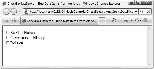
In the previous example, using the for loop, ListItems were added by the Init method after the control was created. In this example, the preexisting ListItem objects were replaced by the new data source because the ListControl.Items collection is initialized by the data source, so any previously defined ListItem objects are lost.
That is the default behavior when data binding to a ListControl object. However, you can set the AppendDataBoundItems property of the control to true, in which case the data-bound items will be added to the existing Items collection, rather than replacing the existing Items collection.
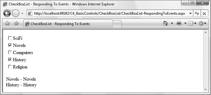
When a user checks or unchecks one of the checkboxes in a CheckBoxList, the SelectedIndexChanged event is raised. This event passes an argument of type EventArgs, which does not expose any properties. By handling this event, you can respond to the user selection on one of the checkboxes. As with most ASP.NET server controls, if AutoPostBack is set to true the response occurs immediately. Otherwise, the response occurs the next time the form is posted to the server.
To see this, copy the previous example to a new page, CheckBoxList-RespondingToEvents.aspx, and then add the highlighted code from the content file in Example 4-31.
Example 4-31. CheckBoxList-RespondingToEvents.aspx
<%@ Page Language="C#" AutoEventWireup="true"CodeFile="CheckBoxList-RespondingToEvents.aspx.cs"Inherits="CheckBoxList_RespondingToEvents" %><!DOCTYPE html PUBLIC "-//W3C//DTD XHTML 1.0 Transitional//EN" "http://www.w3.org/TR/xhtml1/DTD/xhtml1-transitional.dtd"> <html xmlns="http://www.w3.org/1999/xhtml"> <head runat="server"> <title>CheckBoxList - Responding To Events</title> </head> <body> <form id="form1" runat="server"> <div> <asp:CheckBoxList ID="cblItems" runat="server"oninit="cblItems_Init" AutoPostBack="true"OnSelectedIndexChanged="cblItems_SelectedIndexChanged"><asp:ListItem>Item 1</asp:ListItem> <asp:ListItem>Item 2</asp:ListItem> <asp:ListItem>Item 3</asp:ListItem> <asp:ListItem>Item 4</asp:ListItem> <asp:ListItem>Item 5</asp:ListItem> <asp:ListItem>Item 6</asp:ListItem> </asp:CheckBoxList><asp:Label ID="lblCategory" runat="server"></asp:Label></div> </form> </body> </html>
You’ll also need to add a new method to handle the event in the code-behind file, CheckBoxList-RespondingToEvents.aspx.cs, as highlighted in Example 4-32. This method checks to see whether any items are selected. If no items are selected, the method sets the Label control with an appropriate message. If at least one item is selected, the method iterates over all the items in the CheckBoxList and builds up a string indicating which items are checked, to be displayed by the Label.
Example 4-32. CheckBoxList-RespondingToEvents.aspx.cs
using System;using System.Text;using System.Web.UI; using System.Web.UI.WebControls; public partial class CheckBoxList_RespondingToEvents : Page { protected void cblItems_Init(object sender, EventArgs e) { // create an array of items to add string[] Genre = { "SciFi", "Fiction", "Computers", "History", "Religion" }; cblItems.DataSource = Genre; cblItems.DataBind(); }protected void cblItems_SelectedIndexChanged(object sender, EventArgs e){if (cblItems.SelectedItem == null){lblCategory.Text = "<br />No genres selected.";}else{StringBuilder sb = new StringBuilder();foreach (ListItem li in cblItems.Items){if (li.Selected){sb.Append("<br/>" + li.Value + " - " + li.Text);}}lblCategory.Text = sb.ToString();}} }
When you run this page you’ll see how it responds to your selecting and deselecting checkboxes in the list, as shown in Figure 4-19.
Note that you used the StringBuilder class in cblGenre_SelectedIndexChanged to create the string, rather than concatenating each string value onto the previous value, as in this line of C# code:
str += "<br/>" + li.Value + " - " + li.Text;
This is the preferred approach to building up a string because when you write the following code, it only appears as though you are concatenating the second part of the string onto firstString:
String firstString = "Hello";
firstString += " world";
What is actually happening, however, is that a second string is being allocated and assigned to your string reference, and the first string is being destroyed. If you do this a lot (e.g., in a tight loop), it is very inefficient because creating and destroying the string objects are time-consuming operations. The StringBuilder class provides a more efficient way of constructing strings, because it does not require that a new string be created with every modification. Once the string has been constructed in the StringBuilder, you then call its ToString() method to retrieve it, as we demonstrated in Example 4-32:
lblCategory.Text = sb.ToString();
The RadioButtonList control is very similar to the CheckBoxList control. Both are derived from the ListControl class and share all of the same properties, events, and methods. The only difference between the two (aside from the round versus square shape) is that the RadioButtonList control can have only one item selected at a time. When an item is selected, any other selected item is deselected.
The RadioButtonList and the CheckBoxList controls share two properties inherited from ListControl, shown in Table 4-18.
Table 4-18. Selection properties inherited from the ListControl class
Name | Type | Description |
|---|---|---|
| Integer | The lowest index of the selected items in the list. If equal to |
|
| The selected item with the lowest index. This property is read-only. |
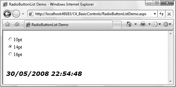
To demonstrate how these properties are useful, copy the contents of RadioButtonDemo.aspx to a new web page, called RadioButtonListDemo.aspx, in the C4_BasicControls website. Also copy the contents of the RadioButtonDemo.aspx.cs code-behind file to RadioButtonListDemo.aspx.cs. Replace the three radio buttons controlling the font size with a single RadioButtonList, calling it rblSize, as highlighted in Example 4-33.
Example 4-33. RadioButtonListDemo.aspx
<%@ Page Language="C#" AutoEventWireup="true" CodeFile="RadioButtonListDemo.aspx.cs" Inherits="RadioButtonListDemo" %> <!DOCTYPE html PUBLIC "-//W3C//DTD XHTML 1.0 Transitional//EN" "http://www.w3.org/TR/xhtml1/DTD/xhtml1-transitional.dtd"> <html xmlns="http://www.w3.org/1999/xhtml"> <head runat="server"> <title>RadioButtonList Demo</title> </head> <body> <form id="form1" runat="server"> <div><asp:RadioButtonList ID="rblSize" runat="server"AutoPostBack="true"onselectedindexchanged="rblSize_SelectedIndexChanged"><asp:ListItem Text="10pt" Value="10" /><asp:ListItem Text="14pt" Value="14" /><asp:ListItem Text="16pt" Value="16" /></asp:RadioButtonList><br /> <br /> <asp:Label ID="lblTime" runat="server" OnInit="lblTime_Init" /> </div> </form> </body> </html>
The code-behind file for this page also needs a few changes, as highlighted in Example 4-34. Instead of a handler for the CheckedChanged event of each individual RadioButton, you now need a handler for the SelectedIndexChanged event of the RadioButtonList. When this event is raised and the page posts back to the server, the method checks the RadioButtonList control’s SelectedIndex property to see whether any of the items in the list have been selected and then uses the Value of that item to set the font size of the text in the Label. If no item has been selected, the SelectedIndex property is equal to -1. If an item has been selected, SelectedIndex will be greater than -1.
Example 4-34. RadioButtonListDemo.aspx.cs
using System; using System.Web.UI; public partial class RadioButtonListDemo : Page { protected void lblTime_Init(object sender, EventArgs e) { lblTime.Font.Name = "Verdana"; lblTime.Font.Size = 20; lblTime.Font.Bold = true; lblTime.Font.Italic = true; lblTime.Text = DateTime.Now.ToString(); }protected void rblSize_SelectedIndexChanged(object sender, EventArgs e){// Check to verify that something has been selected.if (rblSize.SelectedIndex > -1){int size = Convert.ToInt32(rblSize.SelectedItem.Value);lblTime.Font.Size = size;}}}
Note that we could have written the last two highlighted lines of code in the preceding snippet as a single line, as follows:
lblTime.Font.Size = Convert.ToInt32(rblSize.SelectedItem.Value);
However, the more verbose version used in the example makes the code easier to read and debug, and that’s always a preferable thing.
The final page is shown in Figure 4-20 after selecting a font size.
When you run the page, you’ll see that a RadioButtonList looks similar to the individual radio buttons used earlier in the chapter, but it is much easier to work with programmatically as demonstrated even in this simple example. Rather than a cumbersome if or switch statement, you can use the control’s SelectedItem and SelectedIndex properties; a much quicker and more readable solution.
The SelectedIndex property represents the lowest integer value index of all the selected items. The SelectedItem property returns the ListItem object in the list pointed to by SelectedIndex. From the ListItem object, you can then retrieve its text and value, select or deselect it, and change any of its HTML attributes.
Because a RadioButtonList, by definition, can have at most a single selected item, SelectedIndex and SelectedItem will tell you which item is selected. When you apply it to a CheckBoxList control or other multiselect ListControl control, however, you must remember that SelectedIndex and SelectedItem return only the first selected item in the list. To find out whether there are more, you must iterate through the list’s Items collection, as shown in Example 4-34, and check each ListItem’s Selected property to see whether it is set to true.
DropDownList controls display a single item at a time with a button for displaying the list. Only a single item can be selected.
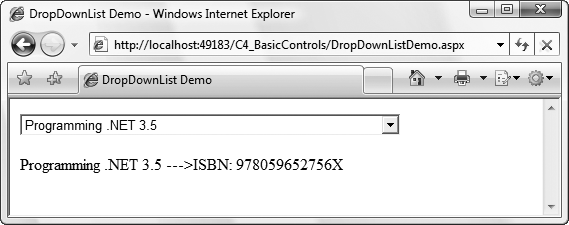
To demonstrate a DropDownList, add to the C4_BasicControls website a new web form called DropDownListDemo.aspx, and drag a DropDownList control and a Label onto it from the Toolbox. The aim of the page will be to have the item selected in the DropDownList reflected in the Label’s text, as shown in Figure 4-21.
To ensure the DropDownList posts back to the server and updates the Label, its AutoPostBack property is set to true and its SelectedIndexChanged event is bound to a method in the code-behind file. Example 4-35 shows the markup for the page.
Example 4-35. DropDownListDemo.aspx
<%@ Page Language="C#" AutoEventWireup="true"
   CodeFile="DropDownListDemo.aspx.cs" Inherits="DropDownListDemo" %>

<!DOCTYPE html PUBLIC "-//W3C//DTD XHTML 1.0 Transitional//EN"
   "http://www.w3.org/TR/xhtml1/DTD/xhtml1-transitional.dtd">

<html xmlns="http://www.w3.org/1999/xhtml">
<head runat="server">
   <title>DropDownList Demo</title>
</head>

<body>
   <form id="form1" runat="server">
   <div>
      <asp:DropDownList ID="ddlBooks" runat="server"
         AutoPostBack="true"
         OnSelectedIndexChanged="ddlBooks_SelectedIndexChanged" />
      <br />
      <br />
      <asp:Label ID="lblBookInfo" runat="server"></asp:Label>
   </div>
   </form>
</body>
</html>
The code-behind file, DropDownListDemo.aspx.cs, contains handlers for two events, as shown in Example 4-36. In the Page_Load method, items are added to the list in two steps. First, a two-dimensional string array is created to hold the Text and Value properties for the items. Then, the code loops through the items in the array adding a ListItem object to the list’s Items collection.
The second method, ddlBooks_SelectedIndexChanged, fires once a new item has been selected in the DropDownList and the page has posted back. It makes sure an item has been selected by testing to see whether its SelectedItem property is not -1 and then sets the Label control’s Text property to reflect the selected item’s Text and Value properties.
Example 4-36. DropDownListDemo.aspx.cs
using System;
using System.Web.UI;
using System.Web.UI.WebControls;

public partial class DropDownListDemo : Page
{
   protected void Page_Load(object sender, EventArgs e)
   {
      if (!IsPostBack)
      {
         //  Build 2 dimensional array for the lists
         //  First dimension contains bookname
         //  2nd dimension contains ISBN number
         string[,] books = {
            {"Learning ASP.NET 2.0 with AJAX", "9780596513976"},
            {"Beginning ASP.NET 2.0 with C#", "9780470042583"},
            {"Programming C#","9780596527433"},
            {"Programming .NET 3.5","978059652756X"},
            {"Programming .NET Windows Applications","0596003218"},
            {"Programming ASP.NET 3e","0596001711"},
            {"WebClasses From Scratch","0789721260"},
            {"Teach Yourself C++ in 21 Days","067232072X"},
            {"Teach Yourself C++ in 10 Minutes","067231603X"},
            {"XML & Java From Scratch","0789724766"},
            {"XML Web Documents From Scratch","0789723166"},
            {"Clouds To Code","1861000952"},
            {"C++ Unleashed","0672312395"}
        };

         //  Now populate the list.
         for (int i = 0; i < books.GetLength(0); i++)
         {
            //  Add both Text and Value
            ddlBooks.Items.Add(new ListItem(books[i, 0], books[i, 1]));
         }
      }
   }

   protected void ddlBooks_SelectedIndexChanged
      (object sender, EventArgs e)
   {
      //  Check to verify that something has been selected.
      if (ddlBooks.SelectedIndex != -1)
      {
         lblBookInfo.Text = ddlBooks.SelectedItem.Text +
            " --->ISBN: " + ddlBooks.SelectedValue;
      }
   }
}
The Page_Load method runs every time the page is reloaded, but it’s often not a good idea to have all the code it contains be executed each time the method is run. For instance, in many applications, the contents of lists and other controls are filled from a database, which can be an expensive operation. Hitting the database only when necessary makes the implementation more efficient. It also means that any selections made from a list are carried over postbacks. They would otherwise be lost when a list is rebound to a database or other data source.
The approach most often taken is to have this database access occur only when the page is first loaded, and for this purpose you test to see whether the IsPostBack property is true. The IsPostBack property is false when the page is first loaded, but it is set to true whenever the form is posted back to the server as a result of user action on one of the controls.
The AJAX Control Toolkit contains two extender controls that target the DropDownList control. Both aim to make the selection of items from the list a little bit easier.
CascadingDropDownIn a situation where you have several related
DropDownLists on the same page, updates the items in one list based on the choices made in other listsListSearchExtenderHelps the user work through very long (and unsorted) lists more quickly by allowing the user to start typing out the choice he wants from the list and highlighting the first option from the list that matches what he has typed
The CascadingDropDown extender control uses a web service (see Chapter 16) in the background to do the hard work, so this section will look solely at using the ListSearchExtender.
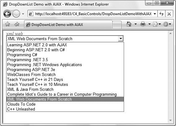
To demonstrate, you’ll add the ListSearchExtender to a copy of DropDownList.aspx to make it easier to search through the list to find the book you want to select. Figure 4-22 shows this in action.
Add a new AJAX web form to the C4_BasicControls website and call it DropDownListDemoWithAJAX.aspx. Copy the DropDownList and Label controls from DropDownListDemo.aspx to the new page underneath the ScriptManager control. Similarly, copy Page_Load and ddlBooks_SelectedIndexChanged from DropDownListDemo.aspx.cs to DropDownListDemoWithAJAX.aspx.cs.
Now drag a ListSearchExtender onto the page under the DropDownList. Set its TargetControlID property to ddlBooks and run the page. Observe that when the DropDownList is in focus, typing the first few letters of a book in the list puts the focus straight on the book in the list. Now, this behavior is true of an unextended DropDownList too, but the ListSearchExtender allows you to see what you’ve typed on top of the list as well, which a DropDownList by itself would not allow you to do.
Now tidy up the UI of the ListSearchExtender a bit more with PromptText, PromptPosition, and PromptCssClass. If you use this last property, you’ll also need to add the relevant CSS styles to your stylesheet. Example 4-37 shows the markup for DropDownListWithAJAX.aspx with the differences between it and DropDownList.aspx highlighted. There’s no change to the code-behind file.
Example 4-37. DropDownListDemoWithAJAX.aspx
<%@ Page Language="C#" AutoEventWireup="true" CodeFile="DropDownListDemoWithAJAX.aspx.cs" Inherits="DropDownListDemoWithAJAX" %><%@ Register Assembly="AjaxControlToolkit" TagPrefix="cc1"Namespace="AjaxControlToolkit" %><!DOCTYPE html PUBLIC "-//W3C//DTD XHTML 1.0 Transitional//EN" "http://www.w3.org/TR/xhtml1/DTD/xhtml1-transitional.dtd"> <html xmlns="http://www.w3.org/1999/xhtml"> <head runat="server"> <title>DropDownList Demo with AJAX</title><script type="text/javascript">function pageLoad() {}</script><style type="text/css">.PromptStyle {color: Red;font-style:italic;}</style></head> <body> <form id="form1" runat="server"> <div><asp:ScriptManager ID="ScriptManager1" runat="server" /><asp:DropDownList ID="ddlBooks" runat="server" AutoPostBack="true" OnSelectedIndexChanged="ddlBooks_SelectedIndexChanged" /><cc1:ListSearchExtender ID="ListSearchExtender1" runat="server"TargetControlID="ddlBooks" PromptPosition="Top"PromptText="Type name of book to find it more quickly"PromptCssClass="PromptStyle" /><br /> <br /> <asp:Label ID="lblBookInfo" runat="server"></asp:Label> </div> </form> </body> </html>
ListBox controls are very similar to DropDownList controls, except that multiple list items are visible on the screen by default (with the aid of a vertical scroll bar if necessary), and multiple items can be selected from it at once (by changing the SelectionMode property from the default value of Single to Multiple).
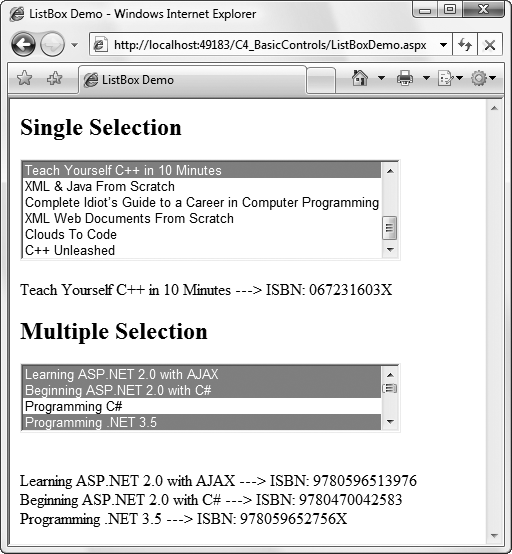
To demonstrate, add a new web form called ListBoxDemo.aspx to the C4_BasicControls website, and then add two ListBox controls to the form from the Toolbox. One will allow only single-item selection and the other will allow multiple-item selection, as shown in Example 4-38.
The first ListBox, with an ID of lbxSingle, is a single-selection listbox. The Rows property has been set to 6, and six items are displayed. Because the control has been populated with more than six items, a vertical scroll bar automatically appears. If a new item is selected, the first item is deselected. As with most of the examples in this chapter, AutoPostBack has been set to true so that the effects of the change are visible immediately.
The second ListBox control, with an ID of lbxMulti, is a multiple-selection listbox with its SelectionMode property set to Multiple. The Rows property has not been set, so the default four rows are visible. Because it is a multiselect listbox, the standard Windows techniques of multiselection can be used.
Example 4-38. ListBoxDemo.aspx
<%@ Page Language="C#" AutoEventWireup="true" CodeFile="ListBoxDemo.aspx.cs" Inherits="ListBoxDemo" %> <!DOCTYPE html PUBLIC "-//W3C//DTD XHTML 1.0 Transitional//EN" "http://www.w3.org/TR/xhtml1/DTD/xhtml1-transitional.dtd"> <html xmlns="http://www.w3.org/1999/xhtml"> <head runat="server"> <title>ListBox Demo</title> </head> <body> <form id="form1" runat="server"> <div><h2>Single Selection</h2><asp:ListBox ID="lbxSingle" runat="server"AutoPostBack="true" Rows="6"onselectedindexchanged="lbxSingle_SelectedIndexChanged" /><br /><br /><asp:Label ID="lblSingle" runat="server"></asp:Label><h2>Multiple Selection</h2><asp:ListBox ID="lbxMulti" runat="server" AutoPostBack="true"SelectionMode="Multiple"onselectedindexchanged="lbxMulti_SelectedIndexChanged" /><br /><br /><asp:Label ID="lblMulti" runat="server"></asp:Label></div> </form> </body> </html>
The code-behind file, ListBoxDemo.aspx, is shown in Example 4-39. Both ListBox controls are populated from the same array when the page is initially loaded, but the techniques used to identify the selected item(s) in each ListBox are different, illustrating again the different uses of the SelectedItem and SelectedIndex properties.
The event handler for the single-selection listbox is similar to the one for the DropDownList or any other single-select ListControl, such as the RadioButtonList.
The event handler for the multiselect listbox shows two different techniques for building up the string of selected items. The first technique is like that used for the CheckBoxList. It first checks to see whether any items in the list are selected, and if so, it iterates through the collection of ListItem objects, checking each to see whether the Selected property is true. If the item is selected, the Text and Value properties will be added to the StringBuilder for output to a label.
The second technique, commented out in Example 4-39, uses the ListBox control’s GetSelectedIndices method to return an integer array of indexes of all the selected items. That array is iterated, with each selected ListItem being instantiated to get its Text and Value properties.
Example 4-39. ListBoxDemo.aspx.cs
using System;
using System.Web.UI;
using System.Web.UI.WebControls;

public partial class ListBoxDemo : Page
{
   protected void Page_Load(object sender, EventArgs e)
   {
      if (!IsPostBack)
      {
         //  Build 2 dimensional array for the lists
         //  First dimension contains bookname
         //  2nd dimension contains ISBN number
         string[,] books = {
            {"Learning ASP.NET 2.0 with AJAX", "9780596513976"},
            {"Beginning ASP.NET 2.0 with C#", "9780470042583"},
            {"Programming C#","9780596527433"},
            {"Programming .NET 3.5","978059652756X"},
            {"Programming .NET Windows Applications","0596003218"},
            {"Programming ASP.NET 3e","0596001711"},
            {"WebClasses From Scratch","0789721260"},
            {"Teach Yourself C++ in 21 Days","067232072X"},
            {"Teach Yourself C++ in 10 Minutes","067231603X"},
            {"XML & Java From Scratch","0789724766"},
            {"XML Web Documents From Scratch","0789723166"},
            {"Clouds To Code","1861000952"},
            {"C++ Unleashed","0672312395"}
        };

         //  Now populate the list.
         for (int i = 0; i < books.GetLength(0); i++)
         {
            //  Add both Text and Value
            lbxSingle.Items.Add(new ListItem(books[i, 0], books[i, 1]));
            lbxMulti.Items.Add(new ListItem(books[i, 0], books[i, 1]));
         }
      }
   }

   protected void lbxSingle_SelectedIndexChanged
      (object sender, EventArgs e)
   {
      //  Check to verify that something has been selected.
      if (lbxSingle.SelectedIndex > -1)
      {
         lblSingle.Text = lbxSingle.SelectedItem.Text +
            " ---> ISBN: " + lbxSingle.SelectedValue;
      }
   }

   protected void lbxMulti_SelectedIndexChanged(object sender, EventArgs e)
   {
      if (lbxMulti.SelectedItem == null)
      {
         lblMulti.Text = "No books selected.";
      }
      else
      {
         StringBuilder sb = new StringBuilder();

         foreach (ListItem li in lbxMulti.Items)
         {
            if (li.Selected)
            {
               sb.AppendFormat("<br/>{0} ---> ISBN: {1}", li.Text, li.Value);
            }
         }
         lblMulti.Text = sb.ToString();
      }
      //  Alternative technique
      //  foreach (int i in lbxMulti.GetSelectedIndices())
      //  {
      //     ListItem li = lbxMulti.Items[i];
      //     sb.AppendFormat("<br/>{0} ---> ISBN: {1}", li.Text, li.Value);
      //  }
      //  lblMulti.Text = sb.ToString();
   }
}
When you run the page and make a few selections, it should look like Figure 4-23.
ListBox controls have two read/write properties in addition to those inherited from ListControl. These properties are shown in Table 4-19.
The BulletedList control provides an ASP.NET server control analog to the HTML ordered (<ol>) and unordered (<ul>) lists. The appearance and functionality of the list are controlled with properties of the BulletedList control. Like the other controls derived from ListControl, the BulletedList has an Items property, which is a collection of ListItem objects.
The style of the bullet is specified with the BulletStyle property. The valid values are contained within the BulletStyle enumeration, with values such as Circle, Disc, Numbered, LowerAlpha, UpperAlpha, LowerRoman, and UpperRoman. If the BulletStyle property is not set, a value of NotSet is the default, in which case the browser determines what style of bullet to use, typically the same as Disc, although this may vary by browser.
If the BulletStyle property is set to a numeric or alphabetic style, such as Numbered, LowerAlpha, UpperAlpha, LowerRoman, or UpperRoman, the starting value can be set using the FirstBulletNumber property. The default value is 1. Numeric bullet styles (Numbered, LowerRoman, UpperRoman) display numbers, and alphabetic types display the alphabetical equivalent.
The DisplayMode property determines appearance and functionality. It can be any one of the three values of the BulletedListDisplayMode enumeration:
TextThe default value; this causes the list content to display as text. No events will be associated with the control if this value is used, that is, there is no user interaction with this control.
HyperLinkEach
ListItemis displayed as an underlined link. When an item is clicked, no server-side events are raised, and the form is not posted back to the server. Rather, like theHyperLinkcontrol itself, the user is navigated directly to the URL specified in theValueproperty of theListItemthat was clicked.The
Targetproperty of theBulletedListcontrol works in conjunction with theDisplayModeset toHyperLink, dictating the browser window in which the target page will be displayed. The values of theTargetproperty are the same as those listed in Table 4-5 for theHyperLinkcontrol.LinkButtonEach
ListItemis displayed as an underlined link, exactly like theHyperLink. However, when the user clicks an item, theBulletedList.Clickevent is raised and the page is immediately posted back to the server. A server-side event handler, specified by theOnClickattribute of theBulletedListcontrol, is executed.
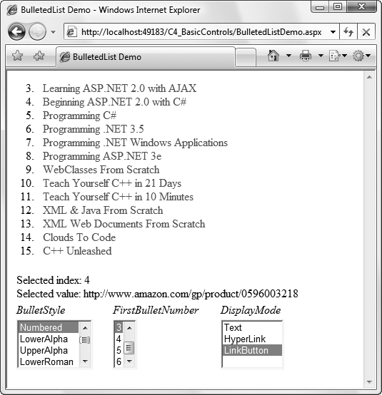
The example shown in Figure 4-24, BulletedListDemo.aspx, demonstrates the different bullet styles, starting numbers, and display modes, as well as event handling with the BulletedList control. The content file for the example is shown in Example 4-40, and the event handler methods from the code-behind file are shown in Example 4-41.
Example 4-40. BulletedListDemo.aspx
<%@ Page Language="C#" AutoEventWireup="true"
   CodeFile="BulletedListDemo.aspx.cs" Inherits="BulletedListDemo" %>

<!DOCTYPE html PUBLIC "-//W3C//DTD XHTML 1.0 Transitional//EN"
   "http://www.w3.org/TR/xhtml1/DTD/xhtml1-transitional.dtd">

<html xmlns="http://www.w3.org/1999/xhtml">
<head runat="server">
   <title>BulletedList Demo</title>
</head>

<body>
   <form id="form1" runat="server">
   <div>
      <asp:BulletedList ID="bltBooks" runat="server"
         Target="_blank" onclick="bltBooks_Click" />
      <table>
         <tr>
            <td colspan="3" id="tdMessage" runat="server"></td>
         </tr>
         <tr>
            <td><em>BulletStyle</em></td>
            <td><em>FirstBulletNumber</em></td>
            <td><em>DisplayMode</em></td>
         </tr>
         <tr>
            <td>
               <asp:ListBox ID="lbxBulletStyle"
                  runat="server" AutoPostBack="true"
                  onselectedindexchanged="lbxSelectedIndexChanged">
                  <asp:ListItem>NotSet</asp:ListItem>
                  <asp:ListItem>Numbered</asp:ListItem>
                  <asp:ListItem>LowerAlpha</asp:ListItem>
                  <asp:ListItem>UpperAlpha</asp:ListItem>
                  <asp:ListItem>LowerRoman</asp:ListItem>
                  <asp:ListItem>UpperRoman</asp:ListItem>
                  <asp:ListItem>Disc</asp:ListItem>
                  <asp:ListItem>Circle</asp:ListItem>
                  <asp:ListItem>Square</asp:ListItem>
                  <asp:ListItem>CustomImage</asp:ListItem>
               </asp:ListBox>
            </td>
            <td>
               <asp:ListBox ID="lbxBulletNumber"
                  runat="server" AutoPostBack="true"
                  onselectedindexchanged="lbxSelectedIndexChanged">
                  <asp:ListItem>1</asp:ListItem>
                  <asp:ListItem>2</asp:ListItem>
                  <asp:ListItem>3</asp:ListItem>
                  <asp:ListItem>4</asp:ListItem>
                  <asp:ListItem>5</asp:ListItem>
                  <asp:ListItem>6</asp:ListItem>
               </asp:ListBox>
            </td>
            <td>
               <asp:ListBox ID="lbxDisplayMode"
                  runat="server" AutoPostBack="true"
                  onselectedindexchanged="lbxSelectedIndexChanged">
                  <asp:ListItem>Text</asp:ListItem>
                  <asp:ListItem>HyperLink</asp:ListItem>
                  <asp:ListItem>LinkButton</asp:ListItem>
               </asp:ListBox>
            </td>
         </tr>
      </table>
   </div>
   </form>
</body>
</html>
In Example 4-40, the BulletedList control has three ListItem objects in its Items collection, all added statically. It so happens that all the list items represent websites. In anticipation of the HyperLink DisplayMode being applied, each ListItem has its Value property set, which supplies the URL to navigate to. The Target property of the BulletedList control is set to _blank, which according to Table 4-5, will cause the new page to open in a new, unnamed browser window.
The OnClick attribute of the BulletedList control binds the Click event to the bltBooks_Click method in the code-behind file, shown highlighted in Example 4-41.
Example 4-41. BulletedListDemo.aspx.cs
using System;
using System.Web.UI;
using System.Web.UI.WebControls;

public partial class BulletedListDemo : Page
{
   protected void Page_Load(object sender, EventArgs e)
   {
      if (!IsPostBack)
      {
         //  Build 2 dimensional array for the lists
         //  First dimension contains bookname
         //  2nd dimension contains ISBN number
         string[,] books = {
            {"Learning ASP.NET 2.0 with AJAX", "9780596513976"},
            {"Beginning ASP.NET 2.0 with C#", "9780470042583"},
            {"Programming C#","9780596527433"},
            {"Programming .NET 3.5","978059652756X"},
            {"Programming .NET Windows Applications","0596003218"},
            {"Programming ASP.NET 3e","0596001711"},
            {"WebClasses From Scratch","0789721260"},
            {"Teach Yourself C++ in 21 Days","067232072X"},
            {"Teach Yourself C++ in 10 Minutes","067231603X"},
            {"XML & Java From Scratch","0789724766"},
            {"XML Web Documents From Scratch","0789723166"},
            {"Clouds To Code","1861000952"},
            {"C++ Unleashed","0672312395"}
        };

         //  Now populate the list.
         for (int i = 0; i < books.GetLength(0); i++)
         {
            //  Add both Text and Value
            bltBooks.Items.Add(new ListItem(books[i, 0],
               "http://www.amazon.com/gp/product/" + books[i, 1]));
         }
      }
   }

   protected void lbxSelectedIndexChanged(object sender, EventArgs e)
   {
      ListBox lb = (ListBox)sender;
      string strID = lb.ID;
      string strValue = lb.SelectedValue;

      switch (strID)
      {
         case "lbxBulletStyle":
            BulletStyle style =
               (BulletStyle)Enum.Parse(typeof(BulletStyle), strValue);
            bltBooks.BulletStyle = style;
            //  The CustomImage style is a special case.
            if (style == BulletStyle.CustomImage)
            {
               bltBooks.BulletImageUrl = "togglebutton_checked.gif";
            }
            break;

         case "lbxBulletNumber":
            bltBooks.FirstBulletNumber = Convert.ToInt32(strValue);
            break;

         case "lbxDisplayMode":
            BulletedListDisplayMode displayMode =
              (BulletedListDisplayMode)Enum.Parse
                 (typeof(BulletedListDisplayMode), strValue);
            bltBooks.DisplayMode = displayMode;
            break;

         default:
            break;
      }
   }
   protected void bltBooks_Click
      (object sender, BulletedListEventArgs e)
   {
      BulletedList b = (BulletedList)sender;
      tdMessage.InnerHtml = "Selected index: " +
         e.Index.ToString() + "<br />" + "Selected value: " +
         b.Items[e.Index].Value + "<br />";
   }
}
The event handler for this Click event will concatenate the Index and the Value properties of the clicked ListItem, along with some HTML elements, and assign that string to the InnerHtml property of an HTML server-side control. This event handler method requires an event argument of type BulletedListEventArgs, which exposes a single property, Index. This property returns the zero-based index of the clicked ListItem in the Items collection.
However, to retrieve the actual Text or Value of the clicked ListItem, you must have a reference to the specific BulletedList control that raised the event. In this example, there is only a single BulletedList control and the ID is known to us: bltList. However, a more generic technique is used here where a single event handler will work with any number of controls. You first cast the object that raised the event, encapsulated in sender, to an object of type BulletedList, and then index into the ListItems collection represented by the Items property of that BulletedList object. This is accomplished in the following line of code from Example 4-40:
BulletedList b = (BulletedList)sender;
Though not directly related to the BulletedList control, some interesting techniques are used with the ListBox controls on the page.
All three of the ListBox controls have AutoPostBack set to true, so you will see the results of changing a value immediately. Also, all three controls use the same event handler method, lbxSelectedIndexChanged, for the SelectedIndexChanged event.
In the lbxSelectedIndexChanged method in the code-behind file in Example 4-41, the first line of code gets a reference to the control that raised the event by casting sender to a ListBox object:
ListBox lb = (ListBox)sender;
Then the ID and SelectedValue properties of the listbox can be retrieved.
A switch block is used to take action appropriate for each listbox. The ListBox that sets the FirstBulletNumber property is straightforward, converting the SelectedValue, contained in the string variable strValue, to an integer and assigning that integer to the FirstBulletNumber property:
bltBooks.FirstBulletNumber = Convert.ToInt32(strValue);
The case blocks for the other two ListBoxes are a bit more interesting. The goal is to determine the item selected, either a BulletStyle or a DisplayMode, and apply that to the BulletedList. In both cases, this is accomplished using the static Enum.Parse method. This method converts a name or value of an enumerated constant into its equivalent enumerated object. You must pass it the type of the enumerated constant and the value of the constant.
So, looking at the case for lbxBulletStyle (lbxDisplayMode is equivalent), the Type of the enumeration is obtained from the typeof operator, which returns a System.Type object. The value of the selected constant is contained in strValue. Given these two arguments, Enum.Parse returns an object, which you then cast to the desired type and assign to a variable:
 BulletStyle style =
   (BulletStyle)Enum.Parse(typeof(BulletStyle), strValue);
This variable can then be used to set the appropriate property:
bltBooks.BulletStyle = style;
In the case of lbxBulletStyle, you must make a special case of the CustomImage style to assign the BulletImageUrl property. Here you can compare BulletStyle directly with the enumerated constants to see whether there is a match:
if (style == BulletStyle.CustomImage)
{
   bltBooks.BulletImageUrl = "togglebutton_checked.gif";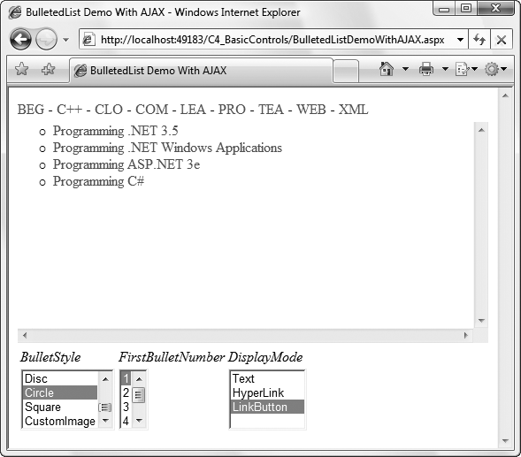
}It would be great if the ListSearchExtender demonstrated earlier could also be applied to a BulletedList control. Unfortunately, there is no scope for this, as a BulletedList doesn’t offer the user a place to type in her choice. However, the AJAX Control Toolkit contains the PagingBulletedListExtender (PBLE) control, as shown in Figure 4-25.
Rather than using user input to help find the correct choice in the list, the PBLE breaks the list into groups of choices based on two properties, IndexSize and MaxItemPerPage. It then adds an index above the list which the user can click to browse through the list more easily.
To re-create this, add to the C4_BasicControls website a new AJAX web form called BulletedListDemoWithAJAX.aspx. Copy to this new form the contents of the <div> element from BulletedListDemo.aspx under the ScriptManager in BulletedListDemoWithAJAX.aspx, and the event handlers from its code-behind page. Now add a PBLE to the new page under the main BulletedList control, bltBooks. Set its TargetControlId property to bltBooks, its ClientSort property to true, and its IndexSize to 3, and then run the page. See how the BulletedList is now augmented with an index which you can use to browse the list more efficiently.
Example 4-42 highlights the additions in BulletedListDemoWithAJAX.aspx over the original code in Example 4-40 to enable the PBLE. There are no changes in the code-behind file.
Example 4-42. BulletedListDemoWithAJAX.aspx
<%@ Page Language="C#" AutoEventWireup="true"CodeFile="BulletedListDemoWithAJAX.aspx.cs"Inherits="BulletedListDemoWithAJAX" %><%@ Register Assembly="AjaxControlToolkit"Namespace="AjaxControlToolkit" TagPrefix="cc1" %><!DOCTYPE html PUBLIC "-//W3C//DTD XHTML 1.0 Transitional//EN" "http://www.w3.org/TR/xhtml1/DTD/xhtml1-transitional.dtd"> <html xmlns="http://www.w3.org/1999/xhtml"> <head runat="server"> <title>BulletedList Demo With AJAX</title><script type="text/javascript">function pageLoad() {}</script></head> <body> <form id="form1" runat="server"> <div><asp:ScriptManager ID="ScriptManager1" runat="server" /><asp:BulletedList ID="bltBooks" runat="server" Target="_blank" OnClick="bltBooks_Click" /><cc1:PagingBulletedListExtender ID="PagingBulletedListExtender1"runat="server" TargetControlID="bltBooks"ClientSort="true" IndexSize="3" /><table> ... as shown in Example 4-40 </table> </div> </form> </body> </html>
The PBLE has several read/write properties which all have an effect on how the index it generates is presented. These are shown in Table 4-20.
Table 4-20. PagingBulletedListExtender properties
Name | Type | Description |
|---|---|---|
| Boolean | Organizes the index entries alphabetically rather than leaving them to echo the order of the list items. |
| Integer | Specifies a fixed height for the entries in the bulleted list. |
| Integer | Specifies the number of characters in each index entry. Has no effect if |
| Integer | Overrides |
| String | Sets the CSS class name for the index entry currently selected by the user. |
| String | Sets the CSS class name for any index entries not currently selected by the user. |
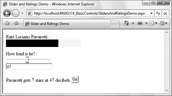
The AJAX Control Toolkit introduces two new controls to web forms that are commonly used metaphors for a user’s feelings toward a purchase or service:
SliderPresents the user with a sliding scale of values (e.g., 0-100) and a “handle” which the user can slide from left to right (or down to up) with the mouse to increase or decrease its value.
RatingsPresents the user with a set of values which are often much smaller than those in a slider (e.g., 0-5) where each value is visually represented by one of two images depending on what the value is. For example, the AJAX Control Toolkit sample website uses filled and empty star images, much like you would see on Amazon.com, to reflect the current rating value.
It’s much easier to show these controls than to describe them. Figure 4-26 shows both of them in action in SlidersAndRatingsDemo.aspx, which you’ll build next.
To build the page, add to the website a new AJAX web form called SlidersAndRatingsDemo.aspx. Add a Ratings control to the form with some explanatory text.
Now you need to define how the current rating value will be displayed onscreen. You can tie four different CSS styles into a Ratings control, as listed in Table 4-21.
Tip
Because it’s customary for online ratings to be given in terms of “stars,” the Ratings control style properties are named as such for ease of use. However, this example just uses blocks of color defined in CSS rather than any particular images. The AJAX Control Toolkit sample website, on the other hand, does demonstrate a Ratings control using star images.
Table 4-21. Style properties for the Ratings controls
Property name | |
|---|---|
| Defines the generic style for a “star”—height, width, background color, etc. |
| Defines the style for a selected “star”. |
| Defines the style for an unselected “star”. |
| When the user changes the rating value, confirms to the user that it has recorded this new value by briefly changing (flashing) the style of the selected stars. This is the “flashing confirmation” style. |
Create four CSS styles for these four mandatory properties and set them accordingly. The full markup for SlidersAndRatingsDemo.aspx in Example 4-43 shows one possibility.
Add a Button (btnSubmit) and a Label (lblChoices) to display the results of the rating, and then an event handler for the button’s Click handler, to update the Label control:
protected void btnSubmit_Click(object sender, EventArgs e)
{
   lblChoices.Text = String.Format("Pavarotti gets {0} stars",
     Rating1.CurrentRating.ToString());
}
Now run the form, change the rating, noting how the control uses the different styles. Click the button to see the current value of the Ratings control reflected on the page. Table 4-22 shows some optional properties for the Ratings control with which you can experiment.
Table 4-22. Optional properties for the Ratings control
Name | Type | Values | Description |
|---|---|---|---|
| Integer | The initial rating for the | |
| Integer | The maximum value for | |
| Boolean | Set to | |
| Orientation |
| Sets whether the stars should be set horizontally or stacked vertically. Default is |
|
|
| Sets which way to increase or decrease the |
| String | Client script that should run after the |
The Slider control is actually an extender for a text box control, which stores the actual slider value. It also requires a second control, Label or Textbox, which is bound to it and displays the numeric value of the slider.
Add to the page two text boxes, called txtHiddenSlider and txtVisibleSlider, with empty text properties beneath the Ratings control. Now add the Slider extender to the page. Set the targetControlId and boundcontrolId properties to txtHiddenSlider and txtVisibleSlider, respectively. You can see the final markup for this page in Example 4-43. You’ll also need to update the Click event handler for the Button to reflect the slider’s value in the Label control, as shown in Example 4-44.
Example 4-43. SlidersAndRatingsDemo.aspx
<%@ Page Language="C#" AutoEventWireup="true"
   CodeFile="SlidersAndRatingsDemo.aspx.cs"
   Inherits="SlidersAndRatingsDemo" %>

<%@ Register Assembly="AjaxControlToolkit"
   Namespace="AjaxControlToolkit" TagPrefix="cc1" %>

<!DOCTYPE html PUBLIC "-//W3C//DTD XHTML 1.0 Transitional//EN"
   "http://www.w3.org/TR/xhtml1/DTD/xhtml1-transitional.dtd">

<html xmlns="http://www.w3.org/1999/xhtml">
<head runat="server">
   <title>Slider and Ratings Demo</title>
   <script type="text/javascript">
      function pageLoad() {
      }
   </script>

   <style type="text/css">
      .ratingStar
      {
         font-size: 0pt;
         width: 25px;
         height: 25px;
         margin: 0px;
         padding: 0px;
         cursor: pointer;
         display: block;
         background-repeat: no-repeat;
      }
      .filledRatingStar
      {
         background-color: Black;
      }
      .emptyRatingStar
      {
         background-color: Yellow;
      }
      .savedRatingStar
      {
         background-color: Green;
      }
   </style>
</head>

<body>
   <form id="form1" runat="server">
   <div>
      <asp:ScriptManager ID="ScriptManager1" runat="server" />
      Rate Luciano Pavarotti :
      <cc1:Rating ID="Rating1" runat="server"
         StarCssClass="ratingStar"
         FilledStarCssClass="filledRatingStar"
         EmptyStarCssClass="emptyRatingStar"
         WaitingStarCssClass="savedRatingStar"
         CurrentRating="3" MaxRating="10" />
      <br />
      <br />
      How loud is he? :
      <asp:TextBox ID="txtHidden Slider" runat="server"></asp:TextBox>
      <asp:TextBox ID="txtVisibleSlider" runat="server"></asp:TextBox>
      <cc1:SliderExtender ID="SliderExtender1" runat="server"
         TargetControlID="txtHiddenSlider"
         BoundControlID="txtVisibleSlider" />
      <br />
      <br />
      <asp:Label ID="lblChoices" runat="server" />
      <asp:Button ID="btnSubmit" runat="server" Text="Go"
         OnClick="btnSubmit_Click" />
   </div>
   </form>
</body>
</html>
Example 4-44. SlidersAndRatingsDemo.aspx.cs
using System;
using System.Web.UI;

public partial class SlidersAndRatingsDemo : Page
{
    protected void btnSubmit_Click(object sender, EventArgs e)
    {
       lblChoices.Text = String.Format
          ("Pavarotti rates {0}/{1} stars at {2} decibels",
           Rating1.CurrentRating.ToString(),
           Rating1.MaxRating.ToString(),
           txtHiddenSlider.Text);
    }
}
Run the page. Notice the value in the text box changes with the Slider. If you change the value in the TextBox, the Slider will update after the TextBox loses the focus. Try setting the slider’s Minimum and Maximum properties to adjust the value bounds on the slider, and the Steps property to a value greater than 1 for sliding up the values faster. Table 4-23 lays out all of the Slider’s optional properties.
Table 4-23. Properties for the Slider control
Name | Type | Values | Description |
|---|---|---|---|
| Integer | Number of decimal places the slider value uses. Default is | |
| Boolean | Enables or disables the animation of the slider handle after the user has manually changed the value in the bound | |
| String | CSS class that defines an alternative look for the slider’s handle. | |
| String | URL for the image to be used as the slider’s handle. | |
| Integer | Width or height of the slider in pixels. | |
| Integer | Maximum value for the slider. | |
| Integer | Minimum value for the slider. | |
|
|
| The slider’s orientation. |
| String | CSS class that defines an alternative look for the slider’s rail. | |
| Boolean | If | |
| Integer | Number of steps in the slider’s range. The default is the number of whole integers between | |
| String | Text to display when the mouse pointer is held over the slider. |
In the next chapter, we look at more advanced controls and compound controls.
Get Programming ASP.NET 3.5, 4th Edition now with the O’Reilly learning platform.
O’Reilly members experience books, live events, courses curated by job role, and more from O’Reilly and nearly 200 top publishers.

