You can use the TextBox control for both user input and read-only text display. You can configure it to be single-line or multiline, or to act as a password entry box, hiding the text being typed in it. If you set it to multiline, it automatically wraps the text it contains unless the Wrap property is set to false. Its Text property sets and retrieves the text content within the box. The text it contains can exceed the length of the control displayed on the page, in which case the beginning of the text is scrolled off to the left of the box.
Table 4-2 lists the frequently used properties of the TextBox control. If you omit any of these values from the control, the default value will apply. All the properties listed in the table are read/write properties.
Table 4-2. Some properties specific to the TextBox control
Name | Type | Values | Description |
|---|---|---|---|
| Boolean |
| Determines whether automatic postback to the server will occur if the user changes the contents of the control and then selects another control on the form. If |
|
|
| Width of the text box as measured in the width of the widest characters in the current font. Default is |
|
|
| Maximum number of characters allowed. If The default value is |
| Boolean |
| If |
|
|
| Number of lines of text in a multiline text box. The default is |
| String | Content of the | |
|
|
|
|
| String | Specifies which validation group, if any, this control is a member of. See Chapter 11 for a discussion of validation. | |
| Boolean |
| Indicates whether text within a multiline text box should wrap. If |
In addition to the events inherited from the WebControl class, such as Init, Load, and PreRender, the TextBox control raises the TextChanged event when the contents of the text box have changed and the control loses focus. This is not a postback event unless the AutoPostBack property is set to true.
When a TextBox control is declared in a content file (.aspx or .ascx), the TextChanged event handler method is specified with the OnTextChanged attribute. TextChanged is the default event handler created by VS2008 when you double-click a TextBox in Design view. This event handler is passed a standard EventArgs argument.
The following example demonstrates the basic use of a TextBox, including handling the TextChanged event. This example has two text boxes: one to input text, and a second, read-only control to echo the contents of the first box. The finished web page should look something like that shown in Figure 4-3, after changing the text in the input box.
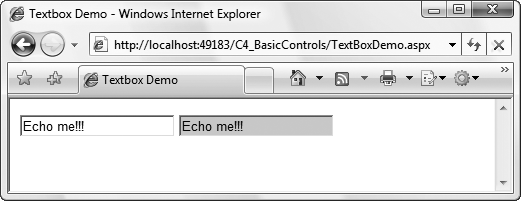
Add to your C4_BasicControls site a new web form called TextBoxDemo.aspx. Drag two TextBox controls onto the page. Set the ID property of the first to txtInput and the second to txtEcho. Set the AutoPostBack property of txtInput to true so that the form will automatically post back whenever the contents of the control changes. Set the BackColor property of txtEcho to LightGray and the ReadOnly property to true. The former will give a visual clue that the latter has been set, and txtEcho won’t accept text. Finally, add some text to txtInput.
To echo the contents of txtInput in txtEcho, you’ll make use of the TextChanged event of txtInput. This event fires when the contents of a text box changes and then the text box loses focus. To bind this event with the method to copy the text to txtEcho, switch to Design view and double-click the TextBox. The OnTextChanged attribute will be added to the txtInput declaration in the content file, and the code-behind file will open with a code skeleton in place of the event handler. Enter the highlighted line of code from Example 4-5.
Example 4-5. The TextChanged event handler in TextBoxDemo.aspx.cs
using System;
using System.Web.UI;

public partial class TextBoxDemo : Page
{
   protected void txtInput_TextChanged(object sender, EventArgs e)
   {
      txtEcho.Text = txtInput.Text;
   }
}
The final markup for TextBoxDemo.aspx is shown in Example 4-6.
Example 4-6. Markup for TextBoxDemo.aspx
<%@ Page Language="C#" AutoEventWireup="true" CodeFile="TextBoxDemo.aspx.cs" Inherits="TextBoxDemo" %> <!DOCTYPE html PUBLIC "-//W3C//DTD XHTML 1.0 Transitional//EN" "http://www.w3.org/TR/xhtml1/DTD/xhtml1-transitional.dtd"> <html xmlns="http://www.w3.org/1999/xhtml"> <head runat="server"> <title>Textbox Demo</title> </head> <body> <form id="form1" runat="server"> <div><asp:TextBox ID="txtInput" runat="server" AutoPostBack="true"OnTextChanged="txtInput_TextChanged" Text="Enter some text" /><asp:TextBox ID="txtEcho" runat="server"BackColor="lightgray" ReadOnly="true" /></div> </form> </body> </html>
Run the page and you’ll see that txtInput contains “Enter some text”. When you change the contents of the control and tab out of the text box, the page will be posted back, the TextChanged event will be raised, and the event handler specified in the OnTextChanged attribute, txtInput_TextChanged, will execute, populating txtEcho.
The TextBox control serves its purpose very well, but it gives users no help or hints on how to complete the information that is required of them. For example, in what format should a date be given? Is this a good password? The AJAX Control Toolkit contains several TextBox extender controls to provide this functionality and alternative ways to change the value in a TextBox without typing it in directly:
AutocompleteThis extender control displays a list of possible values for the
TextBoxbased on the text already added to the box. This list is generated on the fly by querying a web service in the background.CalendarFor
TextBoxes that require a date value, theCalendarExtenderdisplays a standardCalendarcontrol (see Chapter 5 for more on that) next to theTextBoxas soon as theTextBoxgets the focus. The user can then choose a date from theCalendarand that date as a string is then shown in theTextBoxin the format you specify.FilteredTextBoxThis allows you to specify a list of the characters that may be added to the value in the text box. Characters that are not in the list won’t be allowed into the box.
MaskedEditExtenderThis specifies a format for the string to be added to the
TextBox. For example, if the extender specifies a 10-digit ISBN string, theMaskedEditExtenderwill add hyphens between the appropriate numbers to create the correct string.NumericUpDownExtenderThis extender control adds “up” and “down” buttons to the side of the
TextBoxthat increase and decrease a numeric value (if there is one) in theTextBox. You can also define sequences of non-numeric values for theTextBox. Clicking the buttons then calls a web service in the background that tells the extender which is the next or previous value in the sequence.PasswordStrengthFor
TextBoxcontrols where users need to add a password,PasswordStrengthprovides feedback to users as they type regarding how strong the password they’ve entered is so far and what they’ll need to add to the string to make it the required strength.PopupControlExtenderA more generic version of the
CalendarExtendercontrol, this extender allows you to associate another control or group of controls with a text box to make setting the value for the text box simpler. Indeed, this can extend almost any ASP.NET server control, as you’ll see at the end of this chapter.SliderThis defines a range of numeric values to which the
TextBoxcan be set and then replaces the text box with a slider graphic which the user can drag to the appropriate value. We cover sliders separately at the end of this chapter.TextBoxWatermarkExtenderThis displays hint text in the
TextBoxthat is visible when the text box contains no user-entered or programmatically set value. The watermark disappears as soon as the user clicks on theTextBox.
To demonstrate how you can use some of these extender controls with a TextBox, the next example extends TextBoxDemo.aspx to make it easier to enter a date into a TextBox. Add to the C4_BasicControls website a new AJAX web form called TextBoxDemoWithAJAX.aspx. Next, add the highlighted code from Example 4-6 to TextBoxDemoWithAJAX.aspx below the ScriptManager control, and then add the event handler code for txtInput_OnTextChanged from Example 4-5 to TextBoxDemoWithAJAX.aspx.cs.
The first change is to replace the “Enter some text” text in txtInput with a watermark saying the same thing, so the user doesn’t have to delete it before she can actually write what she wants there.
With TextBoxDemoWithAJAX.aspx in Source view, drag a TextBoxWatermarkExtender from the Toolbox onto the page underneath the two TextBoxes. Set the TargetControlId for the extender to txtInput and the WatermarkText to “Enter a Date”. Delete the Text property from txtInput, as it’s no longer necessary, and then run the page. You’ll see the watermark in the TextBox disappear as soon as you click it. If you delete the contents of the TextBox and click elsewhere on the page, the watermark will reappear.
To differentiate the watermark from text you’ve actually typed in, you can define a CSS class for watermarks and set the extender’s WatermarkCssClass property to that. For example, the following CSS style works quite well:
<style type="text/css">
   .watermark
   {
      color : Gray;
      background-color : #dddddd;
      font-size: smaller;
      font-style:italic;
   }
</style>
Tip
You can add an AJAX Toolkit Extender control to an ASP.NET server control in Design view if you prefer. Select the target control for the extender on the page and a small arrow appears by its top-right corner. Clicking this smart tag will expand the control’s Common Tasks dialog. You’ll see an option to Add Extender. Clicking this will present another dialog box showing all the available extenders for that type of control. Select one and click OK.
Note, however, that not all of the properties of the AJAX Control Toolkit controls are visible in the Properties window in Design view, so you’ll still need to use IntelliSense in Source view to see all of those.
With the hint text now a watermark, you can use a couple of other extenders to help users specify a date they want in the format you want. You could just use a Calendar control (see Chapter 5), it’s true, but this is neater and also allows the user to just type the date straight into the box.
Drag a CalendarExtender onto the page under the TextBoxWatermarkExtender. Set its TargetControlId to txtInput. Now run the page and see that when the TextBox gets the focus, a calendar appears below it, as shown in Figure 4-4. Now you can select the date from the calendar or type it directly into the TextBox.
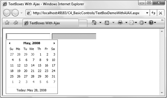
Once you’ve selected a date from the calendar, the TextBox reflects that in its default format: MM/dd/yyyy. To change the format, use the Format property of the CalendarExtender. For example, set format="dd/MM/yy". A list of CalendarExtender’s useful properties appears in Table 4-3.
Table 4-3. CalendarExtender properties
Name | Type | Value range | Description |
|---|---|---|---|
| Boolean |
|
|
| String | Specifies the CSS class that should be applied to the calendar when it is visible. | |
| String |
| Specifies the day to display as the first day of the week on the calendar. |
| String | Use the same format strings as the standard .NET | Specifies the format of the selected date to be used in the text box after the date has been selected. |
| String | Specifies the ID of a button control that must be clicked before the calendar appears. If this is set, the calendar will not appear if the text box simply gets the focus. To display the calendar, users have to click the button first. |
The CalendarExtender helps people write the date in the format you want, but it doesn’t preclude them from writing their own version of the date directly into the TextBox. You could use a watermark to give a better hint, but an additional route is to enforce the desired format with the MaskedEditExtender and then check the entry with the MaskedEditValidator. (See more on validation in Chapter 11.)
Drag a MaskedEditExtender onto the page under the CalendarExtender. Set its TargetControlId property to txtInput, its MaskType property to date, its Mask to 99/99/9999, and its ErrorTooltipEnabled to True so that the validator’s errors are visible. Now drag a MaskedEditValidator onto the page under the MaskedEditExtender. Set its ControlToValidate property to txtInput, its ControlExtender property to the ID of the MaskedEditExtender control, and its Display to “dynamic” so messages are inserted as appropriate. Then add messages with EmptyValueMessage, InvalidValueMessage, and ToolTipMessage properties. These additions, along with the code for the other extenders, are shown in Example 4-7.
Example 4-7. Full source code for TextBoxDemoWithAJAX.aspx.cs
<%@ Page Language="C#" AutoEventWireup="true" CodeFile="TextBoxDemoWithAJAX.aspx.cs" Inherits="TextBoxDemoWithAJAX" %><%@ Register Assembly="AjaxControlToolkit"Namespace="AjaxControlToolkit" TagPrefix="cc1" %><!DOCTYPE html PUBLIC "-//W3C//DTD XHTML 1.0 Transitional//EN" "http://www.w3.org/TR/xhtml1/DTD/xhtml1-transitional.dtd"> <html xmlns="http://www.w3.org/1999/xhtml"> <head runat="server"> <title>TextBoxes With Ajax</title><script type="text/javascript">function pageLoad() {}</script><style type="text/css">.watermark{color: Gray;background-color: #dddddd;font-size: smaller;font-style: italic;}</style></head> <body> <form id="form1" runat="server"> <div><asp:ScriptManager ID="ScriptManager1" runat="server" /><asp:TextBox ID="txtInput" runat="server" AutoPostBack="true" OnTextChanged="txtInput_TextChanged" Text="Enter some text" /> <asp:TextBox ID="txtEcho" runat="server" BackColor="lightgray" ReadOnly="true" /><cc1:TextBoxWatermarkExtender ID="TextBoxWatermarkExtender1"runat="server" TargetControlID="txtInput"WatermarkText="Enter a date" WatermarkCssClass="watermark" /><cc1:CalendarExtender ID="CalendarExtender1" runat="server"TargetControlID="txtInput" Format="MM/dd/yyyy" /><cc1:MaskedEditExtender ID="MaskedEditExtender1" runat="server"TargetControlID="txtInput" Mask="99/99/9999" MaskType="Date"ErrorTooltipEnabled="True" CultureInfo="en-us" /><cc1:MaskedEditValidator ID="MaskedEditValidator5"runat="server" ControlExtender="MaskedEditExtender1"ControlToValidate="txtInput"EmptyValueMessage="Date is required"InvalidValueMessage="Date is invalid"Display="Dynamic" TooltipMessage="Enter a date" /></divgt; </form> </body> </html>
Now run the page. See how the MaskedEditExtender applies itself to the TextBox when you type directly into the text box, and fits in nicely with CalendarExtender.
Warning
This example leaves the date format at the default, but it must be set anyway in the CalendarExtender to agree with the MaskedEditExtender. If you decide to use a different format, or if your users don’t all use the same culture settings as you do, make sure the CalendarExtender and MaskedEditExtender controls agree on the format using the CultureName property for the MaskedEditExtender and the Format property for the CalendarExtender.
When the page is posted back and the selected date is reflected in txtEcho, txtEcho by default will show the date in the default format for the default culture on the server. You might need to experiment with culture and format values, before the extenders and txtEcho all show the same date in the same format. See http://msdn2.microsoft.com/en-us/library/5hh873ya.aspx for more on cultures and dates in general and http://asp.net/learn/ajax-videos/video-131.aspx for more on how this applies to the MaskedEdit controls in particular.
A list of useful properties for the MaskedEditExtender is given in Table 4-4. Note that it validates only numbers, times, and dates. For any other specific value you’ll need one of the other Validation controls covered in Chapter 11.
Table 4-4. Useful MaskedEditExtender properties
Name | Type | Value range | Description |
|---|---|---|---|
| String | A sequence of the characters in Table 4-5 | Defines the format of the string to be entered in the text box. For example, |
| String | A string containing the characters allowed in place of “C” in the | |
|
| Specifies what the value entered into the target | |
| Boolean |
|
|
| String | Default value for | |
| Boolean |
|
|
|
| For | |
|
| For | |
| Boolean |
|
|
Table 4-5. Mask characters
Character | Represents |
|---|---|
9 | Only a numeric character |
L | Only a letter |
$ | Only a letter or a space |
C | Only a custom character defined in the |
A | Only a letter or a custom character |
N | Only a numeric or custom character |
? | Any character |
/ | Date separator |
: | Time separator |
. | Decimal separator |
, | Thousand separator |
\ | Any C# escape character |
| Indicates the character represented by |
An escape character in C# is a backslash (\) , followed by one of a small set of letters which allow you to specify a character in a string you wouldn’t otherwise be able to use. For example, you use a double quote (") to specify the beginning and end of a string. If you want to use a double quote in a string, you can escape it as \":
string a = "Dave said, \"How much is that book?\" to the shopkeeper."
The full set of C# escape characters is available at http://blogs.msdn.com/csharpfaq/archive/2004/03/12/88415.aspx.
Get Programming ASP.NET 3.5, 4th Edition now with the O’Reilly learning platform.
O’Reilly members experience books, live events, courses curated by job role, and more from O’Reilly and nearly 200 top publishers.

