Itâs a great big (wide) world... but whoâs really out there?
So youâve got your nice shiny XHTML and CSS diploma hanging on the wall, and the prospective clients are ringing your new business line off the hook. Cool, right? Yeah... until you get your first complaint about a bad layout, or a logo thatâs just so 1998. So how do you create really beautiful websites and still make sure they satisfy your users? It all begins with good planning. Then youâve got to write for the Web, know your audience, and, above all else, make sure youâre designing for your users, not yourself.
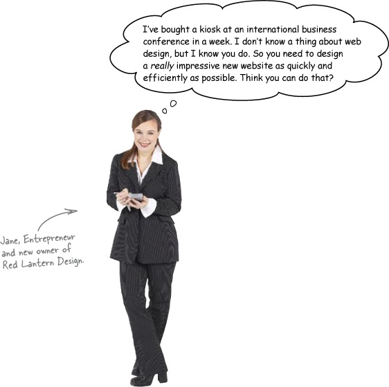
Janeâs just bought a small web design studio. Red Lantern Designâs been producing small sites for local businesses for several years, and now Jane wants to expand their client-base. But thereâs a problem...
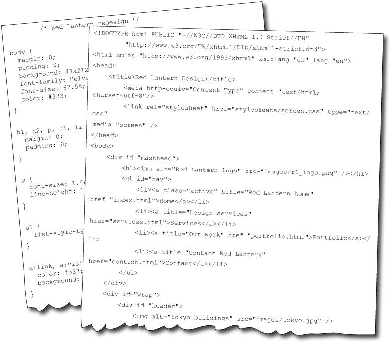
The old Red Lantern webmaster used a WYSIWYG editor to create the companyâs own site, and now no one can edit the files. Janeâs hired you to build a new site that will bring Red Lantern up to modern web standards and bag the company more lucrative clients.
Well, sure you can. Where do you think you should start?
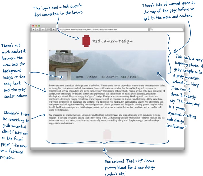
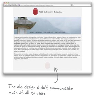
Thereâs not a lot thatâs good about the existing Red Lantern siteâthe logoâs nice, but thatâs a pretty damning comment on the rest of the design if thatâs all there is to like. But if thereâs so much wrong, how can we figure out what to work on next? Where would you start?
âWhere should I start?â and âWhere should I go from there?â are really good questions.
The fact youâre still asking yourself those questions without opening a text editor is a good sign. The answer to both is, always follow a design process. A design process structures your project so that you stay on task and donât go off in every different direction all at once without accomplishing anything but stress, stress, and more stress.
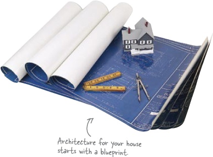
A process is really just a workflow that determines the order you do things on a web design project. Imagine youâre building a house for someone. Itâs their dream home, theyâve got a ton of ideas on their wishlist, and you also need to include the usual things youâd expect to find in a house: walls, floors roof, kitchen, bedroom, bathroom, living areas...
Now ask yourself where youâd start? Would you build the walls first? Would you pick out fabrics, or draw up a blueprint? Which one is going to pay off two weeks from now? Two months? Two years?
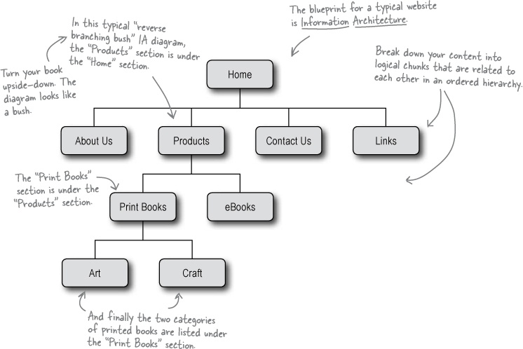
So building a website is a lot like building a house. If you start with a blueprint, youâll know exactly where youâre headed at every step: foundations, load-bearing walls, and so on. For a website, you use Information Architecture (or IA). IA is the process by which you break your websiteâs content into chunks and then organize those chunks hierarchically in relation to one another in a way thatâs logical.
Most of the time, each chunk of information is content (text, images, etc.) that lives on a single page. IA is also closely linked with building your siteâs navigation. So, if youâve got bad IA, chances are, youâll have a bad navigation system as well. If your site doesnât have solid IA, it will feel disorganized and confusing to users. And that will make users go someplace else to get what theyâre looking for.
Brain Power
What content do you have for the Red Lantern site? How will you order it? Will you need any more material?
Sharpen Your Pencil
Start the Information Architecture process by asking Jane about the content she wants for the site.
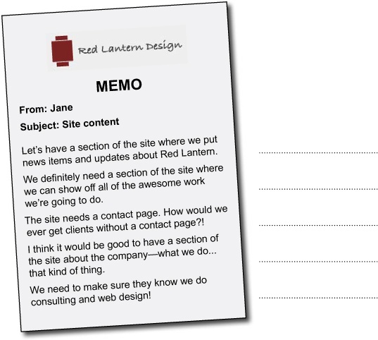
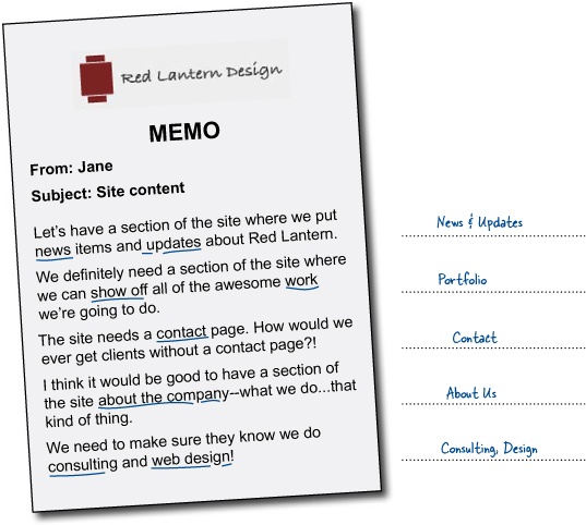
Hereâs a memo from Jane telling you what sections she wants on the site. Write down a one or two word description for that âchunkâ of content.
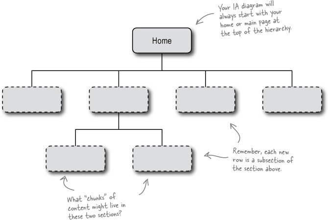
Once youâve worked out the sections of information for the Red Lantern Design site, you can start to build your Information Architecture diagram. Fill in the spaces provided with your individual sections from the facing page.
Sharpen Your Pencil Solution
You started the Information Architecture process by asking Jane about the content she wants on the site.
Jane let you know what she thought the sections should be. Here are some possible one or two word descriptions for each âchunkâ of content.
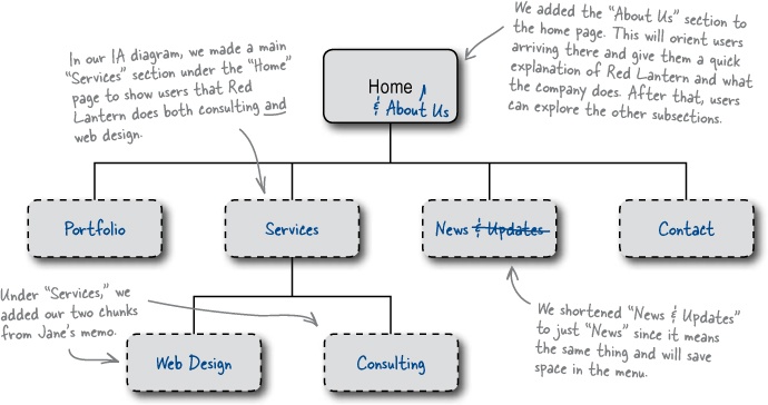
Given these âchunksâ of information, how does your IA diagram look?
Will that be enough to help your users find their way around the site?
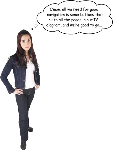
You need to think about navigation twice in the design process? First, you need to think about your navigational elementsâyes, things like buttons and nav barsâwhile you work on the overall layout of the site.
Navigation will show up again when you begin writing the code and building the layout elements that have to do with users finding their way around the site, as well as linking your pages together. But donât jump the gun, you need to start by organizing your top level navigation.
Information Architecture isnât just important for organizing your siteâs information; itâs a big deal for your navigation as well. So, when it comes to building your siteâs navigation, keep your IA diagram close at hand.
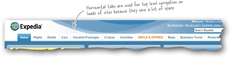
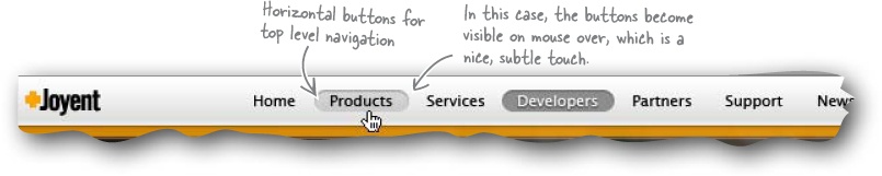
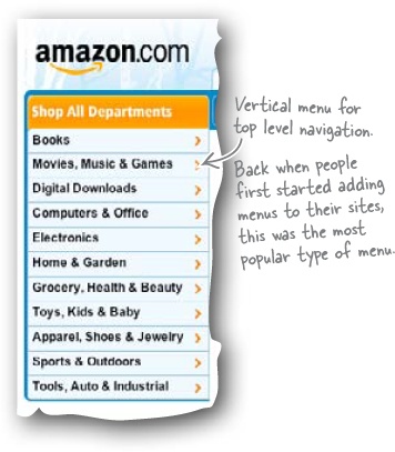
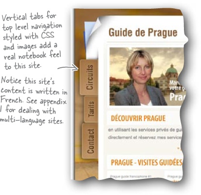
Top level navigation is usually the most prominent navigational elementâthe tabbed nav bar at the top of the page, the vertical nav menu in a secondary column, etc. More often that not, your top level navigation links to those sections one tier below the home page in your IA diagram.
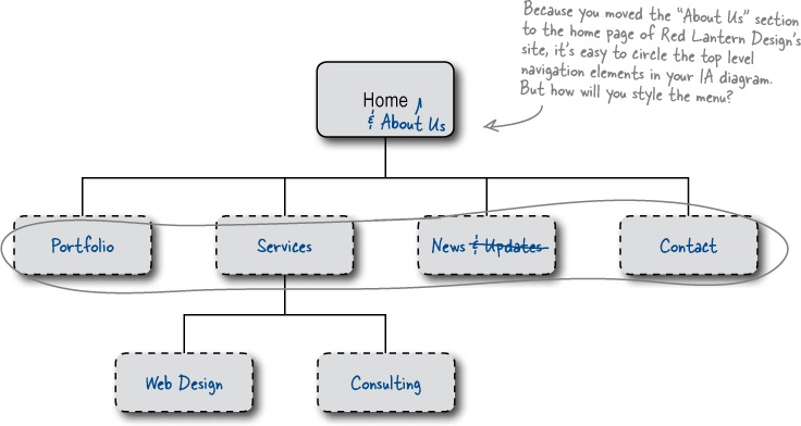
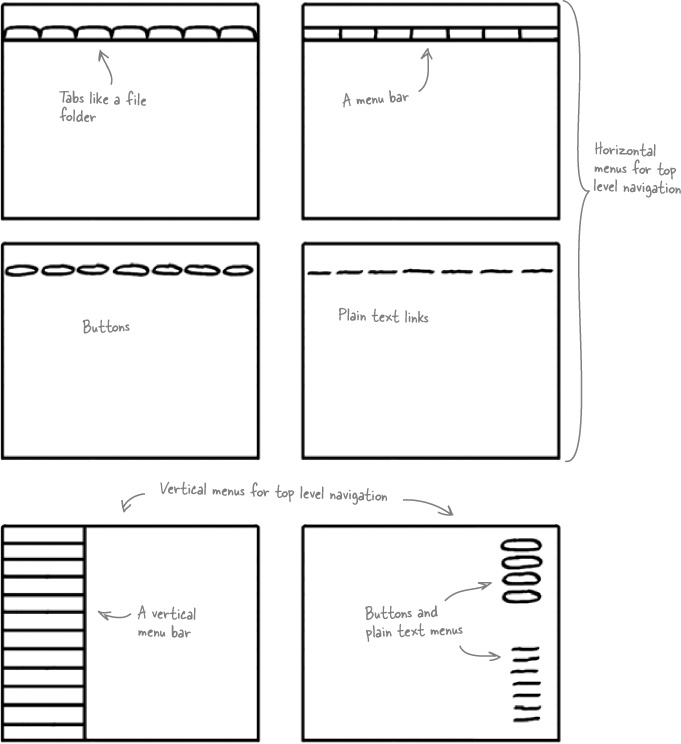
The point of the top level navigation is to show your users where they are within your siteâs main structure. Weâll come back to navigation in a lot more detail in Chapter 6, but for now, you need to ask yourself how youâll style the menu on the Red Lantern site. Time to start thinking about which menu type would suit the site and where it would fit on the page.
So youâve got the main content mapped out. What will you need to do next? At this stage, itâs a good idea to show Jane some basic design sketches...

Having a clear idea of where you want to put the building blocks on screen saves valuable development time.
Itâs much quicker to sketch a few designs on paper and get Janeâs reaction before you start than it is to waste time working up the code for a bunch of designs when she can only pick one...
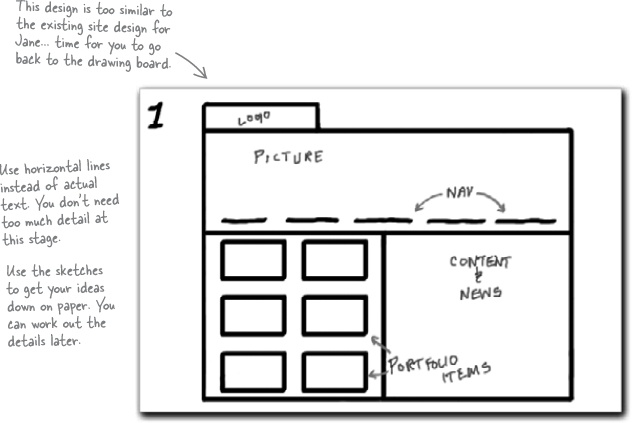
Your first sketches should be black and white and drawn on paper. That way, Jane will be completely focused on the basic layout of the design (instead of what color the background of the page is or how great her logo looks placed over that image or... you get the picture).
Your designs should show Jane some basic layouts with the content sheâs requested in various configurations on the page. The sketches should make Jane ask herself questions like: âDo I want a large image at the top of the page?â, âHow many columns do I want?â, âWhere should the menu go?â, and so on.
Sharpen Your Pencil
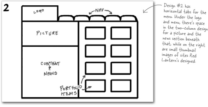
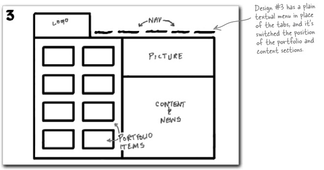
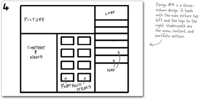
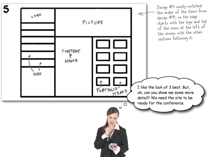
Hereâs the first sketch we showed Jane. She didnât like it because it looks almost exactly like the existing design, but with the main content section broken into two columns.
Now itâs up to you to come up with a basic design Jane does like. Draw at least three more concepts on your own sheets of paper.
Sharpen Your Pencil Solution
Basic black and white sketches keep the focus on the main layout. Itâs time to show the basic layout concepts to Jane. Which will she choose?
Great, youâve agreed on a basic design, what will you do next?
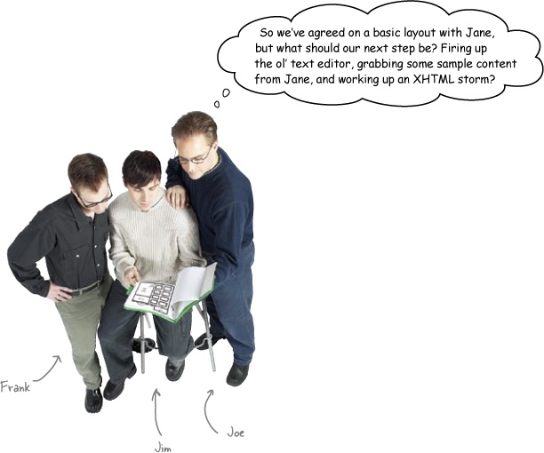
Frank:Â Nope. Weâre going to stick to pen and paper for now. What do you think about adding some color to those sketches?
Jim:Â Why would I do that? Canât I just get going with the code and test different colors using CSS stylesheets?
Frank:Â Well, this way, you get a chance to see how colors interact with one another, how interface and layout elements play off one another once theyâre in color, how your navigation system looks in relation to the rest of the layout, and generally whether contentâs represented in the best way possible.
Joe:Â Wow. That sounds like a tall order for one little sketch. Couldnât we just have shown Jane a few color versions instead of going with the black and white sketches?
Frank:Â Clients can get distracted by color too early in the process. Itâs best to show them something that gives them an idea of the functionality of the siteâ
Joe:Â âbefore we start on the look and feel part of the design process. I get it. The sketches provide us with a painless way to catch any potential design problems before we start coding our design, and they become major obstacles.
Frank:Â There you go. But weâre not just doing one sketch here, Joe.
Joe:Â No?
Frank:Â â
Jim:Â âNo. Weâre going to do a ton, all in different colors, and show them all to Jane like we did with the first sketches, right?
Frank:Â Kinda. What weâre actually doing is creating storyboards to test a few variations. Weâll show Jane the best one or two.
Jim:Â Wait. What?
Frank:Â Yeah, these are like the storyboardsâyou know, that sequence of little sketches that look like a comic stripâthe film industry uses to test out shots before rolling the cameras. Weâre doing the same thing. Here, let me show you a neat trick for creating good storyboards.
Sharpen Your Pencil
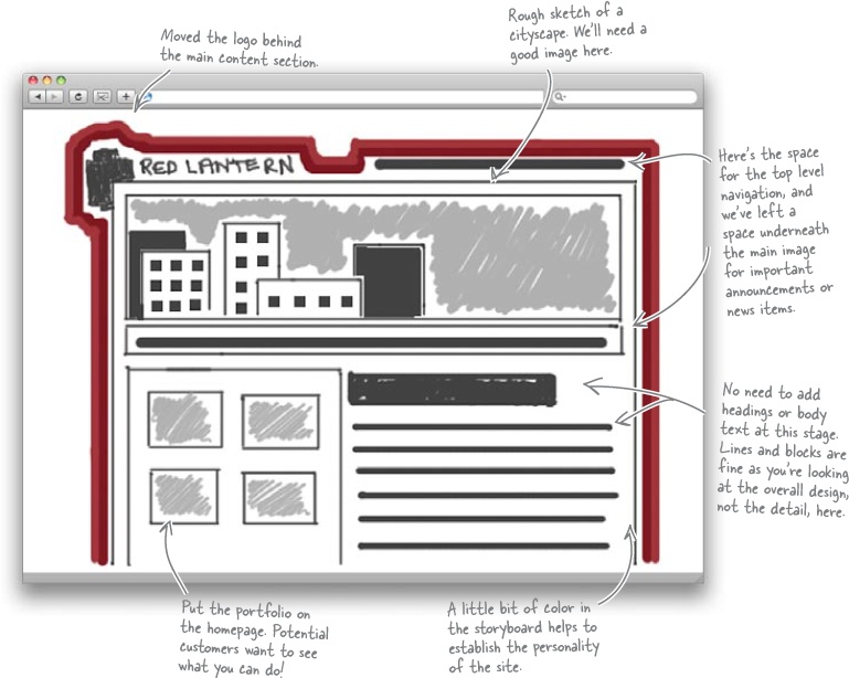
Now that you know what kind of layout Jane wants for the Red Lantern Design site, itâs time to storyboard it. Take a sheet of paper and a pencil and go to work. Be as detailed as possible in what you come up with. If youâve got some handy, use pencil crayons to add color to your storyboards.
Sharpen Your Pencil Solution
Finished Red Lantern storyboard. Yours might look a little different, but this is the level of detail you want to see in a final storyboard.
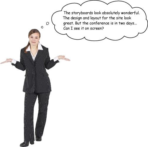
Now itâs time to prototype the site in code
Building a prototype in code has some great advantages. First, even though your design might look great on paper, it might not work (technically speaking) when you code it up. The prototype will give you an opportunity to quickly fix anything (code-wise) before you invest too much time in building a polished finished product.
Also, if youâre working with clients, a code prototype gives you something to show them, and just like your storyboards, you can get useful feedback and make iterative changes.
Relax
What do you mean, iterative?
Iteration is a design methodology that lets you test, analyze, and refine prototypes of work in progress. At each stage, you go through each of the steps in the design processâitâs cyclicalâuntil you get something you (and your client) are happy with.
Ready Bake Code
Go ahead and grab the files for the first code prototype from:
www.headfirstlabs.com/books/hfwd/ch01Then weâll give it a quick test drive to see how everythingâs looking.
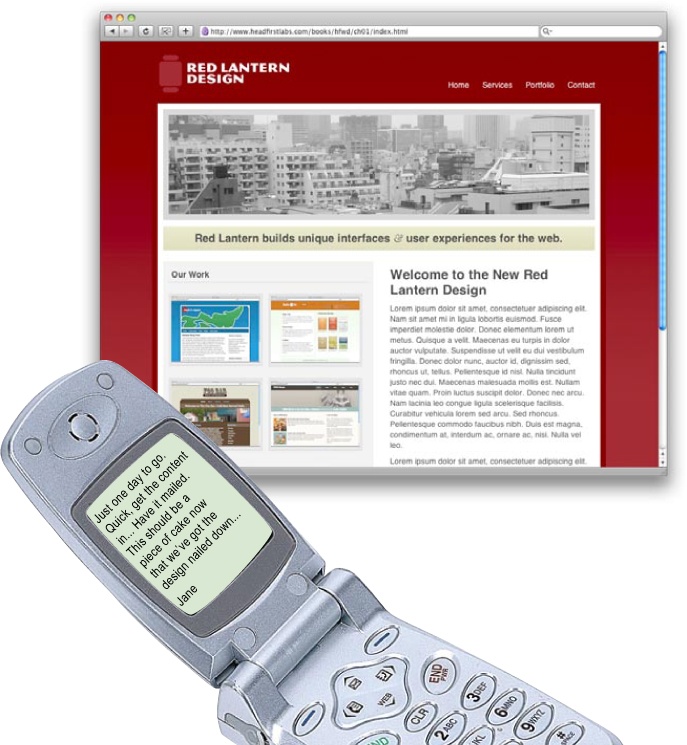
Test Drive
Time to check the site out in your browser. Once youâve tested the site, show it to Jane to get some fast feedback on this iteration.
Exercise
Hereâs the text Jane just sent over. Grab a stopwatch and set it for 15 seconds. Hit the Start button, and begin reading this text. When your timeâs up, write down what this text is about.
Note
MEMO
From: Jane |
Subject: Site content |
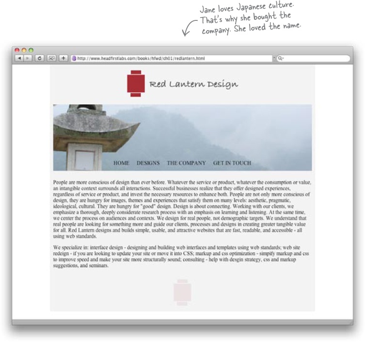
People are more conscious of design than ever before. Whatever the service or product, whatever the consumption or value, an intangible context surrounds all interactions. Successful businesses realize that they offer designed experiences, regardless of service or product, and invest the necessary resources to enhance both. People are not only more conscious of design, they are hungry for images, themes and experiences that satisfy them on many levels: aesthetic, pragmatic, ideological, cultural. They are hungry for âgoodâ design. Design is about connecting. Working with our clients, we emphasize a thorough, deeply considerate research process with an emphasis on learning and listening. At the same time, we center the process on audiences and contexts. We design for real people, not demographic targets. We understand that real people are looking for something more and guide our clients, processes and designs in creating greater tangible value for all. Red Lantern designs and builds simple, usable, and attractive websites that are fast, readable, and accessible - all using web standards. |
We specialize in: interface design - designing and building web interfaces and templates using web standards; web site redesign - if you are looking to update your site or move it into CSS; markup and css optimization - simplify markup and css to improve speed and make your site more structurally sound; consulting - help with design strategy, css and markup suggestions, and seminars. |
____________________________________________________________________________________
____________________________________________________________________________________
____________________________________________________________________________________
All the awesome design work, storyboarding, and prototyping in the world is not going to save your site if you donât have any content (or if the way you present your content stinks). So how will you ensure your contentâs interesting?
Writing for the web is different than writing for regular print.
Instead of reading your content from left to right, beginning to end, like a book, users scan the text for keywords and conceptsâto give them an idea about the contents of the page.
When you combine this with the fact that users generally donât spend that much time on individual pages, you know you are going to have to write differently. The word of the day is scannability!
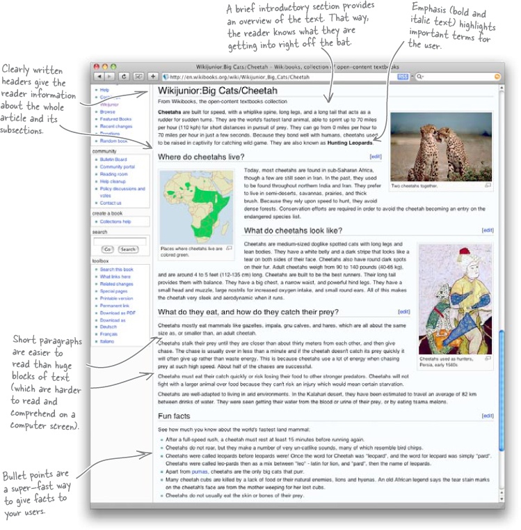
There are several techniques you can use to make your text scannable. Short paragraphs, headings, bullet points, and clear meaning will all help users scan your content more easily.
Long Exercise
Hereâs the text Jane just sent over again. Rework the copy so that follows the scannability checklist.
Note
MEMO
From: Jane |
Subject: Site content |
People are more conscious of design than ever before. Whatever the service or product, whatever the consumption or value, an intangible context surrounds all interactions. Successful businesses realize that they offer designed experiences, regardless of service or product, and invest the necessary resources to enhance both. People are not only more conscious of design, they are hungry for images, themes and experiences that satisfy them on many levels: aesthetic, pragmatic, ideological, cultural. They are hungry for âgoodâ design. Design is about connecting. Working with our clients, we emphasize a thorough, deeply considerate research process with an emphasis on learning and listening. At the same time, we center the process on audiences and contexts. We design for real people, not demographic targets. We understand that real people are looking for something more and guide our clients, processes and designs in creating greater tangible value for all. Red Lantern designs and builds simple, usable, and attractive websites that are fast, readable, and accessible - all using web standards. |
We specialize in: interface design - designing and building web interfaces and templates using web standards; web site redesign - if you are looking to update your site or move it into CSS; markup and css optimization - simplify markup and css to improve speed and make your site more structurally sound; consulting - help with design strategy, css and markup suggestions, and seminars. |
____________________________________________________________________
____________________________________________________________________
____________________________________________________________________
____________________________________________________________________
____________________________________________________________________
____________________________________________________________________
____________________________________________________________________
____________________________________________________________________
____________________________________________________________________
____________________________________________________________________
____________________________________________________________________
____________________________________________________________________
____________________________________________________________________
____________________________________________________________________
____________________________________________________________________
____________________________________________________________________
____________________________________________________________________
____________________________________________________________________
____________________________________________________________________
____________________________________________________________________
Long Exercise Solution
You edited Janeâs text, following the scannability checklist.
Note
MEMO
From: Jane |
Subject: Site content |
People are more conscious of design than ever before. Whatever the service or product, whatever the consumption or value, an intangible context surrounds all interactions. Successful businesses realize that they offer designed experiences, regardless of service or product, and invest the necessary resources to enhance both. People are not only more conscious of design, they are hungry for images, themes and experiences that satisfy them on many levels: aesthetic, pragmatic, ideological, cultural. They are hungry for âgoodâ design. Design is about connecting. Working with our clients, we emphasize a thorough, deeply considerate research process with an emphasis on learning and listening. At the same time, we center the process on audiences and contexts. We design for real people, not demographic targets. We understand that real people are looking for something more and guide our clients, processes and designs in creating greater tangible value for all. Red Lantern designs and builds simple, usable, and attractive websites that are fast, readable, and accessible - all using web standards. |
We specialize in: interface design - designing and building web interfaces and templates using web standards; web site redesign - if you are looking to update your site or move it into CSS; markup and css optimization - simplify markup and css to improve speed and make your site more structurally sound; consulting - help with design strategy, css and markup suggestions, and seminars. |
Your text might look a little different, but as long as youâve used the techniques to make the text more scannable, your users will thank you.
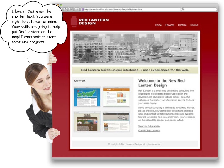
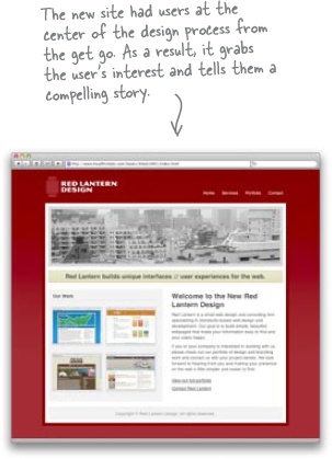
Welcome to the New Red Lantern Design
Note
Headings orient the user within the text. Note, you wonât need one at the top of the page, as the logo will serve as a header for the page.
Red Lantern is a small web design and consulting firm specializing in standards-based web design and development. Our goal is to build simple, beautiful webpages that make your information easy to find and your users happy.
If you or your company are interested in working with us, please check out our portfolio of design and branding work and contact us with your project details. We look forward to hearing from you and making your presence on the web a little simpler and easier to find.
View our full portfolio
Contact Red Lantern
Note
These links will be a short unordered list with the bullet points removed by our CSS.
Sure, she could be. But this version is short, to the point, and a lot more compelling.
It tells users exactly what Red Lantern does, and what they can expect from working together. We edited out a ton of contentâlong words, sentences that you had to read three times to understand, and so onâthat would have clouded this simple message.
Besides, worst case, we can compromise with Jane and put back in some of her text... carefully edited, of course!
So how do the two versions of Janeâs site compare? Every siteâs ultimate aim is to communicate something to its users. If your website doesnât communicate what you want it to, your audience will go to another site looking for the experience or content that you couldnât give them.
This is known as User-Centered Design. When you build a website, youâre building it for your users, not for you. You design for your userâs strengths and weaknesses. You want to use every technique possible to bring users to your site, help them find what theyâre looking for, make sure they have a rewarding experience, and keep them coming back.
The process you followed in this chapterâ
Pre-production. using Information Architecture and storyboards to build a blueprint for your site so that youâre as efficient and focused as possible when you go digital.
Navigation. is based on your IA diagram. Itâs more than just linking pages together. Navigation helps your users find information.
Layout. uses HTML and CSS to build the siteâs interface (which you already came up with on paper back in the pre-production phase).
Writing. âfillsâ the design up with the scannable content that your visitors come to the site for.
âhad just one aim: to produce a great-looking site that tells users all about Red Lantern Design.
Get Head First Web Design now with the O’Reilly learning platform.
O’Reilly members experience books, live events, courses curated by job role, and more from O’Reilly and nearly 200 top publishers.

