You can add items to ListBox
controls declaratively, through code, or through data binding.
Adding ListBox items through
declarative techniques requires simply adding items in the XAML either
by typing them in or by using a designer such as Expression Blend. But
although the declarative technique makes it easy to add items in a
designer, it does not offer a way to add items from a database, because
the values are not known at design time.
To set or modify items through code, you would access the object
model for the ListBox. You would use this technique
when employing a manual binding strategy. Manual binding involves
pulling values from a data source and manually loading them into target
controls in the ListBox. Then the
values can be manually pulled from the controls and back to a data
source when the user clicks a button, for example. Manual binding does
not require a DataContext or any
binding syntax. Instead, it simply loads property values into targets,
one by one, for each row in the ListBox.
A ListBox can take advantage of
data-binding techniques to eliminate the code that is required in the
manual binding process. Using the binding syntax and the techniques
shown in the previous examples in this chapter, you can easily make a
ListBox push and pull data to and
from a data source and a target.
The ListBox control uses a
template to predetermine the layout of its item rows. You define this
template using the ItemTemplate of
the ListBox. The ItemTemplate can refer to a DataTemplate that defines the contents of the
bound elements that you will use to present the values from the
data-binding source. You can define the ItemTemplate directly inline, as shown in Example 4-1, or it can refer to a DataTemplate as a resource. Either way, the
DataTemplate is a very useful
technique for designing repetitive rows of information for controls such
as the ListBox.
Instead of creating a DataTemplate inline, you can create it as a
resource. This approach allows you to use throughout the Silverlight 2
application the layout you used in the DataTemplate. For example, you could
create a user control in the application that defines the layout of
the same controls you will be using in a list-based control. You can
reference this new user control as the DataTemplate source anywhere within the
Silverlight 2 application. In this case, a ListBox control can refer to the resource by
its Key property. You can remove
the DataTemplate in Example 4-1 and create it as a resource, as
shown in Example 4-4. The DataTemplate syntax itself is exactly the
same, except for the addition of
the x:Key attribute. The value of
the Key property is referred to by
the ItemTemplate, so it can use the
exact DataTemplate it
requires.
Example 4-4. DataTemplate as a resource
<UserControl.Resources>
    <DataTemplate x:Key="ProductTemplate">
        <StackPanel Orientation="Horizontal">
            <TextBlock Text="{Binding ProductName, Mode=OneWay}"
Style="{StaticResource TextBlockCaptionStyle}" FontSize="14"/>
        </StackPanel>
    </DataTemplate>
</UserControl.Resources>
You define the DataTemplate
within the UserControlâs resource
section, though you also could create it in any resource section the
ListBox can obtain. For example,
you could have created it as a resource of the container control of
the ListBox, which in this case is
a StackPanel. Creating the DataTemplate as a resource helps separate
the declarative code and allows the template to be used by other
controls, if needed. You can also create the DataTemplate as a resource in the app.xaml page. This would allow the
template to be accessible from anywhere within the Silverlight
application.
Changing an inline DataTemplate to a resource makes the
ListBox controlâs XAML much
cleaner. The ListBox control shown
in Example 4-1 shows several lines of
XAML that include the reference to the DataTemplate via the ListBoxâs ItemTemplate. By removing all of the
children elements of the ListBox
element shown in Example 4-1, you could
rewrite this as a single line of XAML.
Example 4-5 shows
the modified version of this XAML. The ItemTemplate property is moved up into the
ListBox element and refers to a
StaticResource named ProductTemplate. You
can replace the XAML in Example 4-1
with the combination of the XAML in Examples 4-4 and 4-5 to yield the same effect shown in
Figure 4-1.
DataTemplates do not need to
contain merely columns of information. Instead, they can contain any
creative combination of elements that are required to present the
data. For example, you could define a DataTemplate as a Grid container control that contains a table
of values, or a Canvas layout
control that contains images and text from the data source, or a
StackPanel layout control with a
series of horizontally and vertically stacked controls.
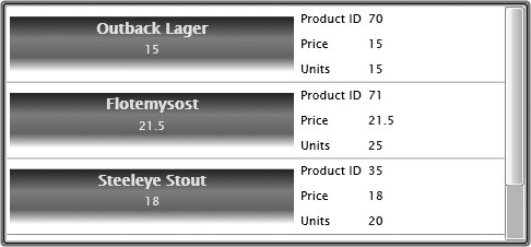
Figure 4-3 shows
a ListBox that uses a DataTemplate that contains a slightly more
complicated presentation. The template contains a horizontally
oriented StackPanel, which contains
a nested, vertically oriented StackPanel and a Grid layout control, for a side-by-side
effect. The nested StackPanel
contains two TextBlocks that are
used to display the ProductName and
UnitPrice properties from the data
source. These TextBlocks use some
custom styles to give them the gradient effect shown in Figure 4-3. The Grid layout control appears to the right. It
contains three rows of property names and values, which display a
summary of the product information. This is a very simple
demonstration of how to create DataTemplates that contain nested controls
for presentation. You can modify this in many ways and with a variety
of controls to present a more aesthetically pleasing look based on the
application.
Note
The UnitPrice shown in
Figure 4-3 is not
formatted as a currency value. The value for UnitPrice is a decimal value that must be
converted to represent the currency value. You can do this using a
converter class, which I will explain later in this chapter.
The XAML that creates the ListBox shown in Figure 4-3 appears in Example 4-6. All of the styles are defined as
local resources to the Silverlight control named ListBoxTemplate. Notice
that the DataTemplate
ListBoxTemplate is contained as a local named resource and
that the ListBox lstProducts
references the DataTemplate in its
ItemTemplate property.
Example 4-6. Stacked DataTemplate
<UserControl x:Class="ListBindings.ListBoxTemplate"
    xmlns="http://schemas.microsoft.com/winfx/2006/xaml/presentation"
    xmlns:x="http://schemas.microsoft.com/winfx/2006/xaml"
    Width="510" Height="500">
    <UserControl.Resources>
        <Style x:Key="TitlePanel" TargetType="StackPanel">
            <Setter Property="Margin" Value="3,3,3,3"/>
            <Setter Property="Width" Value="260"/>
            <Setter Property="Height" Value="50"/>
            <Setter Property="Background">
                <Setter.Value>
                    <LinearGradientBrush EndPoint="0.5,1" StartPoint="0.5,0">
                        <GradientStop Color="#FF2A3557" Offset="0.004"/>
                        <GradientStop Color="#FFFFFFFF" Offset="1"/>
                        <GradientStop Color="#FF6199CD" Offset="0.388"/>
                        <GradientStop Color="#FF4480A0" Offset="0.737"/>
                    </LinearGradientBrush>
                </Setter.Value>
            </Setter>
        </Style>
        <Style x:Key="TitleTextBlock" TargetType="TextBlock">
            <Setter Property="HorizontalAlignment" Value="Center"/>
            <Setter Property="FontWeight" Value="Bold"/>
            <Setter Property="Foreground" Value="#BBFFFFFF"/>
            <Setter Property="FontFamily" Value="Verdana"/>
        </Style>
        <Style x:Key="SubTitleTextBlock" TargetType="TextBlock">
            <Setter Property="HorizontalAlignment" Value="Center"/>
            <Setter Property="FontFamily" Value="Trebuchet MS"/>
            <Setter Property="Foreground" Value="#BBFFFFFF"/>
        </Style>
        <Style x:Key="TextBlockStyle" TargetType="TextBlock">
            <Setter Property="Margin" Value="3,3,3,3"/>
            <Setter Property="FontFamily" Value="Trebuchet MS"/>
            <Setter Property="TextAlignment" Value="Left"/>
            <Setter Property="FontSize" Value="12"/>
            <Setter Property="VerticalAlignment" Value="Center"/>
        </Style>
        <DataTemplate x:Key="StackedProductTemplate">
            <StackPanel Orientation="Horizontal">
                <StackPanel Style="{StaticResource TitlePanel}"
                    Orientation="Vertical">
                    <TextBlock Text="{Binding ProductName, Mode=OneWay}"
                    Style="{StaticResource TitleTextBlock}"
                    FontSize="14"/>
                <TextBlock Text="{Binding UnitPrice,
                    Mode=OneWay}"
                    Style="{StaticResource SubTitleTextBlock}" />
              </StackPanel>
                <Grid>
                    <Grid.RowDefinitions>
                        <RowDefinition></RowDefinition>
                        <RowDefinition></RowDefinition>
                        <RowDefinition></RowDefinition>
                    </Grid.RowDefinitions>
                    <Grid.ColumnDefinitions>
                        <ColumnDefinition></ColumnDefinition>
                        <ColumnDefinition></ColumnDefinition>
                    </Grid.ColumnDefinitions>
                    <TextBlock Text="Product ID"
                    Style="{StaticResource TextBlockStyle}"
                    Grid.Row="0" Grid.Column="0"/>
                    <TextBlock Text="{Binding ProductId, Mode=OneWay}"
                    Style="{StaticResource TextBlockStyle}"
                    Foreground="#FF001070" Grid.Row="0" Grid.Column="1"/>
                    <TextBlock Text="Price"
                    Style="{StaticResource TextBlockStyle}" Grid.Row="1"
                    Grid.Column="0"/>
                    <TextBlock Text="{Binding UnitPrice, Mode=OneWay}"
                    Foreground="#FF001070"
                    Style="{StaticResource TextBlockStyle}"
                    Grid.Row="1" Grid.Column="1"/>
                    <TextBlock Text="Units"
                    Style="{StaticResource TextBlockStyle}" Grid.Row="2"
                    Grid.Column="0"/>
                    <TextBlock Text="{Binding UnitsInStock, Mode=OneWay}"
                    Foreground="#FF001070"
                    Style="{StaticResource TextBlockStyle}" Grid.Row="2"
                    Grid.Column="1"/>
               </Grid>
            </StackPanel>
        </DataTemplate>
    </UserControl.Resources>
    <Grid x:Name="LayoutRoot" Background="White">
        <ListBox x:Name="lstProducts" Height="220" HorizontalAlignment="Left"
        VerticalAlignment="Bottom" Margin="10,10,10,10" Width="480"
        Style="{StaticResource ListBoxStyle}"
        ItemsSource="{Binding}"
        ItemTemplate="{StaticResource StackedProductTemplate}">
        </ListBox>
    </Grid>
</UserControl>
Named templates are easy to set up as resources and to reuse, if
needed. If you intend to use a DataTemplate in multiple Silverlight
controls, it would be beneficial to put the DataTemplate in the app.xaml file as an application global
resource. If the template is designed specifically for a control, it
would be better to put the resource in the local file, as shown in
Example 4-6. You also could create the
resource as a resource of any container control of the ListBox, such as the LayoutRoot Grid. However, it is a better
practice to keep resources at the user control level unless there is a
specific reason to move the resource closer to where it will be
used.
Get Data-Driven Services with Silverlight 2 now with the O’Reilly learning platform.
O’Reilly members experience books, live events, courses curated by job role, and more from O’Reilly and nearly 200 top publishers.

