VISUAL HONESTY: SIZE MATTERS
The next principle is that you must be careful in the visual representation of your data that you do not unintentionally skew the data and how they are represented. Specifically, you must represent the data in scales that are consistent, present the data truthfully, and do nothing to obfuscate the truth and accuracy of the data. As an example, take a look at Exhibit 6.7, which shows a simple representation of the number of milk cows over time.8 One must wonder whether the designer of this image had deception in mind or whether it was just ignorance. As we can see from the image, poor choices or deliberately deceptive choices in data visualization can result in a distorted picture of data and the relationships they represent.
Exhibit 6.7 The Crescive Cow
Source: From How to Lie with Statistics, by Darrell Huff, illustrated by Irving Geis, Copyright 1954 and renewed © 1982 by Darrell Huff and Irving Geis. Used by permission of W. W. Norton & Company, Inc.
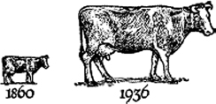
It’s a more common problem than you might think for charts to be designed in ways that hide what the data might tell us or distract the observer from discerning the true meaning of the evidence presented in the data visualization. In our example in Exhibit 6.7, the two numbers from the data are roughly 3 times the magnitude of the other but are represented by two cows, one of which is 27 times larger ...
Get Win with Advanced Business Analytics: Creating Business Value from Your Data now with the O’Reilly learning platform.
O’Reilly members experience books, live events, courses curated by job role, and more from O’Reilly and nearly 200 top publishers.

