Use Anti-Aliased Text
In general, to create professional-looking graphics for the Web, you should use anti-aliased text . Anti-aliasing is the slight blur used on curved edges to make smoother transitions between colors. Aliased edges, by contrast, are blocky and stair-stepped. Figure 28-3 shows the effect of aliasing (left) and anti-aliasing (right).
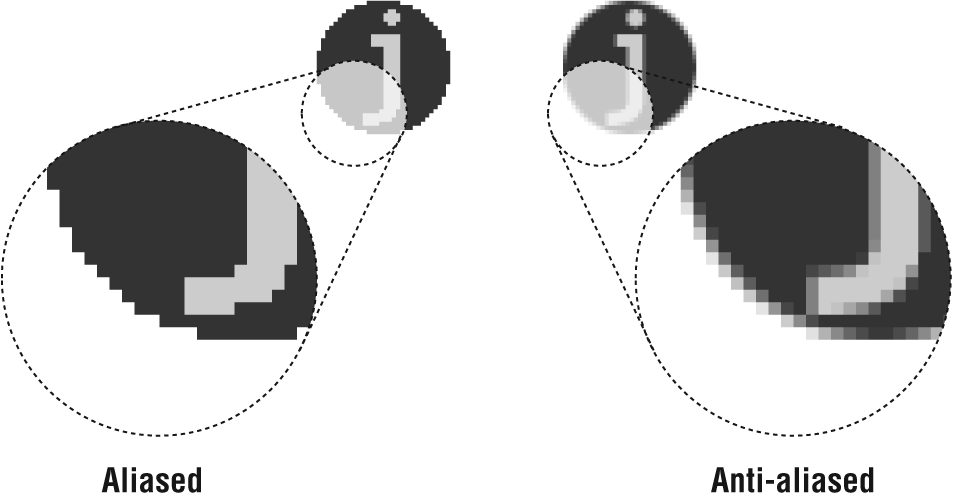
Figure 28-3. Aliased and anti-aliased edges
One case in which anti-aliasing is not the best option is when using very small text (10 to 12 points or smaller, depending on the font design), for which anti-aliased edges blur the characters to the point of illegibility. Text at small sizes may fare better when anti-aliasing is turned off or set to None. You need to experiment on your own.
The trade-off for better-looking graphics is file size—anti-aliasing adds to the number of colors in the image and may result in a slightly larger file size. In this case, the improved quality is usually worth a couple of extra bytes.
Get Web Design in a Nutshell, 3rd Edition now with the O’Reilly learning platform.
O’Reilly members experience books, live events, courses curated by job role, and more from O’Reilly and nearly 200 top publishers.

