Survey Your Options
This isn’t a comprehensive list of what you can use to visualize data, but it should be enough to get you started. There’s a lot to consider and play with here. The tools you end up using largely depend on what you want to accomplish, and there are always multiple ways to accomplish a single task, even within the same software. Want to design static data graphics? Maybe try R or Illustrator. Do you want to build an interactive tool for a web application? Try JavaScript or Flash.
On FlowingData, I ran a poll that asked people what they mainly used to analyze and visualize data. A little more than 1,000 people responded. The results are shown in Figure 3-29.
Figure 3-29: What FlowingData readers use to analyze and visualize data
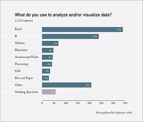
There are some obvious leaders, given the topic of FlowingData. Excel was first, and R followed in second. But after that, there was a variety of software picks. More than 200 people chose the Other category. In the comments, many people stated that they use a combination of tools to fill different needs, which is usually the best route for the long term.
Combining Them
A lot of people like to stick to one program—it’s comfortable and easy. They don’t have to learn anything new. If that works, then by all means they should keep at it. But there comes a point after you’ve worked with data long enough when you hit the software’s threshold. ...
Get Visualize This: The FlowingData Guide to Design, Visualization, and Statistics now with the O’Reilly learning platform.
O’Reilly members experience books, live events, courses curated by job role, and more from O’Reilly and nearly 200 top publishers.

