Readability, Layout, and Design
Depending on how much data you are displaying, you may want to tweak the visual design to ease reading. Assuming youâve read this far and youâve provided the necessary HTML framework for your data, you can easily change cell colors, padding, margin, and borders to make the data easier to read.
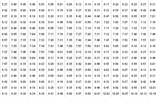
Figure 6-3. Bus schedule, where blue indicates bikes are not allowedâ¦at least onscreen; the blue disappears in black and white and the information that should be conveyed is lostâanother reason additional coding measures are needed
Color
Color is a beautiful thing. We encourage the use of âzebra-stripingââcoloring every other rowâto make a table easier to read. However, we do discourage the use of color to provide important information. Figure 6-3 shows a bus schedule (from http://bart.gov/stations/schedules/lineSchedules_ROUTE11_WD.asp) with several cells shaded blue, indicating bikes arenât allowed on the bus at those times.
If someone is not perceiving colorâeither because of low contrast on a mobile phone or because he is using a screen readerâhe will not have access to that important information. Instead, use an abbreviation like âNBâ or an icon with alt text that conveys âno bikes.â
Adding an asterisk to each cell provides a nonvisual indicator:
<td class="nobike">*6:27</td>Another option is an image with a text equivalent:
<td ...
Get Universal Design for Web Applications now with the O’Reilly learning platform.
O’Reilly members experience books, live events, courses curated by job role, and more from O’Reilly and nearly 200 top publishers.

