Chapter 4. Design Can Sadden
Thereâs a wide array of emotions to take into consideration when designing. Most are a lot more subtle than the anger and frustration we discussed in the previous chapter: sadness, self-blame, humiliation, exclusion, sorrow, grief, discomfort, heartache, boredom, etc. Yet, we rarely hear about any of these. Why are anger and frustration often the only emotions being measured by companies? First, the tools and scales generally used to collect information on usersâ behavior are not appropriate: they donât allow for proper emotional data collection. Second, the best way to understand how people feel is, well, by actually asking them. Unfortunately, this qualitative information is often considered less important and significant than hard quantitative data.
In this chapter, we will explore the different ways we can cause emotional harm to our users by making poor design decisions. Later, we will look at tools to avoid making these errors and to successfully convince all stakeholders in our projects that the emotions felt by our users are important.
The âDribbblelisationâ of Our Users
In the experiences we create, our aim is to delight, to bring joy and valueâthe goal is always a positive one. Thatâs why designers need to be optimistic to do their jobs. So itâs no surprise that we often fail to design for user failure when designing for real users and their very real lives. For examples of this, just take a look at all the concepts on popular websites that showcase designersâ work, like Dribbble (https://dribbble.com) or Behance (https://www.behance.net). We stuff our interfaces with smiling models, epic gateways, giant crisp images of exotic placesâall of which will be rare when our app is used by real people. In reality, usersâ profile pictures may be too far zoomed out or simply blurry, their background images might have low contrast, and their content will be much more subdued than the flashy and idealistic copy we put in our mockups. Often, we launch our products and realize our blunders only when people start using the apps. Even if we keep reminding each other that âYou are not the user,â sometimes we find ourselves designing neither for us nor for the user, but for some ideal persona that we have in our head. Someone whose needs and actions magically align with the business goal we have in mind.
User-centered design (UCD) is effective because it encourages us to really understand the users before designing anything. Only once we know their needs and motivations can we come up with a solution for them. Designing a product and hoping that the users will have needs that correspond to our features just doesnât work. When we really get to know our users, we find that they live very real lives full of ups and downs, of epic adventures and boring afternoons, and of joy and grief. Yet, we often get caught up in our idealistic, positive, and well-intentioned views of what our ideal users might like. Forgetting that our users are not soap opera characters who stop having a life once they are out of our sight is the first mistake a designer can make.
Inadvertent Cruelty
When we forget about the âedge cases,â we risk being downright cruel to our users. A poignant example of this was shared by Eric Meyer in his post âInadvertent Algorithmic Crueltyâ (http://bit.ly/2oa8UhQ), where he recounted how a well-intentioned feature by Facebook caused him pain. Ericâs young daughter, Rebecca, tragically passed away in 2014. At the end of the year, Facebook launched a feature called âYear in Reviewâ in which they cobbled together a review of each userâs year with animations and music, using posts and images they had shared. The feature was a big hit and the compilations were being shared by many. But for someone who had had a difficult year, the celebration was turned into a hurtful reminder of that pain. That day, when Eric logged in, he was presented with a large picture of his now deceased daughter, surrounded by dancing figures and balloons (see Figure 4-1). To add insult to injury, the feature didnât allow users to opt out, so he had to endure seeing this over and over again, every time he visited Facebook.
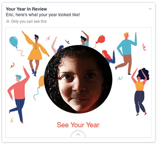
âI didnât go looking for grief this afternoon, but it found me anyway,â Eric wrote in his blog post. Unfortunately, he isnât the only one that had to live this situation. Others also had painful memories forced upon them, without their consent. Homes that had burned down, painful breakups, deceased friends... all unfortunate events presented as âhighlights.â Obviously, no one is deliberately trying to be cruel at Facebook. This feature worked really well for the vast majority of users who had had a great year, the events of which they wanted to be reminded of.
Designers love to surprise and delight their users. We do this by using quirky copy, adding Easter eggs, implementing small features that save a click, or adding details to personalize an interaction. Most of the time, this is a really great practice. However, when we implement a feature meant to celebrate, present a memory, remind of a date, guess a need, etc., we have to make sure that the user can opt out of it. Sometimes, seemingly benign elements of the interface can quickly make someone sad.
Another good practice when using user-generated content is to take advantage of all the information available to determine if itâs sensitive or not. For example, Facebook could have used a pictureâs comments to determine if it represented a sad memory. If words like âsad,â âsorry,â âRIP,â or similar were found in the comments, the image could have been excluded from the Year in Review to avoid becoming a trigger of negative memories.
Self-Blame and Humiliation
At the most basic level, a userâs frustration with our products can cause harm through self-blame and humiliation. They believe that their difficulty to use our products is due to their own failures or shortcomings. Oftentimes we donât realize that these small wounds we inflict on our users can add up over time and cause real harm. The result of this self-blame is people who avoid technology or have anxiety using it in front of others.
Because users are often alone in a task, they donât have anyone to compare their progress to and assume that since the product is used by many people, they must be the only ones having an issue. This can also lead to exclusion, as users remove themselves from using technology to avoid the pain or embarrassment of not knowing how to use it. Users prefer to isolate themselves from what is causing them pain, discomfort, and frustration.
âPower Userâ Features
There are many strategies to help people who are new to your product and make them feel like they belong. First, donât prioritize âpower userâ features above those that benefit the ânewbie.â These features are great, but should never come at the cost of an onboarding feature.
Shortcuts
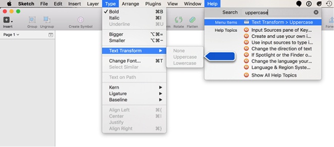
Be wary of options accessible only through shortcuts and actions represented only by an icon (and no text). Think about how you are going to make these actions discoverable. While a tool tip is very useful, it only works with a cursor (not on mobile phones and tablets). One great solution is the search feature under the âHelpâ menu in many macOS applications (see Figure 4-2). Instead of simply presenting the search results that match the input, it teaches the user where they can find that feature the next time they are looking for it. Note that the menus also show the shortcuts next to every item, which is also a good practice to help new users. We do wish that they would spell out the Alt key (or Option key) shortcut completely, though, instead of using the ![]() ,
, ![]() , and ^ symbols, which systematically take more time to read and are not always printed on keyboards. Google Docs does a better job at this (see Figure 4-3).
, and ^ symbols, which systematically take more time to read and are not always printed on keyboards. Google Docs does a better job at this (see Figure 4-3).
Make the Settings are Understandable
Every time you add a new setting, ask yourself if the added complexity is worth it. If you must keep every single setting option, consider hiding and grouping complex and unnecessary options together. Make sure you give great explanations of what these options are. Even better, add visual examples directly in the setting pages. Your users, even the âninjaâ ones, will thank you for it. We often tend to overestimate the capacities of our users to understand and know every detail of our products.
Often, we simply ignore these users and allow them to leave because we donât think they can be helped without a lot of resources. We tell ourselves that we design for âpower users,â âmodern users,â or even âa younger demographic.â The truth is, anyone can have issues, and we are leaving money on the table by not designing products that are easy enough for everyone to use.
Cynthia tells us about the time she gave a workshop to a group of game designers.
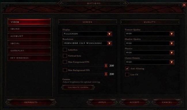
I was recently giving a workshop at a big video game company. I asked the crowd who considered themselves âhardcore gamers,â and the vast majority said they were. To give you an idea, every time I showed a screenshot in my presentation, they had to identify what game it was from, before I named it. They knew all the games, even the obscure, indie ones.
Later in my presentation, I showed some gameplay options from the very popular video game Diablo 3 (see Figure 4-4) and asked them what âvertical syncâ and âclutter densityâ meant. The room went dead silent. Iâd always assumed that I wasnât enough of a hardcore gamer (power user) to know exactly what these options were. But here I was, in front of a group of game developers and level designersâpeople who, I assumed, knew these things really wellâand yet they couldnât explain what these options referred to specifically. Why are these options visible to all of the gamers? Doesnât this contribute to making new players feel excluded? Couldnât these advanced settings be grouped together? Should they have an added explanation, or even better, some examples, to help with discoverability?
Allowing for Abuse
Another way we can cause emotional harm to our users is by forgetting to design safeguards to prevent abuse. Initially, designers were responsible for a very small portion of the product. Over time, they have taken on an increasing amount of responsibilities, crafting the whole user experience, the interactions, and the visual design, and often taking part in product decisions as well. With this shift comes added responsibility. If we get stuck with a narrow vision of what the product should do, we neglect all the potential uses people might have for our productsâuses that we have not planned for and that donât fit any of our personas.
Personas are great tools to ensure everyone in the company can put a face on their users, but they can bite us back when they are representing a limited spectrum of our users. One persona that we systematically forget to design for is the bad one. The popular saying âThere are no bad users, just bad designsâ is simply untrue. We are not talking about users who arenât comfortable with computers, but the nefarious ones. By designing for all people, we must accept that there are aspects of humanity that are reprehensible. Hate, bigotry, bullying, racism, and malice can all be found in users. Especially in social products, where users interact with each other.
For example, if an app allows users to send files around the internet, there will always be users who want to abuse it to send spam, or for phishing, or to send something nasty to a person they despise. Itâs surprising how products can be abused. We need to be mindful of the harsh reality that users can act badly. It is our responsibility to design for this and protect the people using our products.
How do we design to prevent abuse? Designing to mitigate abuse is never intuitive. This is the same reason why technology security is never perfect. Our job is to think about this when we design our products. Here are some good questions to get us most of the way there. They should be asked when designing any new or enhanced feature:
How might people abuse this feature to hurt others?
If this feature is being used for abuse, how can a user take action against it?
Is the banning system top down or bottom up? If itâs top down, can it scale?
What are the consequences of someone abusing others? What do they have to lose?
If we add more safeguards, do they distract or discourage interaction from the rest of the users? If so, is there a way to do so without distraction?
Are there any incentives for someone to abuse?
Never hide behind the very easy excuse, âI just put the tool online; what people do with it, I canât control.â Twitterâs founder used to say that it was âa communication utility, not a mediator of content.[35] However, this has led to the platform becoming a paradise for racists, trolls, and harassers. The problem is so bad that Dick Costolo, Twitterâs CEO from 2010 to 2015, wrote:
We suck at dealing with abuse and trolls on the platform and weâve sucked at it for years. Itâs no secret and the rest of the world talks about it every day. We lose core user after core user by not addressing simple trolling issues that they face every day.
Iâm frankly ashamed of how poorly weâve dealt with this issue during my tenure as CEO. Itâs absurd. Thereâs no excuse for it.[36]
With social products, the abuse can be clear or it can be muddied. Sometimes itâs just not clear that abuse is occurring versus what might simply be a bad argument. For example: âUgh, I hope you die.â Is that worth a ban? It is certainly abrasive, but depending on the context, perhaps not worth a consequence. On a video game chat, wishing for your opponentâs death is very common. The same sentence in a direct message on a social network is not only harsh but illegal.
A social network might deem such behavior okay until there is a history of it. Others might ban users altogether when they see anything like this. Social products have to decide where they will draw the line and how they deal with the gray areas. Facebook and Twitter have both made strides in improving how they deal with abuse, such as making reporting easier or providing a way to mute others, but at the time of this writing, they have taken a weak stance against the gray areas and in many cases even against clear-cut abuses.
How to Prevent Causing Sadness
We know that no designer or engineer at Facebook is ill-intentioned when creating new features. Once again, blaming a single person would not be helpful. But good intentions arenât enough to excuse us from causing harm through the products we design. Letâs instead look at what could be done to prevent creating instant-sadness moments.
Avoid Confusing a Change of Emotion with a Change of State in a Database
For a computer, a reaction on Facebook is literally a number in a column. We can have a hypothesis as to why a user might âlikeâ something, but we shouldnât associate the word used on the button to the actual userâs emotional state. For example, before Facebook introduced the newer reactions (love, haha, angry, wow, and sad), the only ways someone could interact with someone elseâs content were either through a comment or a âlike.â We would witness situations where someone with a very sad status update would have a bunch of people pressing the âlikeâ button on that update. They obviously werenât happy about their friendâs unhappiness. Pressing the âlikeâ button was a way to show empathy. It meant something along the lines of âIâve read your update,â âIâm with you,â or âI like to see that you are expressing your emotions.â There is a major difference between pressing the âlikeâ button and actually liking something.
Also, if you are using an algorithm to build a feature, make sure it uses the right data, not an icon as a proxy of an actual emotion. Users understand that when something has âlikes,â it doesnât necessarily mean itâs actually liked. Unfortunately, algorithms arenât always designed to know the difference between an empathetic âlikeâ and a genuine âlike.â
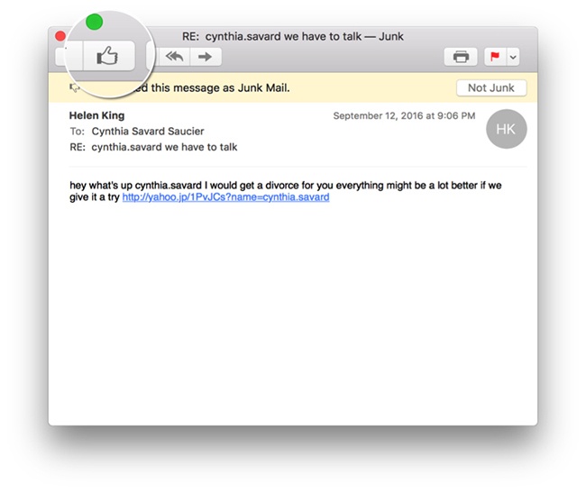
Donât Underestimate the Power of Symbols
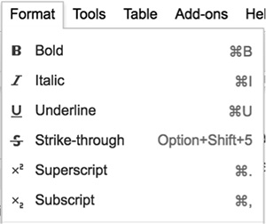
That leads us to a second important point: be very careful with the words and symbols used to interact with content. They should always accurately represent the action that the user is doing. For example, Apple Mail used to ask its users to press a âthumbs downâ button to move an email to the junk folder (recently, this icon was changed to an inbox with an âxâ). It seems logical, then, to press a âthumbs upâ button (associated with the action of liking something) when the user wants to remove an email from the junk folder, moving it back to the inbox (see Figure 4-5). This works in theory, but in practice, not all emails that are safe (not junk) are liked. Hereâs an example that happened to us: a credit card statement from a new financial institution was wrongfully classed as junk by Apple Mail. We then had to âlikeâ that email in order to send it back to the inbox. Trust us, we most certainly do not like our credit card statements, but the software forces us to say that we do.
You may be thinking, âItâs just a symbol, how harmful can it be?â Well actually, symbols linked to actions are pretty powerful! All these smileys, thumbs, likes, stars, and hearts can carry a great load of emotion.
When Airbnb, the online service that enables people to list or rent properties, changed its rating system from stars to hearts, it saw a massive increase in conversions. As reported in an article on Co.Design, while a star is âa generic web shorthandâ that doesnât carry a lot of weight, a heart is âaspirationalâ and creates an emotional response:
For a couple years, registered Airbnb users have been able to star the properties they browse, and save them to a list. But Gebbiaâs team wondered whether just a few tweaks here and there could change engagement, so they changed that star to a heart. [...] To their surprise, engagement went up by a whopping 30%. âIt showed us the potential for something bigger,â Gebbia tells Co.Design. And in particular, it made them think about the subtle limitations of having a search-based service.[37]
Hearts and stars are not the only symbols carrying a lot of emotional weight. Smileys are equally, if not more, powerful. Research has shown that the human brain no longer knows the difference between emoticons and emotions.[38] You did not misread that: our brains no longer distinguish a smiley face from an actual smiling face!
A team of researchers has demonstrated that the brain is now processing emoticons with the same signals that were previously only there when processing real emotions on human faces. They showed 20 participants the smiley symbol, :), along with real faces and strings of symbols that donât look like anything, and recorded the signal in the region of the brain that is activated when we see faces. While the signal was recorded at a higher level when looking at real faces, it was surprisingly higher when people saw the emoticon.[39]
Remember that Every User Will Die
This is certainly not the sexiest part of designing for a service, but if your company plans on staying in business for a long time, it will inevitably be confronted with the death of some of its users. Have you planned for the cancellation of your service when someone dies? How will you handle the situation for a grieving person trying to access their loved oneâs account? What paperwork will you require to make this transition as painless as possible, while remaining secure? Are you going to send emails (or worse, physical mail)?
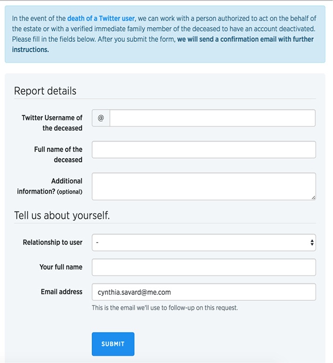
Some companies handle the situation in a very sensible way. The microblogging platform Twitter is a great example. When someone wants to request the removal of an account, they are directed to a form where every detail has been carefully designed (see Figure 4-6). The form uses down-to-earth wording, and sensible options. First, the section about the deceased user is neutrally titled âReport details.â This is a sensible choice of wording to avoid referring to the deceased person directlyâwe can only imagine that the person filling in this form doesnât need a large-type reminder that their loved one is dead. Also, there is an âAdditional informationâ field, but it is clearly indicated that it is optional. This allows the user to give as many or as few details as they feel comfortable with. Finally, Twitter needs to know the relationship between the applicant and the deceased user. Instead of asking for a detailed explanation, they minimize the impact of the question by leaving only three choices: family member or legal guardian, legal representative, or other. Note also how verbs are completely absent from the questions. We can assume that this process is hard enough; being forced to state that you were the deceasedâs mother would be a useless and painful reminder.
Use the Sad Sheriff
If you work within a team, designate a person that will act as the Sad Sheriff for a week. This person has the following responsibilities:
Advocate for the unhappy user in every meeting they attend.
Review all of the current designs with that unhappy mindset.
At the end of the week, share their findings through a collaborative journal (this can be a simple Google doc that is shared with everyone and written as a list of bullet points).
For example, in a brainstorming session, the Sheriff would systematically be the one reminding the team that not everyone is having a good day. They might say things like âSomeone grieving and canceling the account for their partner might find the copywriting of this email really rough,â or âSomeone visiting our website looking for help might have difficulty finding the information they need.â
Then, you can define a rotating schedule of Sheriff types. For example, week one is the Grieving Sheriff, week two is the Sick Sheriff, week three is the Sad Sheriff, week four is the Depressed Sheriff, week five is the Disabled Sheriff, etc. Also, every team member should be in the rotation, not only designers. No one should be designated for more than a week (or sprint, if that is your choice of development methodology), because letâs face it, itâs hard to always be the party pooper.
Reprioritize Feature Development
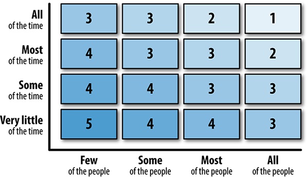
Developing a new product can be costly. Companies, even large ones, donât have endless resources to spend. Therefore, our features generally get prioritized in a table with two axes: frequency of use and percentage of users affected. What most people use, most of the time will be implemented first (see Figure 4-7).
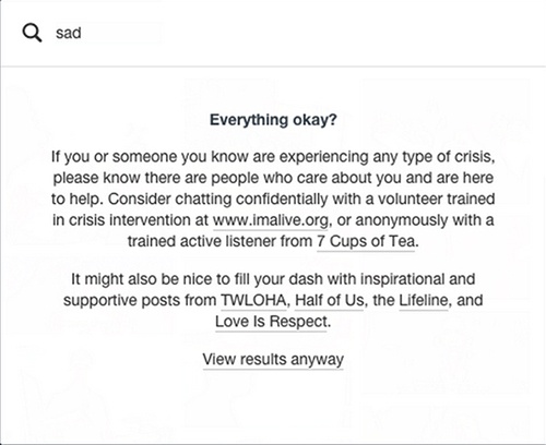
This method works really well, except that it makes it virtually impossible to include safeguards against rare but potentially tragic situations in the roadmap. If when we ask ourselves âWhatâs the worst that could happen?â there is a chance that something might hurt or kill someone, then it should become a priority, even if the odds of this happening are really slim. The safeguards put in place can be annoying to some users. However, we argue that itâs perfectly acceptable to be annoying to most of your users, if itâs to avoid causing pain to a minority. Preventing harm to a user should always triumph over a feature. For example, when a visitor searches for âsad,â the blogging platform Tumblr will offer help instead of actually showing the search results (see Figure 4-8). Even though this might be useless to most people and forces an extra click, it could make a great difference for a few users. It is absolutely worth it. In addition, it shows other users the genuine care Tumblr has for them and the rest of the user base.
Organize Catastrophic Brainstorms
We are well aware that the quantity of potential individual situations makes it impossible to design for every single scenario. To uncover a lot of them, thereâs a very fun 45-minute activity that can be done as a group. We call this the catastrophic brainstorm. The goal is to invite as many people as possible into a room and ask them, âWhatâs the worst that could happen with our new feature?â Each participant has to come up with a catastrophic scenario, write it on a Post-it, and stick it on the wall. Encourage all participants to be creative! We find that coming up with funny examples at the beginning helps to break the ice. Once you have a bunch of Post-its on the wall, vote for âthe worst thing that could happen.â The top three scenarios should then be seriously considered as a priority on the roadmap.
Change Your Usual Testing Scenarios
When performing user tests, we always start with a script that sounds like âHi! Welcome! Take your time, you canât make a mistake, if you canât complete a task itâs because of our design, donât blame yourself!â And so on. We go above and beyond to make sure the testers are comfortable, monitoring the temperature of the room, making sure they donât feel observed, offering them their favorite coffee, and being extra reassuring as soon as they struggle. While all these efforts in making the participants comfortable are commendable, they certainly contribute to getting optimal results from relaxed participants. In real life, our users arenât always in a perfectly designed environment, using the latest equipment, in an ideally lit room, with all the time of the world in front of them.
Raising the stress level
What if we were to raise the stress factor a little bit, by asking participants to complete a task with a time limit? Weâre not suggesting that we transform all test sessions into highly stressful events, but maybe one of the five tasks that have to be tested could be done under slightly more stressful conditions. You could try to incentivize testers with sentences like âIf you finish in less than four minutes, we will donate $5 to this charity,â or âTry to make less than three wrong clicks to find the information,â or even âWe will time you doing this task to see how long it takes.â The results will greatly differ: they will better reflect reality and help uncover some edge cases. (Also, if a user canât find information on your website when they are a little bit stressed, then you know improvements are required!)
Performing usability testing in context
The majority of usability tests take place in conference rooms, laboratories, or even hotel meeting rooms. This is convenient for observing people interacting with the product in a controlled environment and removing distractions and interruptions, while restraining the amount of variables. However, depending on the expected usage scenario, it might be appropriate to test in a realistic environment, with all the expected distractions and imperfections. Before making this call, visit the location as an observer. Note the different issues that could come up during testing and take many pictures.
Considerations for on-location user testing include the following:
Do you have the physical room to observe without causing further distraction? Can you be in the same physical space as the testers without having to move equipment?
Are there any safety concerns?
Are there potential confidentiality issues?
Will the technological setup meet your requirements? Is it reliable?
How about the lighting and noise levels? Can you actually hear and see your testers? This is especially relevant if you have observers in a different room or plan to record the testing session.
While we would like to say that every test should be performed in the actual environment where a product will be used, we understand that it is not always possible. However, it is possible to reproduce certain distractions and suboptimal environment setups in a laboratory. For example, instead of testing in an airport, one could record the sounds from a terminal and play the soundtrack during the test. Consider making props, having actors around, etc. Keep in mind that in most cases, testing with actual users and with realistic use cases is more important than testing in the actual environment.
Design for Failure
Harm is often caused not by design, but because designers forgot a specific use case. No product is perfect: there are always bugs, incomplete pages, elements that are forgotten, or simply errors caused by external factors. Therefore, itâs crucial that the failures are taken into consideration. At the very least, every product should have a strategy for the following situations. What happens when:
Thereâs no cellphone data?
The app, or software, crashes?
The device crashes?
There is no GPS reception?
The service is down?
If youâre designing a website, make sure that the 404 error page is clear and useful. Itâs also a great opportunity to be creative. Think of the empty states of your product, not only when the users are onboarding, but also if they erase all the data. Make sure that you always have clear error messages that not only explain the problem, but also offer suggestions for the next steps. In addition, the tone we take in our error messages should not make the users feel they are to blame or that the errors are their fault. Instead, these messages should convey our empathy and take responsibility. The chat app Slack is a good example of using clear error messages with indications of the next steps required (see Figure 4-9).
Conclusion
âWhat if?â should be asked over and over again. What if the user had a terrible year? What if the event someone is organizing using our service is a sad one? What if the group created using our tool is in memoriam? What if the seemingly ridiculous product ordered on our website holds a very high emotional value to some customers? It is hard for us to think this wayâwe like to imagine how we might delight our users, but people appreciate more than just delight. People appreciate kindness, respect, honesty, and politeness as well.
Emotional harm is something we often overlook because it is hidden. Now that you are aware, make sure to call it out when you see it! The majority of the harm described in this book isnât purposefully considered and committed; it happens without a thought to these consequences. Raising these issues might just be enough to turn your companyâs decisions away from emotional harm and toward respecting usersâ emotions. It will, at the least, start an important conversation at your place of work. Users might not always get to speak, but you can stand up and speak for them.
Key Takeaways
User-centered design (UCD) is effective because it encourages us to study, research, and really understand the users before designing anything. Only once we know their needs and motivations can we come up with a product for them. Designing a product and then hoping that the users will have needs that correspond to our features just doesnât work, and quite frankly is counterproductive.
When we create a feature meant to celebrate, present a memory, remind of a date, guess a need, etc., we have to make sure that the users can opt out of it. By not doing so, we might force a hurtful reminder on our users.
Avoid confusing a change of emotion with a change of state in a database. We shouldnât associate the word used on the button to the actual userâs emotional state. Donât underestimate the power of symbols linked to actions. These smileys, thumbs, likes, stars, and hearts carry a great load of emotion.
To avoid causing sadness, implement a âSad Sheriffâ in your team, organize catastrophic brainstorming sessions, always think of error states, and consider changing your usual user test setup to reproduce stress scenarios.
[35] Schiffman, Betsy. âTwitterer Takes on Twitter Harassment Policy.â Wired, May 22, 2008, https://www.wired.com/2008/05/tweeter-takes-o/.
[36] Warzel, Charlie. ââA Honeypot for Assholesâ: Inside Twitterâs 10-Year Failure to Stop Harassment.â BuzzFeed News, August 11, 2016, http://bzfd.it/2lHtmHl.
[37] Kuang, Cliff. âHow Airbnb Evolved to Focus on Social Rather than Searches.â Co.Design, October 2, 2012, http://bit.ly/2nitrgS.
[38] Eveleth, Rose. âYour Brain Now Processes a Smiley Face as a Real Smile.â Smithsonian.com, February 12, 2014, http://bit.ly/2mpa3kG.
[39] Churches, Owen, Mike Nicholls, Myra Thiessen, Mark Kohler, and Hannah Keage. âEmoticons in Mind: An Event-Related Potential Study.â Social Neuroscience 9:2 (2014): 196â202.
Get Tragic Design now with the O’Reilly learning platform.
O’Reilly members experience books, live events, courses curated by job role, and more from O’Reilly and nearly 200 top publishers.

