Chapter 1. On the Merits of Letters
Letâs talk just a bit about typography, its history, and its impact on design. From the first written words, letters have been the vehicle through which meaning and knowledge have been conveyed. That job is performed in more than one way: the words the letters form impart meaning, but the shape of the letters themselves can make an important contribution.
First, a Few Terms Explained
While this book isnât meant as a complete stand-in for a true typography textbook, Iâd be remiss if I didnât explain some of the key terms and concepts before we dive in:
- Typography
- Quite simply, the theory and practice of selecting and setting type for printed or digital matter. In practice, it refers to typeface selection and setting the type for a given piece of content. Typography also ensures that the correct letterforms are used and proper punctuation marks are shown, generally finessing the final output to produce the highest-quality end result.
- Typeface
- A specific design of letterforms, numerals, and punctuation that generally includes a complete set of letters, numbers, punctuation, and special characters of a specific weight or variant (such as Regular, Bold, Italic, etc.).
- Typeface family
- A set of typefaces of a common design that includes a variety of weights and variants, often ranging from Light to Heavy in both standard and italic variants.
- Font
- Technically, the font is the actual computer file that contains the information to define a single weight and variant of a typeface. For the purposes of this book, weâll be focusing on the latter part of that definition: using the term to refer to Trade Gothic Regular Italic as opposed to that whole typeface family of Trade Gothic.
- Serif
- The tiny âfeetâ and other little projections finishing of strokes of letterforms in typefaces such as Times New Roman or Georgia. Also used to refer to any typeface with those characteristics.
- Sans-serif
- A typeface designed without any serifs (i.e., the strokes that comprise the letterformâs end without any sort of projection).
- Slab serif
- A serif typeface where the serifs themselves are generally the same thickness as the stroke weight of the letters themselves, which lends a somewhat chunkier feel to the typeface. Slab serif faces are often used for headings and display titles.
- Terminals
- A term that refers to the ends of the strokes of letterforms. Some typefaces, such as Helvetica, have perfectly horizontal terminals in letterforms such as a lowercase âaâ or âcâ which tend to make them look more closed. Others have a slightly angled terminal, which can impart a more open feel and can aid legibility, especially at small sizes.
Words Have Meaning, but Letters Have Emotion
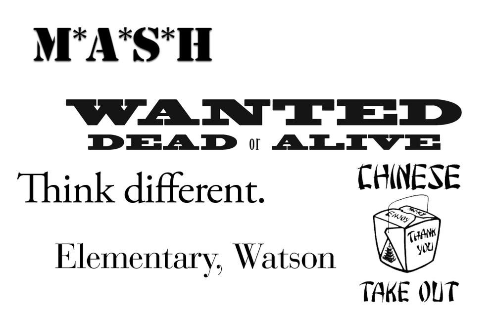
Consider the images conjured by the lettering on a stereotypical Chinese restaurant takeout menu, or a poster advertising an old Western movie, or the opening credits to the show M*A*S*H (see Figure 1-1). Or Appleâs âThink differentâ campaign. Or picture any of the classic IBM ads, with their headlines set in those distinctively exaggerated thick-and-thin stroked letterforms. Itâs hard to use Bodoni without that coming to mind, at least in some subconscious way. Thatâs pretty effective branding when a company can own an entire typeface in our collective consciousness.
In design there are a few basic elements with which we have to play: composition, color, texture, shape, image, and type. When considering existing branding, color, style, and usability, why give up the one element that covers the biggest part of the page? Type can be as expressive or as utilitarian as you like, and the impression it makes is magnified by the fact that itâs so often 90% of what you see on the screen or the page (at least in publications and websites). So letâs leave the land of neutrality behind and really dive into our own expressiveness.
Type is wonderfully versatile and can convey far more than simply the content of the words it spells. It can have gender, color, tone, and emotion all its own. Good typography uses this to impart greater meaning. Great typography can elevate and amplify the message even further, creating its own tension, dynamism, and nuance far beyond the words themselves.
Even when the desire is a bit more practical, choice of typeface impacts readability as much as size and contrast. The actual media makes a difference as well. Newsprint, fine books, mobile phones, television screens, and laptops all present type differentlyâwith widely varying degrees of detail. Choose the form of your letters poorly and your message will be lost and your brand forgotten.
Remember to Be Memorable
When nearly all the sites on the Web are using the same few typefaces (letâs face it: the overwhelming majority specify Helvetica or Arial), itâs noticeable when you use something different. Very noticeable. You can instantly change the tone of the page by shifting the headings and body copy into something just a little bit different. And different can mean memorableâand that kind of memorable can translate into more visits, more recommendations and more transactions.[1] When website visitors make judgments about a siteâs usability and value based on aesthetics, every decision you make about your design matters. A lot.
Do Good Looks Affect Usability?
Youâd be surprised just how much they do. A good place to learn about the topic is this post by Jennifer Chen on Usability.gov, titled âThe Impact of Aesthetics on Attitudes Towards Websites.â
Roots, Rhythm, and Rhyme
As with the examples at the beginning of the chapter, we know we associate certain letterforms with topics, places, and times. Those associations can be used to support (or contrast) the message of your designâbut you can only do so if you understand and identify those associations. This is where knowing your historyâyour rootsâand doing some research helps unearth details that really enrich your design. Identifying typefaces that have a relationship to your content or client can give a sense of place, evoke a mood or even reference a specific period in history.
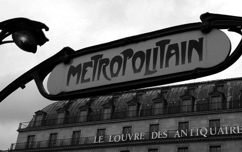
I was fortunate to have been in Paris recently with my wife, and one of the things I sought out was one of the old Métropolitain signs for the Paris subway (originally designed by Hector Guimard). That typeface instantly transports you to not just the place, but that period of time, with its distinct relationship to the Art Nouveau style (see Figure 1-2). Interesting ties can be seen in other city transportation systems, like Helvetica in the New York City subway system or Johnston in the London Underground. But a single typeface is not the only consideration. More often than not, you will likely want to pair different typefaces together, and not every combination will sing in the same key.
The pairing of typefaces and their impact on harmony and readability is a tremendously important aspect of design. Using a distinctive typeface in headers is great, but without considering what comes after, one can end up with some fairly odd bedfellows. The aforementioned Métropolitain typeface would look a bit odd sitting atop a few paragraphs of Helvetica or Arial, but Parisine (designed in the late 1990s and now the standard for use in the Paris Métro system) has a clear relationship and historical tie that might make a lot more sense. (Well, setting headlines in Métropolitain might not be the best choice for readability, but thatâs not the point here.)
What we want to achieve is a visual harmony that helps the reader flow from one element to the next, so pairing typefaces that have similar characteristics can create some wonderful and unique designs. Of course, you may choose to go in the opposite direction and look for pairings that have greater contrast in styles. Thereâs no absolute âright wayââbut thatâs the nature of design. Sometimes rules are meant to be broken, so long as the result feels right.
Adventures in Typeface Pairing
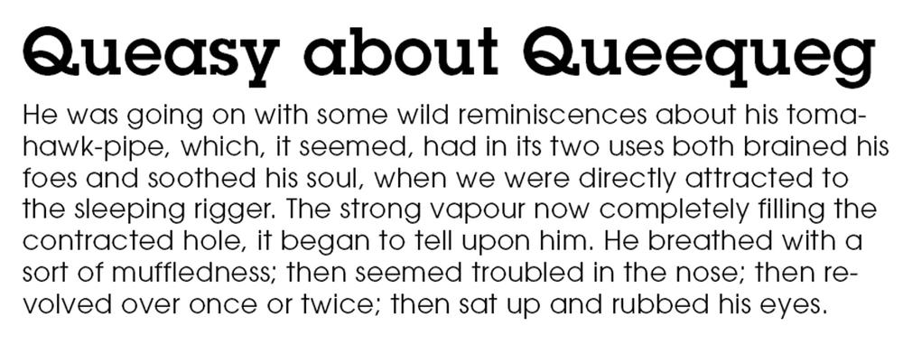
Hereâs an experiment you can try at home: when looking for a typeface for body copy to pair with one youâve selected for headings, look at other typefaces from the same designer. Even when they arenât designed together, there are often relationships that stand out simply because they were drawn by the same hand. A personal favorite is headings set in Lubalin Graphâa great slab serifâand Avant Garde, the sans-serif that inspired it, for body copy (see Figure 1-3). The harmony created by the similarity in letterforms enforces a rhythm between heading and copy that flows elegantly from one to the other.
When looking for pairings, it can also help to consider x-height (the height of lowercase letters compared to uppercase ones), overall horizontal scale (look at the width of letters set in Helvetica or Arial compared with Verdana: the latter is much wider and rounder), and stroke weight. In a rare bit of foreshadowing, Iâll mention that you would do well to remember this trick when we get to later chapters on fine-tuning your fallback fonts and CSS. All of these characteristics come into play when trying to find balance and harmony in your design.
So whatâs the rhyme in your reason? To add to your design and your message, not simply convey it. I appreciate Swiss design, but canât get behind the philosophy that typeâs only job is to convey the meaning of the words it forms. Helvetica (and others, but itâs an easy target) is an extremely clean, clear typeface that does a stellar job of telling you which subway station you are in on the map, but will never convey the sense of place and history in the tile mosaic on the wall of the Canal St. stop. Itâs like expecting a two-cheek-kiss in a greeting from a drill instructor.
I donât presume to be enough of an authority on typography to cover it all, but I feel itâs important to give you the background and reasons why we should dive in and use web fonts now, even though the technology is still relatively young, and there are a fair number of tricks and workarounds necessary to use them well. Itâs worth the effort, as your site will stand apart in dramatic fashion when itâs done elegantly and with finesse. Websites arenât much without text, and since you have to set it in something, you may as well set it well.
The Evolution of Type on the Web
When the graphical web first came about, there was actually no way to specify type at all. It was just something you could set as a preference in your browser. The only way to use a specific typeface on your site was to make a graphic of that word or phrase in an image editor, save it as a GIF or JPEG, and add it with an <img> tag (see Figure 1-4). Given that you had no idea if the rest of the type was going to be set in a serif or sans-serif typeface, it generally meant you had to keep your expectations pretty low. After a few years we saw the introduction of the font attribute added to our vernacular, allowing us to specify a series of fonts that would be called in order, and the first one present in the viewing userâs system would be the one shown. This ushered in the Age of Arial.
The only significant change here for a few years was the advent of CSSâthough all this did was shift the specification of one of the few âweb-safeâ typeface choices from directly inline in the HTML to a separate style sheet. Microsoft was the first to support the new @font-face method of embedding web fonts for use on our sites, but due to incompatibilities with other browsers and licensing issues with font vendors, it was not successful at the time. Font replacement was the first ârealâ method for showing type âliveâ in a typeface other than one of the web-safe ones to come along, but with finicky and complex implementation, font replacement was often of limited use and was ultimately made obsolete by the next big development.
Finally, around 2007, @font-face made its mainstream debut, though font licensing remained a barrier to adoption until 2009, when the first web font service launched. Real typographic options for the Webâthe whole Webâhad finally arrived.
1990sâ2007: The Angry Designer Years
The graphical web was first brought to us in the early â90s and along with the Mosaic web browser, began to usher in our modern browsing era. While it wasnât actually the first web browser, Mosaic was the first to support multiple platforms and enable viewing of images, listening to audio, and more. What it did not do was allow the specification of what font should be used to display the text on the page. It was entirely up to what the browser specified or the user preferred.
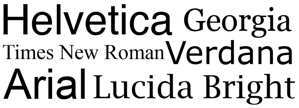
We actually werenât able to specify any typeface at all until Netscapeâs introduction of the <font> tag in 1995 and its later inclusion in the HTML2 standard. As long as a typeface specified with the <font> tag was installed on the userâs system, it would work. This is how we ended up with a list of fonts that were âweb safe,â meaning you could reasonably count on their presence on the majority of usersâ systems (a sampling of which can be seen in Figure 1-5). Because the new standard was designed with fallback in mind, you could list a series of fonts, and the browser would look through the list and display the content in whichever font was the first one found in that list. While some of the specifics changed, this remained the only âstandards-basedâ approach available to web designers for over a decade.
Note
Remember this bit of foreshadowing: the idea of a list of fonts meant that content would come first, and the specifics of presentation were secondary. We must always remember to put âusableâ before âperfect.â
Not ones to leave well enough alone, web designers found their loophole quickly in the form of the GIF. Well, not necessarily a GIF, but when making a graphic of a word to use in a heading or a button, using the background transparency feature of the GIF format let us sit those lovely pixels nicely on our carefully tiled backgrounds. Naturally, during the design process those buttons would change about 37 times, requiring new graphics to be created, carefully exported, and then posted up to the web server for review. Things got even more exciting with the advent of mouseover states, so instead we could make 37 revisions of two graphics for every button and heading. Thatâs your double rainbow right there. Not content to have that be all we had to worry about, accessibility for nonsighted users and the emerging prominence of search engines and their mysterious âbotsâ made sure we needed to have alt text for every graphic we so laboriously produced.
Lest I forget, we did have a significant upheaval in the web design industry with the introduction of Cascading Style Sheets (CSS) in 1996, with version 2 in 1998 supporting specifying font-family property. This allowed us to move our list of web-safe fonts from our markup to our style sheet. Remarkable progress. Not that it didnât bring many benefits, but it did nothing to really help push forward the cause of web typography until the inclusion of @font-face in CSS 2.1 in 2007. Sadly, @font-face would not become practically useful for another couple years.
A Step Sideways: Font-Replacement Techniques
Meanwhile, there were two other significant developments in the world of web-design typography, beginning in 2004. At that time, something called Scalable Inman Flash Replacement (sIFR) was released. Through a combination of Flash, JavaScript, HTML, and CSS, sIFR made it possible to use alternative fonts, which you created as Flash movies emedded on web pages. The displayed text could update dynamically, was still selectable, and overall made the Web a much better-looking neighborhood. However, it could be a bit tricky to set up and was not appropriate for all uses: you couldnât even really think about using it for body copy, and it was often very difficult to use even for navigation elements. Due to its reliance on Flash and JavaScript, it was clearly not a solution for the long haul, but it did provide the ability to utilize different fonts without running afoul of font vendorsâ licensing agreements.
A development a few years later was something called Cufón, which lashed together a generated font file, two rendering engines, and some chewing gum and baling wire (OK, guessing on those last two) to create another way of embedding fonts safely within your page without risking font piracy. Unfortunately the text was rendered nonselectable, so it was useless for nonsighted users or search engines. To its credit, though, it was easier to set up and more stable than sIFR, so it did become fairly widely adopted. Ironically, it came along just as things got a whole lot more interesting for very different reasons, sometime in 2009.
Finally: @font-face
Remember when I mentioned @font-face back in The Evolution of Type on the Web? The reason it sat around unloved except by a few for so long was due to the fact that while it was possible to include a typeface this way, and browsers were starting to support it widely, there were not many typefaces you could legally do this with, and you still needed a number of formats to make it all work. Licensing had always been what held back widespread adoption of web fonts, because there was no good way to prevent those fonts from being downloaded to a userâs computer and then saved by him for use anywhere else. Finally, @font-face delivered a way to embed fonts in your page that browsers could keep from being downloaded, and with the launch of web font services came a way to manage that even better.
Admittedly, this has been a very brief overview. But thatâs so we can get to the good stuff.
May 27, 2009: T-Day
This was the launch date for Typekit, a new service that let users pick typefaces and easily add them to their websites with just a line or two of code. Behind that was @font-face and a crafty bit of wizardry that prevented users from saving those fonts to their own systems. More services launched soon after, with Fontdeck, Fonts.com, and WebINK being some of the first. I have to say that, more than any other advance or technology over the past decade, this is the one that put the fun back in web design for me.
Dawn of a New Design Paradigm
Alas, there is, of course, still more to this saga. Weâre not quite out of the woods just yet. So far weâve been chatting primarily about desktop browsingâbut many sites are reporting 15, 20, even 30% or more of their traffic coming from mobile devices (and one of my own clientâs sites routinely spikes to over 50% mobile traffic during high-traffic periods). In truth, the global trend is for the majority of traffic on the web to tip in favor of mobile within the next year. According to StatCounter, in just the past year global web traffic from mobile devices has increased over 50% (see a few examples in Figure 1-6).
![Global web traffic from mobile devices, with some data by continent, as reported by http://bit.ly/rt-mash[Mashable in August 2013]](/api/v2/epubs/9781491907085/files/images/rety_0106.png)
So what about mobile devices? Well, there are over 50 typeface families available on current iOS devices, with some really nice choices. But weâre still effectively stuck with the âlowest common denominatorâ choices if we want to be really consistent. And then thereâs Android: one of the most prevalent smartphone operating systems out there comes withâwait for itâthree fonts. Well, actually four, as of the most recent release, Android 4.4. Cue wails of despair and gnashing of teeth. Clearly there is a need for a better solution to provide any sort of consistency and distinction across devices, platforms, and browsers.
Even though browser support is there for @font-face, font formats remain an issue. Thankfully the formats are available and we can safely and reliably serve our designs as intended to millions of mobile devices, as well.
Font Format Finagling: Who Shows What and Where
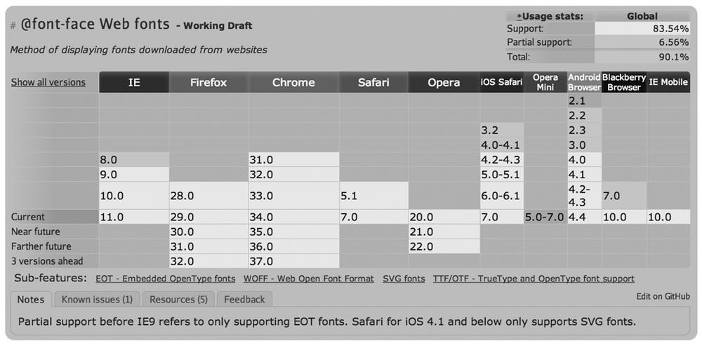
While adoption of @font-face was a big deal, there were and are still some significant technical issues with which to contend. First and foremost are file formats: in order to support the fullest range of browsers, OSes, and devices, one must support no fewer than four different file formats for every variant of every typeface! Only recently has a single format emerged as an agreed-upon standard for the future (Iâll get to which one this is in a moment). It leverages elements of HTML5 and CSS3 to provide reasonable protection for font vendors, while evolving into a format and standard that can work and be supported across all devices, platforms, and operating systems (well, eventuallyâas of April 2014 about 77% of devices accessing the Web support it). However, with access to all of the file formats, fonts added with @font-face are viewable on over 90% of devices on the Web (when tablets and other mobile devices are considered alongside full-fledged computers, vendors such as Typekit and Fonts.com believe the number to be closer to 98%) (see Figure 1-7).
Letâs dig a bit deeper into the issue of file formats. Youâll have to bear with me just a little bit; this is going to get confusing. One of the most common desktop formats for fonts now is TrueType, although that is being supplanted by OpenType. While TrueType originated at Microsoft, Internet Explorer (IE) is just about the only browser that doesnât support it for use on the Web (though partial support came around with IE 9). If you want to support earlier versions of IE, you need to use the EOT (Embedded Open Type) format, but donât expect that to work anywhere else. Thatâs two. If you want to support earlier versions of Safari (both desktop and mobile), SVGâs your choice (thatâs Scalable Vector Graphics). Thatâs format number three. And if you want to go with the ânow just about a fully ratified standardâ called WOFF (Web Open Font Format), well, that will do in almost all current browsers (finally including Android, as of the most recent 4.4 release). And just to be clear: none of it works in Opera Mini.
Note
Opera Mini is the only modern browser that does not support @font-face. Itâs designed to be ruthlessly efficient with bandwidth and hardware resources, which is why itâs used on many of the devices deployed in the fastest-growing markets in the world (which are also some of the most bandwidth-constrained). Asia, Africa, and India see significantly higher percentages of mobile traffic on Opera Mini than almost all other browsers. Bit of a bummer that it doesnât support nicer type.
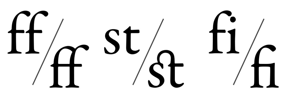
Why all the formats? Why indeed. TrueType and its successor, OpenType, are the de facto standard on the desktop these days. OpenType supports all sorts of typographic goodnessâsuch as full Unicode support for more than 65,000 glyphs, ligatures (think nicer glyphs for double characters like ff, as seen in Figure 1-8), and cross-platform font filesâso there is no longer a need for separate Mac, Windows, and Unix file formats. What is lacking is any kind of protection native to the file format to limit use on the Web, like precluding a font file from being served from one domain and included for display on another. To counter that limitation, Microsoft came out with the EOT format as far back as 1996. However, IE was the only browser to ever support it.
SVG is the third format, and while it is supported on a number of browsers, the only real reason we are discussing it is that prior to iOS 4.2, it was the only format supported on the iPhone. While that changed at the beginning of 2011, itâs still a bit early to forget SVG entirely.[2]
Finally, thereâs WOFF. WOFF is the only font format to reach Recommendation status with the W3C, and it should be come an official standard soon. Technically, WOFF is essentially a wrapper for TrueType or OpenType fonts that adds a significant amount of compression (up to 40%), making it better suited for web use than other formats. As of this writing, more than 77% of devices on the Web can handle WOFF fonts, but thereâs still a ways to go before support can be considered universal and other formats can be dropped.
And So the Stage Is Set
So what does this mean for you, the web designer or developer tasked with adding this support? Well, if you are hosting the fonts yourself, it means you need all four formats for every weight and style you intend to use on your site. This is the only way to be sure your web fonts will be seen on all the devices used to visit your site (at least the ones that support @font-face).
Of course, it wouldnât be the Web if there werenât a catch. Just because a particular browser and OS supports web fonts, it doesnât mean it supports them well. Shockingly, the primary cause for this caveat involves WindowsâWindows XP in particularâwherein there debuted a new font-smoothing technology called ClearType. I wonât delve too deeply yet into just how much this may vex you, but suffice to say it will likely cause you some angst in the short term. At least there is a brighter shade of gloom on the horizon where font rendering in Windows is concerned: Windows 7+ and IE9+ handle web fonts together quite nicely. But letâs look at the whole process of how fonts show up on our screens in the first place.
[1] As opposed to memorable like, âHey, remember that legal services site we saw that used Comic Sans for their headings?â
[2] As of June 2014, usage of those early versions of iOS seems to have dropped to about 1% of iOS devices globally, according to Caniuse.com, so it may well not be an issue for your user base.
Get Responsive Typography now with the O’Reilly learning platform.
O’Reilly members experience books, live events, courses curated by job role, and more from O’Reilly and nearly 200 top publishers.

