Responsive Design
A jQuery Mobile UI will render responsively across different display sizes. For example, the same UI will display appropriately on phones (see Figure 1–9) or larger devices such as tablets, desktops, or TVs (see Figure 1–10).
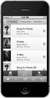
Figure 1–9. Phone Display
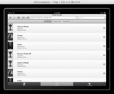
Figure 1–10. Tablet/Desktop/TV Display
The Build Once, Run Anywhere Myth
Is it possible to build a single application that is universally available for all consumers (phones, desktops, tablets)? Yes, it is possible. The Web provides universal distribution. jQuery Mobile provides ...
Get Pro jQuery Mobile now with the O’Reilly learning platform.
O’Reilly members experience books, live events, courses curated by job role, and more from O’Reilly and nearly 200 top publishers.

