ENERGIZING LIFELESS DIAGRAMS
When I see a diagram in a presentation it usually looks like the one shown in Figure 6-1. A bit dull isn't it? Still, I think it's a wonderful diagram. I know the author was feeling a sense of accomplishment when he finished making it. I know that to him, it made total sense. It answered all those nagging questions, like “how?” and “who?” and maybe even “why?” Unfortunately, wonderful as it is, it is entirely unfit for the purposes of a presentation.
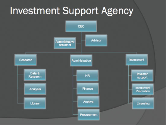
FIGURE 6-1: A typical organizational chart.
The problem with most diagrams shown in presentations is that they could probably work as an analytical tool, but they need too much explanation to be of any use. They are not pictures that are worth a thousand words, they are pictures that require a thousand words to comprehend. But that's not even the worst problem with a slide like this. Although people do need time to digest information, you can set up the animation and show the slide gradually, layer by layer. As long as the whole picture makes sense, it will work. The main issue here is that the picture is senseless and lifeless. The chart lacks drama. It's not going anywhere. It's too static.
![]() A good diagram is like a good story—it has conflict, it has a hero and a villain.
A good diagram is like a good story—it has conflict, it has a hero and a villain.
Like a good story, every good ...
Get Presentation Secrets: Do What you Never Thought Possible With Your Presentations now with the O’Reilly learning platform.
O’Reilly members experience books, live events, courses curated by job role, and more from O’Reilly and nearly 200 top publishers.

