Chapter 1. Visual Thinking in Business
VISUAL THINKING HAS BECOME more important in business, because we’re processing much more information than ever before. In addition, much of that information is nonlinear. As a result, slide presentations have become the language of business.
As Alex Osterwalder, author of the international bestseller Business Model Generation (Wiley), says, “Visual thinking tools help clarify concepts, be they strategy, operations, or new business models.” These visual thinking tools are pictures, sketches, diagrams—anything that quickly conveys an idea or process.
The value of the visual medium is twofold, stemming from:
The volume of meaningful information that can be succinctly conveyed
The approachability of images
“It’s with visual language—such as pictures and graphics—that we can help people feel less intimidated,” says MIT scientist Felice Frankel, a science photographer. That accessibility of images encourages the participation and collaboration vital to solving the problems of today, whether those problems are business problems or societal ones.
Visual Information Is Easier to Process
Humans are naturally visual creatures. “Fundamentally, our visual system is extremely well built for visual analysis,” says Noah Iliinsky, coauthor of Designing Data Visualizations and Beautiful Visualization (both O’Reilly). We’re tuned to spot patterns. Consider Anscombe’s quartet, created by statistician Francis Anscombe, shown in Figure 1-1. First, look at the datasets.
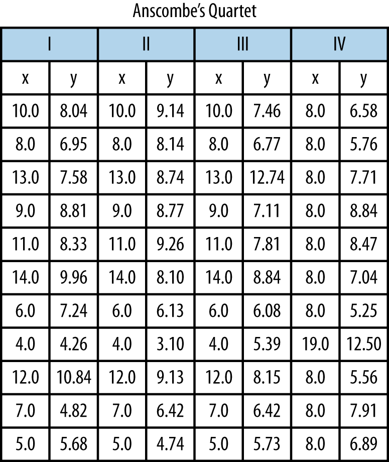
There seems to be little difference between the datasets. But, when they’re graphed out, as shown in Figure 1-2, we suddenly see dramatic differences.

Not only do humans like images, but we’re also more efficient thinkers when we use them. As Mindjet’s Nicola Frazer-Reid reports (http://min.dj/RJIcmF), a study conducted by Mindlab International at the Sussex Innovation Centre investigated how office workers manage existing data using traditional software and how efficient that process is. One of the key findings of the research suggests that when carrying out routine, everyday tasks in the office, if the data is displayed more visually (such as through visual maps), individuals are 17% more productive and need to use 20% fewer mental resources. What’s more, teams collaborating on a joint project use 10% fewer mental resources and are 8% more productive when using visualization tools.
Why is visual information easier to process? Dr. Lynda Shaw, a registered chartered psychologist with the British Psychological Society and a Fellow of the Royal Society of Medicine, explains the science behind why we grasp images faster:
[The brain] stores information in sensory cortical areas and reconstructs meaning based on previously obtained knowledge, tied together by a complex web of connections. Visual mapping emulates this process with visual items that engage more areas of the brain, allowing us to see, explore and understand large amounts of data at once and convey abstract information in intuitive ways.
In short, our brains are finely tuned to process dense visual information faster than other kinds of information. We can grasp more meaning more quickly from an image than from words. The old adage “a picture is worth a thousand words” proves to have a basis in biological fact.
Evolution of Visual Thinking
Verbal abilities developed much later on the evolutionary scale than visual ones. “We are well-developed in imagery for quick environmental awareness,” writes Steven Kim in The Essence of Creativity (Oxford University Press). According to Kim, imagery has two main advantages. First, we can see multiple things in parallel. For example, we can see the body language of four people simultaneously much better than we can track four conversations at a party simultaneously. Second, we can grasp an image’s meaning faster, which accelerates productivity.
Given the growth of big data, the ability to take large amounts of information and present it in a simple, easy-to-read manner is a skill in great demand. Indeed, Dr. Frankel sees a whole new discipline emerging, a “multi-disciplined visual profession.”
Visualizations amplify our cognition. Interacting with visualizations helps us think about the information better, because it lightens the cognitive load of memory. We don’t have to remember a whole series of numbers, such as in Figure 1-1, but instead can just remember a pattern, as shown in Figure 1-2.
Taking advantage of peoples’ visual processing prowess, enterprise software has executive dashboards that use dials or speedometers of red/yellow/green indicators to show you status at a glance. Barcodes and pie charts show relationships. Graphs show trends. That’s how we can get by in today’s information-overload world. “If we look at a sea of numbers, we quickly get lost, but seeing those numbers displayed as graphs lets us explore and understand the data and its implications,” says Stephen Few, author of Now You See It and Show Me the Numbers (both Analytics Press).
For speakers who use slide presentations and businesses that want to convey ideas to potential customers, this is good news. Technology has evolved to let us convey and transmit visual images much more broadly than we could in the past. “Images engage us in ways that words cannot,” Frankel writes with coauthor Angel DePace in their new book, Visual Strategies (Yale University Press).
The importance of images to business can’t be overstated. As Adam Bly, founder and editor-in-chief of Seed magazine, says, “We are a visual society, and the images are as important as the ideas.”
Accessibility of Images
Images can jumpstart communication by creating a common language, which can be useful for introducing new customers to your company’s products or services, particularly if they’re advanced, technological, or new.
In addition, the visual language of pictures and graphics breaks down the barriers of jargon, discipline-related terminology, and language, making it possible for nonexperts or nonnative speakers to understand, provide input, and collaborate. Images are inclusive because they are understandable and approachable.
As a tool for business, the approachability of images means that people can point to a picture and ask about it. As Chapter 6 explores in more detail, this makes visualizations and slides powerful tools for collaboration.
In addition, drawing something helps you figure it out. David Macaulay, bestselling author and illustrator of The Way Things Work (Houghton Mifflin) and 24 other highly illustrated books, says, “When you draw something, you really have to look at it. And when you really look at it, you can’t avoid thinking about it.” Macaulay uses drawing to question, clarify, and think about things.
Macaulay’s books are primarily images, interspersed with words. “How great is it to have those two languages to work with and pick and choose from?” Macaulay says. Slide presentations give your business the same advantage.
Visual Objects
In business, how a company makes money (its business model) can be a complex concept to convey to investors, employees, and other stakeholders. Business models have many interrelated moving pieces, which makes them hard to talk about. People can easily miss a key relationship or interdependency when creating or modifying a business model. And with so much complexity and so many possibilities for different kinds of business models, it’s easy for coworkers to misunderstand each other as they try to invent new business models.
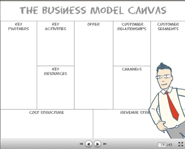
To understand more closely how to use visual objects and tools, let’s use Alex Osterwalder’s Business Model Canvas as an example. Shown in Figure 1-3, the Business Model Canvas is a visual tool that helps structure a team’s thinking about business models.
The first principle of using visual tools and objects is to encourage people to sketch, not just to make lists of words. “Any problem can be made clearer with a picture,” Osterwalder says. The sketch, as a “visual artifact,” lets people react to something concrete. To encourage people who think they can’t draw, Osterwalder points out that people can interpret a stick figure more easily than an abstract concept. “Drawing something, however badly, makes an abstract concept concrete, giving people an opportunity to react to it,” he says. In this way, visual tools and visual thinking help business people with understanding, dialogue, exploration, and communication.
Using visual ideas and tools also makes it easy to move concepts around. For example, Osterwalder encourages using large stickies, such as Post-it® notes or Stattys, because people can move them around as they decide where to put the business ideas on the canvas, as shown in Figure 1-4.
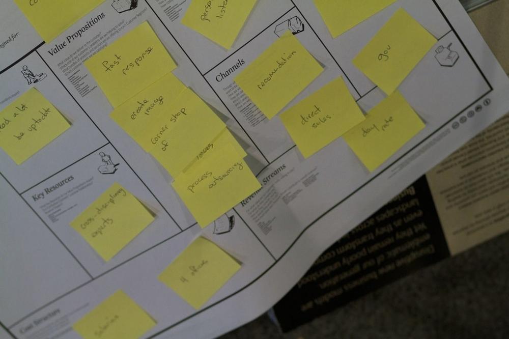
Participants can write ideas—such as who the customer is, the value proposition, and so forth—on stickies, which team members can affix to the canvas and easily move around as they figure out where on the canvas they belong. “Post-it notes are like containers of ideas,” Osterwalder says, that can be easily picked up and moved around. They make it easy for people to reconfigure their business models as they refine their thinking and test out new options. The Business Model Canvas helps a team think through its business model. More generally, businesses can use whiteboards or walls and tack posters or stickies onto them as placeholders for ideas.
Finally, the value of using a visual tool is that you can determine in advance the “buckets” that need to be filled in. This helps you avoid missing a key ingredient. In the case of the Business Model Canvas, the canvas lays out the key aspects of a business model, and by seeing it visually, people can quickly spot a missing component.
Because business models are so complex, with many interlocking pieces, it’s hard to hold all the pieces in memory and see their interactions and dependencies. The canvas helps everyone see all the pieces and confirm that they work together and make sense. Team members can use different colors of Post-it® notes for different business models, which lets them compare alternate models on the same canvas. This side-by-side comparison can help them pick the most promising model to test.
In summary, the canvas has a visual grammar that tells you where to put something. It lets you capture the big picture while simplifying it, and it lets you see the interdependencies between functions, processes, or ideas. It makes assumptions explicit and creates a visual language that triggers ideas and helps you think through a complex business model systematically. Similarly, visual tools in general make it easier to discuss and convey new business ideas to a company’s employees, customers, or investors. In the case of nonprofits and government agencies, visual objects and tools let the public understand and participate in the agencies’ actions.
Visual Note Taking
The rise of note taking exhibits further evidence of the trend toward more visual thinking in business. Visual note taking is the art of drawing a visual record of a meeting or conference while it is taking place. Some graphic note takers use large-format pages (8 feet × 20 feet) to document an event. Others, like Peter Durand, use an iPad hooked up to a projector screen, drawing notes in real time that are projected alongside or behind the speaker as he or she talks.
See the “Real-World Example” sidebar on Dean Meyers for a look at visual note taking and graphic facilitation in action.

Visual problem solver and strategist Dean Meyers is both a graphic recorder and a graphic facilitator, and he takes visual notes both in large format and on the iPad. For example, Dean has taken visual notes at the World Business Forum in large formats, and he used iBrushes on the iPad to take visual notes at the Business Innovation Factory Summit. The iBrushes tool records the order of the brushstrokes and then can re-create them in order, so that participants can later watch a video of the drawing come to life.
“In the real-time event, it adds tremendous value to attendees by increasing participants’ memory skill,” Dean says. “It’s funny that when the boards come to life, it tends to amplify the presentation as it’s going on. It gives the attendees stronger memories.”
Visual note taking is not merely illustrative, however, and the art is less dependent on ability to draw than it is on ability to synthesize. “Synthesis is critically important,” Dean says.
The most successful graphic note takers are the ones who have the strongest ability to synthesize information, to sum everything up. The note taker’s ability to summarize and synthesize gives the visual notes a contextual meaning. Visual note takers find an overarching theme or relationships in the anecdotes that are being told and encapsulate them in an impactful way.
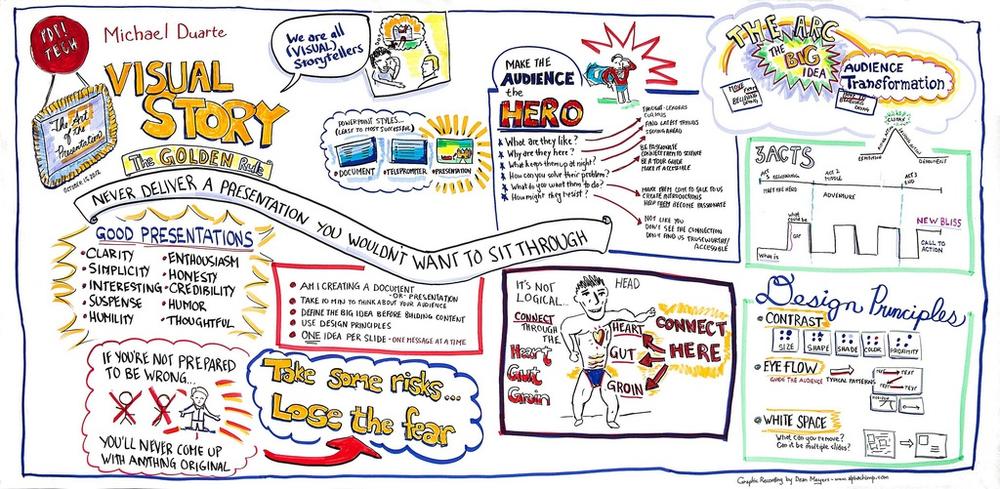
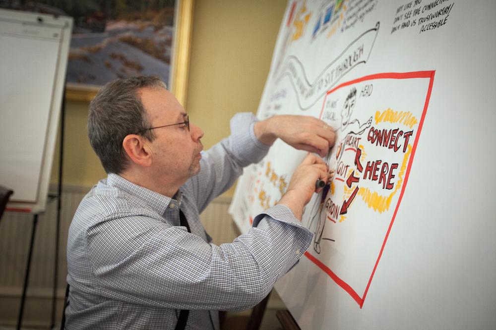
After the meeting or conference, the drawings are often photographed, then cleaned up so they are legible and clear, as shown in Figure 1-5.
Dean has found that event organizers value these drawings because “the drawings have the ability to re-create the emotional impact of the event in a way that a written summary wouldn’t do.”
Visual notes are also an act of cocreation on the viewer’s part, Dean believes: “So much of what you see on the page that’s visual is what’s between the lines—like comic books: frame by frame. In comics, the reader fills in between the frames.”
Graphical facilitation is a natural extension of visual note taking. With graphical facilitation, the facilitator works with a group using visual techniques to help the group achieve a goal, be it to problem-solve, innovate, or arrive at a shared vision of the future.
Dean employs five tools regularly during his graphic facilitations: a mind map, a system map, a matrix, a forcefield, and a storyboard. He also likes to use visual metaphors, which empower participants in a completely new way, as shown in Figure 1-6.
These five tools help people understand how concepts are related by giving them structure. “It really opens people’s thinking, by giving people easy access to other areas of their thought processes,” Dean says.
Dean makes sure that, as a graphic facilitator, he is involved in the planning stages of the meeting. This allows him to decide whether to use real-world visual metaphors, archetypal symbols, or abstract shapes depending on the goals of the meeting. “If you want people to ideate with no subjectivity, to free-think, you don’t want them to be tied to a real-world model,” Dean explains. On the other hand, “if you want people to be more in reality and the goal is a concrete outcome, like a process map, you would want to use real-world images, even photographs,” Dean says.
In summary, visual notes enhance a meeting or conference by aiding participants’ memory processes in real time. Visual notes help after the event, too, re-creating the emotional tone of the meeting.
Use Graphics to Build a Common Language
Thierry de Baillon, a consultant in France and cofounder of Socialearning, uses a deck of symbols he’s created as a spark to get conversations going in his graphic facilitation sessions. Each person picks a symbol and describes what the symbol means to him or her. The goal at this stage “isn’t about creativity but the perception of reality,” Thierry says. “Each of us is unique—you’re not seeing what your neighbor is seeing.” Thierry’s purpose is to identify the gap and bring about discussion of that gap. “We can then build a common language together,” he says.
Slide Presentations in Visual Business
A slide presentation can be many things: a collection of images, a narrative of text, or a framework for grounding a talk. Presentations can be delivered in an arena or on a mobile phone. They can be projected, printed, shared, downloaded, saved, and liked. They can inspire, persuade, or summarize countless hours of work, research, and preparation. They can extend the life of a public event and set expectations for a future gathering.
The overwhelming volume of information that assaults us every day has made brevity an art form. It has also created a need to rely on the recommendations of people we trust for content we view and share.
Slide presentations can:
Persuade an audience to understand and accept a premise
Present complex data in a way that the audience will understand and internalize
Teach people who learn and remember in different ways (auditory, visual, etc.)
Slide presentations have become increasingly important in business due to changes in human behavior brought about by technology. The next section explores two of these changes: continuous partial attention (CPA) and Generation C. Unlike Gen X and Gen Y, which were generations defined by age, Gen C is defined by its “always connected, always on” behavior. The next section shows how CPA and Gen C impact business communication and move it toward the visual.
Continuous Partial Attention and Generation C
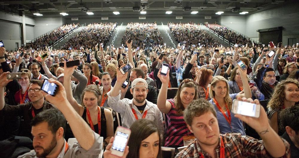
With the proliferation of connected devices, the technical ability to stay connected is rapidly increasing. Respected venture capital firm Kleiner Perkins Caufield & Byers reported in December of 2012 a global increase of 42% in the use of smartphones, with a 50% year-over-year growth in the United States. The number of phone plan subscribers worldwide is 1,142,000,000. That’s 1.142 billion people connecting to each other and to the Internet using smartphones. Even when attending a live event, people bring their tablets and laptops and especially smartphones, as shown in Figure 1-7.
According to Nielsen’s Cross-Platform Report, Q4 2012, published in March 2013, people shift between multiple screens when viewing content. Indeed, the number of households who do not use a television as the primary source of viewing content has increased 2.5 times over the last six years. Nielsen calls these households “Zero TV” households. As the report states, these Zero-TV homes accounted for less than 5% of US households six years ago and have since risen nearly 2.5 times as more households have changed the way they get their content in favor of using other devices and services. These homes now have multiple devices to choose from, and many have more than one way to access content in addition to their TV sets. The number of Zero-TV homes has grown from 2,010,000 in 2007 to 5,010,000 in 2012. This is important to creators of visual online content because it is a clear indicator of a change in behavior, in which people are turning to a variety of devices to consume content.
The challenge of an “always on” culture is that by not wanting to miss anything, people are ignoring some part of everything they tune into at once. For the public speaker, this means you have some of your audience’s attention, but not all of it. Your talk is competing with the outside activities of the networks of every person in your audience who has a smartphone or Internet-connected device.
This always-on, always-connected behavior is what Linda Stone coined continuous partial attention (CPA): the behavior of paying simultaneous attention to a number of sources of incoming information, but at a superficial level. Not the same as multitasking, which is the motivation to be more productive, CPA occurs when someone wants to be always on—to be, as Linda puts it, “a live node on the network; always on, anywhere, anytime, anyplace behavior.”
Generation C is a recently identified demographic, first named by Nielsen when it discovered a decrease in the number of households that were watching TV. Gen C cares about connection and content, and about content’s creation and curation. For anyone or any organization trying to capture the attention of Generation C, the pressure is on to create compelling content and make it available so that people can connect with it.
Unlike previous labels of Baby Boomers or Generations X and Y, Generation C is not defined by its age. Instead, members of Gen C are identified by their behavior, the always-on lifestyle that Linda Stone identified 15 years ago. Members of Generation C know how to find what they want online and can seamlessly switch from one device or online platform to another. Gen C is a lifestyle, a group of behaviors that has come from the 24/7 availability of content and the devices that deliver it.
The Challenge for Presenters
Because today’s audience is engaged in continuous partial attention, presenters must put in extra effort to compete for the mindshare of a distracted audience. One way to win more audience attention is to include engaging visual slides with your presentation and show them intermittently instead of in parallel with your talk.
Think of your slideshow as adding percussive punctuation to a talk instead of performing a continuous accompaniment. A speaker might talk for several minutes or more without showing a visual image on the screen. Then, in order to reinforce a point or introduce a new point, the presenter shows a slide or video. In this case, the presenter uses the visual media to punctuate the talk, breaking it up, adding interest and variety. This is a very different style from the traditional use of a slideshow—running in parallel to the spoken presentation.
Some presenters, such as Baratunde Thurston, include video as well as still images in their keynote speeches. Baratunde moves from his spoken delivery to slides to video and back again as his talk progresses. The multimedia in his presentation is not running in the background; it is front and center and plays an equal role to his speaking. Visual presentations give the audience a reason to stay engaged with a live speaker. A slidedeck or video gives the audience a reason to watch, not just listen and possibly tune out.
Storytelling Makes Mentors of Presenters
In her 2010 TEDxEast talk “You Can Change the World,” Nancy Duarte asserts that the presenter of an idea is not that idea’s hero. To reach and persuade an audience, the presenter shouldn’t be the star of the show. Just as in the classic myth or story structure, which begins with a likeable hero, a new structure has emerged. In this new structure, a problem or challenge arises and the audience-hero must confront it and battle it. There is a hesitation until the mentor-presenter arrives to help move the audience-hero to overcome the problem or challenge and reach a better world.
“The presenter isn’t the hero; the audience is the hero of our idea,” Duarte says. “The role of the presenter is to be the mentor.” The presenter is not Luke Skywalker, the hero in George Lucas’s Star Wars saga. Rather, the presenter is Yoda, Luke’s mentor. Presenters help the audience “move from an ordinary thing into your special idea,” Duarte says. “That’s the power of story.”
Storytelling and visual presentations keep the audience’s attention and move them to action.
Access Data to Create Visualizations
Just as powerful stories make better presentations, so, too, do illustrated slideshows. Illustrated slides use visual illustrations rather than words in the slidedecks. The visual illustrations take the place of the old-style, teleprompter-type slides that just had a few bullet points.
Using illustrations rather than words in slides changes the audience’s expectations of what a public speaker will provide. The expectations of preparation, supporting visuals, and overall delivery are higher. The audience is counting on receiving an engaging, interactive experience.
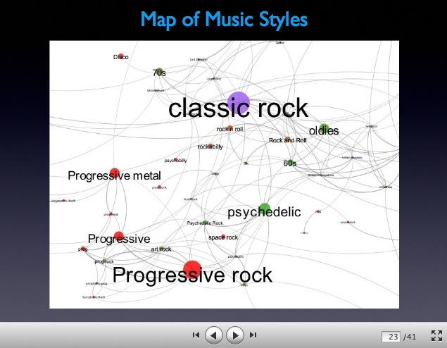
Along with the challenges of keeping up with the various devices on which a presentation might be viewed comes an opportunity to create more engaging visuals. Instead of relying on the graphs and charts provided by Microsoft Excel, content creators are now finding ways to use an application programming interface (API) to import data into a graphic design software, as Paul Lamere of The Echo Nest demonstrates in Figure 1-8.
The IBM project Many Eyes is an application that turns your data into graphics, and it is free and available to everyone. Many Eyes allows pure data in either text or table format to be uploaded and processed into multiple visualization formats. You can translate anything from sales figures to scientific datasets into a visualization, with a variety of graphics to choose from and recommendations based on the desired message of the data.
Many Eyes was created by Fernanda Viégas and Martin Wattenberg, who now lead Google’s Big Picture visualization research group in Cambridge, Massachusetts. Fernanda and Martin give two pieces of advice to presenters who are representing data with graphic art:
Defy the conventional wisdom of starting with a question. Instead, explore the way the data is portrayed in imagery and discover where it takes you.
Use a dataset that is important, and that you care about. Stay true to the data so that it will be useful.
The potential for nondesigners to communicate their message with beautiful images has never been greater. The presentation software company Haiku Deck is one company that is running with this opportunity (see the “Real-World Example” sidebar on Adam Tratt).

One of the most recent influencers in the presentation design world is a company called Haiku Deck. Not a design agency, Haiku Deck instead provides presentation software in the form of beautifully designed templates that let content creators, who are not skilled designers, add highly designed slides to their content.
Cofounder Adam Tratt says that the company was formed to solve the cofounders’ own problem. Their original company was a startup that needed memorable presentations for its sales and investor pitch decks. Adam, formerly a product manager at Microsoft, recognized that a functional knowledge of PowerPoint wasn’t enough to create compelling presentations. “There is a challenge when a presenter wants a creative slideshow, but does not have the design skill or a design department,” Adam says.
As Adam talked to people in the business environment about their presentation design process, the responses were similar: “I know how to use those tools. I do not love using those tools.” This led to the creation of Haiku Deck, shown in Figure 1-9.

Haiku Deck is a simple iPad application that allows you to create a beautiful, compelling slideshow with little to no design expertise.
Adam believes strongly in the power of storytelling. This, along with social sharing and the increased ability of devices to display visual content beautifully, has fueled an evolution of the slideshow. Adam also credits the “Instagram effect,” the idea that compelling images can be created quickly and easily, for creating an expectation among viewers that beautiful photographs should be included in presentations.
Adam compares sharing a presentation to presenting a gift. It should feel good. So, with a small collection of design templates, Haiku Deck launched. Haiku Deck is integrated with SlideShare so that a presentation created with Haiku Deck can be uploaded to a SlideShare user’s channel.
The New World of Social Sharing
Traditionally, the bullet-point-riddled, text-saturated slides of the past were accepted with resignation by audiences who didn’t know better. People were exposed to slidedecks for only the talks and live events that they attended. With the advent of SlideShare, suddenly people were able to view slideshows from people and events they didn’t know, much less participate in.
Google is not the only show in town now for getting your content noticed. Social sharing, the posting and “liking” of content from one user to another, is an organic recommendation engine driven by people whom you have chosen to include in your social networks. People are now designing content that is designed to be shared. Not only has the viewing been disbursed across a spectrum of devices, but the selection of content that comes your way is also selected and distributed as a democratic process. Om Malik, the founder and senior writer for GigaOm, calls this phenomenon the “democratization of distribution.” Social sharing allows content to be transported to audiences that were previously unreachable.
The power of social sharing created the need for the SlideShare platform of presentation content. As it evolved, SlideShare empowered presenters to reach a worldwide audience. It also empowered viewers to share, like, and even embed presentations on their own websites. Curation of slidedecks has emerged as subject matter experts and influencers give their votes of approval with shares, likes, and embeds. Thoughtful editorial curators have tremendous power in whom and what they select to publish.
The following chapters explore the ways that you can get your content noticed and shared by curators, as well as potential customers and clients of your business.
Get Present Yourself now with the O’Reilly learning platform.
O’Reilly members experience books, live events, courses curated by job role, and more from O’Reilly and nearly 200 top publishers.

