Chapter 9. Charting and Analyzing Data
In This Chapter
Understanding the parts of a chart
Creating a chart
Editing a chart
Modifying the parts of a chart
Playing with pivot tables
If you stare at an Excel spreadsheet long enough, you may ask yourself, “What do these numbers really mean?”
To help you analyze and understand what rows and columns of numbers might mean, Excel offers the ability to convert your data into a variety of charts such as pie charts, bar charts, and line charts. By letting you visualize your data, Excel helps you quickly understand what your data means so you can spot trends and patterns.
Understanding the Parts of a Chart
To create charts that clarify your data (rather than confuse you even more), you need to understand the parts of a chart and their purpose, as shown in Figure 9-1
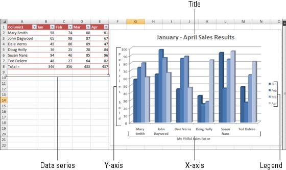
Figure 9.1. Figure 9-1: Each part of a typical Excel chart displays information about your data.
Charts typically use two data series to create a chart. For example, one data series may be sales made that month, while a second data series may be the names of each salesperson.
The X‐axis of such a chart would list the names of each salesperson while the Y‐axis would list a range of numbers that represent dollar amounts. The chart itself could display different colors that represent different products sold, and the legend would explain what each color represents (such as red measuring life insurance ...
Get Office 2007 For Dummies® now with the O’Reilly learning platform.
O’Reilly members experience books, live events, courses curated by job role, and more from O’Reilly and nearly 200 top publishers.

