8.4 MANAGING DIFFERENT DEVICES
In our previous discussion it became apparent that not all devices are the same. This is a rather obvious point given the broad range of form factors, and something we discuss later in the book when we look at devices (see Chapter 10). However, we have also just seen that even on devices that may ostensibly be similar, there could be variations in browser implementation. This may preclude using a common design approach, or, if we were to go down that route, then we may end up gravitating to the lower common denominator. This may lead to design compromises that we are not willing to accept.
There are copious mobile device parameters to take into account: browser, language support, OS, user preferences, screen size, colour support, connection speed, graphics capabilities, audio capabilities. The catalogue of features keeps expanding. It is obvious that not every application design will work for every user in all situations.
If we look at a device like the Sony Ericsson P800 mobile phone, which is really a wireless PDA, then the integrated browser can access the Web using HTML, XHTML, cHTML and WAP. The screen, as shown in Figure 8.33, is a quarter-VGA (videographics array) touch screen with 4096 colour depth. This means that when fully opened (the keypad is flipped out), the screen size is 208 × 320 pixels.
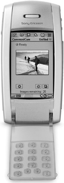
Figure 8.33 Sony Ericsson P800 (Reproduced ...
Get Next Generation Wireless Applications: Creating Mobile Applications in a Web 2.0 and Mobile 2.0 World, 2nd Edition now with the O’Reilly learning platform.
O’Reilly members experience books, live events, courses curated by job role, and more from O’Reilly and nearly 200 top publishers.

