Chapter 4. Using Source Mode
Adding Components in Source Mode
S, FX, and MX: Namespaces Explained
“The whole is greater than the sum of its parts.”
When we created the HelloWorld application, Flash Builder automatically generated several lines of MXML code. In this chapter, we use Source mode to examine our HelloWorld application and glean some additional insight into the structure of a Flex project. We also use Source mode to add a few more components and get a feel for Flash Builder’s code completion mechanism and MXML syntax.
What Design Mode Does
As previously stated, when you drag components into your Flex 4 project, Flash Builder creates corresponding MXML code in whatever MXML file you’re currently editing. Conversely, if you alter the MXML code in Source mode, Design mode will rebuild and reflect the changes. Let’s take a look at the MXML for our HelloWorld application.
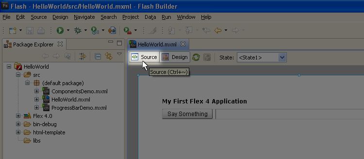
If you closed Flash Builder since creating HelloWorld in Chapter 3, reopen it and switch to Source mode. It’s easy to switch from Design mode to Source mode; just click the “Source” button above your WYSIWYG editor (Figure 4-1).
Anatomy of a Flex Application
Your source code for this example should look something like that in Example 4-1.
Note
Code created by Design mode has a tendency to be ugly. On another note, due to limitations of print/page dimensions, it’s impossible to identically replicate the code you’re seeing in print. As a result, expect our book examples to differ from yours somewhat.
<?xml version="1.0" encoding="utf-8"?><s:Applicationxmlns:fx="http://ns.adobe.com/mxml/2009" xmlns:s="library://ns.adobe.com/flex/spark" xmlns:mx="library://ns.adobe.com/flex/mx" width="100%" height="100%"><fx:Declarations><!-- Place non-visual elements (e.g., services, value objects)here --></fx:Declarations><s:Labelx="50" y="50" text="My First Flex 4 Application" id="titleLabel" fontFamily="Arial" fontWeight="bold"/><s:HGroupx="50" y="70" width="80%"><s:Buttonlabel="Say Something" id="speakButton"/><s:TextInputid="speakTI" width="100%"/></s:HGroup></s:Application>
Code created by Design mode is usually jumbled and messy. As a result, our source code could use some housecleaning. Before we break apart the code and discuss it, let’s clean up the code here in Source mode. Using extra line breaks and tab indents, make your Source code look more like Example 4-2.
Note
Notice that we deleted the Declarations block? This block will always appear in a new project, so if you won’t need it—and we won’t need it for a while—you can delete it to create cleaner code. Of course, it won’t hurt to leave it. It’s your decision.
<?xml version="1.0" encoding="utf-8"?><s:Applicationxmlns:fx="http://ns.adobe.com/mxml/2009" xmlns:s="library://ns.adobe.com/flex/spark" xmlns:mx="library://ns.adobe.com/flex/mx" width="100%" height="100%"><s:Labelid="titleLabel" x="50" y="50" fontFamily="Arial" fontWeight="bold" text="My First Flex 4 Application"/><s:HGroupx="50" y="70" width="80%"><s:Buttonid="speakButton" label="Say Something"/><s:TextInputid="speakTI" width="100%"/></s:HGroup></s:Application>
Now that we can comfortably read the code, let’s consider what’s happening. The first line is a mere XML declaration that usually begin XML files. It has no functional purpose in the code, but Flash Builder will always add it to new application files. The “real Flex” begins with the Spark Application tag.
Every Flex application contains a root tag. Flex applications geared for web deployment will use an Application tag, but Adobe AIR applications designed for the desktop will use a WindowedApplication tag. Our HelloWorld application is designed for the Web; therefore, the entire project exists between <s:Application> and </s:Application>, the opening and closing tags of the Flex Application container.
Notice that the opening tag includes an ensemble of attributes, specifically several namespace assignments (i.e., xmlns:), as well as the width and height properties we established back in Design mode. The opening tag for every component exists between left (<) and right (>) angle brackets.
The Declarations section (which you may have deleted per the note) is identified by the <fx:Declarations> and </fx:Declarations> tags, and it’s reserved for nonvisual elements. We briefly discussed nonvisual elements in Chapter 3. Even though this application doesn’t have any nonvisual elements, Flash Builder creates the Declarations section anyway.
The <s:Label/>, <s:HGroup/>, <s:Button/>, and <s:TextInput/> tags represent components we added in Design mode. The Label and the HGroup container are nested within the main application, but the Button and the TextInput are nested within the HGroup.
The Label, Button, and TextInput controls are closed differently than the Application and HGroup containers. Closing XML tags using /> is an optional syntax, but it’s frequently used for controls. Alternatively, you could open and close the Button using the code shown in Example 4-3.
<s:Buttonid="speakButton" label="Say Something"></s:Button>
However, using the full syntax on controls has a tendency to make your code less readable. Fortunately, Flash Builder will encourage the abbreviated syntax by using it for controls created in Design mode.
As you inspect the remaining MXML code, you should recognize other properties we set back in Design mode. While you’re here, feel free to change some of the basic properties (x, y, width, height, text), and then leap back into Design mode (Ctrl-tilde) to see the changes take effect.
Adding Components in Source Mode
Of course, we can also add components to our project while in Source mode, so let’s add another button to perform a “clearing” function.
Just below the TextInput but still within the HGroup tag, add a Button component by typing <s:Button id="clearButton" label="Clear"/>. In context, it should look like Example 4-4.
<s:HGroupx="50" y="70" width="80%"><s:Buttonid="speakButton" label="Say Something"/><s:TextInputid="speakTI" width="100%"/><s:Button id="clearButton" label="Clear"/></s:HGroup>
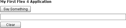
If you switch back to Design mode, you’ll notice the TextInput control sandwiched between the “Say Something” and “Clear” buttons. The HGroup container is forcing the three controls to consume the 80% width allotted to it.
For the sake of playing around, convert both HGroup tags to VGroup tags (literally replace the “H” in each tag with a “V”), and then jump back to Design mode to see how this change affected the layout of your application (Figure 4-2). You can keep the layout in this arrangement if you want, but our example will continue using the HGroup.
Code Completion
When you created the button in Source mode, did you notice a pop up after you started entering the code for the control? Perhaps it looked like Figure 4-3.
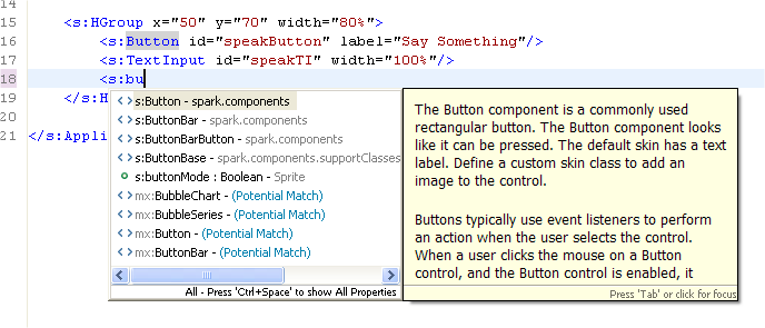
Code completion is your best friend when you’re new to a programming language. Not only does code completion help you avoid typos and spelling errors, it can also be a useful reference. Consider this: in Design mode’s Properties pane, you can toggle Category or Alphabetical view to see properties available to a component. Similarly, Source mode’s code completion allows you to browse a control’s properties and methods, but it also allows you to browse components, classes, data types, objects, etc. If you’re trying to brainstorm a solution to a programming task, sometimes it’s helpful to trigger code completion just to peruse the menu. You never know; it just may trigger some inspiration.
Code hinting will attempt to offer you the best reasonable match to the text you’ve entered into the code editor, and it will begin making suggestions alphabetically as soon as you create the left angle bracket (<).
Note
Code completion is a rose with many names: code hinting, content assist, autocomplete, and autocompletion, to name a few. Developers with a lot of experience using Microsoft’s Visual Studio might even call it IntelliSense. This is important because you’ll encounter these various terms in the blogosphere.
If you’re looking for a specific component, type as much of the component declaration as you find convenient (e.g., “<s:tex”); then, once you get the content assist utility, either left-click on the component you want or hit Tab to change focus to the code completion pop up. Once the code hinting utility has focus, use your arrow keys to scroll through the menu. Even better, if you typed enough text for code completion to zero in on the correct component, simply press Tab and then Enter to select it and plug it into your code. That declares your class.
After you’ve declared a class, use code completion to configure its properties and methods. So, if you just declared a new instance of the TextInput using code completion, you’ll have <s:TextInput, with your insert cursor against the last character. But once you hit your space bar, you’ll get a host of properties and methods to choose from.
MXML in Depth
Metaphorically, think of MXML as the skeleton within the body of your source code. Just as skeletons provide structural definition to our human bodies, MXML code gives your project a visible structure.
You’ll quickly adapt to MXML syntax because it’s so intuitive, but a few details should be covered now to guide your thinking.
The XML in MXML
XML stands for Extensible Markup Language. Extensible refers to the capacity to create your own tag relationships. Markup means your tags can include text as well as extra information about that text, also via tags. Remember, tags are identified by their <opening> and </closing> syntax.
XML is not a programming language. Rather, XML is a structured arrangement of text and data. There are no keywords, component classes, class properties, or methods. It’s simply textual information presented according to specific syntax rules that identify a hierarchy or relationship between the elements. So how do XML and MXML compare?
MXML borrows its syntax rules from XML. However, to the Flex compiler, MXML identifies ready-made ActionScript classes that can be instanced using XML syntax. In this way, MXML is essentially a class vocabulary that provides a more convenient approach to declaring ActionScript UI components.
It’s All About Structure
As we just discussed, XML is simply structured text. It distinguishes data structures within tags defined by angle brackets (< and >). There isn’t an XML vocabulary of reserved words; in fact, the author of XML is free to create her own structural hierarchy. So, XML is purely syntax and structure.
You’re reading a book right now, so you recognize that a book is divided into chapters and sections. If you wanted to represent a book in XML, you could create tags like <book/>, <chapter/>, and <section/>, and deploy the book like Example 4-5.
<book>
    <chapter>
        <section/>
    </chapter>
</book>
As implied by this example XML, “book”—the root node—contains “chapter” nodes, which contain “section” nodes.
A Few Ground Rules
XML parsers, including Flash Builder, web browsers, etc., are unforgiving when it comes to XML syntax. While you can invent whatever tags and data structure you desire, you can’t invent your own syntax rules. So let’s discuss the basics of XML syntax.
All that is opened must be closed
An important fact about XML is that each tag must be complete. If a tag is opened, it must eventually be closed later in the XML. As you’ve seen, an XML tag is opened with a left bracket (<), some text representing the tag’s name, and then a right bracket (>). To maintain our previous example, <book> is an opening tag. Finishing the tag requires closing it using a forward slash (/) in the proper position within the closing tag, </book>.
You can ensure all tags are closed in a couple of ways. The first is by creating the end tag immediately after you create a beginning tag. So, after creating the open container tag <book>, go ahead and create the closing tag </book>. Alternatively, if a tag will not have any nested tags—as is often the case with simple Flex controls such as the Button, CheckBox, and others—you can use shorthand syntax by adding a forward slash immediately before the right angle bracket of the opening tag, like this: <section/>. So, <section></section> is equivalent to <section/>.
Case matters
XML is case-sensitive. That is to say, uppercase letters and lowercase letters distinguish different elements. So, <book> and <Book> aren’t the same in XML. That means <s:Text> and <s:text> are different as well.
Declarations are optional, but polite
The first line of an XML document may optionally contain a line declaring it as XML and listing what encoding it uses. The declaration looks like the line in Example 4-6.
Note
Encoding in this context refers to your potential to use various characters and symbols in your XML markup. There are different encoding standards available to you, but utf-8 is the way to go. For more information, see the w3schools discussion of this topic at http://www.w3schools.com/XML/xml_encoding.asp.
All MXML files created through Flash Builder automatically contain this XML declaration, so you don’t need to worry about creating it.
Because MXML is XML, MXML inherits all the XML rules.
Warning
Make sure you don’t have any spaces, empty lines, or other whitespace before the XML declaration in a Flex application. Otherwise, Flex will warn you that whitespace is not allowed before an XML Processing Instruction and your application won’t compile!
The Anatomy of a Tag
An XML tag can contain information in two ways, either by content or by attributes. Content is simply the text that exists between the node’s opening and closing tags. Attributes are value assignments inside the opening tag. Consider the XML in Example 4-7.
<book title="Learning Flex 4"
    author1="Alaric Cole" author2="Elijah Robison">

    <chapter title="Using Design Mode"/>
    <chapter title="Using Source Mode"/>
</book>
In this example, <book> is the root node, but title, author1, and author2 are attributes of that book. This code also has two nested tags representing chapters, and each has a title attribute.
Compare the previous code to Example 4-8, which contains the same information using a different structure.
<book>
    <title>Learning Flex 4</title>
    <author1>Alaric Cole</author1>
    <author2>Elijah Robison</author2>
    <chapter3>
        <title>Using Design Mode</title>
    </chapter3>
    <chapter4>
        <title>Using Source Mode</title>
    </chapter4>
</book>
The second example is essentially the same as the first, but the second is more verbose. The first example uses attributes, and the second uses nested tags. So, attributes can be useful as a compact way to represent information, and more compact means more readable. Compare this code to the same example in MXML.
You’re probably used to seeing something like this:
<s:Labeltext="Learning Flex 4"/>
But did you guess you could do the following?
<s:Label><s:text>Learning Flex</s:text></s:Label>
Those two code snippets create the same product, but one uses an attribute to add the text property, and the other uses a nested tag. We recommend using attributes in your MXML for the reasons stated earlier: compactness and readability.
There will be times, however, when you’ll need to use nested tags instead of attributes. This is because nested tags allow more complex content than a single line of text or a number. In other words, nested tags are preferable for adding data that can’t be represented as simple attributes. Consider the case of the text property. If the text were a whole paragraph, it would look strange as an inline property.
Similarly, nested tags are essential when assigning complex data properties. For example, you might use an ArrayCollection to supply data to a control, and some controls can display a long list of items. Example 4-9 shows a relevant example.
<s:ComboBoxselectedIndex="0"><s:ArrayCollection><fx:Object>Alabama, AL</fx:Object><fx:Object>Alaska, AK</fx:Object><fx:Object>Arizona, AZ</fx:Object><fx:Object>Arkansas, AR</fx:Object></s:ArrayCollection></s:ComboBox>
The same is true for complex components that may require an array of other component objects, such as the columns property of a DataGrid, which takes an array of DataGridColumn components, each with its own properties. You can see an example of this by dragging a DataGrid control to your application in Design mode, which gives you the MXML in Example 4-10.
<mx:DataGrid><mx:columns><mx:DataGridColumnheaderText="Column 1" dataField="col1"/><mx:DataGridColumnheaderText="Column 2" dataField="col2"/><mx:DataGridColumnheaderText="Column 3" dataField="col3"/></mx:columns></mx:DataGrid>
Clearly the columns property of the DataGrid can’t be written as an attribute, because it expects a complex list of DataGridColumn objects, which in turn require their own property assignments.
S, FX, and MX: Namespaces Explained
Flex 4 provides three packages of components, and each is identified by a unique namespace. The three Flex 4 namespaces are Spark (s:), Halo (mx:), and the Language (fx:) namespace.
Each MXML component tag should contain a namespace designation, like the Button tag in Example 4-11, which declares the Button component from the Spark collection.
The Halo collection has its own Button, as in Example 4-12.
The same syntax is used to declare components from the Language (fx:) namespace, as shown in Example 4-13.
<fx:Declarations><fx:Arrayid="statesArray"><fx:Object>Alabama, AL</fx:Object><fx:Object>Alaska, AK</fx:Object><fx:Object>Arizona, AZ</fx:Object><fx:Object>Arkansas, AR</fx:Object></fx:Array></fx:Declarations>
Namespace Basics
What’s a namespace? Take a look at the word itself: name + space. Basically, a namespace is a package designation for a prebuilt set of components. You can illustrate this concept in Source mode by typing <s:Bu, and noticing that you have two Button options to choose between, as shown in Figure 4-4.
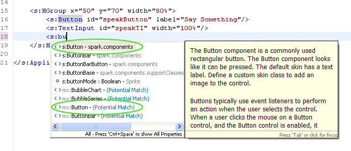
The Button class has been around for a while and continues to be important. Therefore, it exists among the new Spark components as well as the older Halo components. We recommend you use the updated Spark component, but because both packages are available within Flex 4, it’s your choice. Similarly, you could create an extension of the Spark Button that includes a few specialized properties and save it in your own package/folder. To use the extended button in your project, you’d have to assign your custom package a namespace declaration. Custom namespaces are pretty common, even among small applications.
Most simply, namespaces point to component locations within a package structure. They may identify components in precompiled libraries (SWC files), or they may represent a classpath in your project’s src folder.
If we revisit the concept of extending a Button, you could still name it “Button” because your unique namespace would distinguish it from its Spark/Halo counterparts, and the source code for your class would exist in a unique directory. You might then refer to your button in MXML as something like <tweaks:Button/> to differentiate it from <s:Button/> or <mx:Button/>.
Namespaces and Third-Party Libraries
If you work with a third-party library, code completion will add the library’s namespace definition for you as you add components from the third-party library. For example, if you download the Google Maps API (it’s a SWC) and add it to your libs folder, typing <map is enough for code hinting to lead you to <maps:Map/>, and in turn, Flash Builder will create the Google Maps namespace, as shown in Example 4-14.
<s:Applicationxmlns:fx="http://ns.adobe.com/mxml/2009" xmlns:s="library://ns.adobe.com/flex/spark" xmlns:mx="library://ns.adobe.com/flex/mx" xmlns:maps="com.google.maps.*"
But what if you don’t like that default namespace? Why not change maps to some other identifier? Well, you can.
Note
If you spend much time dabbling in third-party libraries, you’ll frequently encounter the convention com.domain.subpath.* among package structures. The technique is called reverse domain package naming, and developers endorse it for two reasons. First, and most significantly, this strategy helps to keep component packages in unique classpaths, serving the purpose of avoiding class name conflicts. Second, well, there’s a clear marketing advantage.
Note the line xmlns:maps="com.google.maps.*". This is easy to customize. For instance, instead of maps, you could use gmap, as demonstrated in Example 4-15.
<s:Applicationxmlns:fx="http://ns.adobe.com/mxml/2009"xmlns:s="library://ns.adobe.com/flex/spark" xmlns:mx="library://ns.adobe.com/flex/mx"xmlns:gmap="com.google.maps.*"
This simple change lets you use <gmap:Map/> instead of <maps:Map/> in your MXML component declarations.
Summary
In this chapter we explored the basics of Source mode. You learned how to clean up autogenerated code. You also learned how to add components and assign properties with the help of code completion. We discussed basic XML syntax rules, how to read XML structure, and how these relate to MXML. Finally, we discussed namespaces, giving you an improved perception of component package structure.
In the next chapter, we discuss the basics of scripting and object-oriented programming, and along the way, we’ll finish that HelloWorld application.
Get Learning Flex 4 now with the O’Reilly learning platform.
O’Reilly members experience books, live events, courses curated by job role, and more from O’Reilly and nearly 200 top publishers.

