Chapter 4. Collaborative Design
As you navigate through the rest of your life, be open to collaboration. Other people and other people’s ideas are often better than your own. Find a group of people who challenge and inspire you, spend a lot of time with them, and it will change your life.
—Amy Poehler
Lean UX is a collaborative process. It brings designers and nondesigners together in co-creation. It yields ideas that are bigger and better than those of the individual contributors. But it’s not design-by-committee. Instead, Lean UX increases a team’s ownership over the work by providing an opportunity for all opinions to be heard much earlier in the process. In this chapter, we explore the many benefits that come from this close, cross-functional collaboration. Specifically, we look at:
Why everybody gets to design
How low-fidelity artifacts increase collaboration
Building a shared understanding across your team
We’ll also dig into a series of techniques that enable this more productive way of working, including:
In the previous chapter, we discussed product feature hypotheses. The first part of a product feature hypothesis statement describes what we will build to solve our customers’ pain point. These features can be designed in many ways. Navigating through these options can be difficult for teams. How often have you experienced team conflict over design choices?
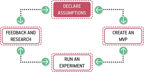
The most effective way I’ve found to rally a team around a design direction is through collaboration. Over the long haul, collaboration yields better results than hero-based design (the practice of calling in a designer or design team to drop in, come up with something beautiful, and take off to rescue the next project). Teams rarely learn or get better from working with heroes. Instead, designing together increases the design IQ of the entire team. It allows every member of the team to articulate his or her ideas. It gives designers a much broader set of ideas to draw upon as they refine the user experience. This collaboration, in turn, breeds increased feelings of ownership over the work being done by the entire team. Finally, collaborative design builds team-wide shared understanding. It is this shared understanding that is the currency of Lean UX. The more the team collectively understands, the less it has to document in order to move forward.
Collaborative design is an approach that allows a team to create product concepts together. It helps teams build a shared understanding of the design problem and solution. It allows them to work together to decide which functionality and interface elements best implement the feature in their hypothesis.
Collaborative design is still a designer-led activity. It’s the designer’s responsibility not only to call these meetings but to facilitate them as well. Sometimes you’ll have one-on-one sessions with a developer at a whiteboard. Other times, you’ll gather the whole team for a Design Studio exercise. The key is to collaborate with a diverse group of team members.
In a typical collaborative design session, teams sketch together, critique the work as it emerges, and ultimately converge on a solution that they feel has the greatest chance of success. The designer, while still producing designs, takes on the additional role of facilitator to lead the team through a series of exercises.
The output of these sessions typically consists of low-fidelity sketches and wireframes. This level of fidelity is critical to maintaining the malleability of the work, which allows the team to pivot quickly if their tests reveal that the approach isn’t working. It’s much easier to pivot from a failed approach if you haven’t spent too much time laboriously documenting and detailing that approach.
Collaborative Design in Practice
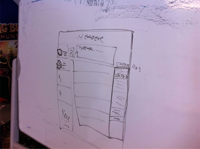
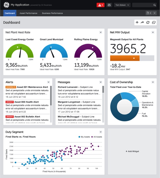
In 2010, I was designing a dashboard for a web app targeted at TheLadders’ recruiter and employer audience. There was a lot of information to fit on one screen and I was struggling to make it all work. Instead of burning too much time at my desk pushing pixels, I grabbed a whiteboard and called the lead developer over. I sketched my original idea about how to lay out all the content and functionality for this dashboard. We discussed it and then I handed him the marker. He sketched his ideas on the same whiteboard. We went back and forth, ultimately converging on a layout and interaction schema that was not only usable but feasible given our two-week sprint timeframes (see Figure 4-2). At the end of that two-hour session, we returned to our desks and started working. I refined our sketch into a more formal wireframe and workflow and he began to write the infrastructure code necessary to get the data we needed to the presentation layer.
We had built a shared understanding through our collaborative design session. We both knew what we were going to build and what it needed to do. We didn’t need to wait to document it. This approach allowed us to get the first version of this idea built within our two-week timeframe.
Design Studio
When your team is comfortable collaborating, informal sessions like the one I’ve just described take place all the time. But sometimes you are going to need to gather everyone for a formal working session. Design Studio is a popular way to do this. Design Studio (sometimes called Design Charrette) is a way to bring a cross-functional team together to visualize potential solutions to a design problem. It breaks down organizational silos and creates a forum for your fellow teammates’ points of view. By putting designers, developers, subject matter experts, product managers, business analysts, and other competencies together in the same space, and focusing them all on the same challenge, you create an outcome far greater than working in silos allows. A Design Studio has another benefit: it starts to build the trust your team will need to move from these formal sessions to more frequent and informal collaborations.
Running a Design Studio
Although the technique described below is very specific, you should feel comfortable to run less or more formal Design Studios as your situation and timing warrants. The specifics of the ritual are not the end goal: instead, you should be aiming to solve problems with your colleagues and clients.
Process
Design Studio follows this path:
Problem definition and constraints
Individual idea generation (diverge)
Presentation and critique
Iterate and refine (emerge)
Team idea generation (converge)
Supplies
Here’s what you’ll need:
Pencils
Pens
Permanent markers (multiple colors/thicknesses)
Highlighters (multiple colors)
Sketching templates (you can use preprinted 1-up and 6-up templates or you can use blank sheets of 11″×17″ paper divided into six boxes)
25″×30.5″ self-stick easel pads
Drafting dots (or any kind of small stickers)
The process works best for a team of five to eight people. If you have more people, create more teams and have the teams compare output at the end of the process.
Problem definition and constraints (15–45 minutes)
The first step in Design Studio is to ensure that everyone is aware of the problem you are trying to solve, the assumptions you’ve declared (including personas, as explained elsewhere in this chapter), the hypotheses you’ve generated, and the constraints within which you are working. This step can be anything from a formal presentation with slides to a group discussion, based on the team’s level of comfort.
Individual idea generation (10 minutes)
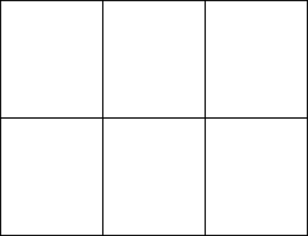
You’ll be working individually in this step. Give each member of the team a 6-up template—a sheet of paper with six empty boxes on it (Figure 4-3). You can make one by folding a blank sheet of 11″×17″ paper (or you can use a preprinted template).
Optional: sometimes, people find they have hard time facing a blank page. If that’s the case, try the following step (5 minutes): ask each person to label each box of his or her sheet with one of your personas and the specific pain point or problem he will be addressing for that persona. Write the persona’s name and pain point at the top of each of the six boxes. Team members can write the same persona/pain point pair as many times as they have solutions for that problem, or they can write a different persona/pain point combination for each box. Any combination works.
Next, with your blank (or optionally labeled) 6-up sheets in front of you, give everyone five minutes to generate six low-fidelity sketches of solutions for each persona/pain point pair on their 6-up. These should be visual articulations (UI sketches, workflows, diagrams, etc.), not written words. Encourage your team by revealing the dirty secret of interaction design to level the playing field: if you can draw a circle, a square, and a triangle, you can draw every interface. I’m confident that everyone on your team can draw those shapes.
Presentation and critique (3 minutes per person)
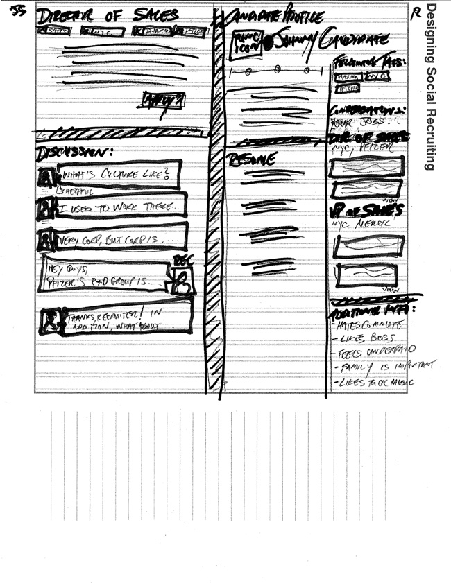
When time is up, share and critique what you’ve done so far (see Figure 4-4). Going around the table, give each participant three minutes to hold up his or her sketches and present them to the team. Presenters should explicitly state for whom they were solving a problem (persona), which pain point they were addressing (hypothesis), then explain the sketch. Each member of the team should provide critique and feedback to the presenter. Critique should focus on clarifying the presenter’s intentions. Questions such as “How does this feature address the persona’s specific problem?” are very helpful. Comments such as “I don’t like that idea” provide little value and don’t give the presenter concrete ideas for iterating.
Make sure that every team member presents and receives critique.
Iterate and refine (5–10 minutes)
Now ask everyone to work individually once more. Ask each participant to take his or her original six ideas and, using the critique they just received, to refine their thinking into one big idea on a single sheet of 11″×17″ paper. The goal here is to pick the idea that has the most merit and develop a more evolved version of that idea.
Once time is up, ask the team to go through the present and critique process again.
Team idea generation (45 minutes)
Now that everyone on the team has feedback on his or her individual idea, the team must converge on one idea. In this step, the team is trying to converge on the idea they feel has the biggest chance for success. This idea will serve as the basis for the next step in the Lean UX process: creating an MVP and running experiments (both covered in the next chapter).
Ask the team to use a large 2′×3′ self-stick easel pad or a whiteboard to sketch the components and workflow for their idea. There will be a lot of compromise and wrangling at this stage; to get to consensus, the team will need to prioritize and pare back features. Encourage the team to create a “parking lot” for good ideas that don’t make the cut, which will make it easier to let go of ideas.
If you have multiple teams in the design studio, ask each team to present their final idea to the room when they are finished for one final round of critique and feedback.
The artifacts created in the design studio are now used to create refined wireframes, prototypes, and early code that will drive the team forward in proving their hypotheses.
Style Guides
One tool that makes collaborative design easier is the style guide. A style guide is a broadly accepted pattern library that codifies the interactive, visual, and copy elements of a user interface and system. Style guides (also known as pattern libraries) are a living collection of all of your product’s customer-facing components. If it’s made of pixels, it goes in the style guide. Headers, footers, grids, forms, labels, button logic, and everything else that goes into your product’s user experience goes in the style guide.
Some companies use wikis for their style guides, which allows the collection to stay current and accessible to everyone on the team. Other teams choose to create “live” style guides. These are repositories of front-end code and design that not only define how the product looks and behaves, but actually function as the underlying markup and stylesheets for that experience. If you change the style guide, you change the product.
Style guides create efficiency. They provide a repository of ready-to-go, approved interface components that can be assembled and aligned to form a workflow. By minimizing debate over mundane elements like the placement of labels in forms or the never-ending debate over left/right placement of the “positive” action button, developers can get started creating core UI components without waiting for a designer to define and specify these assets. The assets are already designed, defined, and collected in one place.
Interaction and visual designers benefit as well. They no longer have to recreate representations of experiences that already exist. They become free to focus on new design challenges—novel interaction problems or extending the visual system to new elements. Approval cycles are streamlined because the repetitive elements (e.g., the treatment of the global navigation) are no longer up for debate. Reviews become more focused on the core product challenge and broader views of the proposed solution.
Creating a Style Guide
There are two basic approaches to creating a style guide:
- Big bang
In this approach, your team takes a limited amount of time (e.g., one to two weeks or sometimes months) away from their current efforts to document all of your product’s UI elements in a style guide. The benefit here is that the style guide gets created in a relatively short amount of time. The negative is that your team is not learning anything new about your product during this time.
- Slow drip
In this approach, your team adds an element to the style guide each time they create or change one for the project. The biggest benefit here is that the team continues to work on the project. However, the drawback is that the style guide is rarely completed and therefore fails to provide some of the efficiencies that a complete one does.
Maintaining a Style Guide
When planning your style guide, it’s important to plan for maintenance. You’re going to need to create a process and dedicate people to keeping your style guide up to date. Think of a style guide as a living process that you launch and maintain, rather than a static thing you create. When you have an up-to-date and easy-to-use style guide, you make it easy for the team to actually use the style guide—and your goal should be to make it easier to use the style guide than to avoid it. You want to make compliance easy! So plan to dedicate people and time to keeping your style guide current.
Case Study
In this case study, we’ll look at how the UX team at General Electric (GE) created an enterprise-grade style guide.
When Greg Petroff took the helm of GE’s global UX practice in late 2011, he inherited a globally distributed team struggling to bring great product experiences to one of the world’s largest organizations. As it turns out, GE is the fourteenth-largest producer of software in the world, creating systems to monitor, manage, and understand the industrial equipment they build. With 500 developers for every designer, the team found it challenging to achieve the desired design results to satisfy the organization’s massive demands. Hiring more designers was not an option, and broad corporate advocacy for increased consideration of UX design methods would change cultural foundations—including processes, values, communications practices, attitudes, and assumptions—too slowly. In addition, the newly minted UX Center of Excellence quickly found itself overwhelmed by requests for work. Reviewing every UX project that came through the company had turned them into the bottleneck they were seeking to remove.
There had to be a better way. The team initially tried to build a company-wide UX community through a centralized social networking platform. Although that approach began to build camaraderie, it didn’t do enough to socialize a consistent design aesthetic or enable development teams without UX capability to do good work.
After running a few pilot projects across several business lines, Petroff’s team quickly noticed recurring use cases, personas, and design patterns. With individual business lines focused on their business needs and not on the whole, there was naturally a tremendous amount of duplicative work being done at GE, as each separate organization recreated similar elements over and over. Worse, the quality of that work had not progressed to what smartphone customers were starting to demand. GE’s method was not only inefficient, it was also increasing the amount of time each project took to reach market. And when projects did reach market, the experiences across GE business lines were disparate and inconsistent.
The team brainstormed over the course of a week and came up with a straw man of what a social environment for consistent UX guidelines would look like. Their target audience was GE’s 8,000 software engineers worldwide. The team realized that by empowering the developers with templates, guidelines, assets, and code snippets, they could take great UX into their own hands without waiting for design assistance or approval.
With that initiative, the Industrial Internet Design System (IIDS) was born. The straw man was greenlighted by management and was implemented over the summer of 2012.
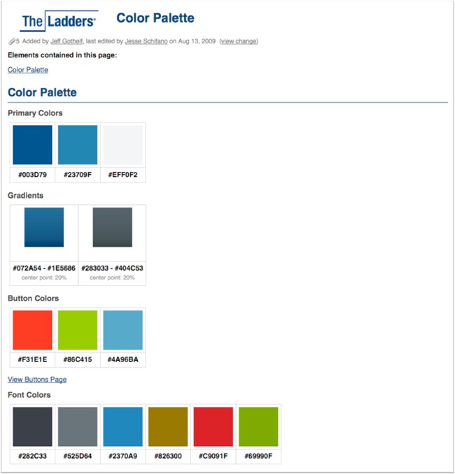
The IIDS is based on modern HTML5 frameworks such as Bootstrap, jQuery, and others, but looks nothing like them (see Figure 4-5 and Figure 4-6). It is a branded, functional UI design pattern library. It provides the graphical assets, code snippets, and usage rules for each of GE’s templated product experiences. The team also built example applications to aid other teams in the composition of applications. The IIDS also includes typical customer personas so that project teams can get a clear sense of their target customers and how the intended customer affects the design pattern choices they make.
Petroff’s team identified two distinct audiences for the IIDS. The first was developers at GE who need the assets to build sites and products. The second was made up of the program managers and owners who need to decide what kind of application to create. The IIDS serves both communities well, with positive feedback coming in regularly, usage statistics skyrocketing, and project-success metrics going up and to the right.
The IIDS is empowering teams seeking to become more agile and dip their toes into Lean Startup. It allows project teams to build prototypes of experiences far faster than ever before. These prototypes reach the validation stages months earlier than projects in the past, allowing the teams to prove their worth well in advance of heavy back-end integration. Average project lifecycles have been shortened by as much as six months with rough estimated resource-usage savings in the millions per year.
Most importantly, all the teams at GE are now empowered to get to a clickable version of their experience in days instead of months. They are able to bring these ideas to internal stakeholders and external customers well before committing further resources. In addition, the teams are far better equipped to judge how successful a new product release will be. The waste that once plagued the product design cycle in GE is slowly being alleviated through the ever-improving resources available in the IIDS.
What Goes Into a Style Guide?
If it’s made of pixels, it goes into the style guide. All interaction design elements should be defined and added to the style guide. Use design patterns that work well in your existing product as the baseline of your style guide. Form fields, labels, drop-down menus, radio button placement and behavior, Ajax and jQuery events, buttons—all should be included in the style guide.
Provide three data points for each interaction design element:
- What the element looks like
Include detail about the minimum and maximum sizes of the element, vertical and horizontal constraints, and any styling demands on the element.
- Where it’s usually placed on the screen
Make it clear if an element should be consistently placed in certain areas of the screen as well as any exceptions that may negate this design pattern.
- When it should be used
It’s imperative that your team knows when to use a drop-down menu rather than a radio button and other factors that would determine the selection of one UI element over another.
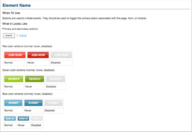
Next, include all visual design elements. Start with the general color palette of your product. Ensure that each primary color is available with hex values as well as complementary and secondary color choices. If certain elements, such as buttons, have different colors based on state, ensure that this information is included. Other elements to include here are logos, headers, footers, grid structures, and typographical choices (i.e., which fonts to use where and at what size/weight). The same attributes of what, where, and when provided for interaction design elements should also be included here.
Finally, ensure that copywriting styles are codified as well. Capture the tone of your brand, specific words you will and won’t use, grammatical choices, tolerated (and not tolerated) colloquialisms, along with button language (OK? Yes? Go? etc.) and other navigation language (previous/next, more/less, etc.).
Characteristics of a Successful Style Guide
A successful style guide has three important characteristics: it’s accessible, it’s continually improved (a.k.a. a living document), and it’s actionable.
Accessible
Accessibility means that the style guide is available to everyone in your organization. Accessible style guides are:
- Easily found
Use a memorable URL and ensure that everyone is aware of it.
- Easily distributed
Ensure that your teams can access the style guides at their convenience (in the office, out of the office, on mobile, etc.).
- Easy to search
A comprehensive and accurate search feature in the style guide greatly increases its usage.
- Easy to use
Treat this as you would any other design project. If it’s not usable, it will go unused very quickly.
Continually improved
The style guide should be considered a living document. Yes, the elements within it ensure a consistent experience for your customers, but your product (and your customers) will evolve. The style guide should be malleable enough to add these updates easily. In addition, as your designers create new elements, they will demand an easy way to add them to the style guide.
I recommend using a wiki. Here’s why:
Wikis are familiar places for developers. This means that getting your teammates in engineering to participate in this tool will not involve forcing them to learn a new tool or one that was purpose-built only for designers.
Wikis keep revision histories (good ones do, anyway). This practice is crucial because there will be times when you want to roll back updates to the UI. Revision histories keep you from having to recreate previous states of the style guide.
Wikis keep track of who changed what and provide commenting functionality. This feature is ideal for keeping a trail of what decisions were made, who made them, and the rationale for and even the discussion about making that change. As you bring on board new team members, this type of historical capture can bring them up to speed much faster. In other words, wikis are your documentation.
Actionable
Your style guide is not just a library or museum for interaction components. It should be a “widget factory” that can produce any interface element on demand. As each new element is added to the style guide, make it available for download in whatever formats your team will need. Ensure that not only the code is available but the graphical and wireframe assets as well. Doing so allows every designer to have a full palette of interface elements with which to create prototypes at any given time.
How Do You Create a Style Guide?
There are two parts to creating a style guide:
Create a table of contents (TOC)—the TOC determines how your style guide will be structured and provides buckets into which you can start dropping design elements. Separate your TOC into interaction design, visual design, copywriting, branding guidelines, accessibility needs, and any other high-level sections that make sense for your business.
Populate the content—As mentioned earlier, there are two ways to go about this: the big bang approach and the slow drip.
The big bang approach (in which your team creates the entire style guide in advance of any project) works well if you have a young product or a relatively simple one.
The slow drip approach works well if you have a legacy or complex product.
Maintaining a Style Guide
Your style guide must stay current if it’s to stay relevant and useful. Add new experiences as they’re created and remove outdated features as they are deprecated.
Assign an owner to the style guide. That person need not be singlehandedly responsible for the creation of content in the style guide itself, but he or she should be responsible for ensuring the current state of the guide. Your style guide curator should reach out to content creators and ensure that elements are entered as they are created. In essence, this person functions as the editor of the pattern library. It’s a less than enviable position, so consider rotating this role on a regular basis every three months.
Not Just for Designers
Your style guide should not contain information relevant only to designers. It must house code snippets as well. Developers then have a one-stop shop for getting all their design direction as well as foundational pieces of code that will get them to some kind of experience exponentially faster than before.
A Word about Live Style Guides
Teams working on the Web have recently begun taking a new approach to style guides—the live style guide. Essentially, these are identical to wiki-based style guides, with one fundamental difference: the code in a live style guide is the same code the application uses. Teams gain efficiencies from this approach but take on some additional infrastructure and process burden.
Live style guides are basically a portion of your product that is visible only to the product team. It is a portion of your application that generates a “one of each” page that displays all the styles and widgets being used on the site. It has the advantage of being much closer to self-maintaining.
As you make changes to the underlying HTML and CSS of your site, these changes are displayed in the style guide pages. Someone still needs to pay attention to this page to make sure it’s curated and maintained and that conflicts are resolved. But the movement toward a self-documented application is exciting and holds tremendous promise.
Collaborating with Geographically Distributed Teams
Physical distance is one of the biggest challenges to strong collaboration. Some of the methods I’ve discussed in this chapter—especially Design Studio—become harder when a team isn’t all in the same location. But you can still find ways to collaborate.
Here are some techniques that can help bridge the distance for geographically distributed teams. Tools such as Skype, Google Docs (including Google Draw), wikis, and a phone with a camera make cross-time-zone collaboration effective and allow teams to feel virtually connected for long periods of time during the day.
Worldwide Collaborative Design Session
Geographically distributed teams make collaborative design more difficult. But the benefits are worth the extra effort. Let’s take a look at how one team with whom I worked overcame a continent-wide separation and designed solutions together.
This team was divided into two groups in two cities: the product and user experience team was in New York and the development team was in Vancouver. My goal was to run a Design Studio and affinity mapping session with the whole team.
Setup
We asked the two groups to gather in their individual conference rooms with their own laptops. Each conference room had a Mac in it with a location-specific Skype account (i.e., it wasn’t a specific individual’s account, it was that office’s account). The two offices connected to each other via their office Skype accounts so that we could see each other as a group. This step was critical, as it was the closest we could get to physically being in the same room.
We prepared a very brief setup presentation (about 10 slides) that explained the problem statement we were tackling. It included customer testimonials, data, and a very brief recap of our customers’ needs. The presentation also included the constraints of the solution space.
Priming the pump with affinity mapping
We kicked things off with an affinity mapping exercise. Typically these are done with sticky notes and a whiteboard. In this case, we used a shared Google Docs spreadsheet to conduct the exercise. We asked everyone in both offices to sign in to the shared spreadsheet. The spreadsheet itself had a column labeled for each person. Google Docs allows multiple editors to work in the same document. In this case, we had eight team members in the document at the same time!
We asked the team to come up with as many ideas as they could think of to solve the problem we presented. Each team member wrote one idea per cell in the column marked with his or her name. We gave them five minutes to generate as many ideas as they could.
In order to make sure that everyone in each location was aware of all of the proposals, we next asked each team member to read his or her ideas to the distributed team. Some ideas went by quickly and others generated more discussion.
To simulate affinity grouping in the shared spreadsheet, the facilitator (me, in this case) began a second sheet in the document using a personal laptop. I created some initial column headers in the second sheet that reflected themes I was hearing as the group read their ideas.
Then I asked the team to take each idea and copy it into the matching theme on the second sheet. If it didn’t fit, I asked them to create their own theme. I also encouraged them to change the wording of the themes as we went along if they felt the theme name was either not representative or misleading.
At the end of this process, we had a spreadsheet filled with ideas that were sorted into themes. Some themes had just a pair of ideas; others had as many as eight.
Design Studio with remote teams
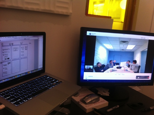
To set up for the next step, a Design Studio session, we tried to mimic a co-located version of the activity as much as possible. We distributed paper and pens to each location. We created a dual-monitor setup in each conference room so that each room would be able to see the sketches on one monitor while still being able to see their teammates via Skype on the second monitor (as shown in Figure 4-10). We asked each team to use an iPhone to photograph their sketches and email them to everyone else. This setup helped connect the dialog and the artifacts to the conversation.
After that initial setup, we were able to proceed with the Design Studio process as usual. Each team member was able to present his or her ideas to both rooms and to receive transcontinental critique. The two teams were able to refine their ideas together and were eventually able to converge on one idea to take forward.
Wrapping Up: Collaborative Design
Collaborative design is the evolution of UX. In this chapter, I discussed how “open sourcing” the design process brings the entire team deeper into the project. I talked about how the low-fidelity drawings created in Design Studio sessions can help teams generate many ideas and then converge on a set the entire team can get behind. I showed you practical techniques that you can use to create shared understanding, the fundamental currency of Lean UX. Using tools such as style guides, Design Studio, and simple conversation, your team members can build a shared understanding that allows them to move forward at a much faster pace than in traditional environments.
Now that all of our assumptions are declared and our design hypotheses created, you can really get into the learning process. In the next chapter, I cover the Minimum Viable Product (MVP) and how to use it to plan experiments. We’ll use those experiments to test the validity of our assumptions and decide how to move forward with our project.
Get Lean UX now with the O’Reilly learning platform.
O’Reilly members experience books, live events, courses curated by job role, and more from O’Reilly and nearly 200 top publishers.

