jQuery Mobile started in August 2010 as a modern framework, including many patterns and best practices for multiplatform development. The main features of the framework are:
Cross platform, cross device, and cross browser
UI optimized for touch devices
Themeable and customizable design
Usage of nonintrusive semantic HTML5 code only, without the need of any JavaScript, CSS, or API knowledge
AJAX calls automatically to load dynamic content
Built on the well-known and supported jQuery core
Lightweight size, 12Kb compressed
Progressive enhancement
Accessibility support
Weâve already discussed some of these features. Letâs deeply analyze others.
I know you are hungry: you need to see some code. Here you have it. jQuery Mobile creates webapps from standard and semantic HTML5, perfectly suitable for search engine optimization (SEO) and web performance optimization (WPO) purposes:
<!DOCTYPE html>
<html>
<head>
<meta charset="utf-8" />
<title>My first jQuery Mobile code</title>
<link rel="stylesheet" href="http://code.jquery.com/mobile/1.0/jquery.mobile-
1.0.min.css" />
<script src="http://code.jquery.com/jquery-1.6.4.min.js"></script>
<script type="text/javascript" src="http://code.jquery.com/mobile/1.0/
jquery.mobile-1.0.min.js"></script>
<meta name="viewport" content="width=device-width, initial-scale=1">
</head>
<body>
<div data-role="page" data-theme="a">
<div data-role="header">
<h1>jQuery Mobile</h1>
</div>
<div data-role="content">
<ul data-role="listview" data-inset="true" data-divider-theme="b">
<li data-role="list-divider">Summary</li>
<li><a href="ch1.html">The Platform</a></li>
<li><a href="cap2.html">The Page</a></li>
<li><a href="cap3.html">Lists</a></li>
<li><a href="cap4.html">Components</a></li>
</ul>
<ul data-role="listview" data-inset="true" data-divider-theme="d">
<li data-role="list-divider">Links</li>
<li><a href="http://www.mobilexweb.com">Mobile Web Blog</a></li>
<li><a href="http://www.oreilly.com">O'Reilly Media</a></li>
</ul>
</div>
<div data-role="footer">
<h4>© 2011 Maximiliano Firtman @firt</h4>
</div>
</div>
</body>
</html>You can see in Figure 1-6 how this sample renders on many mobile browsers, including non-jQuery Mobile compatible ones, as in Figure 1-7. As you can see, there is no JavaScript code there for initialization or any other stuff. Just some JavaScript includes.
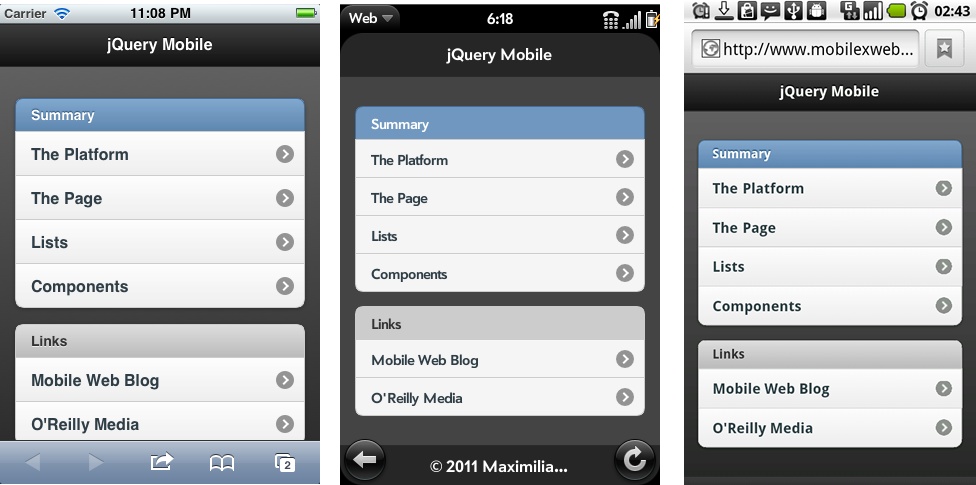
Figure 1-6. How our first simple jQuery Mobile code looks on different devices: iOS, webOS, and Android
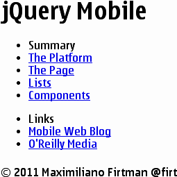
Figure 1-7. On noncompatible browsers, jQuery Mobile falls back to a simple, fully functional HTML file
Be patient, we will start analyzing the jQuery code in the following chapters.
Progressive enhancement is a simple but very powerful technique used in web design that defines layers of compatibility that allow any user to access the basic content, services, and functionality of a website, while providing an enhanced experience for browsers with better support of standards. jQuery Mobile is totally built using this technique.
The term progressive enhancement was coined by Steven Champeon in 2003 (http://www.hesketh.com), and while this approach wasnât defined for the mobile web specifically, it is perfect for mobile web design.
Progressive enhancement has the following core principles:
Basic content is accessible to all browsers.
Basic functionality is accessible to all browsers.
Semantic markup contains all content.
Enhanced layout is provided by externally linked CSS.
Enhanced behavior is provided by unobtrusive, externally linked JavaScript.
End user browser preferences are respected.
This list sounds like jQuery Mobileâs feature list, doesnât it? Thatâs right. A jQuery Mobile application will also works on a very basic browser without CSS or JavaScript support. And that is a great feature for a mobile webapp.
From Wikipedia:
Web accessibility refers to the inclusive practice of making websites usable by people of all abilities and disabilities. When sites are correctly designed, developed, and edited, all users can have equal access to information and functionality.
Web accessibility inside mobile browsers has just begun; however, jQuery Mobile is now fully compatible with W3Câs WAI-ARIA specification on compatible browsers (http://www.w3.org/TR/wai-aria/). At the time of this writing, only iOS 4.0 or higher is compatible with this specification with the feature called VoiceOver.
Therefore, a jQuery Mobile webapp will provide an accessible experience to users with visual disabilities on iPhone, iPod, and iPad.
Get jQuery Mobile: Up and Running now with the O’Reilly learning platform.
O’Reilly members experience books, live events, courses curated by job role, and more from O’Reilly and nearly 200 top publishers.

