Chapter 8. Axes
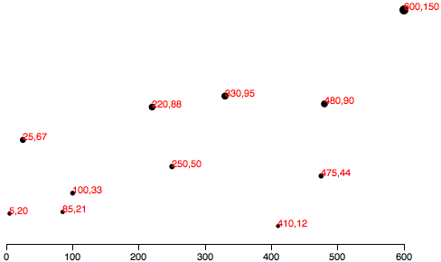
Having mastered the use of D3 scales, we now have the scatterplot shown in Figure 8-1.
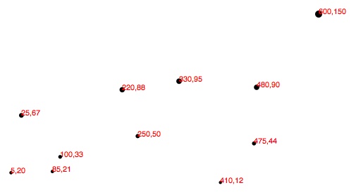
Let’s add horizontal and vertical axes, so we can do away with the horrible red numbers cluttering up our chart.
Introducing Axes
Much like its scales, D3’s axes are actually functions whose parameters you define. Unlike scales, when an axis function is called, it doesn’t return a value, but generates the visual elements of the axis, including lines, labels, and ticks.
Note that the axis functions are SVG-specific, as they generate SVG elements. Also, axes are intended for use with quantitative scales (as opposed to ordinal ones).
Setting Up an Axis
Use d3.svg.axis() to create a generic axis function:
varxAxis=d3.svg.axis();
At a minimum, each axis also needs to be told on what scale to
operate. Here we’ll pass in the xScale from the scatterplot code:
xAxis.scale(xScale);
We can also specify where the labels should appear relative to the axis
itself. The default is bottom, meaning the labels will appear below
the axis line. (Although this is the default, it can’t hurt to specify
it explicitly.) Possible orientations for horizontal axes are top and
bottom. For vertical axes, use left and right:
xAxis.orient("bottom");
Of course, we can be more concise and string all this together into one line:
varxAxis=d3.svg.axis().scale(xScale).orient("bottom");
Finally, to actually generate the axis and insert all those little lines
and labels into our SVG, we must call the xAxis function. This is
similar to the scale functions, which we first configured by setting
parameters, and then later called, to put them into action.
I’ll put this code at the end of our script, so the axis is generated after the other elements in the SVG, and therefore appears “on top”:
svg.append("g").call(xAxis);
This is where things get a little funky. You might be wondering why this
looks so different from our friendly scale functions. Here’s why: because
an axis function actually draws something to the screen (by appending
SVG elements to the DOM), we need to specify where in the DOM it
should place those new elements. This is in contrast to scale functions
like xScale(), for example, which calculate a value and return those
values, typically for use by yet another function, without impacting the
DOM at all.
So what we’re doing with the preceding code is to first reference svg, the
SVG image in the DOM. Then, we append() a new g element to the end
of the SVG. In SVG land, a g element is a group element. Group
elements are invisible, unlike line, rect, and circle, and they
have no visual presence themselves. Yet they help us in two ways: first,
g elements can be used to contain (or “group”) other elements, which
keeps our code nice and tidy. Second, we can apply transformations to
g elements, which affects how visual elements within that group (such
as lines, rects, and circles) are rendered. We’ll get to
transformations in just a minute.
So we’ve created a new g, and then finally, the function call() is
called on our new g. So what is call(), and who is it calling?
D3’s call()
function takes the incoming selection, as received from the prior link in the chain, and hands that selection off to any function. In this case, the selection is our new g group element. Although the g isn’t strictly necessary, we are using it because the axis function is about to generate lots of crazy lines and numbers, and it’s nice to contain all those elements within a single group object. call() hands off g to the xAxis function, so our axis is generated within g.
If we were messy people who loved messy code, we could also rewrite the preceding snippet as this exact equivalent:
svg.append("g").call(d3.svg.axis().scale(xScale).orient("bottom"));
See, you could cram the whole axis function within call(), but it’s
usually easier on our brains to define functions first, then call them
later.
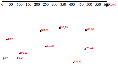
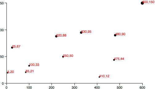
In any case, Figure 8-2 shows what that looks like. See code example 01_axes.html.
Cleaning It Up
Technically, that is an axis, but it’s neither pretty nor useful. To
clean it up, let’s first assign a class of axis to the new g
element, so we can target it with CSS:
svg.append("g").attr("class","axis")//Assign "axis" class.call(xAxis);
Then, we introduce our first CSS styles, up in the <head> of our page:
.axispath,.axisline{fill:none;stroke:black;shape-rendering:crispEdges;}.axistext{font-family:sans-serif;font-size:11px;}
See how useful it is to group all the axis elements within one g
group? Now we can very easily apply styles to anything within the group
using the simple CSS selector .axis. The axes themselves are made up of
path, line, and text elements, so those are the three elements
that we target in our CSS. The paths and lines can be styled with
the same rules, and text gets its own rules around font and font
size.
You might notice that when we use CSS rules to style SVG elements, only
SVG attribute names—not regular CSS properties—should be used. This
is confusing, because many properties share the same names in both CSS
and SVG, but some do not. For example, in regular CSS, to set the color
of some text, you would use the color property, as in:
p{color:olive;}
That will set the text color of all p paragraphs to be olive. But
try to apply this property to an SVG element, as with:
text{color:olive;}
and it will have no effect because color is not a property recognized
by SVG. Instead, you must use SVG’s equivalent, fill:
text{fill:olive;}
If you ever find yourself trying to style SVG elements, but for some reason the stupid CSS code just isn’t working, I suggest you take a deep breath, pause, and then review your property names very closely to ensure you’re using SVG names, not CSS ones. (You can reference the complete SVG attribute list on the MDN site.)
The
shape-rendering property is another weird SVG attribute you should
know. We use it here to make sure our axis and its tick mark lines are
pixel-perfect. No blurry axes for us!
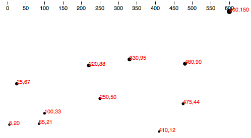
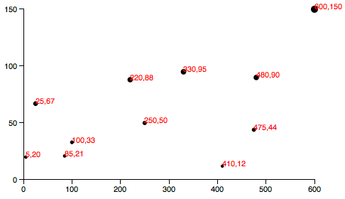
The chart looks like Figure 8-3 after our CSS clean-up.
That’s better, but the top horizontal line of the axis is cut off, and
the axis itself should be down at the base of the chart anyway. Here’s
where SVG transformations come in. By adding one line of code, we can
transform the entire axis group, pushing it to the bottom:
svg.append("g").attr("class","axis").attr("transform","translate(0,"+(h-padding)+")").call(xAxis);
Note that we use attr() to apply transform as an attribute of g.
SVG
transforms are quite powerful, and can accept several different kinds
of transform definitions, including scales and rotations. But we are
keeping it simple here with only a translation transform, which simply
pushes the whole g group over and down by some amount.
Translation transforms are specified with the easy syntax of
translate(x,y), where x and y are, obviously, the number of
horizontal and vertical pixels by which to translate the element. So, in
the end, we would like our g to look like this in the DOM:
<gclass="axis"transform="translate(0,280)">
As you can see, the g.axis isn’t moved horizontally at all, but it is
pushed 280 pixels down, conveniently to the base of our chart. We
specify as much in this line of code:
.attr("transform","translate(0,"+(h-padding)+")")
Note the use of (h - padding), so the group’s top edge is set to h,
the height of the entire image, minus the padding value we created
earlier. (h - padding) is calculated to be 280, and then connected
to the rest of the string, so the final transform property value is
translate(0,280).
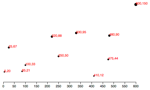
The result in Figure 8-4 is much better! Check out the code so far in 02_axes_bottom.html.
Check for Ticks
Some ticks spread disease, but
D3’s
ticks communicate information. Yet more ticks are not necessarily
better, and at a certain point, they begin to clutter your chart. You’ll
notice that we never specified how many ticks to include on the axis,
nor at what intervals they should appear. Without clear instruction, D3
has automagically examined our scale xScale and made informed
judgments about how many ticks to include, and at what intervals (every
50, in this case).
As you would expect, you can customize all aspects of your axes,
starting with the rough number of ticks, using ticks():
varxAxis=d3.svg.axis().scale(xScale).orient("bottom").ticks(5);//Set rough # of ticks
See 03_axes_clean.html for that code.
You’ll notice in Figure 8-5 that, although we specified only five ticks, D3 has
made an executive decision and ordered up a total of seven. That’s
because D3 has got your back, and figured out that including only five
ticks would require slicing the input domain into less-than-gorgeous
values—in this case, 0, 150, 300, 450, and 600. D3 inteprets the
ticks() value as merely a suggestion and will override your
suggestion with what it determines to be the most clean and
human-readable values—in this case, intervals of 100—even when that
requires including slightly more or fewer ticks than you requested. This
is actually a totally brilliant feature that increases the scalability
of your design; as the dataset changes and the input domain expands or
contracts (bigger numbers or smaller numbers), D3 ensures that the tick
labels remain easy to read.
Y Not?
Time to label the vertical axis! By copying and tweaking the code we
already wrote for the xAxis, we add this near the top of of our code:
//Define Y axisvaryAxis=d3.svg.axis().scale(yScale).orient("left").ticks(5);
and this, near the bottom:
//Create Y axissvg.append("g").attr("class","axis").attr("transform","translate("+padding+",0)").call(yAxis);
Note in Figure 8-6 that the labels will be oriented left and that the yAxis group
g is translated to the right by the amount padding.
This is starting to look like a real chart! But the yAxis labels are
getting cut off. To give them more room on the left side, I’ll bump up
the value of padding from 20 to 30:
varpadding=30;
Of course, you could also introduce separate padding variables for
each axis, say xPadding and yPadding, for more control over the
layout.
See the updated code in 04_axes_y.html. It looks like Figure 8-7.
Final Touches
I appreciate that so far you have been very quiet and polite, and not at all confrontational. Yet I still feel as though I have to win you over. So to prove to you that our new axes are dynamic and scalable, I’d like to switch from using a static dataset to using randomized numbers:
//Dynamic, random datasetvardataset=[];varnumDataPoints=50;varxRange=Math.random()*1000;varyRange=Math.random()*1000;for(vari=0;i<numDataPoints;i++){varnewNumber1=Math.floor(Math.random()*xRange);varnewNumber2=Math.floor(Math.random()*yRange);dataset.push([newNumber1,newNumber2]);}
This code initializes an empty array, then loops through 50 times,
chooses two random numbers each time, and adds (“pushes”) that pair of
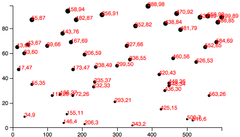
values to the dataset array (see Figure 8-8).
Try out that randomized dataset code in 05_axes_random.html. Each time you reload the page, you’ll get different data values. Notice how both axes scale to fit the new domains, and ticks and label values are chosen accordingly.
Having made my point, I think we can finally cut those horrible, red labels, by commenting out the relevant lines of code.
The result is shown in Figure 8-9. Our final scatterplot code lives in 06_axes_no_labels.html.
Formatting Tick Labels
One last thing: so far, we’ve been working with integers—whole numbers—which are nice and easy. But data is often messier, and in those
cases, you might want more control over how the axis labels are formatted.
Enter
tickFormat(),
which enables you to specify how your numbers should be formatted. For
example, you might want to include three places after the decimal point,
or display values as percentages, or both.
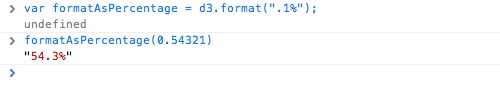
To use tickFormat(), first define a new number-formatting function.
This one, for example, says to treat values as percentages with one
decimal point precision. That is, if you give this function the number
0.23, it will return the string 23.0%. (See
the
reference entry for d3.format() for more options.)
varformatAsPercentage=d3.format(".1%");
Then, tell your axis to use that formatting function for its ticks, for example:
xAxis.tickFormat(formatAsPercentage);
Tip
I find it easiest to test these formatting functions out in the JavaScript console. For example, just open any page that loads D3, such as 06_axes_no_labels.html, and type your format rule into the console. Then test it by feeding it a value, as you would with any other function.
You can see in Figure 8-10 that a data value of 0.54321 is converted to 54.3% for display purposes—perfect!
You can play with that code in 07_axes_format.html. Obviously, a percentage format doesn’t make sense with our scatterplot’s current dataset, but as an exercise, you could try tweaking how the random numbers are generated, to make more appropriate, non-whole number values, or just experiment with the format function itself.
Get Interactive Data Visualization for the Web now with the O’Reilly learning platform.
O’Reilly members experience books, live events, courses curated by job role, and more from O’Reilly and nearly 200 top publishers.

