Chapter 4. The Anatomy of an Information Architecture
In the preceding chapters, we discussed information architecture from a conceptual perspective. This chapter presents a more concrete view of what information architecture actually is to help you recognize it when you see it. We also introduce the components of an architecture; these are important to understand because they make up the information architect’s palette. We’ll cover them in greater detail in Chapters 5–9.
Visualizing Information Architecture
Why is it important to be able to visualize information architecture? There are several answers. One is that the field is new, and many people don’t believe that things exist until they can see them. Another is that the field is abstract, and many who might conceptually understand the basic premise of information architecture won’t really “get it” until they see it and experience it. Finally, a well-designed information architecture is invisible to users (which, paradoxically, is quite an unfair reward for IA success).
IA’s lack of tangible qualities forces all information architects to be salespeople to some degree. Because it’s highly probable that you’ll need to explain information architecture to several important people, including colleagues, managers, prospects, clients, and perhaps your significant other, it’s in your interest to be able to help them visualize what an information architecture actually is.
Let’s start by looking at a site’s main page. Figure 4-1 shows the main page for Gustavus Adolphus College in Saint Peter, Minnesota, USA.
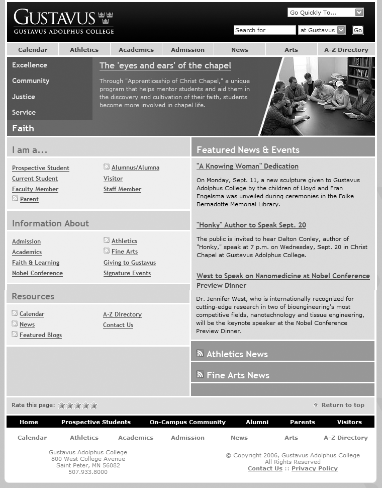
What’s obvious here? Most immediately, you see that the site’s visual design stands out. You can’t help but notice the site’s colors (you’ll have to take our word for it), typeface choices, and images. You also notice aspects of the site’s information design; for example, the number of columns—and their widths—changes throughout the page.
What else? With a careful eye, you can detect aspects of the site’s interaction design, such as the use of mouseovers (over main menu choices) and pull-down menus for “Go Quickly To” and search options. Although the college’s logo and logotype are prominent, the site relies on textual content (e.g., “Excellence,” “Community,” and so forth) to convey its message and brand. And although this particular site functions well, you’d learn something about its supporting technology (and related expertise) just from the main page—for example, if it didn’t load properly in a common browser, you might guess that the designers weren’t aware of or concerned with standards-compliant design.
Thus far, we’ve noticed all sorts of things that aren’t information architecture. So what is recognizable as information architecture? You might be surprised by how much information architecture you can see if you know how to look. For example, the information has been structured in some basic ways, which we’ll explain in later chapters:
- Organization systems
Present the site’s information to us in a variety of ways, such as content categories that pertain to the entire campus (e.g., the top bar and its “Calendar” and “Academics” choices), or to specific audiences (the “I am a...” area, with such choices as “Prospective Students” and “Staff Member”).
- Navigation systems
Help users move through the content, such as the “A–Z Directory” and the “Go Quickly To...” menu of popular destinations.
- Search systems
Allow users to search the content. Here, the default is set to search the Gustavus site, but one could also search the Gustavus calendar, its directory, or the whole web from the site’s search interface.
- Labeling systems
Describe categories, options, and links in language that (hopefully) is meaningful to users; you’ll see examples throughout the page, some (e.g., “Admission”) more understandable than others (“Nobel Conference”).
Figure 4-2 provides a visualization of these architectural components.
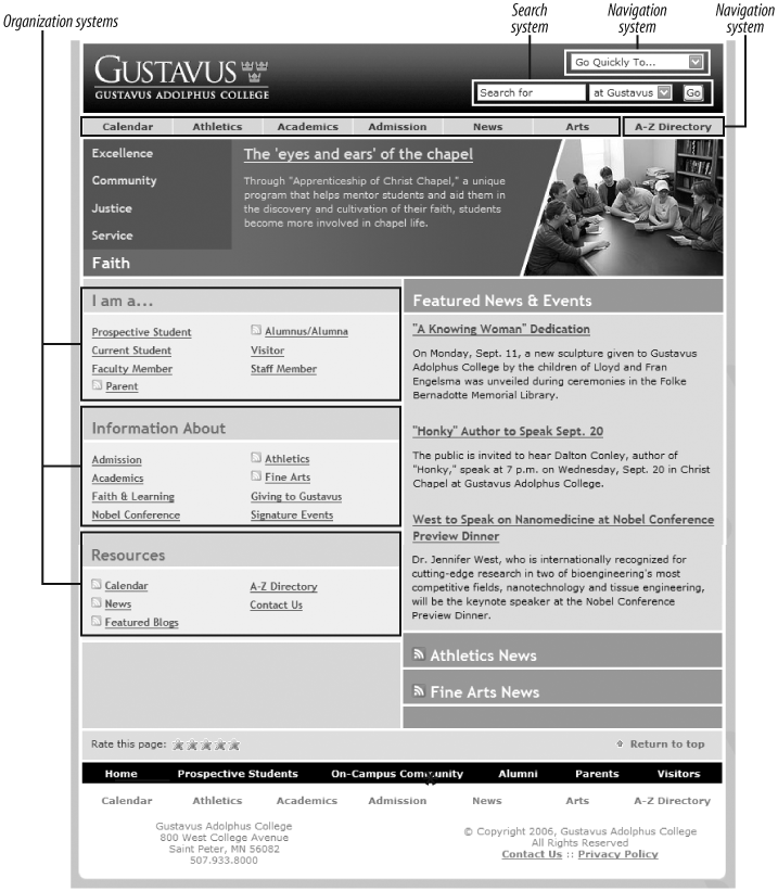
As we can see from this figure and from Figure 4-3, these areas are just the tip of the iceberg. Categories group pages and applications throughout the site; labels systematically represent the site’s content; navigation systems and a search system can be used to move through the site. That’s quite a lot of information architecture to cram into one screenshot!
In effect, the Gustavus main page tries to anticipate users’ major information needs, such as “How do I find out about admissions?” or “What’s going on this week on campus?” The site’s information architects have worked hard to determine the most common questions, and have designed the site to meet those needs. We refer to this as top-down information architecture, and the Gustavus main page addresses many common “top-down” questions that users have when they land on a site, including:
Where am I?
I know what I’m looking for; how do I search for it?
How do I get around this site?
What’s important and unique about this organization?
What’s available on this site?
What’s happening there?
Do they want my opinion about their site?
How can I contact a human?
What’s their address?
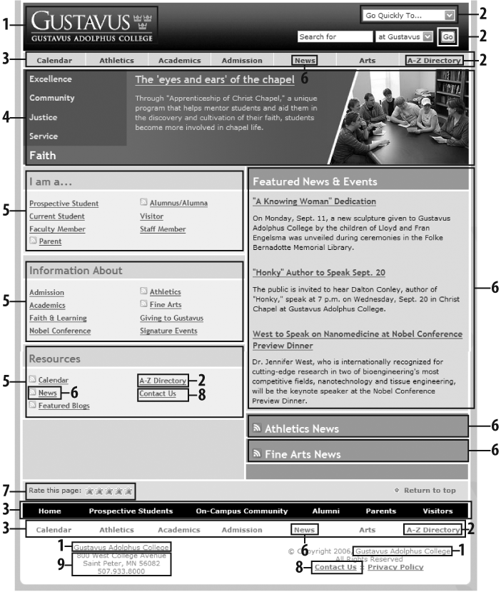
Figure 4-4 shows a slightly different example—pages tagged by one of the authors as relevant to enterprise user experience in del.icio.us, a social bookmarking service.
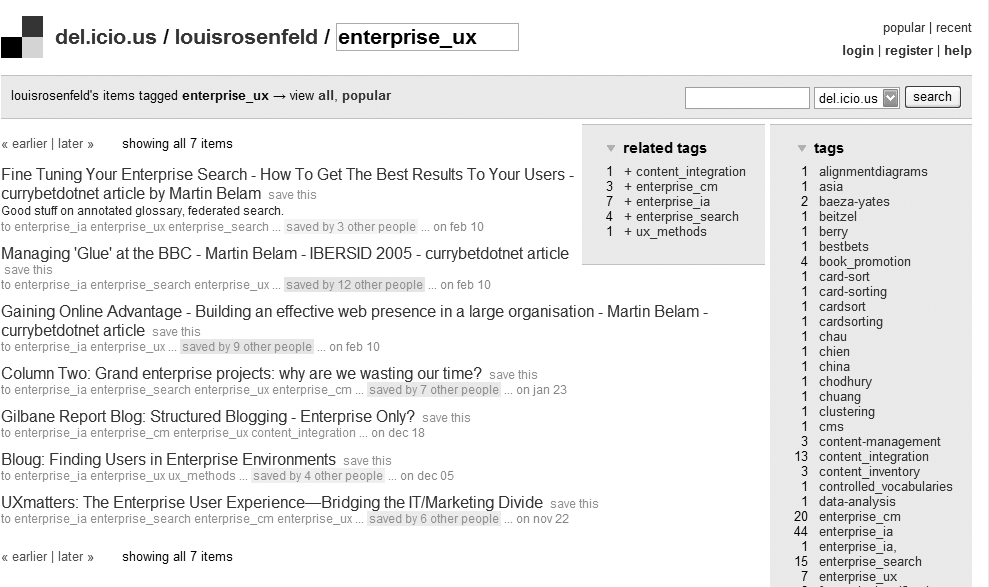
There is little to see here besides the information architecture and the content itself. In fact, as the content is just a collection of links to bookmarked pages from other web sites, the information architecture is the bulk of the page. It provides context for the content, and tells us what we can do while we’re here.
The information architecture tells us where we are (in del.icio.us, on a page maintained by user “louisrosenfeld” that contains bookmarks he tagged as “enterprise_ux”).
It helps us move to other, closely related pages (by, for example, scrolling through results (“<< earlier | later >>”) and to pages we’ve bookmarked using different tags (under “tags” and “related tags”).
It helps us move through the site hierarchically (for example, we can navigate to the del.icio.us main page, or to recent or popular bookmarks) and contextually (for example, by clicking on “saved by 4 other people” or by seeing who else bookmarked pages using the same tag).
It allows us to manipulate the content for better browsing (we can display tags in alphabetical order, as is shown, or as a “tag cloud”; a variety of other configuration choices are displayed in the “options”).
It tells us where we can go for basic services, such as logging into our account or getting help (“contact us” and “help”).
In many respects, this page from del.icio.us is nothing but information architecture.
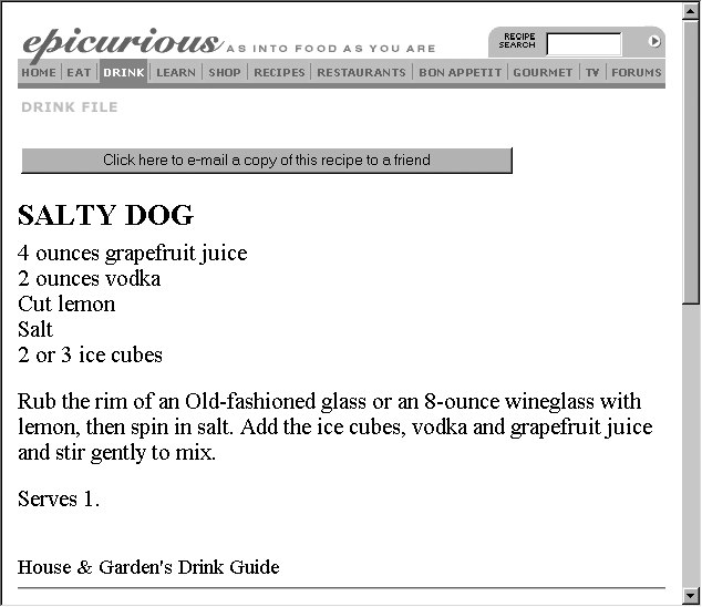
Content itself can have information architecture embedded within it. The recipe in Figure 4-5 shows a nutritious drink from the Epicurious site.
Beyond the navigational options at the top of the page, there’s not much information architecture here. Or is there?
The recipe itself has a clear, strong structure: a title at the top, a list of ingredients, then preparation directions and serving information. This information is “chunked” so you know what’s what, even without subtitles for “ingredients” or “directions.” The recipe’s native chunking could also support searching and browsing; for example, users might be able to search on the chunks known as “recipe titles” for “salty dog” and retrieve this one. And these chunks are sequenced in a logical manner; after all, you’ll want to know the ingredients (“Do I have four ounces of grapefruit juice?”) before you start mixing the drink. The definition and sequential placement of chunks help you to recognize that this content is a recipe before you even read it. And once you know what it is, you have a better idea what this content is about and how to use it, move around it, and go somewhere else from it.
So, if you look closely enough, you can see information architecture even when it’s embedded in the guts of your content. In fact, by supporting searching and browsing, the structure inherent in content enables the answers to users’ questions to “rise” to the surface. This is bottom-up information architecture; content structure, sequencing, and tagging help you answer such questions as:
Where am I?
What’s here?
Where can I go from here?
Bottom-up information architecture is important because users are increasingly likely to bypass your site’s top-down information architecture. Instead, they’re using web-wide search tools like Google, clicking through ads, and clicking links while reading your content via their aggregators to find themselves deep in your site. Once there, they’ll want to jump to other relevant content in your site without learning how to use its top-down structure. A good information architecture is designed to anticipate this type of use; Keith Instone’s simple and practical Navigation Stress Test is a great way to evaluate a site’s bottom-up information architecture (http://user-experience.org/uefiles/navstress/).
You now know that information architecture is something that can be seen, if you know what to look for. But it’s important to understand that information architecture is often invisible. For example, Figure 4-6 shows some search results from the BBC’s web site.
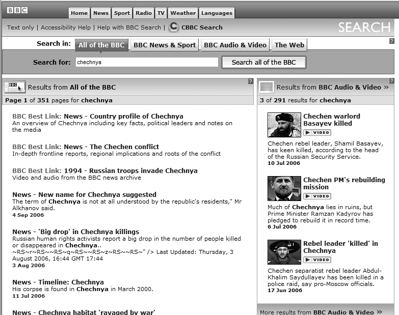
What’s going on here? We’ve searched for “chechnya,” and the site has presented us with a couple of different things, most interestingly three results labeled as a “BBC Best Link.” As you’d imagine, all search results were retrieved by a piece of software—a search engine—that the user never sees. The search engine has been configured to index and search certain parts of the site, to display certain kinds of information in each search result (i.e., page title, extract, and date), and to handle search queries in certain ways, such as removing “stop words” (e.g., “a,” “the,” and “of”). All of these decisions regarding search system configuration are unknown to users, and are integral aspects of information architecture design.
What’s different is that the “Best Link” results are manually created: some people at the BBC decided that “chechnya” is an important term and that some of the BBC’s best content is not news stories, which normally come up at the top of most retrieval sets. So they applied some editorial expertise to identify three highly relevant pages and associated them with the term “chechnya,” thereby ensuring that these three items are displayed when someone searches for “chechnya.” Users might assume these search results are automatically generated, but humans are manually modifying the information architecture in the background; this is another example of invisible information architecture.
Information architecture is much more than just blueprints that portray navigational routes and wireframes that inform visual design. Our field involves more than meets the eye, and both its visible and invisible aspects help define what we do and illustrate how challenging it really is.
Information Architecture Components
It can be difficult to know exactly what components make up an information architecture. Users interact directly with some, while (as we saw above) others are so behind the scenes that users are unaware of their existence.
In the next four chapters, we’ll present and discuss information architecture components by breaking them up into the following four categories:
- Organization systems
How we categorize information, e.g., by subject or chronology. See Chapter 5.
- Labeling systems
How we represent information, e.g., scientific terminology (“Acer”) or lay terminology (“maple”). See Chapter 6.
- Navigation systems
How we browse or move through information, e.g., clicking through a hierarchy. See Chapter 7.
- Searching systems
How we search information, e.g., executing a search query against an index. See Chapter 8.
Like any categorization scheme, this one has its problems. For example, it can be difficult to distinguish organization systems from labeling systems (hint: you organize content into groups, and then label those groups; each group can be labeled in different ways). In such situations, it can be useful to group objects in new ways. So before we delve into these systems, we’ll present an alternative method of categorizing information architecture components. This method is comprised of browsing aids, search aids, content and tasks, and “invisible” components.
Browsing Aids
These components present users with a predetermined set of paths to help them navigate the site. Users don’t articulate their queries, but instead find their way through menus and links. Types of browsing aids include:
- Organization systems
The main ways of categorizing or grouping a site’s content (e.g., by topic, by task, by audiences, or by chronology). Also known as taxonomies and hierarchies. Tag clouds (based on user-generated tags) are also a form of organization system.
- Site-wide navigation systems
Primary navigation systems that help users understand where they are and where they can go within a site (e.g., breadcrumbs).
- Local navigation systems
Primary navigation systems that help users understand where they are and where they can go within a portion of a site (i.e., a subsite).
- Sitemaps/Tables of contents
Navigation systems that supplement primary navigation systems; provide a condensed overview of and links to major content areas and subsites within the site, usually in outline form.
- Site indices
Supplementary navigation systems that provide an alphabetized list of links to the contents of the site.
- Site guides
Supplementary navigation systems that provide specialized information on a specific topic, as well as links to a related subset of the site’s content.
- Site wizards
Supplementary navigation systems that lead users through a sequential set of steps; may also link to a related subset of the site’s content.
- Contextual navigation systems
Consistently presented links to related content. Often embedded in text, and generally used to connect highly specialized content within a site.
Search Aids
These components allow the entry of a user-defined query (e.g., a search) and automatically present users with a customized set of results that match their queries. Think of these as dynamic and mostly automated counterparts to browsing aids. Types of search components include:
- Search interface
The means of entering and revising a search query, typically with information on how to improve your query, as well as other ways to configure your search (e.g., selecting from specific search zones).
- Query language
The grammar of a search query; query languages might include Boolean operators (e.g., AND, OR, NOT), proximity operators (e.g., ADJACENT, NEAR), or ways of specifying which field to search (e.g., AUTHOR=“Shakespeare”).
- Query builders
Ways of enhancing a query’s performance; common examples include spell checkers, stemming, concept searching, and drawing in synonyms from a thesaurus.
- Retrieval algorithms
The part of a search engine that determines which content matches a user’s query; Google’s PageRank is perhaps the best-known example.
- Search zones
Subsets of site content that have been separately indexed to support narrower searching (e.g., searching the tech support area within a software vendor’s site).
- Search results
Presentation of content that matches the user’s search query; involves decisions of what types of content should make up each individual result, how many results to display, and how sets of results should be ranked, sorted, and clustered.
Content and Tasks
These are the users’ ultimate destinations, as opposed to separate components that get users to their destinations. However, it’s difficult to separate content and tasks from an information architecture, as there are components embedded in content and tasks that help us find our way. Examples of information architecture components embedded in content and tasks include:
- Headings
Labels for the content that follows them.
- Embedded links
Links within text; these label (i.e., represent) the content they link to.
- Embedded metadata
Information that can be used as metadata but must first be extracted (e.g., in a recipe, if an ingredient is mentioned, this information can be indexed to support searching by ingredient).
- Chunks
Logical units of content; these can vary in granularity (e.g., sections and chapters are both chunks) and can be nested (e.g., a section is part of a book).
- Lists
Groups of chunks or links to chunks; these are important because they’ve been grouped together (e.g., they share some trait in common) and have been presented in a particular order (e.g., chronologically).
- Sequential aids
Clues that suggest where the user is in a process or task, and how far he has to go before completing it (e.g., “step 3 of 8”).
- Identifiers
Clues that suggest where the user is in an information system (e.g., a logo specifying what site she is using, or a breadcrumb explaining where in the site she is).
“Invisible” Components
Certain key architectural components are manifest completely in the background; users rarely (if ever) interact with them. These components often “feed” other components, such as a thesaurus that’s used to enhance a search query. Some examples of invisible information architecture components include:
- Controlled vocabularies and thesauri
Predetermined vocabularies of preferred terms that describe a specific domain (e.g., auto racing or orthopedic surgery); typically include variant terms (e.g., “brewskie” is a variant term for “beer”).Thesauri are controlled vocabularies that generally include links to broader and narrower terms, related terms, and descriptions of preferred terms (aka “scope notes”). Search systems can enhance queries by extracting a query’s synonyms from a controlled vocabulary.
- Retrieval algorithms
Used to rank search results by relevance; retrieval algorithms reflect their programmers’ judgments on how to determine relevance.
- Best bets
Preferred search results that are manually coupled with a search query; editors and subject matter experts determine which queries should retrieve best bets, and which documents merit best bet status.
Whichever method you use for categorizing architectural components, it’s useful to drill down beyond the abstract concept of information architecture and become familiar with its more tangible and, when possible, visual aspects. In the following chapters, we’ll take an even deeper look at the nuts and bolts of an information architecture.
Get Information Architecture for the World Wide Web, 3rd Edition now with the O’Reilly learning platform.
O’Reilly members experience books, live events, courses curated by job role, and more from O’Reilly and nearly 200 top publishers.

