Typographical Miscellany in CSS
There are a number of obscure CSS properties that demonstrate the limits of what designers can control with CSS, but also introduce many of the accents that stand between the plain and the elegant.
The line-height Property
As suggested earlier, the line-height property
inserts negative space between lines, making it analogous to leading in
print. However, as shown in Figure 12-9, the result is
applied equally to both sides of each line of type
to which it applies. The good news is that in current browsers this behavior is consistent; older versions
placed all of the additional negative space above
the type (as in Internet Explorer 6), or below it, as shown in Figure 12-9.
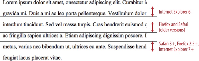
Figure 12-9. Behavior of the line-height property in various browsers (specimen used is 16px Times New Roman at a line-height value of 32px)
The other notable detail of the line-height property is that its range of
valid values includes numbers without units, such as:
line-height: 1.5;
which is functionally similar to a value of 150% or 1.5em.
For the sake of consistency and discipline, I find that itâs
usually better to use the same size units for line-height values that you apply to the rest
of your font and text properties.
Default line-height values are
specified with a normal value, vary from one font/platform combination to the next, and tend to be very small, in the range of ...
Get HTML & CSS: The Good Parts now with the O’Reilly learning platform.
O’Reilly members experience books, live events, courses curated by job role, and more from O’Reilly and nearly 200 top publishers.

