You can spend your programming days happily working within the comforting confines of .NET’s managed code libraries without ever seeing a smidgen of unmanaged code. The framework team is not stupid, though; they know there are times when you have to call out to a COM library or Win32 DLL to get your job done. So they created hooks in the framework to enable the flow of code between the sheltered world of managed code and the mysterious unmanaged realm. It’s the same story when interoping between HLSL code and Silverlight/WPF classes.
In this chapter, we look at the .NET parts that facilitate the use of
unmanaged HLSL shaders in the visual tree. The UIElement.Effect property is our first stop. It
provides a way to assign a ShaderEffect
to a visual element. Next, we look at some of the classes in the System.Windows.Media.Effects namespace. These
classes (ShaderEffect, PixelShader, etc.) enable the flow of information
to the HLSL world. We’ll examine how to create your own managed wrappers for
HLSL and investigate the prebuilt effects in the System.Windows.Media.Effects namespace and the
Expression Blend libraries.
Note
Remember: on the .NET side, the customary term is effect; on the HLSL side, the preferred term is shader.
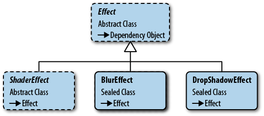
It’s easiest to start our discussion of framework effects by looking
at the two shaders included in the System.Windows.Media.Effects namespace (see
Figure 4-1). By starting
with the BlurEffect and DropShadowEffect, we can concentrate on the XAML
syntax and not worry about custom classes and resource management.
All visual elements derive from the UIElement class, which makes it an ideal
location to surface the Effect
property. With a few lines of XAML, you can apply an effect to any
UIElement, as shown in Example 4-1.
Example 4-1. Applying BlurEffect to Image element
...<ImageOpacity='1'><Image.Effect><BlurEffectRadius='12'/></Image.Effect></Image>...
In an earlier chapter, I showed how to use the BlurEffect. It is one of the simpler effects.
It applies a blur algorithm to the output, resulting in—you guessed it—a
blurry output. The Silverlight version has one property, Radius, which influences the blurriness of the
effect.
The WPF version adds two additional properties. The KernelType property is used to specify the
blurring algorithm. The default algorithm is the infamous Gaussian blur. To switch to the simpler and
less smooth Box kernel type, simply
change the value as shown here (Example 4-2).
Example 4-2. Setting BlurEffect Properties
<CheckBox><CheckBox.Effect><BlurEffectKernelType='Box'RenderingBias='Quality'/></CheckBox.Effect></CheckBox>
There are tradeoffs in shaders, just as in other areas of
programming. Blur algorithms can affect rendering speed, so the WPF
BlurEffect provides the RenderingBias property as a means to choose
performance or quality output for the effect. To get better quality
output, alter the property as shown in Example 4-2.
The UI design community has a turbulent relationship with the drop
shadow. One decade, it’s a beloved tool in UI design and it pervades the
popular design metaphors, and the next it isn’t. Designers are restless
and inquisitive and eventually the drop shadow falls from favor and is
viewed as an anachronism by the same community. If you long to add a
shadowy aspect to your UI, reach for the DropShadowEffect class.
The Silverlight version contains a few properties that are
self-explanatory (Color, Opacity, and ShadowDepth) so I won’t burden you with a
description. The Direction property
represents the angled direction of the shadow. A direction of zero draws
a shadow to the right of the host element. Higher values rotate the
shadow counterclockwise with the default value (315) placing the shadow
in the lower right position. The BlurRadius property configures the blurriness
of the shadow. Set the BlurRadius to
zero and the shadow has a crisp, sharp edge; crank up the value for
maximum shadow fuzziness.
WPF adds one additional property, RenderingBias, over the Silverlight version,
which provides the same services as seen in the BlurEffect.RenderingBias property described
earlier.
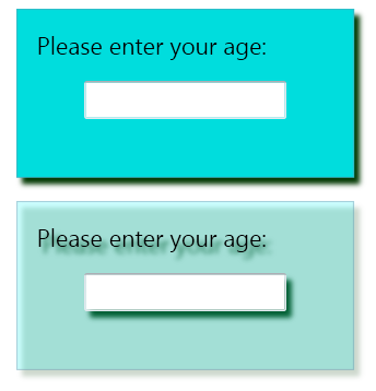
When an effect is applied to a framework element, it affects that element and all of its children. In many circumstances, this is the appropriate approach and the UI looks as expected. Other times, the nested effects give an undesirable look to the UI. Figure 4-2 shows two stack panels with a drop shadow applied. The first stack panel has the desired look because its background brush is fully opaque. The second stack panel uses a solid color background brush with the alpha channel set to a non-opaque value. Because the brush is semi-transparent, the drop shadows for the child elements are visible.
Warning
Take heed: once an effect is set on a parent element, there is no way to disable the effect on its children elements.
On a sophisticated interface, there might be effects applied at
different levels of the visual
tree. It’s likely that at some point you will want to apply multiple
effects to a single element. The
Effect property has some limitations,
which you should understand before
proceeding. The primary constraint on your creativity is that the
Effect property can only have a
single effect in scope at any time. In other words, there is no
collection of effects permitted on a UIElement.
Imagine that you want to apply a blur and drop shadow to a button. The workaround for the single effect problem is to nest the button inside another element and apply the second effect to the containing element. Example 4-3 shows some XAML that demonstrates this technique.
Example 4-3. Using a canvas to add second effect to a button
<Canvas><Canvas.Effect><DropShadowEffect/></Canvas.Effect><ButtonContent='Blurred and Shadowed'Width='180'Height='50'><Button.Effect><BlurEffect/></Button.Effect></Button></Canvas>
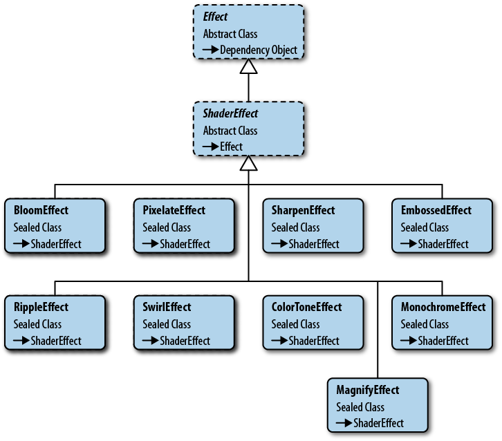
It’s a bit underwhelming to learn that Microsoft only includes these two simple effects in the framework. With the vast number of shaders known to the graphics programming crowd, I was expecting a lot more out of the box. Fortunately, Expression Blend fills in the gaps and provides many supplementary effects.
The Expression Blend team is constantly looking for tools to enhance
the XAML design experience. A few years ago, they decided to cherry-pick
the best shader effects and package them for use in Silverlight/WPF
projects (see Figure 4-3). In the
Blend interface, you can easily add these effects to elements via the
Assets panel. You are not limited to using Expression Blend to access
them, as you can always add a reference to the Microsoft.Expression.Effects DLL to bring them
into any XAML project.
The first step to using a Blend effect is to add a reference to the Blend effect library (Microsoft.Expression.Effects.dll). If you have installed Expression Blend in the default location, the Silverlight DLL is in the C:\Program Files\Microsoft SDKs\Expression\Blend\Silverlight\v4.0\Libraries directory and the WPF version is in the C:\Program Files\Microsoft SDKs\Expression\Blend\.NETFramework\v4.0\Libraries directory.
To use the effect in an XAML file, add the Blend namespace as shown in the following XAML (Example 4-4).
Example 4-4. Add Blend effects namespace to XAML file
<UserControlx:Class="Demo.Examples.UseBlendEffectPage"xmlns="http://schemas.microsoft.com/winfx/2006/xaml/presentation"xmlns:x="http://schemas.microsoft.com/winfx/2006/xaml"xmlns:ee="http://schemas.microsoft.com/expression/2010/effects"...
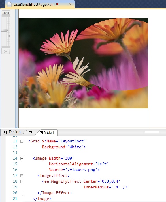
Now it’s just a matter of setting the Effect property and configuring some
parameters, as shown here in Figure 4-4.
There are about a dozen standard effects in the Blend library. Blend also includes specialized effects known as transition effects. I won’t detail either type of effect in this chapter, but you will see more of the standard and transition effects in Chapter 5.
Note
You may encounter the BitmapEffect class and its derived types
(BevelBitmapeffect,
BlurBitmapEffect, DropShadowBitmapEffect, EmbossBitmapEffect, and OuterGlowBitmapEffect) while exploring the
WPF libraries. Don’t be fooled by the name, these are legacy effects
from the early days of WPF; they are not implemented with pixel
shaders. They are slow and inefficient when compared to their speedy
ShaderEffect relatives and are ultimately destined for the .NET
dustbin.
The process of creating a custom effect starts by creating an
unmanaged pixel shader. As you may recall, pixel shaders are written in
their own quirky programming language called HLSL. Once the HLSL shader
code is finished, it is compiled into a binary .ps
file. To use the shader, it has to be loaded into the rendering engine
input stream. To accomplish this task, you need to work with the .NET
ShaderEffect and PixelShader classes.
The ShaderEffect is the abstract
class that serves as a base for your custom effect class. It is a
dependency object, so you can populate it with dependency properties. It
works in conjunction with the PixelShader class. The PixelShader class is a managed wrapper around
your HLSL pixel shader. Internally, the ShaderEffect keeps a reference to the PixelShader class, so that it can inject the
unmanaged shader into the graphics pipeline. You will have little
interaction with the PixelShader class,
other than configuring it to load the shader. Most of the customization of
your effect revolves around the ShaderEffect class.
The ShaderEffect offers a handful
of members that we’ll examine in this chapter.
RegisterPixelShaderSamplerProperty
UpdateShaderValue
PixelShaderSamplerCallback
PixelShaderConstantCallback
Padding
Consider the following code definition:
public class BareBones : ShaderEffect {}While this might technically be considered a ShaderEffect, it is an empty shell, incapable
of influencing any pixels. The first step in turning the class into a
useful effect is to load an unmanaged pixel shader file.
Note
This chapter concentrates on understanding the .NET code and leaves the in-depth discussion of unmanaged pixel shaders for another chapter. To that end, the examples in this section assume that a pixel shader has been compiled into a .ps file and is ready to use in the custom effect.
The compiled pixel shader is stored inside a binary file. It is
common to name this file with a .ps extension,
but that is not a requirement. To make it accessible to your ShaderEffect, add it to your .NET project
and mark it as a project resource. It’s still not usable until your
ShaderEffect extracts the
.ps file and associates it with the managed
PixelShader class. The syntax for
locating the .ps file is the same as retrieving
any other project resource file. Here is some sample code (see Example 4-5) demonstrating
how to extract the resource.
Example 4-5. Extracting the .ps file and assigning to PixelShader
publicclassLoadingPsFileEffect:ShaderEffect{publicLoadingPsFileEffect(){// the PixelShader class provides a// managed wrapper for the unmanaged pixel shadervarpixelShader=newPixelShader();// retrieve the .ps resource with a URI// the .ps file needs to be marked as resource in Build ActionvarpsFileUri=newUri("/CustomShaderEffects;component/PsFiles/BlueTintEffect.ps",UriKind.Relative);pixelShader.UriSource=psFileUri;// store the reference to the PixelShader instance// in the ShaderEffect.PixelShader propertythis.PixelShader=pixelShader;}}
The code starts by creating an instance of the PixelShader class in the class constructor.
Next, a new URI is created and assigned to the PixelShader.UriSource. This example assumes
that the assembly containing the resource is named CustomShaderEffects and that the
.ps file is in the PsFiles project folder.
Finally, the PixelShader reference
is assigned to the ShaderEffect
PixelShader property. From this point forward, the ShaderEffect will
manage the communication with the GPU.
Note
For simplicity’s sake, I’ll use the term GPU in this chapter to refer to both the WPF and Silverlight rendering engine. The purists in the audience will be offended but it makes it easier to talk about the process in this chapter.
The LoadingPsFileEffect class
is a functional effect, so let’s see how to use it in an XAML
page.
Using your custom effect is similar to working with the Blend
effects. Start by compiling your project and then adding a custom
xmlns namespace to the XAML file.
This xmlns attribute indicates
which assembly contains the preferred effect. Once you have the xmlns namespace configured, you can use it
as the following code reveals (Example 4-6).
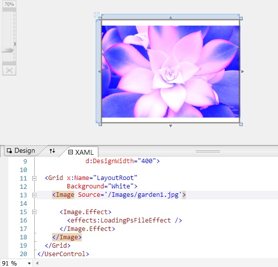
Example 4-6. Using the effect on an Image element
...<!-- In the root element add this namespace-->xmlns:effects='clr-namespace:HLSL.Book.Ch04.TheEffects'<!-- Use the Effect in your application--><ImageSource='/Images/garden1.jpg'><Image.Effect><effects:LoadingPsFileEffect/></Image.Effect></Image>...
Once the project is compiled, you can see the effect result by running the application or viewing it in the Visual Studio designer as shown in Figure 4-5.
In the preceding example, the ShaderEffect was applied to the entire image.
Clearly, that implies that the pixels from the Image element are passed to the HLSL shader.
How does that happen?
To understand how this works, we need to look at the sampler2D concept in the HLSL specification
and the ShaderEffect.RegisterPixelShaderSamplerProperty
in the managed libraries.
Let’s start by examining the HLSL (Example 4-7) for the BlueTintEffect:
Example 4-7. HLSL code for a blue tint shader
sampler2Dinput:register(s0);float4main(float2uv:TEXCOORD):COLOR{float4Color;Color=tex2D(input,uv.xy);Color.b+=1+uv.y;returnColor;}
It’s a simple color alteration shader. It applies a slight blue tint to each inbound pixel. Direct your attention to the first line of the example. It’s in that first line that you see how the HLSL code gets the inbound pixels.
The HLSL specification states that pixel shaders have access to bitmap information via samplers. A sampler is a bitmap that is stored in video memory. In the early days of shaders, the sampler was often used to store a small texture file (for example, an image containing bricks, stones, moss, or cloth) that was mapped or painted onto a 3D object to make the model look realistic. The early graphics pioneers called it a sampler because it was a way to sample a texturemap within the shader. The terminology persists to this day. In an XAML application, the HLSL sampler usually contains the rasterized output of the effected UI elements.
Samplers are passed into the HLSL program by means of the GPU registers. To do this in HLSL, you declare a program level variable and associate it with a shader register as shown here:
sampler2Dinput:register(s0);
In this example, the variable name is input and the associated shader register is
s0. The sampler2D variable type signals that the
accompanying GPU register contains bitmap data.
Note
Samplers and other inputs to the shader are declared at the top of the HLSL code and are considered global variables by the HLSL specification. Be aware that the shader term global variable has a different connotation here, especially when compared to your favorite .NET language. Global variables are settable during the shader initialization phase, but cannot be changed during the shader execution. This guarantees that the parameter value is constant for all the pixels processed by the shader.
The Pixel Shader 2.0 specification permits up to 16 shader registers. Unfortunately, .NET restricts the number of accessible sampler registers to a smaller number. Silverlight and WPF 3.5 limit you to a maximum of four inputs, while WPF 4.0 is more generous and ups the input limit to eight.
We’ve just seen that the HLSL shader uses the sampler2D type for
its texture input. That won’t work on the .NET side; we need a
Silverlight/WPF-specific type instead. The good news is that .NET uses
the familiar Brush type for this
purpose. Several types of XAML brushes can be used as input but we’ll
start by looking at a special, effect-friendly one called ImplicitInputBrush.
Example 4-8 shows one of the
most common scenarios for using an effect by setting the Effect property on an element.
Example 4-8. Use the ImplicitInput brush
<TextBox><!-- Use the ImplicitInput brush feature of the Effect base class --><TextBox.Effect><effects:BlueTintEffect/></TextBox.Effect></TextBox>
In this circumstance, the “sampler” that the shader gets as
input is the rasterization of the Textbox. As mentioned above, a brush is used
to send the information to the shader. A close inspection of the XAML
in Example 4-8 reveals no trace of
a brush, however. What’s happening?
The ShaderEffect base class
has some default behavior that creates a special ImplicitInputBrush in this
situation. This implicit brush contains the rasterized Textbox pixels, which are eventually sent
over to the shader for processing.
To take advantage of this implicit brush feature requires
nothing more than registering the shader .ps file
as you saw in Example 4-5. To assign any
other type of brush to the shader texture requires creating an
explicit DependencyProperty in your
custom effect.
Start by creating a dependency property within the custom
ShaderEffect and marking the
property type as System.Windows.Media.Brush. Traditionally
this property is named Input, but the choice of name is entirely up to
you and your imagination. To integrate this Input property with the
HLSL shader, you must associate the dependency property with the
correct GPU s register. For
convenience, the ShaderEffect class
exposes the static RegisterPixelShaderSamplerProperty method
for this purpose.
Here is the explicit way to achieve the association (Example 4-9):
Example 4-9. Writing a DependencyProperty that uses the “s” register
// the last argument (0) refers to the HLSL s registerpublicstaticreadonlyDependencyPropertyInputProperty=ShaderEffect.RegisterPixelShaderSamplerProperty("Input",typeof(AddingInputTextureEffect),0);
With this dependency property in place, the custom effect is applied to any brush assigned to the Input property.
Note
Even though the effect has an explicit Input property, you can still use the syntax shown in Example 4-8 to apply the implicit brush.
At this point in the story, you know how to create an explicit input property. I’ll show you how to assign other brushes to it, but first let’s look at a small scenario that highlights shader input and output within the visual tree.
To explore these concepts, I’ll use a sample UI with four elements placed inside a Canvas panel. Look at the screenshot of the sample elements in the Visual Studio designer (Figure 4-6).
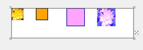
The first two elements on the left side have no effects configured. As you can see from the following XAML snippet (Example 4-10), there is nothing especially notable about these two elements.
Example 4-10. Two elements
...<!-- Normal Image.Drawn at Location(0,0) Size(40,40) --><ImageSource='/Images/garden1.jpg'x:Name='GardenImage'Width='40'Height='40'Canvas.Top='0'Canvas.Left='0'Stretch="UniformToFill"/><!-- Normal Rectangle.Drawn at Location(0,80) Size(40,40) --><Rectanglex:Name='RectangleWithoutEffect'Fill='Orange'Width='40'Height='40'Stroke='Black'StrokeThickness='2'Canvas.Top='0'Canvas.Left='80'/>...
Silverlight/WPF processes these two elements (GardenImage and RectangleWithoutEffect) during the layout phase. Once
that phase is finished, it knows the location and size for both
elements and rasterizes their UI for consumption by the rendering
engine.
It’s a similar process for elements with effects. Take, for
example, the two rectangles defined in the following XAML snippet
(Example 4-11). They are
similar to the prior example, but have the distinction of having the
BlueTintEffect applied.
Example 4-11. Two rectangles with effects applied
...<!-- Rectangle with Effect applied. Output from pixel shaderis drawn at Location(0,180) Size(60,60)Raster input into the pixel shader comes from the Rectangle --><Rectanglex:Name='RectangleWithEffect1'Fill='Orange'Width='60'Height='60'Stroke='Black'StrokeThickness='2'Canvas.Top='0'Canvas.Left='180'><Rectangle.Effect><effects:BlueTintEffect/></Rectangle.Effect></Rectangle><!-- Rectangle with Effect applied. Output from pixel shaderis drawn at Location(0,280) Size(60,60)Raster input into the pixel shader comes from the ImageBrush --><Rectanglex:Name='RectangleWithEffect2'Fill='Orange'Width='60'Height='60'Stroke='Black'StrokeThickness='2'Canvas.Top='0'Canvas.Left='280'><Rectangle.Effect><effects:BlueTintEffect><effects:BlueTintEffect.Input><ImageBrushImageSource='{BindingElementName= GardenImage,Path=Source}'/></effects:BlueTintEffect.Input></effects:BlueTintEffect></Rectangle.Effect></Rectangle>...
Once Silverlight/WPF has finished the layout pass, it knows the
location and size for RectangleWithEffect1 and RectangleWithEffect2. During the
rasterization phase, it passes the rasterized output data into the
elements associated shader. The pixel shader does its pixel voodoo and
the resultant output is placed in the regions reserved for these two
rectangles.
Note
To hammer home the point: RectangleWithEffect1 is drawn at the same
location and size regardless of whether it has an effect or
not.
So where do the inbound pixels for the pixel shader come from?
That depends on a few factors. BlueTintEffect has an Input DependencyProperty defined as seen
previously in Example 4-9.
Let’s apply the effect and dissect where the input comes from.
Example 4-12 shows the
BlueTintEffect applied to a
Rectangle.
Example 4-12. Using the BlueTintEffect on a Rectangle element
<Rectangle.Effect><effects:BlueTintEffect/></Rectangle.Effect>
Even though the effect has an explicit input property, it is not used when using this syntax; instead, it uses the implicit input. You can verify that this is true by checking the Input property as seen in the code in Example 4-13.
Example 4-13. Checking explicit Input brush
varbrush=(RectangleWithEffect1.EffectasCustomShaderEffects.InputTestEffect).Input;// brush is null, indicating that the Input property was not set
Because the BlueTintEffect
exposes an explicit Input property, it’s possible to pass in other
brushes to the shader input as shown in this XAML (Example 4-14).
Example 4-14. Assigning an ImageBrush to the explicit Input property
<Rectangle.Effect><effects:BlueTintEffect><effects:BlueTintEffect.Input><ImageBrushImageSource='{BindingElementName=GardenImage,Path=Source}'/></effects:BlueTintEffect.Input></effects:BlueTintEffect></Rectangle.Effect>
As you can see, the pixel shader input is coming from an
ImageBrush but you can also use a
VisualBrush, or BitmapCacheBrush in the same manner.
Note
When an effect is applied to an element, the output of the shader is exactly the same size as the original input size. If the rectangle is 60 × 80 pixels, the output of the shader is also sized at 60 × 80 pixels. Choosing implicit or explicit input has no bearing on the output size.
The only exception to the sizing rule is when an effect uses the effect padding properties.
A pixel shader can have up to 16 input samplers defined in the HLSL. WPF 4.0 limits you to 8, however.
Here is a HLSL example with two input samplers defined (Example 4-15).
Example 4-15. Pixel shader with two sampler2D inputs
sampler2DBaseImage:register(s0);sampler2DTextureMap:register(s1);float4main(float2uv:TEXCOORD):COLOR{floathOffset=frac(uv.x/1+1);floatvOffset=frac(uv.y/1+1);float2offset=tex2D(TextureMap,float2(hOffset,vOffset)).xy*4-1/2;float4outputColor=tex2D(BaseImage,frac(uv+offset));returnoutputColor;}
The first sample2D variable is
using the s0 register while the second sample2D variable maps to the s1
register.
Note
Be pragmatic and thoughtful when naming your HLSL variables. Readability is just as important in HLSL code as in other programming languages.
In this example, the first sample2D variable name reflects its
status as the base image. The second variable name, TextureMap, indicates that it holds a bitmap
containing lookup textures. The HLSL in the sample uses a simple mapping
technique to blend the pixels from the two sampler inputs.
On the .NET side, you need to create two dependency properties and
call ShaderEffect.RegisterPixelShaderSamplerProperty on both.
The registration code will be similar to the code shown in Example 4-9.
To use these inputs in XAML, use syntax like this (Example 4-16):
Example 4-16. Assigning some ImageBrushes to the input properties
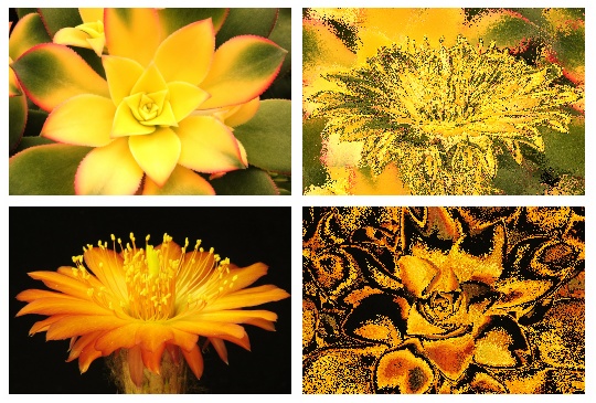
...<Rectanglex:Name='RectangleWithEffect1'Width='256'Height='170'Stroke='Black'StrokeThickness='2'><Rectangle.Effect><effects:TwoInputEffect><effects:TwoInputEffect.BaseImage><ImageBrushImageSource='{BindingElementName=GardenImage2,Path=Source}'/></effects:TwoInputEffect.BaseImage><effects:TwoInputEffect.TextureMap><ImageBrushImageSource='{BindingElementName=GardenImage1,Path=Source}'/></effects:TwoInputEffect.TextureMap></effects:TwoInputEffect></Rectangle.Effect></Rectangle>...
This is a beautiful effect as you can see in the screenshot below (Figure 4-7). It shows four images, the left two being the original images and the right two showing the texture mapping.
All sampler inputs into the shader are resized by the Silverlight/WPF runtime to match the render size of the host element.
Consider the following XAML (Example 4-17):
Example 4-17. Effect brushes with mismatched size
...<Rectanglex:Name='Rectangle1'Width='400'Height='400'><Rectangle.Effect><effects:TwoInputEffect><effects:TwoInputEffect.BaseImage><!-- flowers_wide.jpg is 925 × 260 pixels --><ImageBrushImageSource='/Images/flowers_wide.jpg'/></effects:TwoInputEffect.BaseImage><effects:TwoInputEffect.TextureMap><!-- garden_small.jpg is 150 × 200 pixels --><ImageBrushImageSource='/Images/garden_small.jpg'/></effects:TwoInputEffect.TextureMap></effects:TwoInputEffect></Rectangle.Effect></Rectangle>...
This example uses the TwoInputEffect and assigns an ImageBrush to each sampler input. During the
layout pass, the runtime determines the render size and location for the
host rectangle, in this case, a 400 × 400 square. When each ImageBrush is readied for the shader, its
sized is constrained to the same 400 × 400 size as the host rectangle,
causing the larger image to be compressed and the smaller image to be
enlarged. As far as the HLSL shader is concerned, it gets two 400 × 400
textures assigned to its s registers.
If you could debug the shader pipeline and look at the two textures
stored in video memory, you’d see that this is true.
Use a transform to manipulate an input brush before the scaling occurs, as shown in Example 4-18:
Example 4-18. Transforming a brush before sending to shader
...<effects:TwoInputEffect.TextureMap><ImageBrushImageSource='/Images/flowers_wide.jpg'><ImageBrush.Transform><CompositeTransformScaleX ='.4'ScaleY ='.4'TranslateX ='100'/></ImageBrush.Transform></ImageBrush></effects:TwoInputEffect.TextureMap>...
Now that you’ve seen how to pass bitmap parameters to the shader, it’s time to expand your horizons and see how to pass other types of parameters into the shader.
Parameters are the lifeblood of a flexible programming model. Can you imagine how dull and impractical it would be to work in a programming language without parameters? Luckily for us, HLSL accepts various types of input data into the shader.
You’ve already seen how to pass bitmap data to the pixel shader
through the GPU registers. To be more precise, we used the sampler
registers for this purpose. They are designated with the “s”
nomenclature (s0, s1, s2,
etc.). You are not limited to passing bitmap data into the shader as
HLSL sports another set of registers known as the constant registers
(c0, c1, c2,
etc.). A constant parameter is similar to a readonly field in C#. The value is changeable
during the pixel shader initialization period, but remains constant
throughout the execution of the shader. In other words, once the value
is set, it will be the same for every pixel processed by the pixel
shader. You can have up to 32 constant registers in PS_2_0. PS_3_0
expands that to 224, but is only accessible in WPF 4.0.
Let’s rewrite the multi-input shader as follows:
Example 4-19. Adding constant registers to the HLSL shader
sampler2DBaseImage:register(s0);sampler2DTextureMap:register(s1);floatvertScale:register(c0);floathorzScale:register(c1);floattranslateX:register(c30);floattranslateY:register(c31);float4main(float2uv:TEXCOORD):COLOR{floathOffset=frac(uv.x/vertScale+translateX);floatvOffset=frac(uv.y/horzScale+translateY);float2offset=tex2D(TextureMap,float2(hOffset,vOffset)).xy*4-(1/2);float4outputColor=tex2D(BaseImage,frac(uv+offset));returnoutputColor;}
In addition to the sampler2D inputs shown earlier in Example 4-15, the refactored code
contains four additional input values declared at the top of the pixel
shader. If you look closely, you can see that these new items are float
values, which are loaded into registers c0, c1,
c30 and c31, and then used inside the main function.
The ShaderEffect class
transmits parameter information to an HLSL constant register through a
DependencyProperty. It does this by
using the special PixelShaderConstantCallback method. The trip
is one-way, from the effect class to the pixel shader. The parameter
value never travels back to the effect class.
Now, let’s focus on how to write the effect to take advantage of
these parameters. Here is a snippet (Example 4-20) that shows the
DependencyProperty
registration:
Example 4-20. Binding the “c” registers with PixelShaderConstantCallback
...publicstaticreadonlyDependencyPropertyVertScaleProperty=DependencyProperty.Register("VerticalScale",typeof(double),typeof(InputParametersEffect),newPropertyMetadata(((double)(0D)),PixelShaderConstantCallback(0)));publicstaticreadonlyDependencyPropertyHorzScaleProperty=DependencyProperty.Register("HorizontalScale",typeof(double),typeof(InputParametersEffect),newPropertyMetadata(((double)(0D)),PixelShaderConstantCallback(1)));// ... continue in this manner for other dependency properties
The last argument on each registration line is the important one
for this discussion. We call the PixelShaderConstantCallback method and pass in
the appropriate constant register. PixelShaderConstantCallback sets up a PropertyChangedCallback delegate, which is
invoked whenever the DependencyProperty is changed. Example 4-21 shows how easy it
is to use these new properties.
Example 4-21. Setting some shader parameters via DependencyProperties
...<Rectanglex:Name='RectangleWithEffect2'Width='Auto'Height='Auto'Margin='3'Grid.Row='1'><Rectangle.Effect><effects:InputParametersEffectHorizontalScale='{Binding ElementName= horzSlider, Path=Value}'VerticalScale='{Binding ElementName=vertSlider, Path=Value}'TranslateX='{Binding ElementName=xSlider,Path=Value}'TranslateY='{Binding ElementName=ySlider,Path=Value}'><effects:InputParametersEffect.BaseImage><ImageBrushImageSource='/Images/Garden1.jpg'/></effects:InputParametersEffect.BaseImage><effects:InputParametersEffect.TextureMap><ImageBrushImageSource='/Images/Garden2.jpg'/></effects:InputParametersEffect.TextureMap></effects:InputParametersEffect></Rectangle.Effect></Rectangle>...
There is one more step necessary to make a functional ShaderEffect. You need to invoke the
UpdateShaderValue method in the
class constructor for every bound DependencyProperty; otherwise, the pixel
shader won’t be initialized with the default values for the property.
Call the method for every effect property, as shown in Example 4-22, to ensure that
the initial value for each property is set in the pixel shader.
On the HLSL side, the constant register works with various types
of float values. When you register a ShaderEffect DependencyProperty with the
PixelShaderConstantCallback method,
you are limited to a short list of .NET types. Table 4-1 lists the
permitted .NET types, and the matching HLSL types.
Normally, an effect is applied to an element’s actual render size.
Therefore an effect for a 200 × 200 Image will modify pixels in a 200 ×
200 region. Certain effects, like the drop shadow, need additional space
outside the normal render area. Use the ShaderEffect padding properties (PaddingTop, PaddingLeft, PaddingRight, PaddingBottom) to increase the size passed
into the pixel shader.
The padding properties are marked as protected scope, so you
cannot access them outside your ShaderEffect. The typical pattern is to set
the padding within your type and expose other dependency properties for
client code to access. The built-in DropShadowEffect uses the ShadowDepthProperty in this manner.
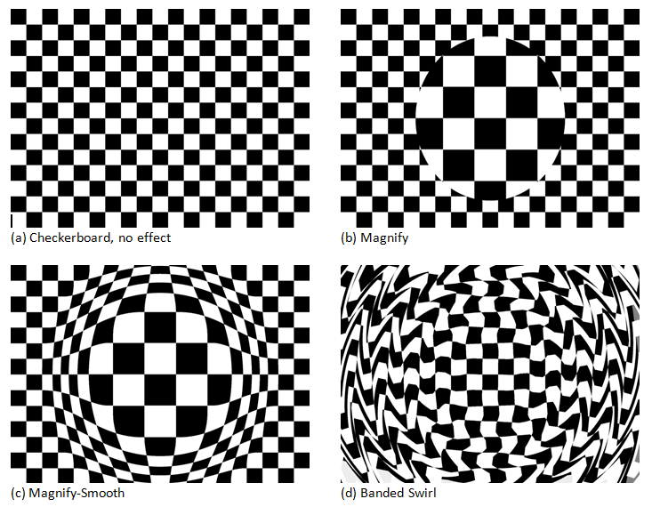
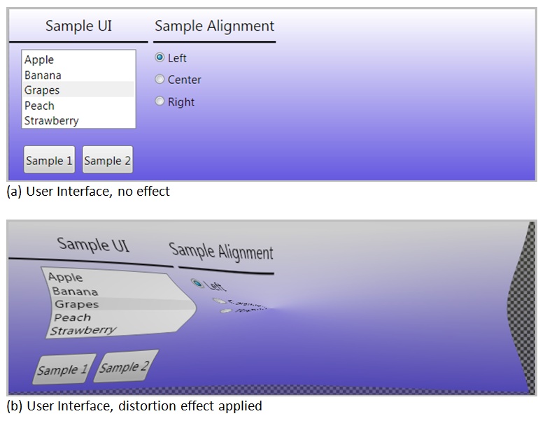
Distortion effects are a popular use of pixel shaders (see Figure 4-8).
Distortion effects require extra work if you want them to behave in a predictable fashion. When you apply a distortion effect to an interactive element like a list box (Figure 4-9.a), the touch, stylus, and mouse events won’t work as expected. The pixel shader is rearranging the output pixels, but the Silverlight/WPF hit-testing infrastructure is unaware that the pixels are in a new location (Figure 4-9.b).
The EffectMapping property
provides a way to synchronize the input coordinates between the two
worlds. It takes the raw input coordinates and maps them to the pixel
shader coordinates. This is accomplished by creating a custom GeneralTransform class.
Before we examine the customized GeneralTransform, let’s look at the sample
compression shader (Example 4-23) that lives
on the HLSL side.
Example 4-23. A compression shader
sampler2Dinput:register(s0);floatCrushFactor:register(c0);float4main(float2uv:TEXCOORD):COLOR{if(uv.y>=CrushFactor){floatcrushAmount=lerp(0,1,(uv.y-CrushFactor)/(1-CrushFactor));float2pos=float2(uv.x,crushAmount);returntex2D(input,pos);}elsereturnfloat4(0,0,0,0);}
This HLSL example takes the incoming pixels and compresses the
pixel shader output toward the bottom of the element. The higher the
CrushFactor property value, the
shorter the output image will be.
In the XAML snippet shown below (Example 4-24), the CrushEffect causes the Image to be rendered at 30% of its original
height.
Example 4-24. Applying the CrushEffect
...<BorderBorderBrush='Red'BorderThickness='4'Width='240'Height='120'Margin='5'Grid.Row='2'><ImageStretch='Fill'Source='/Images/garden1.jpg'MouseMove='distortedImage2_MouseMove'MouseLeftButtonUp='distortedImage2_MouseLeftButtonUp'Name='distortedImage2'><Image.Effect><effects:CrushWithMappingEffectCrushFactor='.7'/></Image.Effect></Image></Border>...
Figure 4-10 shows the
output of the CrushEffect, when
applied to an Image element. The
image is wrapped in a Border element,
which shows the size of the Image if
it didn’t have the effect applied.
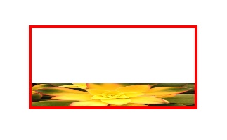
If there is no EffectMapping
provided, the image mouse events will fire when the mouse is within the
white area, even though it’s evident in the screenshot that the image
pixels are no longer visible in that region. To fix this shortcoming,
create an EffectMapping property. The
ImageMapping property is responsible
for returning a custom GeneralTransform class to the Silverlight/WPF
engine as seen in this code scrap.
Example 4-25. Creating an EffectMapping property
privateCrushTransform_transform=newCrushTransform();protectedoverrideGeneralTransformEffectMapping{get{_transform.CrushFactor=CrushFactor;return_transform;}}
The GeneralTransform class is
one of the XAML transform classes. Though not as familiar as other
transforms like CompositeTransform,
it is used by the framework during certain transform actions like
TransformToVisual and EffectMapping. It contains a few members of
interest. It has two transform methods, Transform and TryTransform. Both methods take an incoming
point and return a transformed point. The difference between the two
is that the TryTransform method
returns a Boolean, instead of
throwing an exception if the transform fails for any reason, and it
uses an out parameter to deliver the transformed point back to the
caller. Example 4-26
shows a few of the members of the GeneralTransform class.
Example 4-26. Prototyping the GeneralTransform class
publicclassGeneralTransform{// a few of the class memberspublicPointTransform(Pointpoint){Pointpoint1;if(this.TryTransform(point,outpoint1)){returnpoint1;}else{thrownewInvalidOperationException("Could not transform");}}publicabstractboolTryTransform(PointinPoint,outPointoutPoint);}// sub-classing the GeneralTransform classpublicclassSampleTransform:GeneralTransform{}
Were you to create an instance of the SampleTransform class shown in Example 4-26, you could easily
get a transformed point with code similar to (Example 4-27).
Example 4-27. Getting a transformed point
vartransform=newSampleTransform();varoriginalPoint=newPoint(10,20);PointtransformedPoint;if(transform.TryTransform(originalPoint,outtransformedPoint)){// do something with the out parameterConsole.WriteLine(transformedPoint.Y);}
The GeneralTransform class
also has an Inverse property. This
property is utilized whenever an inverted version of the transform is
needed, and it is this property that is called during the effect
mapping operations. It returns a reference to another transform, as
shown in Example 4-28.
The ShaderEffect
EffectMapping property tells the Silverlight/WPF framework
which GeneralTransform class to use
during hit-testing and other input events. The framework follows this
workflow. When a mouse event is detected (mousemove), the framework
get the transform from the EffectMapping property. Next, it calls the
Inverse method to get the undo
transform. Finally, it calls the TryTransform method on the inverted
transform to get the corrected mouse location.
For every distortion action in the pixel shader, you provide an
undo action in the Inverse
transformation class. For intricate shaders, the transformation code
can get quite complex. The different algorithms available in the HLSL
and .NET frameworks exacerbate the problem. Nevertheless, it is your
responsibility to write the transform to make hit testing work
correctly.
Here is some code (Example 4-29) that demonstrates the
transforms that reverse the CrushEffect.
Example 4-29. General and Inverse transforms
publicclassCrushTransform:GeneralTransform{// create a DependencyProperty that matches the DependencyProperty// in the CrushEffect ShaderEffect class.// Is used to pass information from the ShaderEffect to the TransformpublicstaticreadonlyDependencyPropertyCrushFactorProperty=DependencyProperty.Register("CrushFactor",typeof(double),typeof(CrushTransform),newPropertyMetadata(newdouble()));publicdoubleCrushFactor{get{return(double)GetValue(CrushFactorProperty);}set{SetValue(CrushFactorProperty,value);}}protectedboolIsTransformAvailable(PointinPoint){if(inPoint.Y<CrushFactor){returnfalse;// No transform available for this point location}else{returntrue;}}publicoverrideboolTryTransform(PointinPoint,outPointoutPoint){outPoint=newPoint();// normal transform actionsdoubleratio=inPoint.X;outPoint.Y=CrushFactor+(1-CrushFactor)*ratio;outPoint.X=inPoint.X;returnIsTransformAvailable(inPoint);}publicoverrideGeneralTransformInverse{get{// this method is called by framework// when it needs an inverse version of the transformreturnnewInverseCrushTransform{CrushFactor=CrushFactor};}}publicoverrideRectTransformBounds(Rectrect){thrownewNotImplementedException();}}publicclassInverseCrushTransform:CrushTransform{publicoverrideboolTryTransform(PointinPoint,outPointoutPoint){outPoint=newPoint();// inverse transform actionsdoubleratio=(inPoint.Y-CrushFactor)/(1-CrushFactor);outPoint.Y=inPoint.Y*ratio;outPoint.X=inPoint.X;returnbase.IsTransformAvailable(inPoint);}}
Silverlight/WPF has a nice system for integrating shaders and .NET effects. This chapter showed you how to make the managed wrapper for the HLSL shader.
Let’s review the steps needed to create your own shaders.
Write a shader in HLSL.
Compile the shader to a binary file (.ps) with FXC.exe or another HLSL compiler.
Add the .ps file to your Silverlight/WPF project and set the build action to
Resource.Create a .NET effect class that derives from
ShaderEffect.Load the .ps file into the effect class and assign it to the class’s
PixelShaderproperty.Set up one or more input dependency properties of type
Brushand use theShaderEffect.RegisterPixelShaderSamplerPropertymethod to map the input to the correct GPUsregister.If the shader has parameters, map each parameter to a dependency property and bind to the correct GPU
cregister with thePixelShaderConstantCallbackmethod.In the effect constructor, call
UpdateShaderValuefor eachDependencyPropertyin the class.For certain shader types, create Padding or EffectMapping code.
Apply the effect to any
UIElement.
Note
The WPF and Silverlight teams took different routes when creating the ShaderEffect and PixelShader classes. Looking at the public interfaces of the implementation, the classes look nearly identical, but a quick look at the internal implementation shows some differences. If you plan on creating shaders that work in both systems, be cognizant of the potential internal differences and test accordingly.
As you’ve seen in this chapter, there are many steps necessary to create a working shader effect class. To ease the development of custom shaders, I created a specialized utility called Shazzam Shader Editor. It automates most of the steps needed to make effects. A detailed tour of Shazzam is imminent, but first comes a chapter showing how to use Expression Blend to add effects to any Silverlight/WPF project.
Get HLSL and Pixel Shaders for XAML Developers now with the O’Reilly learning platform.
O’Reilly members experience books, live events, courses curated by job role, and more from O’Reilly and nearly 200 top publishers.

