Chapter 21. Using Style Builder
Although the Styles palette has a large number of available presets, it might not have the exact look that you want for your model. To help define your own custom look, you can use the Style Builder program.
The tool, which is actually a separate application, ships with SketchUp and lets you create your own custom styles.
Note
You can learn more about styles and the Styles Browser in Chapter 20.
Learning the Style Builder Interface
The Style Builder interface is similar to the other SketchUp applications that use various menus, panels, and windows. The main interface, shown in Figure 21.1, is divided into three panels. The left panel holds the Sample Strokes, the top panel holds the current selection set of sketched strokes, and the bottom panel displays a preview model.
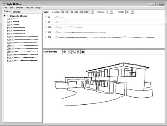
Figure 21.1. The Style Builder interface is divided into three panels.
Loading Sample Strokes
In the left window, you can switch between two panels using the tabs at the top. The Strokes panel shows a collection of sample strokes loaded from a template. These template files are image files that hold the various strokes. These files can be PNG, BMP, or TIFF files. Each stroke is 8, 16, 32, or 64 pixels high, and 16, 32, 64, 128, 256, or 512 pixels wide depending on the size of the stroke.
You can quickly ...
Get Google® SketchUp® and SketchUp® Pro 7 Bible now with the O’Reilly learning platform.
O’Reilly members experience books, live events, courses curated by job role, and more from O’Reilly and nearly 200 top publishers.

