Chapter 4. Charting
Introduction
Excel has built-in support for preparing a wide variety of charts , including custom charts, in your spreadsheet. You can even copy charts you create and embed them in Word documents. Charting is a handy data visualization technique that may provide valuable insight into the experimental or calculated data you may be trying to analyze. Excel makes charting quick and easy, and provides a great deal of flexibility in customizing your charts. Excel’s charting capabilities are not as sophisticated as those of some specialized scientific data visualization applications, but in many cases Excel may be the fastest way to visualize data. This is especially true if you’re generating your data in Excel via calculations or if you have already imported your data into Excel using techniques discussed in Chapter 3.
4.1. Creating Simple Charts
Problem
You’ve imported or generated data and you’d like to plot your data for further analysis.
Solution
Use Excel’s built-in charting features. Select the data you want to plot. Then select Insert → Chart...from the main menu bar to launch the Chart Wizard . Now let the wizard walk you through the rest of the chart-creation process.
Discussion
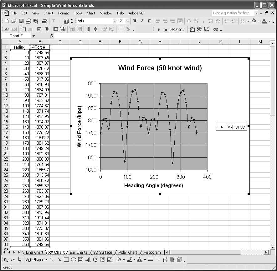
Let’s walk through an example to illustrate the basic steps involved in creating a chart in Excel. Figure 4-1 shows the data we’ll use in this example.
The data consists of two columns. The first column contains heading angles in degrees and the second contains wind force in kilo-pounds (kips) corresponding to the heading angles. (In case you’re curious, this data represents the wind forces exerted on an offshore drilling rig operating in the Gulf of Mexico.)
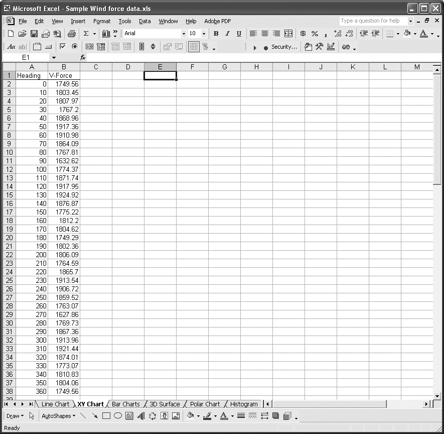
This is a good example of the sort of data that can be plotted on an XY chart. Basically, the heading data represents abscissa (x-axis) values, while force data represents ordinate (y-axis) data. Plotting the data should reveal how the wind force varies with heading.
To plot the data, click and drag the cell range containing the data. In this case, click and drag from cell A1 to B38. It’s okay to include the column headings in the selected range, because Excel will use these as default series names.
After selecting the data, select Insert → Chart...from the main menu bar or press the Chart Wizard button on the toolbar (in Figure 4-1, it’s the eighth button from the left under the main menu bar and has a little bar chart image on it). This activates the Chart Wizard (see Figure 4-2).
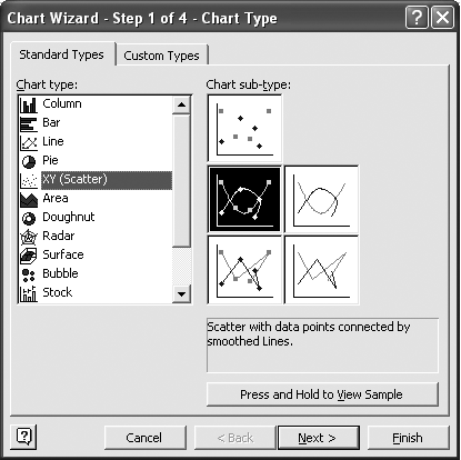
Excel offers a variety of built-in chart types, as shown in the “Chart type” list in Figure 4-2. See Recipe 4.2 for a list of other kinds of charts you can create in Excel. Here, we’re working with an XY (or scatter) chart, so select XY (Scatter) in the “Chart type” list.
Tip
Both Line and XY scatter chart types allow you plot points or lines and curves through data. XY charts allow you to specify both the ordinate and abscissa of each point, which can be at irregular spaces. Line charts plot ordinates versus equally spaced abscissas corresponding to the data point number. XY scatter charts give you greater flexibility when plotting two-dimensional data.
The right side of the Chart Wizard contains images of available sub-types for each major type of chart. XY charts have the five sub-types shown in Figure 4-2. The images are fairly representative of the sub-types. The choices here include simply plotting data points, plotting points with smoothed lines passing through them, plotting just the smooth lines, plotting points with straight line segments passing through them, and plotting just the straight line segments. I’ve selected smooth lines with point markers for this example.
If you press the button labeled “Press and Hold to View Sample,” you’ll see a little sample of your data plotted with the selected chart type and sub-type. Click the Next button to go to the second Chart Wizard step, or click Finish to stop here and create your chart, after which you can view and edit it manually.
Figure 4-3 shows the second step in the Chart Wizard.
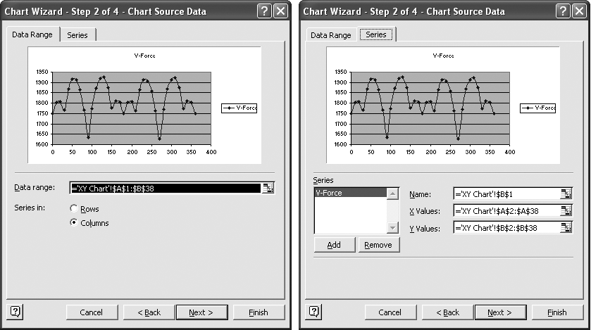
I included two views of the step 2 dialog box in Figure 4-3. The one on the left corresponds to the Data Range tab , while the one on the right corresponds to the Series tab .
On the Data Range tab, you can change the data range you selected for plotting. Since I selected the data before launching the Chart Wizard, the data range field is already populated with the correct data range. Excel makes an assumption as to whether or not your data is oriented in columns of data or rows of data. In this case, the data is contained in two columns and Excel correctly defaulted to “Series in Columns.” Excel gets this right most of the time and usually goofs up only when you don’t select headings in your data range and your data range is nearly square.
The Series tab shows the data series that will be plotted on the chart. In this example, the first column in the selected range represents x-values and the second column represents y-axis data. You can have more than one column of y-axis data corresponding to a single column of x-axis data. In such cases you could plot more than one data series. Here, you have the opportunity to add more data series to your chart. Further, you can always access the series dialog to add new series to an existing chart.
Tip
Once a chart has been created, you can access the Source Data dialog box to edit, add, or delete series. Right-click on the chart and then select Source Data from the pop-up menu to display the Source Data dialog box.
To add a new series, select each field on the right side of the dialog and fill in the appropriate cell ranges corresponding to the range containing the series name, the series x-axis data (which could be the same for all series on a chart), and the series y-axis data. Pressing the little icon to the right of each range field allows you to temporarily switch back to your spreadsheet and select the ranges by using the mouse instead of trying to remember cell references and manually typing them in.
Again, at this point you can press the Next button to proceed to the third step or press the Finish button to quit the Chart Wizard, thus creating your chart.
The step 3 dialog contains five different tabs, as shown in Figures 4-4, 4-5, and 4-6.
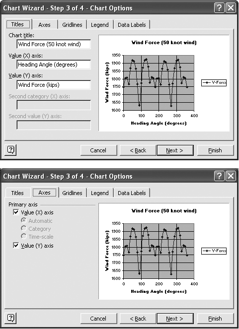
The Titles tab allows you to enter titles for major components of your chart, such as the chart title and the axes titles. If you have secondary axes (for plotting multiple series with different scales), you can also specify titles for the secondary axes. (See Recipe 4.6 for more information.) The Axes tab allows you to specify which axes you’d like to show.
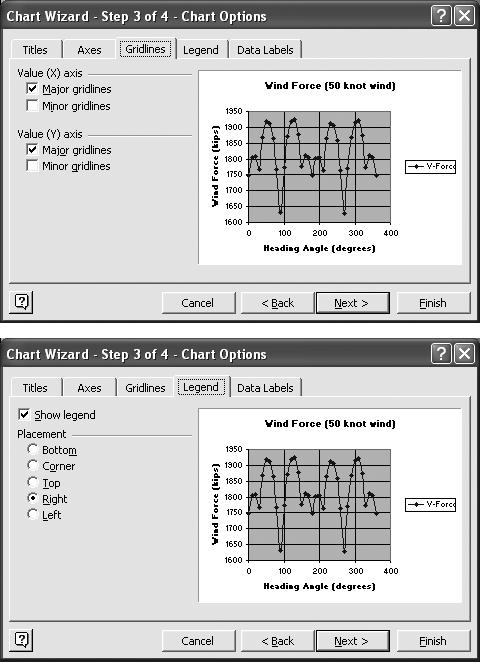
The Gridlines tab allows you to select which, if any, gridlines you’d like to show on the chart. Major gridlines correspond to the major scale divisions for each axis, while the minor gridlines correspond to the minor scale divisions. (See Recipe 4.4 for more information on customizing your chart axes, including setting scale divisions.)
The Legend tab allows you to specify whether or not you want to include a legend on your chart and where you’d like it displayed. For this example, we really don’t need a legend, since we’re plotting a single data series. Legends are handy when you have multiple data series and would like a key that lets the user know which is which.
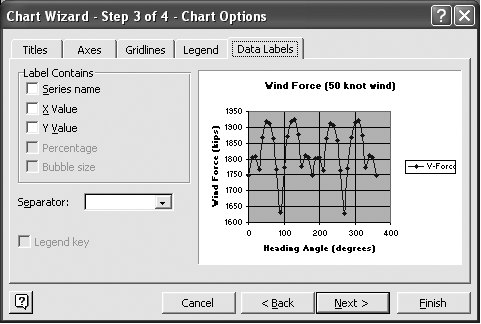
The final tab, Data Labels, allows you to specify whether you want data labels plotted next to each data point on your series and which label you want shown. You can choose from the series name itself, the x-value of each point, or the y-value of each point. (As you can see, there are a few other options for some other specific chart types.)
At this point I usually just press the Finish button to quit the Chart Wizard and create my chart. However, let’s take a look at the final Chart Wizard step by pressing the Next button.
Figure 4-7 illustrates the final step in the Chart Wizard.
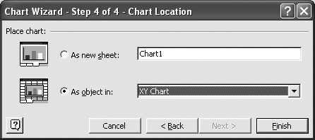
In this final step, you tell Excel where you want to create your chart. You can choose between having the chart created on a new chart sheet within your workbook or embedding it within a different worksheet.
Almost 99.9% of the time, I choose to have the chart embedded in the same sheet containing the data I’m plotting. The main reason I do this is that in many cases the data being plotted is generated or manipulated with custom calculations, and by placing the chart on the same pane as the data (and calculations), I can instantly view how changes in the underlying data (and calculations) affect the chart.
If you choose to place your chart on its own sheet, then you can specify the name of that sheet in this dialog box. The drop-down list next to the “As Object in” radio button allows you to select into which worksheet you want to embed your chart.
Now you can press the Finish button to exit the Chart Wizard and see the resulting chart. Figure 4-8 shows the chart created for this example.
You have some flexibility in where to locate your new chart in a worksheet. You can click and drag it anywhere to suit your needs.
You need not worry about skipping steps in the Chart Wizard or changing your mind. You can always go back and reformat your chart. See Recipe 4.3 for more information.
See Also
See Recipe 4.2 to learn about other chart types available in Excel.
4.2. Exploring Chart Styles
Problem
You’ve seen how to create handy XY charts in the previous recipe and would like to learn what other chart types are available in Excel.
Solution
Excel has several built-in chart types to choose from. Excel’s standard chart types are:
- Column
The Column type includes the sub-types Clustered Column, Stacked Column, 100% Stacked Column, Clustered Column 3-D, Stacked Column 3-D, 100% Stacked Column 3-D, and 3-D Column.
- Bar
The Bar type includes the sub-types Clustered Bar, Stacked Bar, 100% Stacked Bar, Clustered Bar 3-D, Stacked Bar 3-D, and 100% Stacked Bar 3-D.
- Line
The Line type includes the sub-types Line, Stacked Line, 100% Stacked Line, Line with Markers, Stacked Line with Markers, 100% Stacked Line with Markers, and 3-D Line.
- Pie
The Pie type includes the sub-types Pie, Pie 3-D, Pie of Pie, Exploded Pie, Exploded Pie 3-D, and Bar of Pie.
- XY (Scatter)
The XY type includes the sub-types Scatter, Scatter with smoothed lines, Scatter with smoothed lines and markers, Scatter with lines, and Scatter with lines and markers.
- Area
The Area type includes the sub-types Area, Stacked Area, 100% Stacked Area, Area 3-D, Stacked Area 3-D, and 100% Stacked Area 3-D.
- Doughnut
The Doughnut type includes the sub-types Doughnut and Exploded Doughnut.
- Radar
The Radar type includes the sub-types Radar, Radar with Markers, and Filled Radar.
- Surface
The Surface type includes the sub-types 3-D Surface, Wireframe 3-D Surface, Contour, and Wireframe Contour.
- Bubble
The Bubble type includes the sub-types Bubble and Bubble 3-D.
- Stock
The Stock type includes the sub-types High-Low-Close, Open-High-Low-Close, Volume-High-Low-Close, and Volume-Open-High-Low-Close.
- Cylinder
The Cylinder type includes the sub-types Column, Stacked Column, 100% Stacked Column, Bar, Stacked Bar, 100% Stacked Bar, and 3-D Column.
- Cone
The Cone type includes the sub-types Column, Stacked Column, 100% Stacked Column, Bar, Stacked Bar, 100% Stacked Bar, and 3-D Column.
- Pyramid
The Pyramid type includes the sub-types Column, Stacked Column, 100% Stacked Column, Bar, Stacked Bar, 100% Stacked Bar, and 3-D Column.
In addition to these standard chart types, Excel has many other built-in, custom chart types to choose from. Moreover, you can combine many of the these chart types on a single chart to create your own custom chart type, which you can save in the Custom Types list for repeated use.
To different types of charts, follow the same procedure described in Recipe 4.1. Just select a different type of chart during step 1 of the Chart Wizard process. The Chart Type dialog box (step 1 of the Chart Wizard) shows you all of the available built-in chart types. You can select any type and view a preview of the resulting chart by pressing the preview button, as discussed earlier. The Custom Types tab of the Chart Type dialog box also allows you to select or add custom chart types. (See Recipe 4.12 for more information.)
See Also
See Recipe 4.8 to learn how to set different styles for each data series on a single chart.
4.3. Formatting Charts
Problem
You’ve created a chart and would like to alter its appearance.
Discussion
You can select any chart element, including the chart itself, by clicking on it with the mouse. Also, once a chart is selected, you can cycle through, selecting each element using the arrow keys. You can select and format the chart itself, the plot area, the axes, labels, data series, and the legend, as well as any other element that may appear in a chart.
Tip
The name of the currently selected chart element is displayed in the Name box to the left of the formula bar.
You can change the formatting of any chart element by selecting the element and pressing Ctrl-1 to open a format dialog box specific to the selected chart element. Or you can right-click on any element and select the Format option from the pop-up menu. Alternatively, you can use the various format tool buttons in Excel’s main window to format various aspects of the chart element. Also, when a chart element is selected you can select Format from the main menu bar to access a context-specific format dialog box just as if you had pressed Ctrl-1.
Some of the most common format options available for chart elements include colors, line style and thickness, fill pattern (including gradients, patterns, textures, and pictures), and font styles. Specific chart elements, such as chart axes, have other options that allow you to format things such as axes scales, labels, position, and whether an axis is in linear or log scale. (See Recipe 4.4 for more information.)
The bottom line is that pretty much everything on a chart can be customized. Simply select it and press Ctrl-1 to see what options are available. The recipes throughout this chapter provide specific examples and tips for formatting charts.
4.4. Customizing Chart Axes
Problem
While Excel automatically sets chart axis scales, they aren’t always what you desire; therefore, you’d like to customize the axes to suit your needs.
Solution
To format an axis, right-click on it and select Format Axis from the pop-up menu. This launches the Format Axis dialog box , allowing you to format many aspects of the selected axis.
Discussion
Right-clicking on an axis to select it can be difficult at times, especially when the chart is a little cluttered. Take a look at the chart in Figure 4-9, whcih shows angular vibration samples taken during a laboratory experiment.
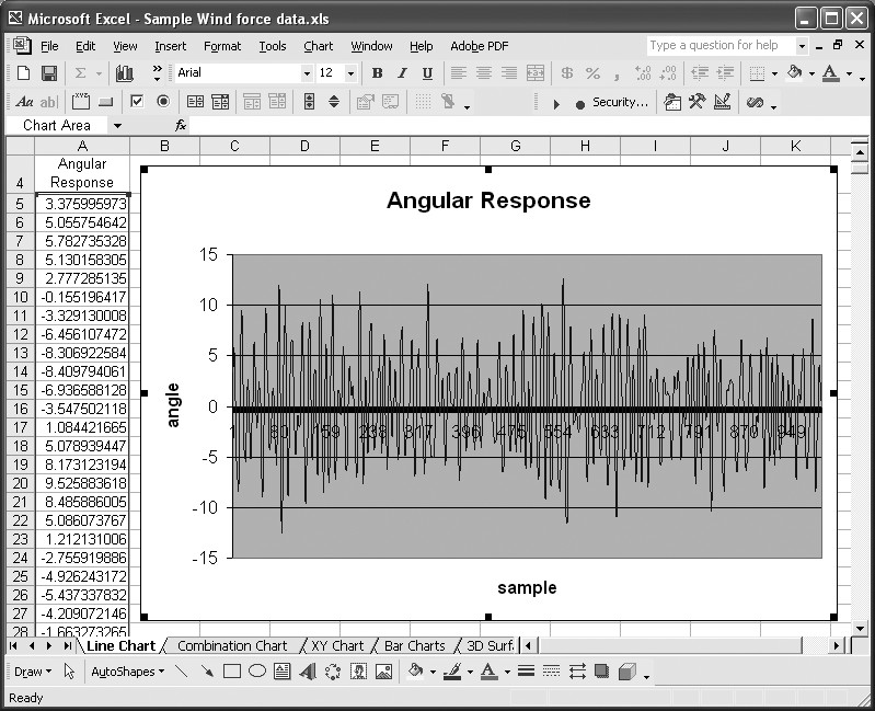
This is a standard Line chart with sample numbers (Excel calls them categories) shown on the horizontal axis. By default, Excel places tick marks along this axis, one at every other sample. With a thousand samples as shown here, the axis is quite cluttered. Indeed, the density of samples plotted makes selecting the axis with the mouse difficult.
An alternative way to select chart elements for formatting is to first select the chart itself by clicking anywhere on it, and then use the arrow keys to cycle through, selecting each chart element. The name of the currently selected element is displayed in the Name box to the left of the formula bar. In this case, we’re looking for Category Axis. After selecting the chart axis in this manner, you can launch the Format Axis dialog by selecting Format → Selected Axis...(Ctrl-1) from the main menu bar.
Figure 4-10 shows the Format Axis dialog box with the Scale tab selected.
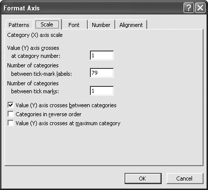
To make the horizontal axis a bit more readable you could set the number of categories between tick marks and tick-mark labels to, say, 100. You could also go to the Font tab and change the font size of the axis labels to make them larger and more readable. The Font tab also allows you to change the font type, style, and color, among other settings.
If you’d prefer to have your category labels oriented vertically, you can go to the Alignment tab and alter their orientation. The Number tab allows you to format the labels just as you might format numbers or text in a cell. For example, you could have numbers displayed in scientific notation, as percentages, or as fractions.
In addition to formatting axis labels, you can change the appearance of the axis line itself by using the format controls on the Patterns tab. For example, you could change the thickness, line style, and color of the axis line, as well the appearance of tick marks.
The Scale tab contains different controls depending on the type of data plotted along the axis. The horizontal axis in this case shows categories or numbers that are evenly spaced. An XY scatter chart’s x-axis shows real numbers with arbitrary spacing. The vertical axes in both chart types also show arbitrary real numbers. Figure 4-11 shows the scale controls available for axes that display arbitrary real numbers.
The controls on this tab allow you to specify the minimum and maximum values (i.e., the range of values shown along the axis). You can also specify the major and minor units, which control how often labels and gridlines are displayed. And you can specify where the x-axis intersects the y-axis, in case you want to shift the x-axis out of the way for clarity.
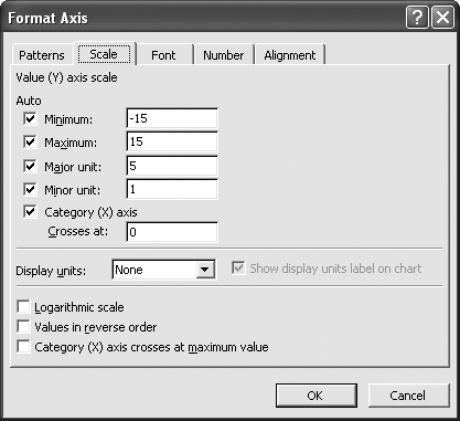
By default, all of these controls are set to Auto, which means Excel will attempt to determine suitable values for you. For the most part, Excel does an OK job at this. However, there are several reasons why you’d want to set these controls manually. One reason is that you may not want to view the entire range of data on the chart, but instead would rather focus in on a specific subrange. You can set the minimum and maximum values to a suitable range for this purpose. Another reason is that you may want specific scale divisions shown rather than those selected by Excel. For example, Excel may automatically set the major unit to 2 and the minor unit to 1; however, for your particular data you may prefer a major unit of 10 and a minor unit of 2.
As you can see from Figure 4-11, Excel also allows you to specify a logarithmic scale (see Recipe 4.5 for an example). You can even reverse the order of values along the axis or specify the x-axis crossing point at the maximum value, whatever that may be.
4.5. Setting Log or Semilog Scales
Problem
You’d like to use log scales instead of linear scales.
Solution
Select the axis you’d like to set to log scale and open the Format Axis dialog, as described in Recipe 4.4. Go to the Scale tab and check the Logarithmic Scale option (see Figure 4-11).
Discussion
You can create a log chart by setting both axes to logarithmic scale, or you can create a semilog chart by setting only one axis to logarithmic scale.
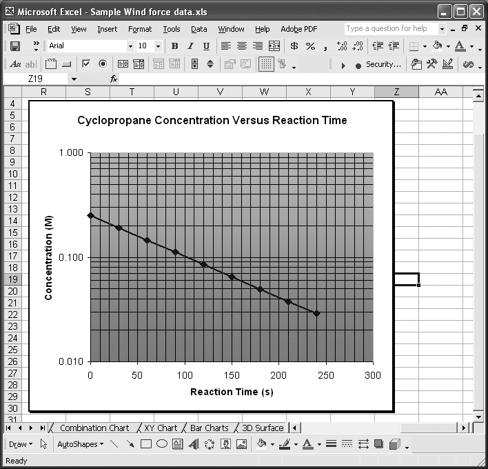
Consider the data shown in Figure 4-12 as an example. This data represents the reduction in concentration of cyclopropane as a function of reaction time (the cyclopropane gets converted to propane gas).
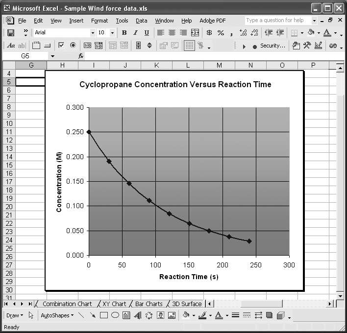
This plot of concentration versus reaction time shows the characteristic logarithmic form of so-called first-order reactions. Changing the vertical axis to logarithmic scale as described earlier results in the chart shown in Figure 4-13.
Notice that the plotted line is now linear. Plotting the data in this form facilitates estimating the rate constant for such a reaction, since the slope of the line can be determined by using the simple equation for a straight line.
See Also
See Chapter 8 to learn how to perform least-squares curve fitting in Excel.
4.6. Using Multiple Axes
Problem
You’ve plotted several series on a chart, but one of them consists of values much larger than the others; when it is plotted on the same scale, you can barely discern the smaller values. Thus, you’d like to plot multiple data series on a single chart but with different scales.
Solution
You can use multiple scales. Excel has built-in support for secondary axes . This allows you to plot, for example, one data series using a primary y-axis and another data series using a secondary y-axis. To specify the axis for a data series, select the series and then select Format → Selected Data Series...from the main menu bar to open the Format Data Series dialog box . Click the Axis tab and then click either “Primary axis” or “Secondary axis” to specify the axis. Press OK when you’re done, and Excel will automatically set up another axis and rescale your series.
Discussion
Figure 4-14 shows an example of two data series with very different scales plotted on the same chart.
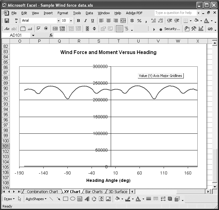
The scales of these two sets of data are so different that when they are plotted on the same chart, you can barely even see one of the data series; it’s almost coincident with the x-axis.
Changing the axis of this series so that it’s plotted on a secondary y-axis (as described earlier) results in the chart shown in Figure 4-15.
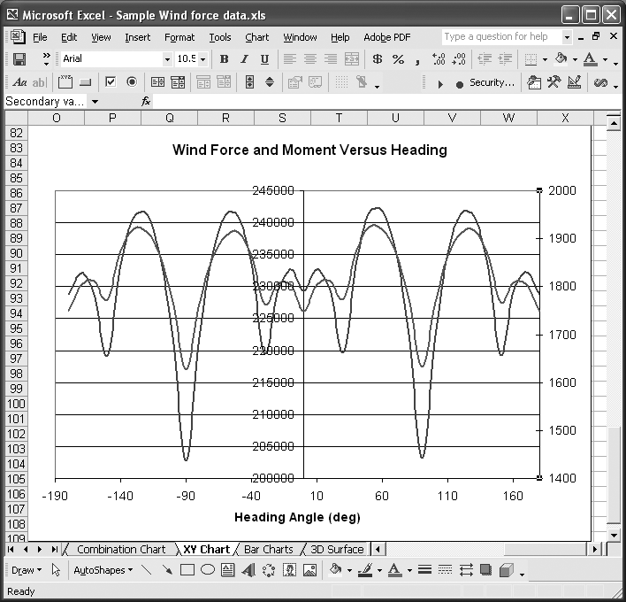
This version of the chart is far more readable than the original, and shows how useful secondary axes are. You can adjust the position of each series relative to the other by changing the minimum and maximum values of the primary or secondary axes.
You can, of course, plot more than one series relative to either the primary or secondary axes. Unfortunately, Excel does not support more than one secondary axis. While this isn’t the end of the world, there are times when more than one secondary axis would be useful. In these cases, there are a couple of workarounds you can try.
The easiest thing to try is to scale your data. For example, multiply (or divide) a data series by 10, 100, 1,000, or some other appropriate value and then plot it against the primary or secondary axis. Be sure to label the series properly so readers of your chart can clearly see that the data is scaled.
Another trick you might find useful is to fake another axis by using a specifically crafted dummy series. Let’s say we wanted to plot another series on the chart shown in Figure 4-15, but the values of this new series ranged from about 100 to 150. Clearly such a series would get buried by the scale of values for the other two series.
The solution is to multiply the values in this new series by an appropriate scale factor, say 10, and then plot it against the primary axis. This would make the values range from about 1,000 to 1,500, which would be clearly visible on the chart. Confusion may arise, however, if the scale is not annotated to indicate the new series has been scaled. To get around this, you can create a fake scale using a dummy series. Figure 4-16 shows just such a fake scale.
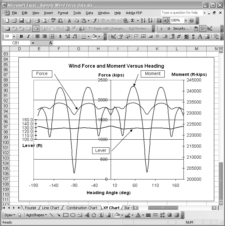
The series labeled Lever is the new, scaled series plotted against the primary y-axis (the center one). The fake axis is the short axis to the left, labeled Lever. This technique allows all of these series to be plotted on the same chart, even though the series values vary widely in magnitude.
To create the fake axis, you need to create and add a dummy series. The dummy series I created for this example is shown in Figure 4-17.
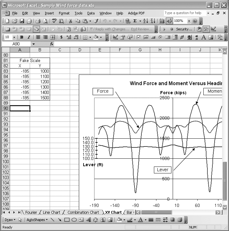
The key to using a series to represent an axis is to make one of the coordinates constant. In this case, since I want the series to represent a vertical axis, I set the x-value for the series to a constant. I used -185 to position the series all the way to the left of the chart. The y-values are simply selected to capture an appropriate range of values. Once the series data is prepared, you can add the series to the chart as discussed in Recipe 4.1. You’ll also want to turn on Y-labels for the dummy series. You can turn on Y-labels by opening the Format Data Series dialog box and selecting the Data Labels tab. Upon doing so, you’ll notice a little hiccup that you have to correct.
The default Y-Labels for the dummy series displays the actual y-values. The problem is that these values represent the scaled values for the series we wanted to use the fake axis for in the first place. This isn’t what we want, so you must edit each data label manually to display the appropriate values. Click the series labels once to select all of the labels. Then click once again on the specific label you want to modify. This will put the label in edit mode, where you can change the label to whatever you desire. Make the changes to all of the labels and you’ll end up with something like the chart shown in Figure 4-16.
4.7. Changing the Type of an Existing Chart
Problem
You’ve created a chart but later decide a different chart type would be more effective. You’d like to change the chart type without having to re-create the chart from scratch.
Solution
Select your chart and right-click on it with the mouse. On the pop-up menu that appears, select Chart Type to open the Chart Type dialog box, which is the same as that used during step 1 of the Chart Wizard (see Figure 4-2). Select the new chart type and sub-type and press the OK button when you’re done.
Discussion
As a simple example, reconsider the data used in the example for Recipe 4.1. The force data is a function of heading in degrees from 0 to 360. In the previous example, we used an XY chart type that showed the data series as a function of heading angles along the x-axis. A better way to view this data would be to plot the force data radially as a function of heading in a polar plot fashion. In Excel this type of chart is called a Radar chart.
Figure 4-18 shows what the data from Figure 4-1 looks like as a Radar chart.
I should mention that Radar charts require the x-axis data to be evenly spaced. The heading data for this example is the x-axis data, but for this Radar chart the heading data is merely used for labeling the chart; it does not govern the structure of the polar axis. The spacing of radial gridlines on Radar charts is always uniform. The number of radial gridlines will equal the number of data points in the series being plotted.
Figure 4-19 shows the Source Data dialog box for this example. To access this dialog box, select the chart and right-click to display a pop-up menu. Select Source Data from the pop-up menu.
The cell range in the Values field is the range of cells containing the y-data to be plotted, the force data in this example. The heading data happens to be uniform and ranges from 0 to 360 degrees. These facts make the chart appear as you would expect. To force the chart to display the heading angles on the radial axis, you have to supply the cell range containing the heading data in the “Category (X) axis labels” field. Since we converted this chart from an XY chart, Excel filled in the label field automatically.
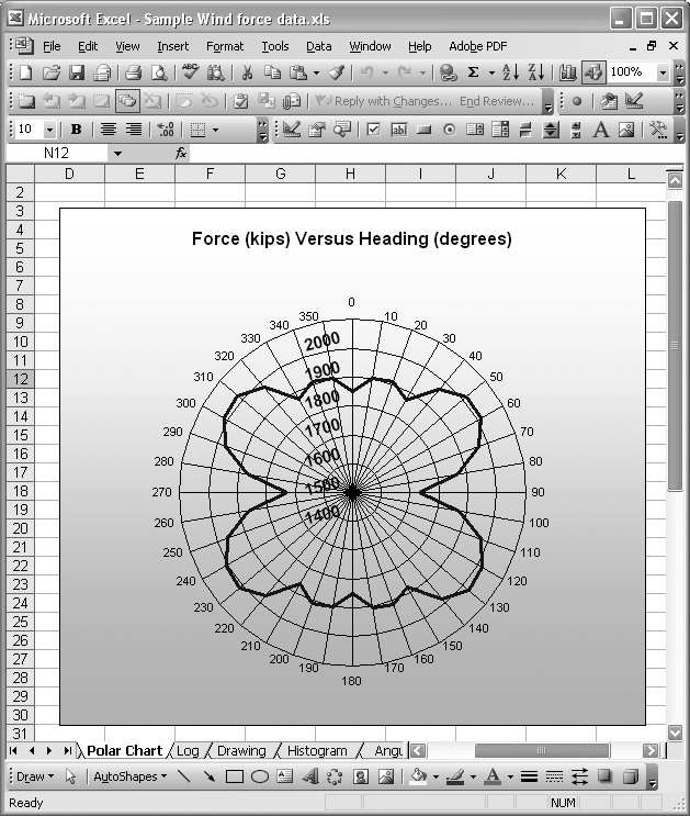
You’ll notice that this chart looks a little fancier than some of the other examples discussed earlier. All I did was format the chart a little differently by including a background image as the fill pattern for the chart itself, and by tweaking the title and grid line colors using their format options. See Recipe 4.3 for more information.

4.8. Combining Chart Types
Problem
You want to display different datasets on the same chart using different styles.
Solution
Set the chart style for each data series individually. First, right-click on the desired series and then select Chart Type from the pop-up menu to display the Chart Type dialog box (see Figure 4-2 in Recipe 4.1). Now select the type of chart you’d like to apply to that series.
Discussion
In Recipe 4.7 you saw how easy it is to change the type of chart for an existing chart. Sometimes, instead of changing the chart type for the entire chart, it’s more desirable to change the type for individual series on a chart, resulting in a combination chart.
Take a look at Figure 4-20, for example. This provides a picture of student grade statistics for a college course over a five-year period. The series representing the mean of grades is a Line chart with error bars representing the standard error (see Chapter 5 for recipes on generating descriptive statistics).
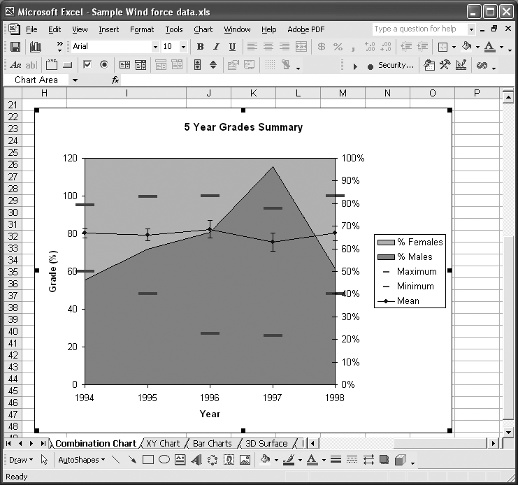
The series representing the minimum and maximum grades (the range for each year) are also Line charts.
The other two series, Females and Males, represent the relative population of males and females in each class for the given year. Both of these are Area charts. I could have made these Line charts like the others, but thought that making them Area charts as a sort of backdrop would be more effective.
This chart was created with all the data series initially in Line chart type. I then selected each of the Female and Male series and changed their type, as described earlier.
4.9. Building 3D Surface Plots
Problem
You want to create a 3D surface plot in Excel (e.g., to present results on a multidimensional optimization study or perhaps to present topographic data).
Solution
Use Excel’s built-in Surface chart type.
Discussion
Excel’s Surface chart allows you to create plots that can be viewed from various angles.
In Excel, surface plots are like a collection of line plots that get connected to form a surface. Thus, they suffer from some of the limitations of line plots. In particular, the values to be plotted (we’ll call these the z-data) must be uniformly spaced along the x- and y-axes. You can’t have arbitrarily spaced data as you can in XY scatter plots.
Figure 4-21 shows some sample data in the proper form for a 3D surface plot. The sample data shown here represents results from a 1D finite element simulation of nonlinear, non-Newtonian fluid flowing through a porous material.
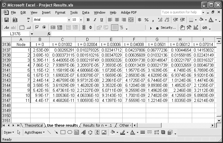
The Node column represents the finite element node at which data was calculated. This column also represents values (or categories) that will be displayed on one of the chart axes. The row of text showing t=0, t=0.01002, and so on represents the other axis; more precisely, these are labels to be displayed on the other axis. Excel will display these labels (for both axes) uniformly spaced on the chart, so I purposely extracted data at regular time intervals so the chart would make sense.
The values in the cell range starting at B3137 and ending in the lower-right corner represent the z-values to be plotted as functions of node and time. These values represent the velocity of the fluid flowing through the porous material in this example.
To create the plot, select the entire range of cell data, including the label column and row (i.e., the Node column and the row containing the elapsed time labels). In this example, the complete range is A3136:AD3147. After selecting the data, click the Chart Wizard button and go through the Chart Wizard as discussed in Recipe 4.1; however, this time select Surface for the chart type. The results are shown in Figure 4-22.
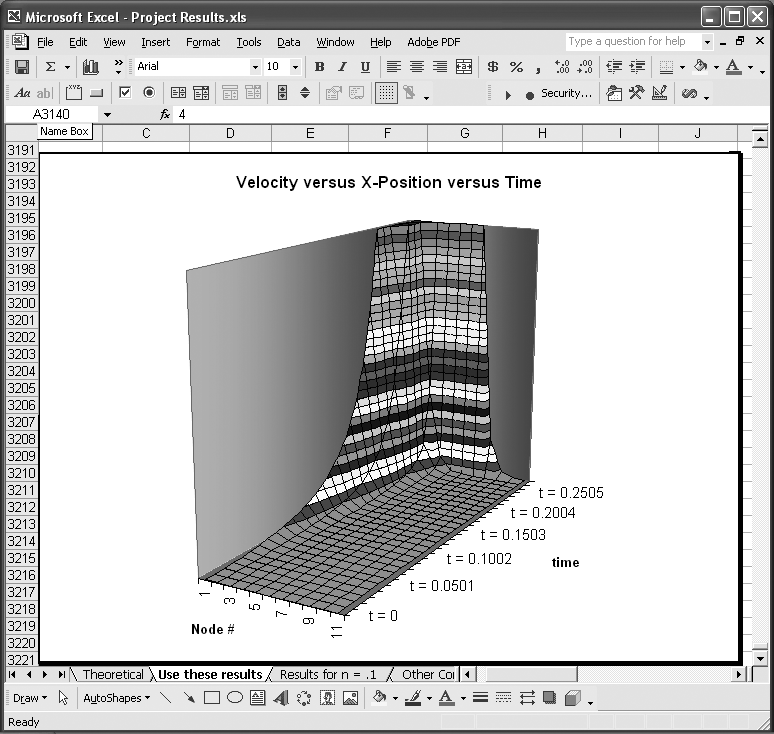
Here you can see that one axis on the horizontal plane contains node number labels, while the other contains the elapsed time labels. The surface represents fluid flow velocity at each node over time. The surface clearly shows a lot of information in a concise fashion, facilitating interpretation of the results.
The colors shown on the surface represent values within small ranges; you can set these to control the number of different colors used on the plot. To do this, you need to format the legend’s scale in much the same way as you would adjust the scale of an axis as discussed in Recipe 4.4. Specifically, you can adjust the major and minor units (see Figure 4-11) to control the number of colors used to represent small ranges of values in the plot.
To format the legend’s scale, you’ll first have to display it. Right-click on the chart and select Chart Options from the menu to display the Chart Options dialog box. Click the Legend tab and then check the Show Legend control.
After closing the Chart Options dialog box, select the legend and press Ctrl-1 to open the Format Legend dialog box. Click the Scale tab to reveal scale controls like those shown in Figure 4-11. Adjust the scale to suit your needs.
Figure 4-23 shows a new version of the chart from Figure 4-22, with a reduced number of colors.
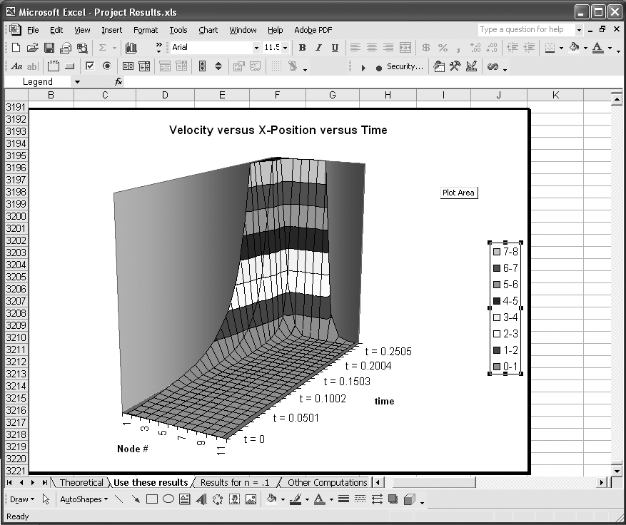
If you set the major and minor units too small, you could end up with a large number of colors and items in the legend. This may make the legend too big to display on your chart. If you want to keep such a large number of colors, then you’ll probably want to hide the legend.
You can format the legend and data series even further. After selecting the legend, click on any legend entry to select it (you’ll see selection handles around it). Right-click on it and select Format Legend Entry from the pop-up menu. You’ll then be able to change the formatting of the legend entry font. With a legend entry selected, click on its legend key—the little colored square next to the legend entry text. Now right-click on the key and select Format Legend Key from the pop-up menu. You’ll then be able to change the formatting of the legend key. For example, you can change its color or fill pattern, which also affects the chart. This allows you to set specific colors for the values displayed in the chart. In the Format Legend Key dialog box, you’ll also find an Options tab. Click it to reveal additional formatting options that affect the entire chart. For example, you can change the depth of the chart or set a 3D shading effect, giving the chart more of a 3D look.
3-D Surface charts can also be useful for plotting 3D analytic functions to visualize their form. For example, the plot of the function
looks like that shown in Figure 4-24.
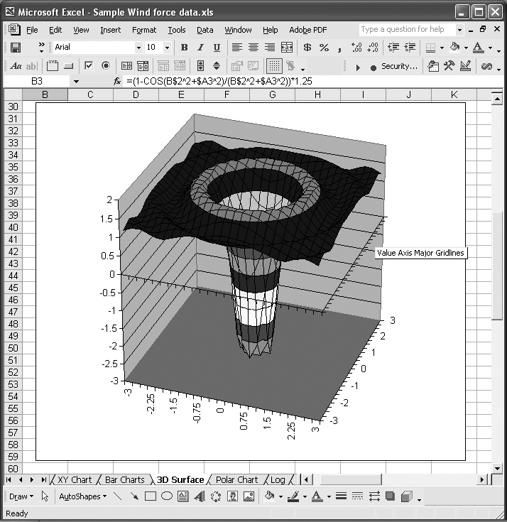
Notice that the x- and y-axes (in the horizontal plane) show real numbers. These resemble axes in an XY scatter plot, but they are still just category labels here. The trick to pulling this sort of plot off is to make sure you perform your calculations at uniformly spaced x- and y-values.
Excel’s Surface chart type also gives you the option of displaying wireframe representations of surfaces such as that shown in Figure 4-25.
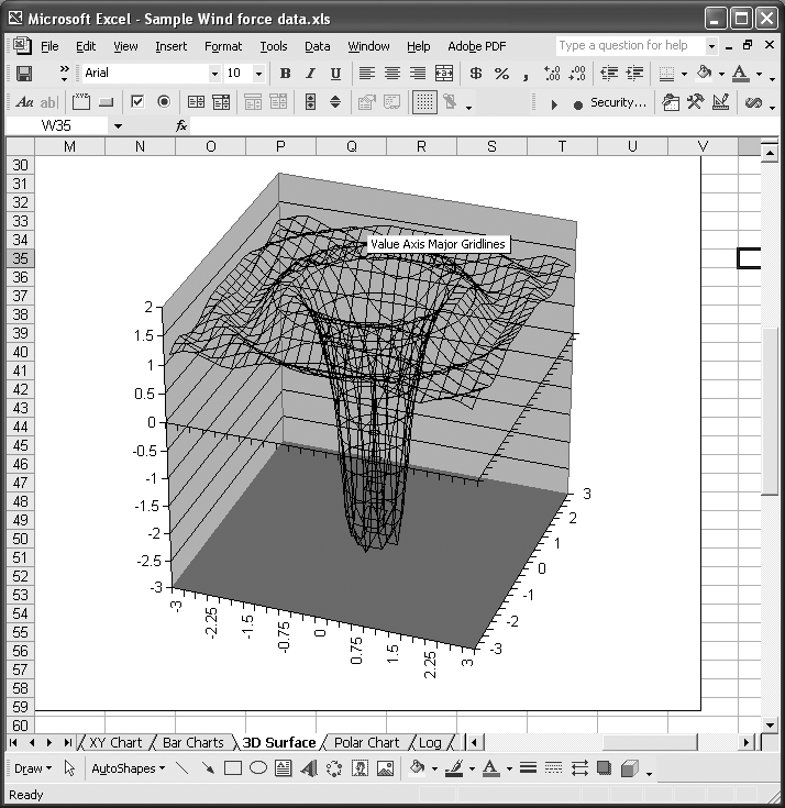
Sometimes, wireframe views are more effective in revealing the structure of such a surface without the distraction of all the colors.
Tip
You’re not restricted to the point of view I used in these examples, by the way. Excel allows you to change the point of view by rotating, translating, or even changing the level of perspective of your 3D plot. Right-click on your chart to reveal a pop-up menu and then select 3-D View.... This will open the 3-D View dialog box, which contains several controls allowing you to adjust the point of the view for your chart.
4.10. Preparing Contour Plots
Problem
You’d like to prepare a contour plot (e.g., to illustrate an elevation map, a map of pressure readings, or any other value distributed over a uniformly spaced grid).
Solution
Use Excel’s Surface chart type. Open the Chart Type dialog as discussed in Recipes 4.1 and 4.9. Select the Surface chart type and then the Contour chart sub-type.
Discussion
Figure 4-26 shows a set of data representing measured height readings taken over a uniform 10 × 10 grid.
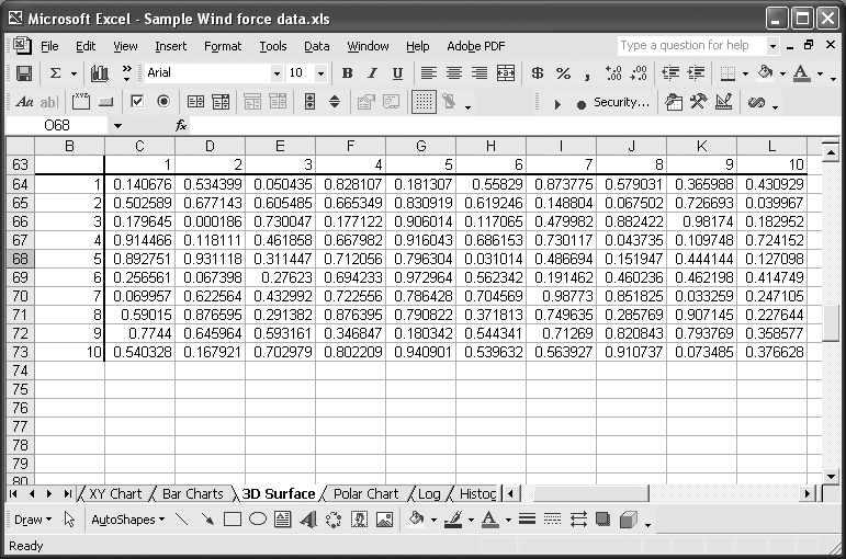
You could use a 3-D Surface chart to display this data as discussed in Recipe 4.9, or you may instead want to present this data as a contour plot.
Excel’s Surface chart type allows you to plot contour plots in addition to 3D surface plots. Contour and Wireframe Contour plots are sub-types of the Surface type. If you create a Surface-Contour chart (see Recipe 4.1 for the basic chart-creation steps) with the data shown in Figure 4-26, you’ll end up with the contour plot shown in Figure 4-27.
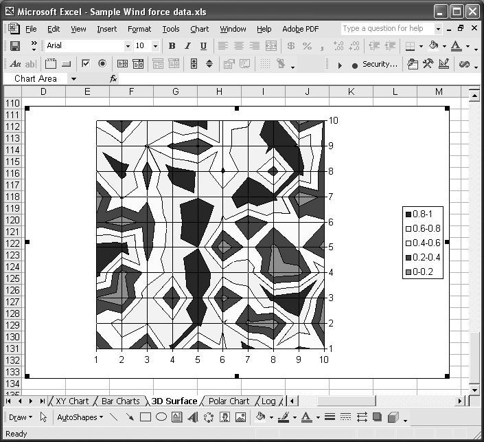
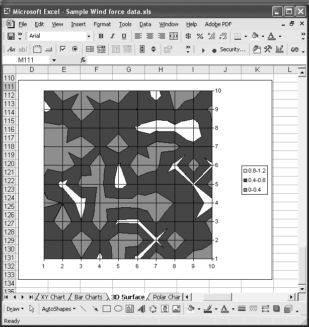
Note the legend displayed on this chart. You can format this legend as discussed in Recipe 4.9 to either increase or decrease the number of colors (and represented data ranges) displayed on the chart. Figure 4-28 shows a new version of the plot from Figure 4-27, with a slightly reduced resolution, so to speak.
This chart uses only two fewer colors, but results in a very different look—it’s less cluttered and perhaps more clearly highlights the data of interest. You can use the legend scale in this way to really draw attention to the data you want the viewer to focus on.
4.11. Annotating Charts
Problem
You’d like to embellish your charts with annotations (for example, to add emphasis or provide notes for viewers of your charts).
Solution
Use Excel’s drawing tools to draw directly on your charts.
Discussion
The callouts (text boxes with arrows) on the chart shown in Figure 4-16 in Recipe 4.8 were added using Excel’s drawing tools. You need to display the Drawing toolbar if it isn’t already visible. Select View → Toolbars → Drawing from the main menu bar. Figure 4-16 shows the Drawing toolbar docked in the lower left of Excel’s window.
The drawing toolbar contains all sorts of tools, allowing you to add text notes, callouts, arrows, shapes, and many other elements to your charts. There are also tools that allow you to format your annotations. For example, you can edit line style and thickness, color, and fill pattern, among other attributes. The 3D style buttons even allow you to create 3D effects to really make your annotations stand out. There are also tools that allow you to change the depth order, spacing, and alignment of your annotations.
To draw on your chart, simply select your chart and then click on the desired element from the drawing toolbar. Now start drawing on your chart. For example, to add a line to your chart, click the chart, then click the line button on the drawing toolbar, then click and drag on your chart to add the line. You can change the position of the line after it has been drawn by clicking and dragging it. You can also edit the line endpoints by clicking and dragging the endpoint handles (little circles).
Tip
By the way, you can use these same drawing tools directly on your spreadsheets; they aren’t limited to drawing on charts. Follow the same procedure described in this recipe for drawing on charts, but instead just draw directly on your spreadsheet.
Figure 4-29 shows an example chart that I embellished using Excel’s drawing tools.
This chart illustrates results of a standard beam analysis. The results include load, shear, and bending moment curves, as well as calculated reactions at each support. To create this chart, I prepared a table of data including the load, shear, and bending moment values at various locations along the beam. I plotted this data on a standard XY scatter chart using the procedure outlined in Recipe 4.1. I formatted the primary and secondary axes to display specific ranges with minimum and maximum units, as described in Recipe 4.4. For the primary y-axis, I specified the crossing point for the x-axis as -800. I did this to force the x-axis toward the bottom of the chart.
After setting up the curves and axes, I labeled the bending moment and shear curves using Callout text boxes with leader arrows, which are accessible from the Drawing toolbar’s Autoshapes → Callouts menu. To represent the beam, I added a basic rectangle shape and manually positioned it where the y-axis values show zero. I formatted the rectangle using a cross-hatched fill pattern.
Tip
Right-click on any drawing element you add to a chart or spreadsheet and select Format Autoshape from the menu to format the shape (or press Ctrl-1). You can also using the formatting tools displayed on the Drawing toolbar.
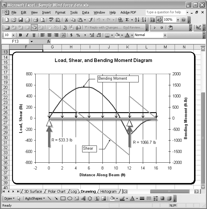
I used small triangle shapes to represent standard, simple supports for the beam. I added these by accessing the Autoshapes → Basic Shapes menu from the Drawing toolbar. I manually positioned them at the proper x-location using the mouse. For the reaction forces, I added a couple of arrows from the Autoshapes → Block Arrows menu on the Drawing toolbar. I formatted these with a red fill color. Further, I added a couple of text boxes (also accessible from the Drawing toolbar) to indicate the calculated reaction forces. I formatted the beam, support, and reaction shapes with a faint drop shadow for a little depth effect. I used the Shadow Style tool (the button with a rectangle and drop shadow, second from the right) from the Drawing toolbar to format the drop shadow.
These are just a few examples of the sort of embellishments you can add to your technical charts to make them more meaningful, readable, and attractive. Excel’s drawing tools are far more extensive than has been demonstrated here. You can add 3D text and shapes, draw smooth lines and edit their points, and prepare flow charts, among many other drawing tasks. I encourage you to explore the drawing tools more.
See Also
Do a search in Excel’s help using the keywords “drawing” or “autoshapes” to find help topics specifically related to drawing in Excel.
4.12. Saving Custom Chart Types
Problem
You find yourself repeatedly creating the same type of chart, with the same custom formats, titles, colors, and so on, and you’d like to be able to save your customizations so you don’t have to redo them each time you create a new chart.
Solution
Add your customized chart to the Custom Types list to make it available in the Custom Type dialog box and Chart Wizard. After creating your customized chart, right-click on it and select Chart Type from the pop-up menu. In the Chart Type dialog box, select the Custom Types tab. Select the “User-defined” radio button toward the bottom of the tab. Press the Add...button to bring up the Add Custom Chart Type dialog box. Type a unique name in the Name field and type a short description in the Description field. Press OK when you’re done; you should then see your custom chart’s name added to the Custom Types chart list. Now you can select this type when creating new charts, instead of having to recustomize one of Excel’s built-in charts each time.
4.13. Copying Charts to Word
Problem
You’ve created a chart in Excel and would like to include it in a report written in Word.
Solution
Simply copy and paste the chart from Excel to Word. Select your chart and press Ctrl-C, or select Edit → Copy from the main menu bar. Open your Word document and select the line where you’d like to paste the chart and press Ctrl-V or select Edit → Paste from the main menu bar.
Discussion
This seems simple enough, and it is. But you do have some options to consider when pasting an Excel chart into a Word document. By default, a picture of the chart gets pasted into Word. This picture is static: you can’t edit the chart and it isn’t linked to the original spreadsheet.
When you paste a chart into Word, you’ll notice a little clipboard icon near the lower-right corner of the pasted chart. If you select that icon, you’ll see three paste options: Picture of Chart; Excel Chart; Link to Excel Chart. The first option is just a picture of the chart, as explained a moment ago.
The second option is really quite powerful. The entire spreadsheet gets embedded into your Word document. This means that you can transmit the entire spreadsheet along with the Word document to other readers of your document. Within Word you can right-click on the chart and select Chart Object → Edit from the pop-up menu to edit the chart right there, as though you were in Excel. You can even edit the spreadsheet data used to create the chart. This may prove handy in some cases. Be careful, however, not to transmit underlying data and formulas to people who shouldn’t see that data.
The third option embeds just the chart (not the entire spreadsheet), but not as a static picture. Instead it’s a link to the original Excel spreadsheet. When the spreadsheet gets updated, the embedded chart will be updated too. You can access the linked spreadsheet by right-clicking on the chart in Word and selecting Linked Worksheet Object → Open Link from the pop-up menu. This will open the linked spreadsheet in Excel, where you can make changes if you’d like. Any changes will be reflected in the Word document containing the linked chart.
When you open a Word document containing a linked chart, Word will ask you if you want to update the linked chart so that recent changes to the Excel chart are reflected in the Word document. If for some reason the link between the Word document and Excel file gets broken (for example, if you move or rename the Excel file), then Word will inform you that it could not update the linked chart.
4-14. Displaying Error Bars
Solution
You can display error bars for a series by opening the Format Data Series dialog box. Select the series and press Ctrl-1. Click the Y Error Bars tab to specify how you’d like the error bars displayed. You can choose to display plus or minus bars or both. Further, you can specify the error as a fixed value, a percentage of the value being plotted, or as custom values in a cell range you provide. Figure 4-20 (in Recipe 4.9) shows an example data series with error bars.
Get Excel Scientific and Engineering Cookbook now with the O’Reilly learning platform.
O’Reilly members experience books, live events, courses curated by job role, and more from O’Reilly and nearly 200 top publishers.

