Chart Types
Although there's a lot to be said for simple column charts—they can illuminate trends in almost any spreadsheet—there's nothing quite as impressive as successfully pulling off the exotic bubble chart. This section covers the wide range of charts that Excel offers. If you can use these specialized chart types when they make sense, you can convey more information, make your point more effectively, and add a little bit of flair to your workbook.
Note
The following sections explain all of the Excel chart types. To experiment on your own, try out the downloadable examples, which you can find on the "Missing CD" page at MissingManuals.com. The examples include worksheets that show most chart types. Remember, to change a chart from one type to another, just right-click it and then select Chart Type.
Column
By now, column charts probably seem old hat. But column charts actually come in several different flavors (technically known as subtypes). The main difference between the basic column chart and these subtypes is how they deal with data tables that have multiple series. The quickest way to understand the difference is to look at Figure 9-12, which shows the same data using several different subtypes.
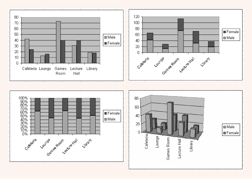
Figure 9-12. Excel generated all these different column-chart subtypes from a single worksheet shown. The data compares the population of males and females in selected rooms. Each subtype ...
Get Excel 2003 for Starters: The Missing Manual now with the O’Reilly learning platform.
O’Reilly members experience books, live events, courses curated by job role, and more from O’Reilly and nearly 200 top publishers.

