Name
Chart → Add Trendline
Synopsis
Trendlines provide the ability to show trends that exist within your data. They can also be used to forecast future data, although you should not base too much on the trendline created. You can add a trendline to your chart by selecting Chart → Add Trendline to display the Add Trendline dialog shown in Figure 10-25. Trendlines can be added for each data series. In fact, a data series can have multiple trend lines.
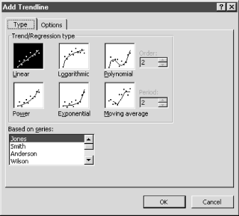
Figure 10-25. Add a Trendline to show trends in the data and to forecast future data
The Add Trendline dialog has two different tab options. The Type tab is where you select the type of trendline that you want to add to your chart. There are six different trendlines that you can select, as shown in Figure 10-25. Each of the trendlines uses a specific formula to calculate the values of the trendline based upon the selected data series. The most commonly used type of trendline is a linear trendline. It is of course only valid if there really is a linear relationship between the two variables in your chart. This option creates a straight trendline that shows the trend of the selected data series.
The Options tab allows you to indicate the text that will represent the trendline within the legend. Probably the most useful feature is the ability to forecast previous or future data values for the selected series. For example, if you want to project ...
Get Excel 2000 in a Nutshell now with the O’Reilly learning platform.
O’Reilly members experience books, live events, courses curated by job role, and more from O’Reilly and nearly 200 top publishers.

