Dijit offers two related widgets that provide dialog
functionality: Dialog, which is
similar to the kind of interaction you normally have with something
like an ordinary alert box (only a whole lot more aesthetically
pleasing and flexible), and TooltipDialog, which is much like an
ordinary tooltip except that it can render other widgets and provide
for more interaction that an ordinary Tooltip.
The Dialog dijit is
conceptually like a pop up that sets up a translucent underlay below
it. While it is visible, you cannot respond to anything below it,
making it ideal for situations in which you need to temporarily
prevent access to controls on a page or force the user to
acknowledge or respond to an alert.
But in addition to the obvious uses, you might also use a
Dialog for almost any situation
in which the alternative would be to pop up a new window. From an
implementation standpoint, using a Dialog is often easier than interacting
with a separate window because everything that is contained in the
Dialog is part of the current
page's DOM.[25] You can query it and otherwise manipulate it like
anything else on the pageâeven if it's currently not visible.
A Dialog may contain any
DOM content you'd like to place in it, whether it is a simple HTML
snippet, a complex layout dijit, or a custom widget of your own.
Example 15-2 illustrates the most basic
usage of a Dialog ; in this case,
it is automatically displayed on page load.
Warning
As noted in the previous chapter, you may need to manually
call a layout dijit's resize
method to force it to redraw itself if you initially create it to
be hiddenâwhich it would be if you created it and then embedded it
inside of a Dialog.
Example 15-2. Typical Dialog usage
<html>
    <head>
        <title>Fun With Dialog!</title>

        <link rel="stylesheet" type="text/css"
          href="http://o.aolcdn.com/dojo/1.1/dojo/resources/dojo.css" />
        <link rel="stylesheet" type="text/css"
          href="http://o.aolcdn.com/dojo/1.1/dijit/themes/tundra/tundra.css" />

        <script
            type="text/javascript"
            src="http://o.aolcdn.com/dojo/1.1/dojo/dojo.xd.js"
            djConfig="parseOnLoad:true">
        </script>

        <script type="text/javascript">
            dojo.require("dojo.parser");
            dojo.require("dijit.Dialog");
            dojo.addOnLoad(function(  ) {
                dijit.byId("dialog").show(  );
            });
         </script>
    </head>
    <body class="tundra">
        <div id="dialog" dojoType="dijit.Dialog">
            So foul and fair a day I have not seen...
        </div>
    </body>
</html>
Programmatically creating a Dialog is easily accomplished with
Dialog 's setContent method, which can accept a DOM
node. Consider this example, which forces the user to click on a
Button that is placed into a
Dialog âeven though you've
expressly told them not to do it:
dojo.addOnLoad(function(  ) {
    var d = new dijit.Dialog(  );

    //hide the ordinary close button from the user...
    dojo.style(d.closeButtonNode, "visibility", "hidden");

    var b = new dijit.form.Button({label: "Do not press this button"});
    var handle = dojo.connect(b, "onClick", function(  ) {
        d.hide(  );
        dojo.disconnect(handle);
    });
    d.setContent(b.domNode);
    d.show(  );
});
Tip
Dialog 's template
contains a number of useful attach points, including the closeButtonNode attach point, which was
used in the previous code example to hide the icon that normally
closes a Dialog.
Like the other dijits, you'll often get by with just a few common methods and attributes, but Table 15-2 presents the rest of the story for when you need it.
Tip
Dialog inherits from
ContentPane, so all of ContentPane 's attributes, methods, and
extension points are also available if you need them. See Example 14-3 for that API.
Table 15-2. Dialog API that builds upon ContentPane's API
Name | Type | Comment |
|---|---|---|
| Boolean | The state of the
|
| Integer | The duration in
milliseconds it takes to fade in and fade out the |
| Function | Hides the |
| Function | Positions the
|
| Function | Display the |
TooltipDialog inherits from
Dialog, but provides
functionality that may sort of remind you of a menu out of a
DropDownButton âexcept that you
can interact with it. In fact, the current manifestation TooltipDialog must be housed in a DropDownButton or a ComboButton, although you could
theoretically adjust the button's style to make it appear quite
different. You may recall the concept of a TooltipDialog from interacting with a
spreadsheet application.
Warning
To get TooltipDialog, you
must do a dojo.require("dijit.Dialog") because
TooltipDialog is embedded into
Dialog 's resource file.
Aside from the inability to programmatically create and
display a TooltipDialog as a
standalone, the rest of its functional API of a TooltipDialog is quite similar to Dialog with the caveat that it does not
support a show( ) method.
Additionally, it offers a standard title attribute that you can fill in if
you'd like to stay accessibility compliant.
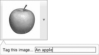
A good use case for a TooltipDialog might be to provide an
interactive means of tagging an image. For example, you might use a
DropDownButton to provide an
image via its iconClass attribute
and then interactively supply the TooltipDialog when the user clicks on the
image. The following snippet provides the basic outline for how you
might get started with a custom image tagger, producing the results
shown in Figure 15-2.
<!-- somewhere out there...
<style type="text/css">
.customImage {
                background-image : url('/static/path/to/apple.jpeg');
                backgrond-repeat : no-repeat;
                width : 120px;
                height : 120px;
            }
</style>
-->

<button dojoType="dijit.form.DropDownButton" iconClass="customImage"
  showLabel="false">
    <span>This label is hidden...</span>

    <div dojoType="dijit.TooltipDialog">
        <span>Tag this image...<span>
        <div dojoType="dijit.form.TextBox"></div>
    </div>
</button>[25] In fact, some browsers will not even allow you to manipulate one window's DOM from another windowâeven if both windows are from the same origin.
Get Dojo: The Definitive Guide now with the O’Reilly learning platform.
O’Reilly members experience books, live events, courses curated by job role, and more from O’Reilly and nearly 200 top publishers.

