Chapter 4. Building Trust into Mobile Payments
One of the key tenets of human/computer interaction is to avoid inciting anxiety in the user, which can be caused by uncertainty about negative events.[50] This is especially true when dealing with people’s hard-earned money. Eliminating that uncertainty with design is a matter of addressing or finding out what your users expect from an experience, and catering to those expectations as much as possible, using common user interfaces that the user will recognize. With nascent technology like mobile payments, there are less abundant examples of successful design patterns than, say, for ecommerce shopping carts or browsing a social network feed. Still, there are some emerging patterns and best practices that we can look to as good (or bad) examples.
Don’t Design for Early Adopters, Design for Everyone Else
Mobile payments are not really a new thing. Consumers in places like Japan and South Korea have enjoyed immensely popular mobile payment initiatives since 2004, beginning with services like FeliCa and NTT DoCoMo’s osaifu keitai (“wallet phone”), with transaction volume surpassing ¥1 trillion by 2007.[51] They have also been using the same phones as door keys and airline boarding passes. So now that all these technologies exist in the mobile space, how come we aren’t using them every day here in North America?
The easy answers to the adoption question are generally centered on the fact that swiping a plastic card still works (mostly) and chicken-and-egg scenarios: mobile payments are built upon an outdated financial infrastructure,[52] or merchants won’t adopt new point-of-sale technology, or telcos like those in the Isis collective have placed a chokehold on the mobile ecosystem. These are, of course, valid challenges, but I see a much broader, more difficult challenge: consumers are not yet entirely comfortable with the idea of using their phones to pay for things.
There are many points in the mobile payments supply chain that present technical challenges to adoption, such as compatible phones (in the case of NFC) and point-of-sale upgrades (like QR code scanners and NFC readers). NFC in particular requires business relationships between the bank and the mobile network operator, which are not always harmonious. Once the user has the right phone, then gets his card on his phone or links it to his app account, there’s no guarantee that his favorite merchants will even be able to accept a mobile payment. All this makes it hard for a user to start using his phone to transact, even if he were totally on board with the idea of his phone having access to his bank account in some way. Institutions in the related verticals (financial services, telecommunications, retail operations) don’t typically work together, unless they see a compelling consumer demand for a new payment method. The reason why NFC has become popular in places like South Korea is thanks to close collaboration between these disparate parties to bring new technology to the consumer. In the US, there are signs of joint ventures at this scale, like Isis (the three major MNOs) and MCX (retail brands), which are starting to inch the bar forward in terms of commercial visibility. In the end, I don’t think it matters if the impetus of a payments revolution begins with a startup or with a respected financial brand, but what is clear is that industry-wide initiatives to improve payments technology would be a large contributor to mobile payments becoming more widespread.
Even if the stars of the mobile payment ecosystem align, there is still one key element that is less tangible but can make or break a mobile wallet, regardless of the method it uses (cloud, NFC, barcodes, etc.). That element is the consumer’s trust in the experience, and it is the largest hurdle that mobile wallet designers and developers must tackle in order to build a successful payment system.
Of course, all new inventions must overcome the growing pains of gaining consumer mindshare, just as using the Web to shop, date, and rent vacation homes was slow to be adopted widely when those options came to market. If someone had told me five years ago that banks would be banging down my company’s door to get mobile check deposit (i.e., account holders take pictures of their checks and deposit them digitally) built into their banking apps, I would have questioned that person’s sanity. One great example of this is when University Federal Credit Union, the largest financial institution in Austin, Texas, first launched mobile deposit capture in its banking app. Within the first eight months, its members used their phones to deposit $16 million in checks.[53] These days, most major banks have this feature, with very similar usage figures. It’s in our nature as humans to be skeptical of new technology, but this skepticism is not impervious. We are, of course, capable of change, if it’s to adopt something that is convenient and reliable and that improves our daily lives in a profound way. Over time as we try new gadgets or ways of doing things, we begin to trust them—if they work the way we expect and don’t provide cause for grief. Consider how often you do any of the following now, versus 10 years ago:
Write a check
Balance a paper checkbook
Print out an online map for driving directions
Visit your local bank branch
Use a pay phone
My favorite quote on our capacity to adopt new ways of doing things, when it comes to the financial world, comes from Susan Crawford, Harvard Law professor and past advisor to President Obama on technology and innovation policy:[54]
There is nothing more imaginary than a monetary system. The idea that we solemnly hand around printed slips of paper in exchange for food and water shows just how trusting and fond of patterned behavior we human beings are. So why not take the next step? Of course we’ll move to even more abstract representations of value.
The sea change inherent in mobile payments will not happen overnight. These new interactions face an entirely unique and complex adoption challenge because these apps intend to revolutionize a common task that we all do several times a day: purchasing something or paying someone. One criticism of mobile payments (often directed at NFC, but it applies to any mobile payment method) is that it’s a solution looking for a problem. This point rings true—as of today, most consumers are just fine with swiping a plastic card. The current system works consistently, even if it’s running on decades-old technology. It’s generally reliable, as long as the magnetic stripe on the user’s card hasn’t worn out, and the store’s card readers are functioning properly. No one could argue that there is a pretty low learning curve to using cash or cards. If consumers do eventually switch to paying with a phone, their mental model will remain rooted in the stimuli of the brick-and-mortar checkout experience: wait in line, be greeted by the cashier, open a leather wallet, swipe a card, type a PIN, hear the register beep, take the receipt, pick up the bags, etc.
What’s even more daunting is that we are talking about combining two very personal objects: our mobile devices and our money. We never leave home without them—though I think that our phones might be dearer to us (a Stanford student survey in 2010 found that 69% would be more likely to leave their wallet at home than their iPhone[55]). Both of these hold significant places in our lives, and compromising either is something most of us would like to avoid at all costs. Likewise, consumers are understandably concerned with their financial privacy in this new paradigm. Since you are reading this book, you probably feel (as I do) that mobile devices and money go together like chocolate and peanut butter, but it’s important to keep in mind that not everyone feels this way. Before the user taps that Register button on a welcome screen, she needs to be assured that the provider of the mobile experience will protect her money, and that she will not be exposed to fraud or information privacy breaches. Once that faith is broken, it’s nearly impossible to earn it again.
It is rather ironic that mobile payments are so untrusted by the general public, when traditional payment methods like cards and checks are in fact much less secure, and easily compromised or faked. Sure, a user’s credit card has a magnetic stripe or an encrypted gold chip that locks down the account number and payment data, but what happens when someone steals his wallet? When was the last time a sales cashier asked to see the back of your card to verify that your signature matched? Are you one of the 12.6 million consumers who has had their identity stolen and used for unauthorized purchases?[56] Consumers are now more wary of their financial privacy than ever before: the Unisys Security Index in May 2014 found that 59% of Americans were extremely worried about hackers obtaining their card details. Financial fraud was their greatest concern, even greater than terrorism (47%), epidemics (34%), or going broke (30%).[57]
Consumers have good reason to be worried. Even large retail brands struggle with the assurance of security, as Target saw in December 2013 after its registers were hacked and cardholder information was compromised. The Heartbleed attack of OpenSSL in early 2014 compromised the passwords of many high-traffic websites (Facebook, Google, Amazon Web Services). These high-profile security breaches only contribute to the fear that hackers are out there, chiseling away at the walls that keep consumer information from falling into the wrong hands.
So mobile commerce has an uphill battle to fight. Of the mobile wallet usability testing sessions I have observed or moderated, an overwhelming dichotomy emerged, no matter how many users were able to complete the test’s payment tasks successfully, or how nice they thought the animations looked. Users generally fell into one of two camps:
- Early adopters
Love the futuristic sexiness of buying stuff with their phone. Had previous experience using the Starbucks app, PayPal, or Square.
- Everyone else
Felt anywhere from “mildly apprehensive” to “scared shitless” at the thought that their credit card number is stored inside a technological black box that they have never heard of, and don’t understand.
There are, of course, nuanced subgroups in both of these, but the second group, “everyone else,” is the one we as designers need to reassure, particularly as we build onboarding and payment interactions. Ideally, our efforts should go a few steps beyond finding the most “trustworthy” shades of blue, or sprinkling arbitrary “lock” icons everywhere.
Consumers’ concerns are multifaceted, and fall into these four trust categories:
The security of their bank account information
Use of personally identifiable information
Control of when and how payments can be made
Contingencies for theft or loss of their device
Designs that successfully address these four areas will imbue a holistic impression of trustworthiness in the app experience. Falling short on any of these aspects will trigger doubts in the user’s mind.
A recent report published by the Federal Reserve Bank of Boston reflects the four trust categories, chief among them being the exposure of their identity, and the fear of what might happen if their phone goes missing (Figure 4-1).
Let’s look at those first three responses to the survey, as they’re fairly interrelated. It’s clear that the surveyed consumers were most concerned with identity theft. It’s truly frightening to think that a thief could eavesdrop on or steal your phone, then learn everything about you: your name, your address, your relationships, your pictures, your credit card numbers, and more. This is why designers should take care never to display on screen any information that would personally identify the user.
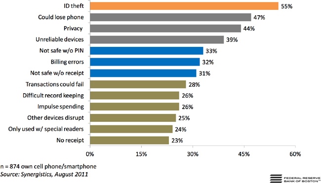
The next concern for users was the loss of their device, which would trigger the first concern—identity theft—as well as the inconvenience of having to cancel any cards that might have been linked in some way to their phone. The third one, privacy, is a bit vague. Privacy could be the personal sense: who they are, where they live, or their phone number. In the financial sense, privacy could refer to their account numbers, balances, and spending history. These are typical of the grave concerns that run through a user’s mind when he first encounters a new payment app, either by seeing a friend using it or noticing it in his app store.
Financial privacy rights are heavily protected by global regulators (like the PCI Security Standards Council), especially around what we in the financial service industry call cardholder data: the cardholder’s name, card numbers, expiration dates, PINs, and customer verification codes (the three digits on the back of the card or four digits from the front of the card, in the case of American Express). Industry security standards dictate that the most effective preventative measure against those three scenarios taking place is the use of a consumer authentication factor. Asking a user to enter a password or PIN is more often a welcome task than an annoyance. Even if a user doesn’t have an NFC wallet or PayPal on her phone, she is now likely more accustomed to using complex passwords (a mix of letters, numbers, and symbols) as well as locking her phone with a passcode, gesture, or fingerprint. She will expect any app that deals with her financial information to have similar affordances. You can never pay too much attention to the areas of an experience where users might have cause for alarm.
Now, we will take a hard look at common pain points where mobile payment users feel the most uncertainty:
Onboarding and registration
Security options
On-screen display of sensitive data
Getting help
These four interaction families are where users are most likely to second-guess a financial app, especially if they encounter something unexpected. These complementary use cases are what I like to call the bookends of the payment experience (users signing up for the service, setting up their payment preferences, and finding help when they have questions), so it’s important to make them as seamless as possible. These use cases will most likely come into play before the user even gets to the checkout line.
Onboarding and Registration
A user’s first encounter with your app is a do-or-die moment. If at any point the user is not sure what your app does or feels overwhelmed by the registration process, he will instantly question the overall security of the experience and drop out. An effortless onboarding process is essential for any application, but this is especially true of a mobile financial experience. Relying on the consumer’s familiarity with the brand is not enough. He must be assured that the app he’s downloaded is clear about its purpose and will protect his financial privacy.
The First Screen
Users opening your app for the first time may expect to see a walkthrough, login forms, your logo, and maybe some slick animations. Even if their first task is to sign up or log in, don’t skip out on the opportunity to state exactly what the app does. Never take for granted that the user has read through all the features in the app store listing. You could accomplish this with a simple statement like “MobilePay lets you pay [securely] for things with your phone!” You could also explain your app’s purpose with a brief animation, or over two or three screens that state the benefits and features of using the app. Avoid wordy explanations, or long demo videos—just cut to the chase!
Calls to action like “Log In” or “Sign Up” should, of course, be obvious to the user, but don’t force her to go through a registration process without first walking her through the app’s key features.
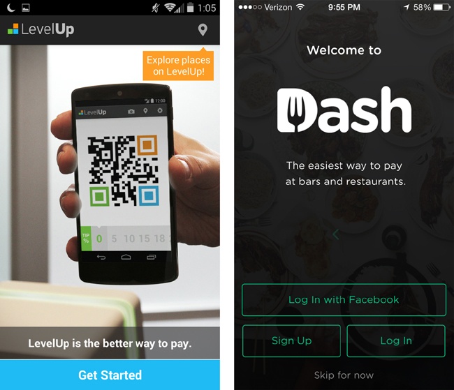
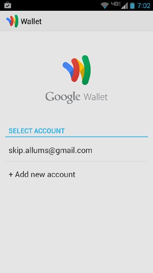
Both LevelUp and Dash (Figure 4-2) use the start screen as an opportunity to communicate clearly what the app’s primary features are. The Sign Up and Log In buttons are prominent, offering distinct paths for new users who want to sign up, and returning users who want to log in. Compare these with Google Wallet (Figure 4-3), which tells me zilch about what the app does or what will happen when I sign in with my Google account. The goal here is to be absolutely clear what the benefit will be to users, so they can decide whether or not it’s worth their time.
Walkthroughs and Demos
Usability best practices would stipulate that if your application needs a tutorial, then maybe it’s too complex. As designers, we’ve had it instilled in us to avoid over-embellishing. Keep it simple, Stupid...right? Mobile payment apps can be an exception to this rule, as most users aren’t accustomed to using their phones to pay for things. They will probably need a little bit of instruction. Even if they are familiar with the general concept, your particular app’s payment interaction may have subtle nuances (as we saw in the previous chapter) that make it different from one they have used before. For example, a customer who is familiar with using the Starbucks barcode for payment may not be familiar with the NFC tap-to-pay method, at least for the first few uses. You should include a brief introduction to demonstrate how paying works, or to point out navigation elements that will likely be used the most. There are two optimal moments in which a tutorial like this can be placed: on the start screen before the user signs up, or following registration.
If you decide to place a walkthrough before enrollment, strive to cover the general app functionality and its benefits, and limit it to three or four screens. Content placed before enrollment should follow a concise format, almost like an elevator pitch: what the app does, why users should use it, how it works. Use visual elements like diagrams and animations in concert with text to get the concepts across. Ideally, a Close or Get Started button should be plainly visible, so users don’t have to swipe through the whole walkthrough or watch the complete animation if they don’t want to.
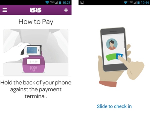
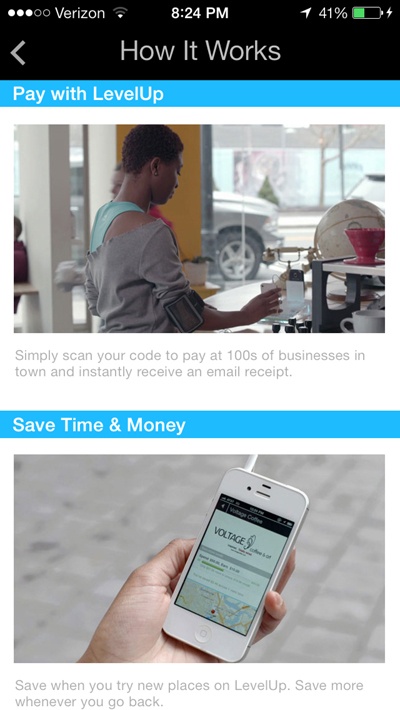
Before the user registers, both Isis Mobile Wallet and PayPal (Figure 4-4) use animations to show how a typical payment works, so there are no surprises when the user gets to the register. Be sure to make your tutorials available from secondary Help or How To menus, so that customers can view it again later, as LevelUp has done in a section called How It Works (Figure 4-5).
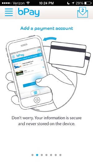
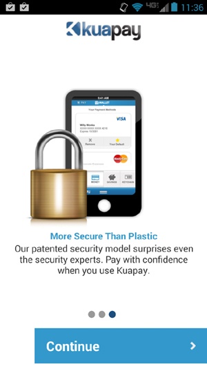
Walkthroughs don’t have to be limited to marketing bullets and instructional animations. Take the time to call out your security model as a feature, like any other selling point. You don’t have to use detailed schematics or process flows to show how user data is encrypted as it moves over the payment network. A general statement or diagram is enough to assure users that yes, you are being careful with their financial privacy. The bPay trial (Figure 4-6) from Barclay’s Bank Delaware did a great job of addressing this common onboarding concern: on the screen that explains the part of enrollment where users must link a card to the service, there is a simple statement below the graphic that clarifies that their card data is never stored on the device. Don’t assume that users know the difference between local memory storage and storage on a secure hosted service, or that they’ll know where their personal data will be kept. Don’t be vague, either—your users aren’t stupid. Compare bPay’s onboarding with Kuapay’s (Figure 4-7), which touches on the topic of data security, but in kind of flimsy way: a giant lock on a phone image (which tells the user nothing, really). There is a vague statement promising that the app’s security “surprises even the security experts.” That sounds impressive, but there’s not much to reassure the user here.
Once your users have completed their enrollment, you can provide them with a tour of key features to help orient them. This can be focused on areas like how to start a payment, where to find the settings menu, or how to navigate to other areas of the app. This kind of tutorial works best at the home screen as a transparent overlay. You may also consider walking users through a payment demo, so that they will know what to expect when they make their first payment. Users should be able to dismiss the tour overlay with a tap or swipe, but let them bring it up again from a Help or About menu, in case they need a refresher.
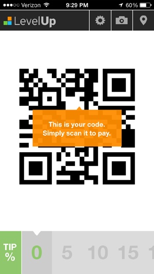
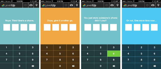
LevelUp (Figure 4-8) employs helpful pop-ups or toasts to call out key features of the app upon first use, but some of them are vague. Who is supposed to scan the code? The customer? The merchant? A more accurate description would be “Show this code at the register to pay.”
PayPal (Figure 4-9) shows an overlay upon first use, explaining its custom iconography and directing the user to the slide-out nav for more features. This is especially helpful if there are key icons that may not fit into the standard pantheon of mobile iconography. These initial walkthroughs and how-to’s are a thoughtful way to ease users into using their phone as a payment instrument. Whether used as a welcoming experience or as an interstitial while the user account is being set up, these visualizations can alleviate users’ anxiety about getting to the register and not being sure what to do. After all, no one wants to be the schmuck holding up the line!
Registering and enrollment is the most challenging pain point for financial apps. Legalese, awkward button labels, and endless, endless forms all present points of friction that can cause a user to give up and delete an app. Though the flow of signing up a new user varies greatly depending on the payment method and required security constructs, there are a few best practices that can make onboarding quick and painless.
Reducing the number of “required” data fields is the easiest way to reduce the amount of effort inherent in a registration flow. One common road hazard is the dreaded credit card form. Partnering with banks is the only way of circumventing this step, as users could link their source cards and accounts via an existing banking credential or token, like their online banking login. Otherwise, you could expedite the process of adding a card by using a character recognition API for credit cards, like card.io, or simply by limiting the required fields to the bare minimum, namely:
City and state can generally be drawn from the zip code, so they aren’t necessary. There is also no need for the user to select the type of card (Visa, MasterCard, Discover, etc.), as the format of the card numbers can tell you that, thanks to standards set by International Organization for Standardization and the International Electrotechnical Commission.[59] From the first six digits of the card number (called the bank or issuer identification number), you can deduce the card type as well as the bank that issued the card (see Table 4-1). That’s potentially four data points that the user won’t have to enter manually!
American Express | Starts with 37XX XXXXXX XXXXX |
Discover | Starts with 6011 XXXX XXXX XXXX |
MasterCard | Starts with 51XX XXXX XXXX XXXX or 55XX XXXX XXXX XXXX |
Visa | Starts with 4XXX XXXX XXXX XXXX |
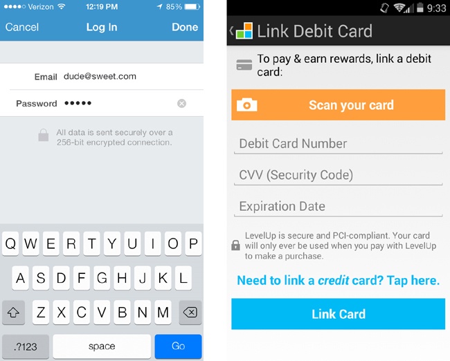
Cover and Venmo (Figure 4-10) capture card details in a simple form that fits in the top half of the screen. Fields like card type and city/state are bypassed in favor of dynamic field validation and OCR capture with the phone’s camera. Compare this with the Dunkin Donuts app, which has a much longer form, with a total of 12 data entry fields. Even worse, the form does not obfuscate card details once they are entered, which could make users feel that their financial data is exposed. Of course, you will want users to have the visual feedback of seeing which numbers they’ve entered, but once the card number field is no longer active, I recommend hiding all but the last four digits of the card. Registration should not exceed three or four steps or screens. Throughout the process, users should be given an obvious indication of how many steps are required, and where they are in the flow as they progress. In the mobile context, this can be shown as a progress bar, or simply with text in a prominent location, like “Step 2 of 4.” This is comforting to users, in that they know approximately how long it will take to set up their account, and it gives them a fair idea of how much information they may need to volunteer.
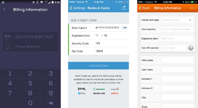
Uber (Figure 4-11) shows users a progress indicator that turns green as users complete each step in the process. Venmo uses text along the top bar to tell users how many steps they have left to go. Both apps take care to explain to the user why they are asking for certain types of personally identifiable information.

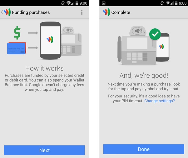
Likewise, if there is a point (usually at the end of the registration process) where users must wait while some behind-the-scenes process carries out (like activation of the secure element in NFC payment apps), you should inform them how long the process will take, and concisely explain why the delay is necessary. Ideally, we want to avoid this scenario, but if this process is absolutely necessary, it should be made apparent to the user that all is well. For example, Google Wallet (Figure 4-12) displays friendly, concise messaging to let users know that their phone is being set up for payments, explaining what is being done in the background (the phone is securely receiving contactless card data), and wraps up with a cheerful success screen once the process is complete. If possible, avoid blank screens with stock loader animations, and, as an alternative to the usual “Loading...please wait” messaging, utilize this interstitial period to guide the user through other areas of the app that don’t rely on the background process, like merchant locator maps or settings.
The frustrating paradox about terms and conditions in applications is essentially: no one reads ’em, but you can’t get rid of ’em. Most likely you will be required to show these at some point to users, and they should have ready access to them at any point in the experience where it might be appropriate, such as in a supplementary About menu. Still, for those who do like to read the fine print, try to incorporate legal disclaimers and service statements in a way that is not obtrusive, but not outright sneaky. It’s never too early to bring legal advisors into the design process to discuss the best way to present these policies without negatively impacting the user experience.
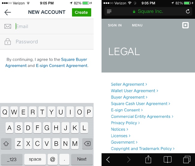
Square Order’s service agreements (Figure 4-13, left) are subtly placed below the email address and password fields on the first screen of its registration flow. Tapping on either of these will bring users to a page in their browser where they can read legal phrases to their heart’s content. Square’s service agreements are probably the most readable and plain-spoken legal documents you could find. While this subtler approach is the least annoying method and avoids privacy “sticker shock” in the majority of users who don’t read this stuff, it runs the risk of users missing the fact that they were ever presented with terms and conditions before signing up.
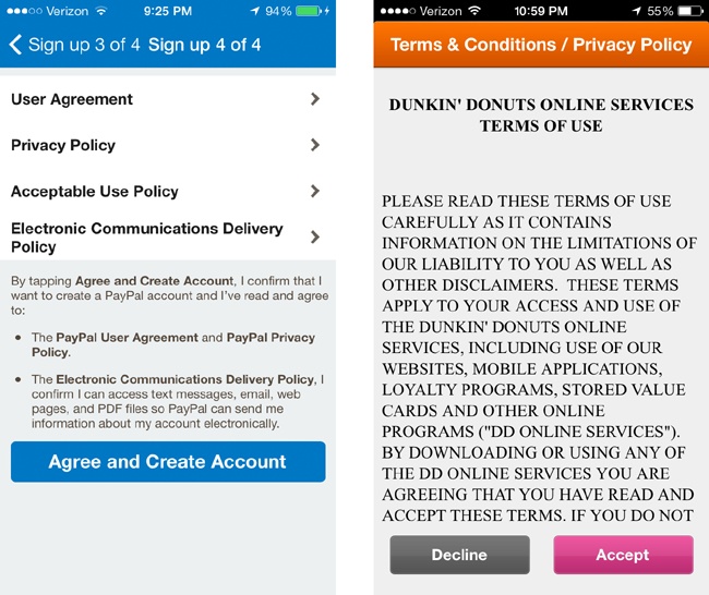
PayPal strikes a good balance between transparency and convenience by incorporating the full text of its policies as the last step of its four-step signup flow, but in a way that doesn’t force users to read them if they don’t want to (Figure 4-14). Dunkin Donuts, on the other hand, is less subtle, dumping the entirety of the document into one long screen that the user must scroll through; the user most likely won’t bother to read and will just tap Accept. This approach, while likely meeting the base legal requirements, makes it much harder for users who do take the time to read the fine print and inform themselves about the impact an app may have on their privacy.
As designers, we often groan at the idea of having to account for legal statements. This very important content tends to get dismissed (buried in an About menu, or put in a slapdash scrolling view like the Dunkin Donuts example). It’s important for designers to keep in mind that users expect to see clear evidence that the payment or banking app they are using adheres to regulatory and legal standards. When it comes to trust in these experiences, the perceived absence of service terms and agreements would be more worrisome to the user than the inconvenience of having to tap an extra button. In addition to Terms of Use and privacy statements, at some point in the user’s first use of your app you should explain—in a way that is concise and easy to understand—how that user’s financial information will be protected. Reassuring statements like these can explain in plain English the security standards employed behind the scenes that protect your users’ financial information. For example, Venmo (Figure 4-15) reminds users that their data is encrypted each time they log in, while LevelUp calls out its security certifications whenever the user adds a card. Laypeople may not completely understand the underlying encryption protocols at work, but they will have peace of mind that the company that built the app is considerate of their privacy.
Security Options: m-PINs, Passcodes, and Passwords
Once users are signed up and ready to start paying with their shiny new mobile wallet, they will want to tap, scan, or check in while feeling in complete control of the experience, trusting in the fact that their financial data is safe. To that end, users will expect a payments app to have basic security features (like PINs or passwords with timed lockouts) and to be able to set display preferences that will work together to maintain their financial privacy.
With any app that handles sensitive financial data, the most familiar security control that users expect to see is a password, passcode, or m-PIN (mobile PIN). An m-PIN screen is a great way to allow users to lock down their app for periods of inactivity, or even as a method to authorize payments—like a digital signature. Passwords associated with a username or other login credential are also useful for this purpose, but the m-PIN format is the most appropriate for the mobile context. It’s a familiar interaction, as most mobile devices allow for an additional m-PIN lock or gesture to protect unauthorized use or bring the device out of sleep mode. Numerous reports and surveys on the topic of mobile wallet adoption have found that a mobile PIN lock is the primary security feature that consumers expect to use, and makes them feel most at ease.[60]
Successful m-PIN interfaces should use bespoke keypads, rather than the stock keypad provided by the OS. This prevents nefarious programs (especially on the Android OS) from “listening in” on common touch coordinates for native keypads. It also makes for a more efficient interface if the keypad was designed specifically for the task of entering an m-PIN code (i.e., large touch targets), as opposed to being a calculator-like interface with special characters and mathematic controls that stock OS keypads often display.
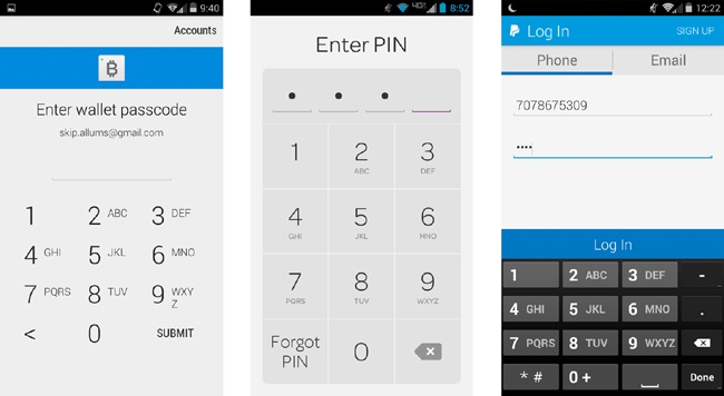
The most common design pattern for mobile PINs (Figure 4-16) calls for a large keypad for fast tapping, paired with a grouping of four or five progressive numeric fields that briefly shows the number the user has entered before obscuring it with a dot or asterisk. Additionally, there should be some way for users to recover a lost m-PIN, via a “forgot PIN/passcode” process that resets their m-PIN after they have verified their account through some other means, such as SMS verification code, security questions, or email login.
Isis (Figure 4-16, center) has probably the most successfully designed mobile payment PIN screen to date. It follows the expected pattern closely. The keypad is easy to read, as the numbers are emphasized over the alphabetical characters (which you could argue are not necessary in this context, since the N in PIN stands for number). The keypad is placed in the lower half of the screen, the most comfortable position for one-handed users to reach. Coinbase (Figure 4-16, left) follows this pattern as well, though the user has to tap the Submit button, even after the fields are complete—which is an extra and unnecessary step.
Meanwhile PayPal (Figure 4-16, right) breaks this pattern, with mixed results. First, PayPal uses default OS keypads, which opens up some vulnerability, especially on the Android platform. Though users have the option of unlocking their app with a PIN as well as their email and password, it requires more taps to enter than in apps that use the more common progressive-numeric-field grouping, as the user must also tap an additional Log In button. For entry feedback, the user sees four tiny dots entered into the field, which can start to blur together—wait, how many numbers did I enter? Lastly, there is nowhere to go if users need help remembering their PIN; they have to switch over to the Email tab and tap the Forgot Password link.
Gracefully handling incorrect PIN entries is just as important as making entry of the PIN more efficient. Effective error cases in this regard hinge on two factors. First is the number of incorrect retries. If a four-digit PIN code has four maximum attempts, for example, then there is a .0004% chance that a malicious user could guess your code. That probability increases as the number of maximum attempts does. Second, users should be given clear visual cues and messaging that they have entered their PIN incorrectly, and guided through what to do if they have locked themselves out or forgotten their code.
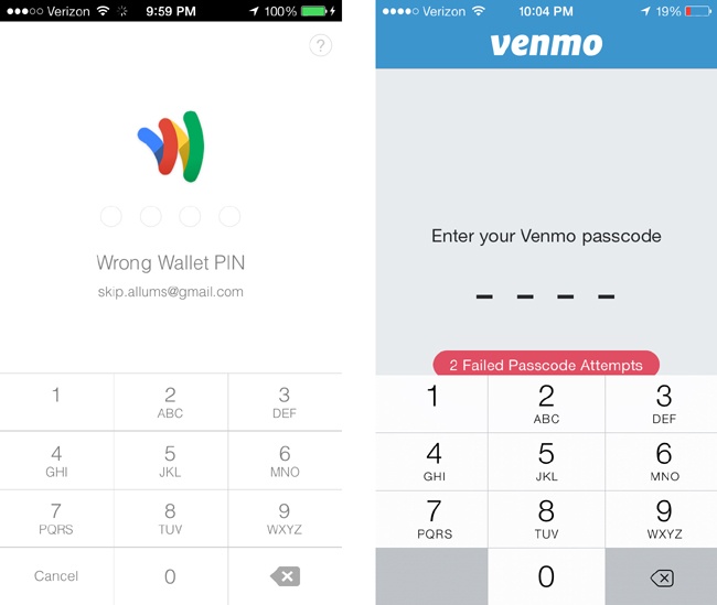
Google Wallet and Venmo (Figure 4-17) both let users know that they’ve entered their PIN incorrectly with easy-to-read text and haptic feedback. All good so far. Venmo shows how many incorrect passcodes have been entered, and Google Wallet simply states “Wrong Wallet PIN.” In Google Wallet’s more subtle approach, it might be easy for a distracted user to not realize he’s entered the wrong numbers.
Once again, LevelUp excels here (Figure 4-18) by offering helpful negative feedback via flashes of color and cheeky copy without exactly revealing the remaining number of attempts. This is a more humanistic way to warn the user than simply stating “Incorrect.”
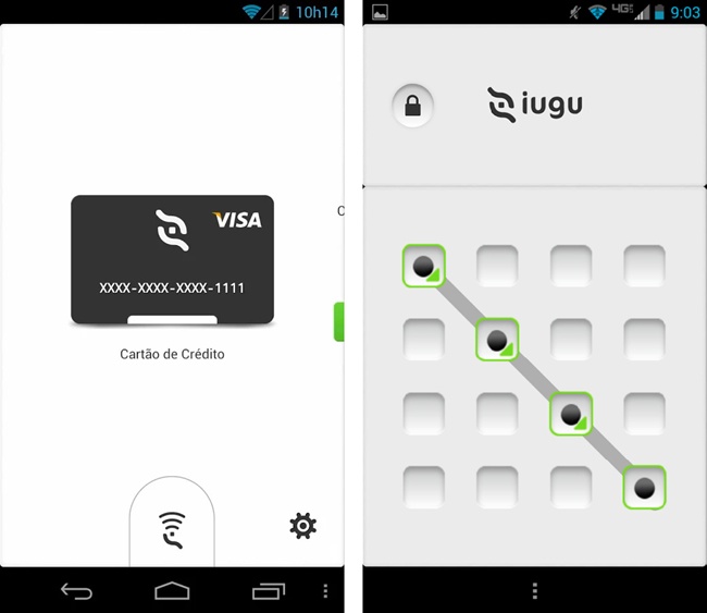
Of course, mobile PINs are not the only way to protect a wallet from unauthorized use. Facial recognition, fingerprint scanning (seen in newer iPhones and Samsung phones), and gestures (like Iugu’s QR code–based wallet, shown in Figure 4-19) will soon become prevalent locking mechanisms. We’ll look more into the implications these new authorization patterns will have on future wallet interfaces in Chapter 7.
Handling Sensitive Data
Developers should take great care never to expose information about users that would compromise their personal or financial privacy. This includes not only data sets like card numbers and PINs, but also identifiable information like location data, full names, and billing addresses. The easiest way to avoid exposure is not to use them in the first place! This is not really possible, of course. Whether they use closed loop reloadable cards (e.g., Starbucks) or a secure element embedded deep in the phone’s innards (e.g., Isis Wallet), all payment apps rely on the user offering up some kind of funding source.
There are two areas in this regard that concern users the most: visual feedback during data entry of their accounts and cards, and the resulting display of those accounts and cards in UI elements. The first scenario is rather straightforward: whenever users enter a credit card number, security code (CVV, CVM), password, or PIN, obfuscate the field so that they can see what they entered for about one second before the app replaces that value with a dot or asterisk.
The second scenario—displaying account information as part of the interface—is trickier.
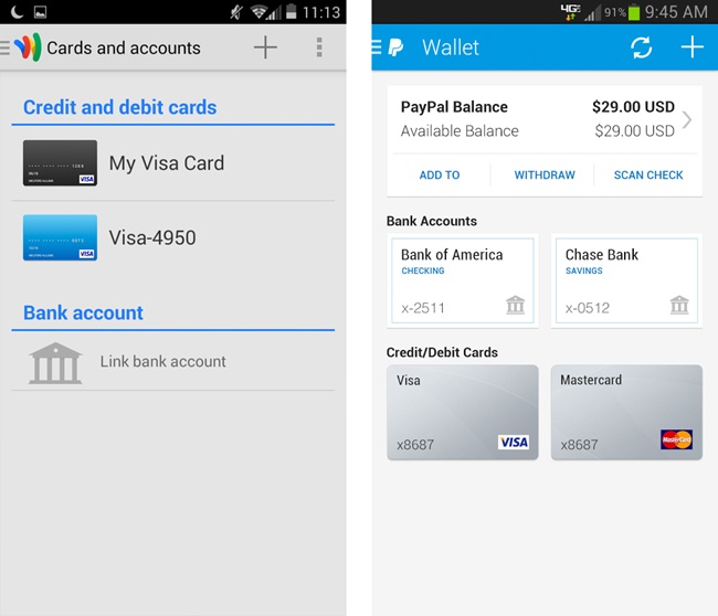
We want users to be able to readily recognize their accounts or cards in a list, and select them to do things like transfer money between accounts or reload a prepaid card. When displaying credit and debit cards, avoid revealing more than the last four digits of the card number, as shown in Figure 4-20. Offer users the option to give their cards nicknames (like “My Debit Card” or “Gas Card”), so that they don’t have to rely on the card number alone for identification. Displaying card images provided by the issuing bank is also helpful, but avoid storing and using an actual photo of the card.
Avoid showing the user’s full name, either as a greeting at login or under a My Account detail screen, as depicted in Lemon Wallet in Figure 4-21. If there’s no business need to display the customer’s name, address, or card numbers, then don’t use them. If it really is necessary, then ensure that such data is stored in a secure hosted service, rather than being hardcoded.[61]
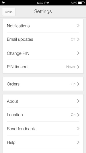
Apart from payments and preferences, consumers will also have security worries associated with supplementary services that a mobile wallet may provide, such as location-based offers, maps for nearby merchants, and messaging for transaction events via push notifications or SMS. Again, transparency is the key. Give the user controls, via the Settings menu (Figure 4-22) or when the app is first installed, to opt out of things like sharing location data and push messages. Where possible, explain why the app needs access to geolocation data and how it might benefit users (e.g., by helping them find participating merchants and offers that are closest to them).
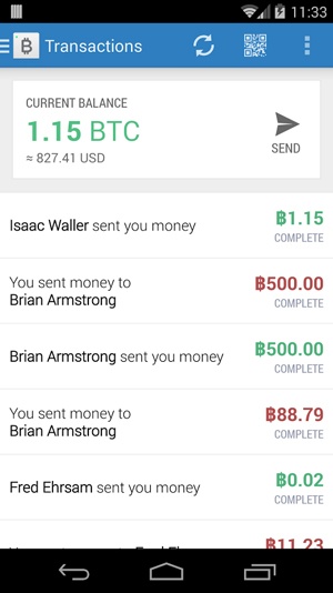
The use of transaction histories and alerts is less of a security concern to most users (though you will want to gauge your users’ comfort level with testing and surveys). Users generally welcome the idea of being able to keep tabs on when and where their mobile wallet is used, and seeing pending transactions subtracted from their balance (Figure 4-23). Payment alerts and notifications are a useful fraud deterrent, especially if they can also be accessed from other devices or web portals. As money becomes more ethereal in its digital form thanks to services like these, the mobile payment experiences that endure will be the ones that become indispensable to users as spending trackers, helping them to manage their money more wisely.
Give Them a Helpful Help Section
Finally, provide as much support content as possible. Users will want to go somewhere in the app to find answers to pertinent questions like “What would happen if my phone was stolen?” or “How do I reset my passcode?” This is the most efficient way to provide support to users when they need it, instead of directing them to a website or call center for every issue. Most NFC wallets can be wiped from the device remotely with a simple call to the bank or network operator. Clearly explain contingent processes for scary scenarios like these, and provide direct phone numbers for customer service.
It’s likely that your users will have limited experience using their phone to pay for things. It’s new cognitive territory, and they are going to have questions about how it all works. They are going to run into situations where the app doesn’t work the way they expected (despite your best intentions), so they will look to your app to provide some kind of autonomous support. If you omit this supplementary content, it will leave a bad taste in the user’s mouth. Have you ever bought a piece of furniture labeled “some assembly required,” and opened the box to find the instructions were missing? Sure, you might have eventually figured out which bolts to put where, but you probably thought twice about ordering something from that retailer again. You don’t need to dump your entire functional specification into the Help section, but you should consider including answers for the most likely questions your users would ask.
Avoid marketing speak and technical jargon in these FAQs. Instead, use easy-to-digest, step-by-step guides while maintaining a helpful tone. Here are some examples:
How MyWallet Works:
Bad: “MyWallet is a groundbreaking new way to pay.”
Worse: “MyWallet uses the applet instance of your mobile MasterCard that is stored in your UICC SIM, by presenting it to a POS contactless reader accessory via the NFC controller.”
Better: “MyWallet uses your NFC-ready phone to securely pay with a MasterCard. When you’re ready to pay, simply tap the back of your phone at the register, on the NFC symbol. When you hear the register beep, you’re done!”
Users aren’t really interested in things like the historical timeline of your company, your mission statement, or your company’s Facebook page. They want to know what to do if the app throws an error during a payment, or how to find local merchants that accept the app. This is also a great place to provide animated tutorials or feature walkthroughs that the user would have encountered during the onboarding process.
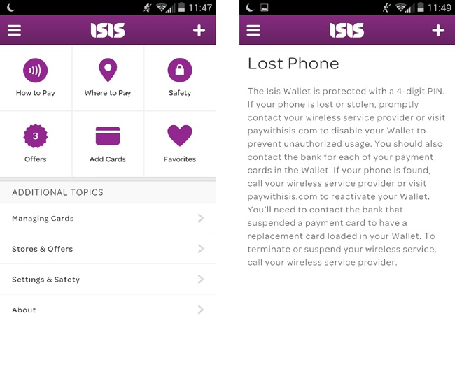
Structure your help content according to the most common use cases, rather than just replicating the app’s architecture. Isis Wallet does a great job of this (Figure 4-24). Its FAQs are grouped into six sections related to the most likely scenarios in which the app would be used (how to pay, where to pay) as well as topics on information security (which Isis refers to as “safety”).
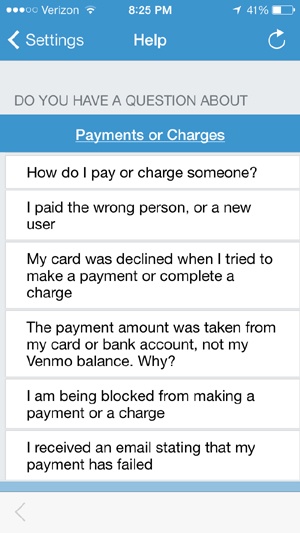
Venmo’s Help section (Figure 4-25) breaks down the FAQs into every possible facet of the help subject. It also phrases each FAQ from the user’s perspective, demonstrating the thoughtfulness of the support content included here. Venmo has opted to host its FAQs online, making them accessible within the app through a web wrapper. This lets you pivot the Help section by adding more FAQs after launch, as you will no doubt receive customer feedback you may not have anticipated. This way, you don’t have to wait until the next release cycle to address support issues your users may be having.
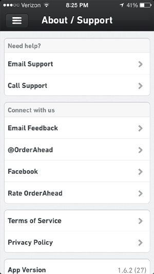
TabbedOut, on the other hand, has no real in-app support for users who need help with the experience. On its About/Support screen (Figure 4-26), there are several ways to send the company questions (call, email) or connect with it through social media. However, if users are trying to make a purchase and have encountered an issue (like a system time-out error, or if their order hasn’t been received by the restaurant), they will likely just give up rather than take the time to write an email describing the issue they are having. They might, however, take the time to slam TabbedOut in their app store reviews or on their Facebook Timelines, since there’s not much else to do in its Support section.
Summary
I admit that the interactions covered in this chapter are not the sexiest. I don’t exactly wake up every morning thinking, Man, I hope I get to design a Terms and Conditions acceptance flow today! Still, it is challenging to build experiences that hit the right balance of airtight security with empathy for the user who just wants to get in and out of the checkout line with as little stress as possible.
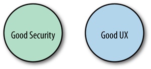
In the course of my day, there tend to be a lot of heated discussions around mobile payment security, and how certain processes we are required to follow might be best practices in the eyes of financial security regulators but are nightmares as user experiences. I often throw the Venn diagram shown in Figure 4-27 into the discussion, as a somewhat sarcastic statement on the state of this relationship.
The point-of-sale or point-of-decision experience is, of course, paramount in mobile payments, but if these supplementary aspects are not fully realized, potential users will not even consider using their phone as a payment tool, much less type their card and bank account numbers into your app’s forms, no matter how many parallax animations there are or how much attention you paid to your kerning.
When setting out to change the world of money with your designs, be mindful of these facets that orbit the payment experience. The best analogy to this is buying a car. If your goal is to be able to drive wherever you need to go, would you buy a car that had no seatbelts, no owner’s manual, and no locks?
[50] Phoebe C. Ellsworth, “Some Reasons to Expect Universal Antecedents of Emotions,” in The Nature of Emotion: Fundamental Questions, ed. Paul Ekman and Richard J. Davidson (New York: Oxford University Press, 1994), 152.
[51] Masaki Yoshikawa, “Mobile Wallet Service in Japan,” NTT DOCOMO, Inc., October 31, 2008 (http://bit.ly/1xNIO0G).
[52] Jose Pagliery, “95% of Bank ATMs Face End of Security Support,” CNN Money, March 4, 2014 (http://cnnmon.ie/1xNJanO). Did you know that 95% of ATMs in the US run on Windows XP? Scary!
[53] Mobile Deposit Case Study, Mitek Systems, 2012 (http://bit.ly/1xNJp2g).
[54] Aaron Smith, Janna Quitney Anderson, and Lee Rainie, “The Future of Money,” Pew Research Center, April 17, 2012 (http://bit.ly/1xNJCTd).
[55] Lance Whitney, “Stanford Undergrads: iPhones Are Addictive,” CNET, March 10, 2010 (http://cnet.co/1xNJSSa).
[56] “2013 Identity Fraud Report: Data Breaches Becoming a Treasure Trove for Fraudsters,” Javelin Strategy and Research, 2013 (http://bit.ly/1xNK97H).
[57] “Unisys Security Index: US,” Lieberman Research Group, May 13, 2014 (http://bit.ly/1xNKpnh).
[58] Elisa Tavilla, “Opportunities and Challenges in Broad Acceptance of Mobile Payments in the United States,” Federal Reserve Bank of Boston, July 24, 2012, 17 (http://bit.ly/1xNKDul).
[59] ISO/IEC 7812-1:2006, “Identification Cards -- Identification of Issuers -- Part 1: Numbering System” (http://bit.ly/1xNKWFy).
[60] 49% of users surveyed, according to Greg Weed and Mark Sutin, “Credit Card Monitor Q2 2013,” Phoenix Marketing International, 2013 (http://bit.ly/1xNL9sg).
[61] Lemon Wallet was pulled from the app stores in May 2014 by parent company LifeLock for violation of PCI DSS regulations, most likely for storing this very sensitive information in the user’s device memory.
Get Designing Mobile Payment Experiences now with the O’Reilly learning platform.
O’Reilly members experience books, live events, courses curated by job role, and more from O’Reilly and nearly 200 top publishers.

