Chapter 1. Examining the Challenge: Evidence of the Problem
What happens when an interaction with a digital service falls short from an ethical standpoint? In this chapter, we explore some real-world examples that could benefit from a more respectful design approach.1 By studying these phenomena, we can be wiser about our next design choices, and have a better idea of how ethical interfaces can impact three key stakeholders: users, businesses, and society.
Impact on Users
The Introduction described elements of respect as they relate to user experience. To best understand the impact of design on users, we will look at some real-world examples and their impact on core building blocks of respect: trust, time, and mood.
Trust
“I’m not upset that you lied to me, I’m upset that from now on I can’t believe you.”
Friedrich Nietzsche
Perhaps the most important element of a respectful conversation, digital or otherwise, is trust. When users are deceived, intentionally or accidentally, their experience suffers. The following sections review some examples of deceitful patterns. Some of these are officially referred to as Dark Patterns—intentional UI paradigms meant to deceive. Others are simply deceptive regardless of intention. What is the cost of deception? We can argue that users’ money, time, trust, and customer morale all suffer at the hand of deceptive UI.
Fake Navigation
Many of us have fallen victim to this before. It’s especially prevalent in slide shows, articles, and top ten lists—experiences that hinge upon a prominent Next or Previous button. We know that designers often use placeholder areas for advertising in their wireframes and often don’t know what the ads that will take their place will look like. As UX designers, we should strive to understand the potential ad content ahead of time because it does end up being a major part of the user’s experience. In the example shown in Figure 1-1, there is an ad for fibromyalgia treatment inserted in a wellness article. Not only is the content distracting and unrelated, but we see three calls to action (tappable navigation arrows) that could potentially take us to the next page, but only the relatively diminutive Next Page link is legitimate. This kind of false navigation creates many stumbling blocks and frustrating experiences for users, and is clearly meant to be misleading.

Figure 1-1. This example from Livestrong.com contains an ad that displays two arrows that are easily confused as actual site navigation
Hide and Seek
Burying key functionality is an effective way to betray a user’s trust. This example comes to us from the Comcast user account portal. We notice that customers who may want to cancel or downgrade their service have an uphill battle. At the top level of Comcast’s site, there are no tabs for changing your service, only for upgrading (Figure 1-2). Of course, this is understandable from a marketing standpoint—it’s certainly OK to try and sell customers more and better service. However, the counterintuitive element of this experience is that it actually is possible to downgrade digitally, but downgrades are accessible under the Upgrade tab. The two options shown in Figure 1-3 represent downgrades from my current service, but are accessible only in the Upgrade section.
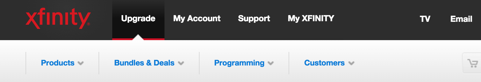
Figure 1-2. Comcast’s website provides only a clear method to upgrade but not necessarily change or downgrade service
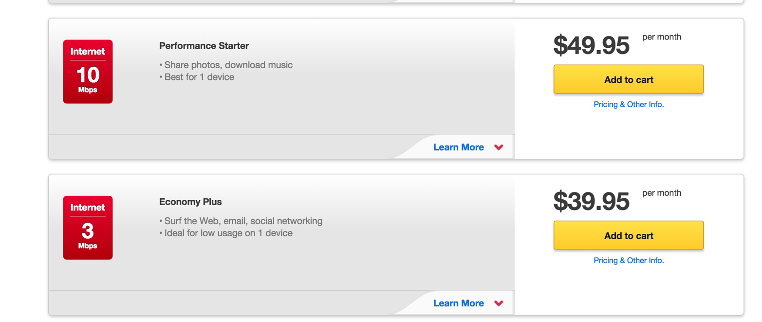
Figure 1-3. Downgrades that are only available in the Upgrade section
This is an example of how business intent impairs a user experience and ultimately ends up being deceptive and counterproductive.
Another example of hiding key navigation or functionality is shown in Figure 1-4. In this popup ad triggered by the Technewsworld site, we have to hunt for a way to close it because the dismiss button is in an unconventional location. The ad also does not adhere to modern conventions which allow users to close the ad by clicking anywhere in the shadowed area, making it even more difficult to dismiss. Devious? Maybe. Respectful? Not likely.
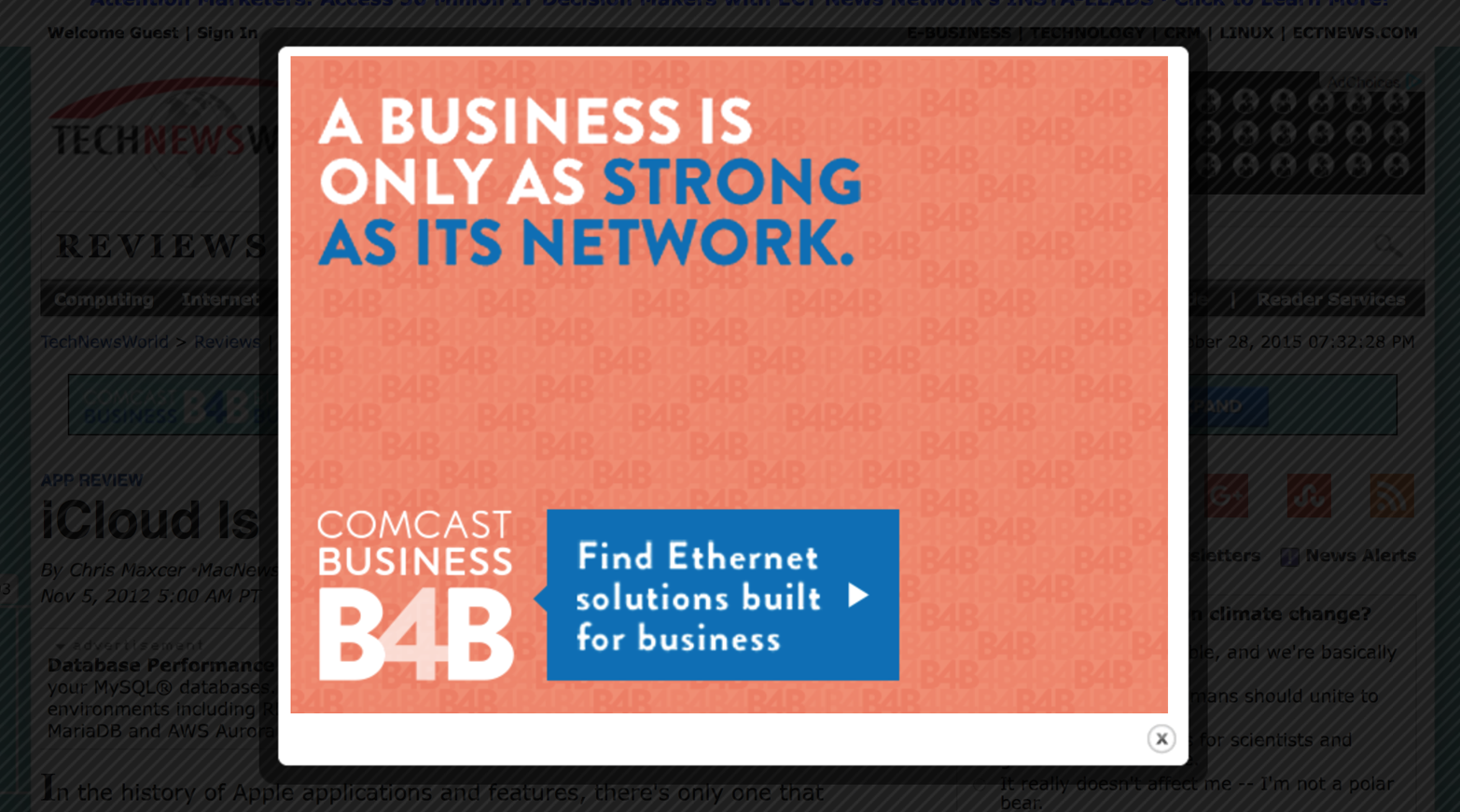
Figure 1-4. Quick quiz: can you quickly find the close button in this screenshot? Hint: it’s not where your muscle memory for dismissing popup ads thinks it is. See for yourself at Technewsworld.
Flagrant Trickery
The winner for deceptive UI in Harry Brignull’s Dark Patterns talk is brought to us by RyanAir. The image from the Dark Patterns blog shows the option to decline travel insurance hidden in a list of countries that you have to choose in order to get travel insurance (Figure 1-5).
Sandwiched between Latvia and Lithuania is the No Travel Insurance Required option. By clearly hiding a valuable option for customers, they lose our trust.
Note
The RyanAir site has since been redesigned, but this still stands as a classic example of tricky UI.
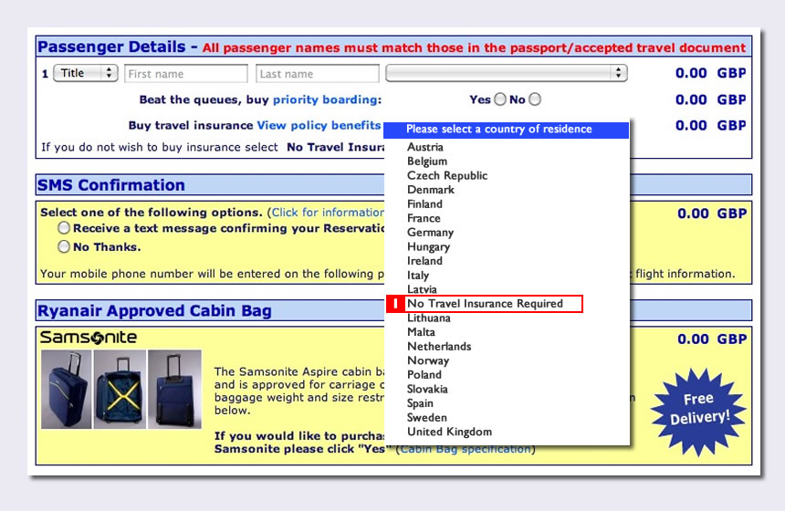
Figure 1-5. RyanAir’s previous website hides the opt-out for travel insurance in a list of countries for which to select travel insurance (source: Dark Patterns via Alan Colville)
Sneaky Defaults
Another example from the Dark Patterns blog is a design paradigm in which merchandise is sneakily added to a user’s shopping cart. The example in Figure 1-6, taken from the Livenation website, shows a magazine that has been added to a cart that you must decline to avoid being charged. Having to explicitly opt out of an upsell definitely violates trust with the customer, and at what cost?
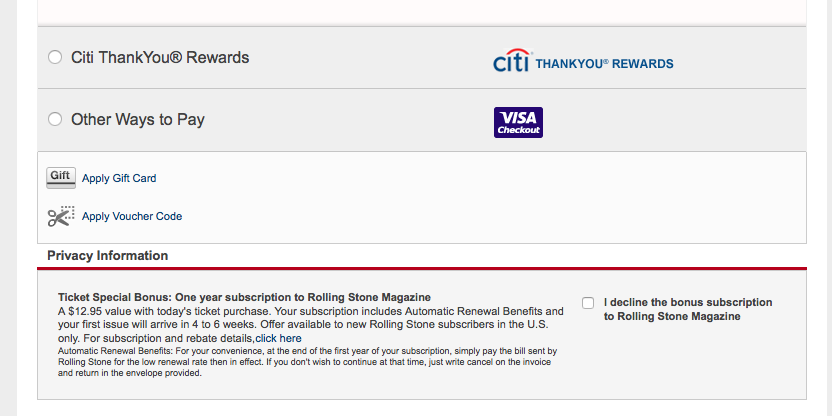
Figure 1-6. In this example from LiveNation.com, can you spot the upsell? Did you even notice it?
Changing the Rules
One day on a long flight, I tried to listen to music that I had previously bought and downloaded through iTunes only to be presented with the symbol shown in Figure 1-7 next to each song.

Figure 1-7. This symbol is a source of confusion in some circumstances
In this case, I felt deceived because I paid for and downloaded music, but wasn’t clearly informed that it would not actually be available on my device and accessible offline. Others have had similar issues with iCloud and iTunes. This situation was probably not intentionally deceptive, but clearer messaging around the storage location of music purchases would have helped prepare me. It’s not just removing music that caused anxiety. When iTunes coercively gifted U2 to all of its users, customers were mostly outraged. The feeling of invasion and disregard for our own personal curatorial efforts damaged trust.
Time
“We only get one life. Wasting someone’s time is the subtlest form of murder.”
Lindy West
There has recently been some great work on the influence of design on users’ time. Specifically, Tristan Harris’ work, Time Well Spent, addresses the issue of addictive interfaces versus mindful engagement with digital services. Here, we will look at some experiences that could stand to be more respectful of users’ time.
At their core, services fell into one of two categories with regard to respecting a user’s time: indifference and greed.
Indifference
Examples in this section are indifferent to users’ time—they aren’t necessarily asking for more of it but end up using it anyway.
System updates
System updates are a necessary evil for many of our modern electronic devices, but fewer of us find or want to make time to upgrade the software on our various operating systems. One example of this pain point comes to us from console gaming systems. If you are a cord cutter, you may fuel your living room entertainment via a PlayStation or Xbox console. You may be able to relate to coming home after a long day, eager to catch up on the latest episode of your favorite series only to have to sit through 15 minutes of system updates (Figure 1-8).
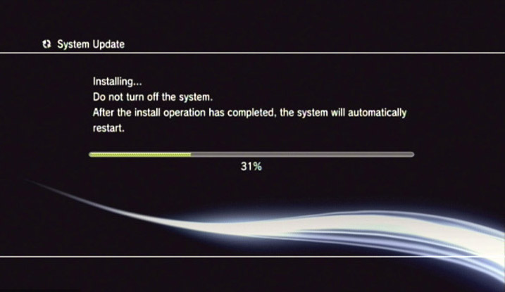
Figure 1-8. Look familiar? System updates from a PS3 require user attention and initiation
Many other devices have their share of required updates—but the difference on smartphones and desktop computers is that updates are optional and the apps are still usable, just in less recent versions. While the PS3 does provide for automatic updates, the feature is not enabled by default and requires a separate subscription service. Out of respect for users’ time, the paradigm that services should emulate is similar to Google chrome—automatic and in the background.
Redundancy
You’ve called your credit card company and entered your card number and personal information during the automated portion of the call, only to have the customer service representative ask for the same information when you’re finally speaking with one of them. This is not a digital UI example, but illustrates the need for efficiency. A recent statistic states that 72% blamed their bad customer service interaction on having to explain their problem to multiple people. Regardless of the medium—digital, phone, or in person—designers should strive to minimize the amount of data entry required of the customer. If we can abolish redundant data entry, we probably will have saved the world lots of lost minutes.
Letting systems do the designing
It was quite surprising to see that one aspect of the new United Airlines website actually takes a step backward in terms of respecting the customer’s time (Figure 1-9). While many features of the new design are quite welcome, such as the cleaner and more breathable layout, one element feels like it could be a victim of a rigid underlying architecture.
Now, in order to log in, a frequent flyer number must be entered. Unless you fly very often or have a great memory, it’s likely that you can’t recall this number. So in order to sign in, you’ll have to click Forgot, check your email and/or search for your number, then copy and paste. Our guess is that United is attempting to simplify the sign-in process, but the ideal credential would be a customers’ name or email simply because we remember what those are. Signing in with a name is also more human. In this example, the system’s needs appear to have won out over the user’s needs, and the result will probably impact lots of customers.
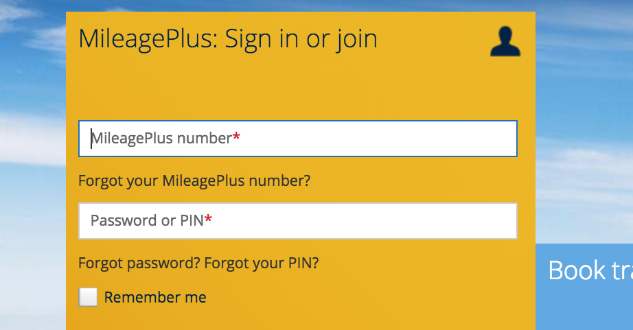
Figure 1-9. The new sign-in process requires a frequent flyer account number—something many people don’t remember
Settings fatigue
Back in 2011, Facebook changed its privacy policy a lot—so much so that many users had a hard time keeping up. Part of the power of Facebook is the ability to customize privacy in an extremely granular way, but it comes at the expense of users’ ability to stay abreast of the changes. For the sake of everyone’s time, changing the rules should be reserved for special cases and fully communicated. To its credit, Facebook has improved its UX for privacy settings a lot—it now feels conversational and friendly (Figure 1-10).
Figure 1-10. This example represents efforts by Facebook to make privacy settings more understandable and manageable—a great improvement from earlier times
Greed
Examples in this section compete for and try to intentionally consume our time and attention.
Notification inflation
Every service these days is trying to get our attention, and they are not always polite about it! We’re all familiar with inflation in a monetary sense: increased currency in circulation causes each discrete dollar to be worth less. A similar phenomenon is happening with digital notifications. We’re drowning in them, yet the really important messages get lost in a sea of triviality. It is time to admit, for the betterment of everyone’s time and attention, that push notifications, left unchecked, have the power to divert countless people’s attention on a daily basis. This is a difficult problem to solve for designers who may be tasked with creating a communications method for one app in particular. The designer might not be thinking about the totality of the user’s experience across all apps and devices. With regard to notifications, we are all yearning for them to be subtler, smarter, and more considerate. I think we’re all looking for the app that only contacts us at the exact right time. In my case, that might be when (1) I’m commuting, and (2) not already listening to Pandora.
Unexpected advertising
Advertisers will always be hungry for our valuable time and attention, but there are some forms of this greed emerging lately that cross over into disrespectful territory. For those of us old enough to remember what it was like to only experience advertising via commercials on TV, we are perhaps conditioned to expect advertising. However, on network television, ads were predictable. We could plan on when the commercials would be aired, so at least we could make use of them to take breaks and refill the popcorn, should we so choose. On our modern equivalent of cable TV, Facebook and Internet surfing, we often get cornered with ads at unexpected times. The most disrespectful, and now common, versions of these unexpected ads occur a few seconds after you’ve already started engaging with content. This article on new smartphone glass is a good demonstration of this common paradigm. Another recent example was a Pandora ad that occurred right in the middle of a song. Of course, advertisers need to help generate revenue, but are there ways that are more respectful of users’ time? For example, users might still want to read articles from some sources that tend to trigger ads, but imagine if article links or headlines were labeled with a small “contains popup ad” logo—a warning label of sorts. This design convention would allow us to choose how to spend our time, before we click.
Mood
“Each one of us has the power to make others feel better or worse. Making others feel better is much more fun than making others feel worse.”
Ralph Waldo Emerson
Perhaps the element of design that is most difficult to measure is the impact it has on the way users feel. Did a digital experience make me feel dumb? Was it frustrating? Some of these phenomena are subtle, but differ from trust and time in that the clearest impact is on our emotions. Some of these judgments are personal, but usually if one person has a particular reaction to a service, they are in good company. Before we look at designs to help uplift us, let’s look at some frameworks for how design can negatively impact mood.
Designing for Designers
A few years ago, skeumorphism conceded the digital design trend battle to flat design, but this paradigm change has not been without casualties. One example of how the more utilitarian, flat aesthetic falls short is in an interface some use every day: the iOS alarm clock (see Figure 1-11).
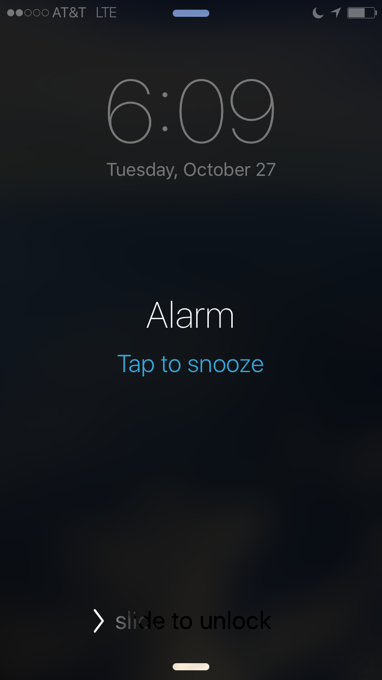
Figure 1-11. What’s the problem with this design, keeping in mind that at this moment, the alarm is sounding, and you have just woken up?
This design was changed to fit within a design framework rather than place the user’s needs at the forefront. Since iOS7, virtual buttons have been replaced in many cases with instructional text. .
The issue is that, for someone that has just awakened, the snooze tap zone is awfully hard to find and very small—tapping snooze successfully on the first try can prove challenging and frustrating. It would be preferable to have a design with a full-screen takeover tap zone with just one word: snooze. In the older versions of this screen, tap zones were still not big enough, but the bounding box for the tap zone was clearly defined, allowing for greater success. The text was also minimal and more digestible for someone who just woke up (see Figure 1-12).
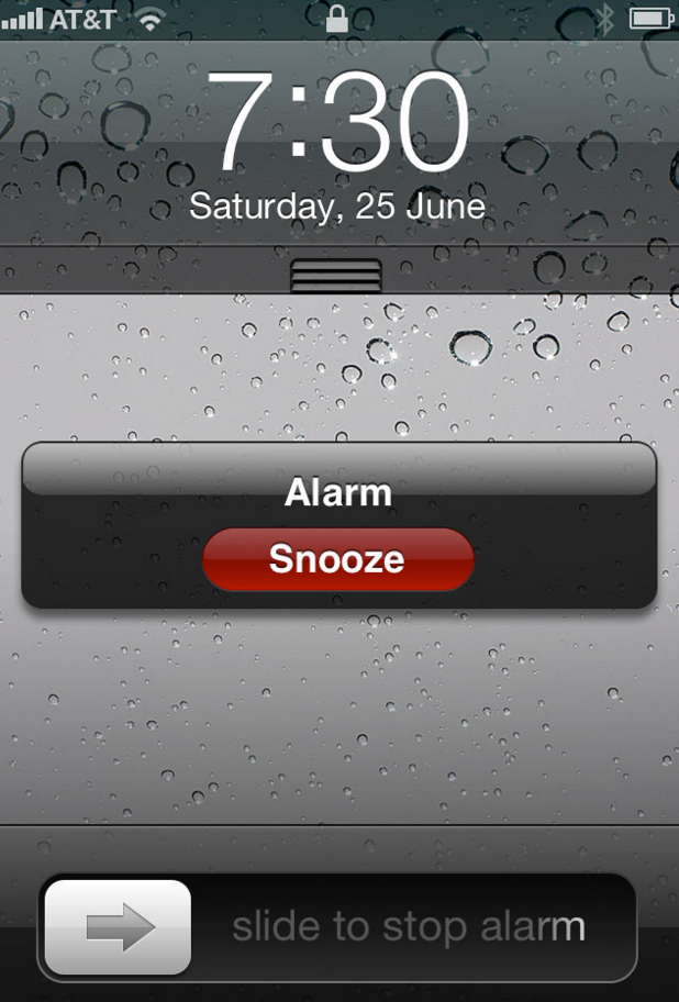
Figure 1-12. Pre-iOS7 snooze features minimal text and clearly defined tap area
In Quarter 1 of 2015, Apple sold almost 75 million smartphones, each loaded with the same alarm experience. Somewhere out there, there’s a lot of alarm users. This example isn’t only about the alarm, it’s about temporarily overlooking the user in order to fit within a design framework. For those of you that never snooze, well, this example is not for you.
Punitive UI
Here’s another example from iCloud. Many agree that iCloud is confusing, and in this specific example there’s a tone of language and persistence with the communication around storage that has, over time, increasingly felt like a lecture. For those users that don’t want to manage their photos using iCloud, or find it confusing, the context of this message feels a bit punitive. iPhone users have probably seen the screenshot shown in Figure 1-13 at some point.
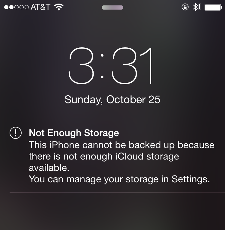
Figure 1-13. For users that don’t understand iCloud, this alert could cause digital anxiety
While this message may provide valuable communication, the frequency with which it appears along with a somewhat punitive text, over time, wears on the user’s psyche. What did I do wrong? or What’s wrong with my phone? are thoughts that come to mind. As with the alarm example, when we stop to think about the number of users who might be feeling confused based on the number of devices out there, we could safely guess that at least thousands of people might experience this type of digital anxiety.
Impact on Businesses
We’ve looked at a number of ways that UX can impact a user’s well-being, but why should businesses care? Beyond the obvious desire to provide efficient paths for users, how does respectful design impact business?
Today, digital touchpoints are the face of innumerable businesses, and we should acknowledge that the digital “conversations” that they facilitate should be subject to the same quality and respect as actual conversations in a physical environment. In other words, customer service begins on the landing page, not at a call center.
Once you think about interaction problems as customer service problems, you can start to realize the value of keeping these interactions respectful. In the RyanAir example, it’s hard to say whether the extra travel insurance revenue made up for the cost of confused and deceived customers, but we do know that customer service is a key reason why people choose one service over another. A recent study found that 2/3 of customers would spend 13% more with a company following an excellent customer service experience, and 55% of customers would cease buying from a company with poor customer service. Furthermore, each interaction counts—it takes 12 positive experiences to make up for one unresolved negative experience.
Not only do negative experiences influence customer behavior more than positive ones, they are also more likely to be shared. A study from the White House Office of Consumer Affairs found that news about bad customer experiences is shared twice as often as positive experiences. One avenue for sharing dissatisfaction is through reviews, which are increasingly a fundamental gateway for attracting or turning off customers. Recent statistics show that 85% of customers say they will read up to 10 reviews before deciding whether to trust a local business. And negative reviews matter. In a recent study, Glassdoor found that 60% of job seekers would not apply to companies with low reviews.
Beyond customer reviews, we know that bad publicity stemming from unethical practices tarnishes the reputation of businesses. Many have heard the infamous Comcast recording of a customer trying to cancel service, and news recently broke of Volkswagen’s emissions scandal. And while it’s hard to know the impact the Comcast scandal had on their business, we do know that for VW, Switzerland banned the sale of some VW cars.
While UX designers are not always tasked with creating the retention script for a cable company or strategy for dodging emissions standards (thank goodness), as designers become more and more involved in more aspects of businesses, we should take our sense of ethics and respectful design with us to different disciplines within our companies and clients.
At the heart of this argument is the idea that user experience is part of customer service—the main difference today is that most of the conversations we have are with pixels instead of people. Either way, customer service is a key measure of business success. And studies show that if we respect the user, business success will follow.
Impact on Society
So, why should everyone care about respectful design? The reason becomes clear when we simply think about the sheer scale of our daily digital interactions. Essentially, how many opportunities do our digital services give us to waste time, feel deceived, interrupted, or confused? To put things into perspective, recent Nielsen research estimates that at the end of 2014, Americans used electronic media over 11 hours a day. Another 2014 study estimates that Americans spend 162 minutes on their mobile devices per day. And a most recent study estimates that in the United Kingdom, the average person spends more than 8 hours on their phone and laptop combined—more than the average night’s sleep.
Knowing these statistics, we invite you to participate in an exercise. Stop for a minute and think about your daily digital usage. Think about your digital interactions when you wake up, commute, work, communicate, and recreate. Think about the various devices that you call on to broker your digital conversations: smartphones, TVs, laptops, desktops, tablets, smartwatches, fitness trackers... Where do you think you fall on the digital usage spectrum?
If you’re like most people these days, you have more conversations with your digital services than you do with your loved ones. Another UK study suggests that in 2013, people spent more time with their smartphones than with their significant others. And while that is a social problem in and of itself, the relevant point here is that we spend a lot of time on our devices, manipulating glowing UI, tapping virtual buttons, waiting for screens to load, responding to digital bids for our attention. Even if we might not be comfortable admitting it, many of us know it to be true that we indeed live digital lives. We have way more digital conversations than actual conversations, which makes it important that our digital conversations be effortless, polite, even enjoyable. In this regard, respectful design is crucial to our public health.
The studies referenced here are from the United States and the United Kingdom, which accounts for a fraction of global digital usage. When put into perspective, we realize that designers are in a position of power that comes with the responsibility to insert as much civility into our work as possible. We aren’t just impacting the well-being of one user or a handful of users, but millions. Beyond satisfying business goals, we should keep in mind how our decisions on usability will affect not only one application or website, but the mental and emotional states of potentially millions of people who engage with it.
1 Some examples in this chapter were chosen because I encountered them in my own life. Many of the pain points cited here represent edge cases and I noticed them simply because I use these products and services so frequently. Many other aspects of these same products are great, which is why I use them in the first place.
Get Designing for Respect now with the O’Reilly learning platform.
O’Reilly members experience books, live events, courses curated by job role, and more from O’Reilly and nearly 200 top publishers.

