Chapter 4. Get Ready to Measure
You need not only the ability to visualize your customer lifecycle, but also the ability to measure it.
The Need for Actionable Metrics
Even though the terrain before product/market fit is riddled with qualitative learning, you still need actionable metrics to be able to visualize and measure your customer lifecycle.
The objective before product/market fit is not as much about optimizing for conversion and all about quickly identifying and troubleshooting hot spots in your customer lifecycle.
Up until now, you have made a number of product decisions based on what customers have told you. It’s time to start measuring what they do.
What Is an Actionable Metric?
An actionable metric is one that ties specific and repeatable actions to observed results.
The opposite of actionable metrics are vanity metrics (like web hits or the number of downloads), which only serve to document the current state of the product but offer no insight (by themselves) into how you got there or what to do next.
A warning flag that indicates you might have a vanity metric on your hands is when the numbers don’t go anywhere but up and to the right every month.
Put another way, things like web hits or downloads are elements of subfunnels that make up the larger macro metric that matters, such as acquisition and activation.
It’s not what you measure, but how.
Understanding the difference between a vanity metric and a macro metric is the first step. In order to make your metrics actionable, you have to additionally make them accessible (through simple reports) and auditable (by being able to go behind the numbers).
The three A’s of metrics are: Actionable, Accessible, and Auditable.
Eric Ries
I’ll go into some detail regarding how you do that in the next few sections, and then I’ll outline the steps for building a conversion dashboard.
Metrics Are People First
Eric Ries popularized the meme of “metrics are people too” for the purpose of making your metrics auditable, but I don’t believe it goes far enough.
While I am a big proponent of building a metrics-driven culture, there is a lot more to building a great product than numbers. For starters, you have to be able to go to the people behind the numbers.
The ideal conversion dashboard is part analytics and part customer relationship management.
Here’s why:
- Metrics can’t explain themselves.
When you first launch a product or new feature, lots of things can and do go wrong. Metrics can help you identify where things are going wrong, but they can’t tell you why. You need to talk to people for that.
- Don’t expect your users to come to you.
When users first use your product, they aren’t yet invested in your solution. They usually start out interested, but they are skeptical and their motivation decays quickly when things go wrong. In other words, you can’t expect users to promptly send in a bug report or pick up the phone and call you when they need help. They might do this, but it’s more likely that they’ll simply abandon your product and leave. The burden of quickly identifying problems and reaching out to your users is yours.
- Not all metrics are equal.
You’ve been very selective about who you’ve interviewed up until now. Once you launch, you won’t be able to control who uses your product. In addition to your target early adopters, you might be visited by bots, curious onlookers, and maybe even other undiscovered target customers. When you just look at numbers, you get an averaging effect that can be greatly skewed if you don’t yet have a lot of traffic (or the right traffic). You need a way to segment your metrics into different buckets.
Simple Funnel Reports Aren’t Enough
The funnel report is a powerful analysis tool. It’s simple to understand and lends itself well to visually depicting a conversion dashboard. But most third-party implementations of funnel reports are better suited at tracking micro-level funnels, like landing page conversions, than macro-level funnels, like your customer lifecycle.
Micro-level funnels are characterized by short lifecycle events typically measured in minutes, while macro-level funnels are characterized by long lifecycle events typically measured in days or months.
Simple funnel reports work by letting you specify a reporting period over which the number of key event occurrences are counted and visualized. This approach doesn’t work when the intervals between events fall outside the reporting period.
To illustrate these problems, let’s consider an example for a downloadable product that uses a 14-day trial.
Figure 4-1 shows an example of what a typical funnel report might look like.
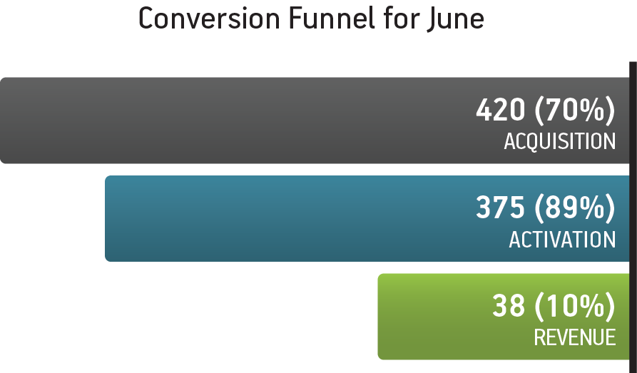
Figure 4-1. Typical funnel report
In Figure 4-1, the “acquisition” and “activation” events are short lifecycle events, while the “revenue” event is a long lifecycle event.
This poses the following issues:
- Inaccurate conversion rates
The numbers reported for the revenue event most likely include purchases made in May and exclude purchases made in July, which skews the overall conversion rates.
- Dealing with traffic fluctuations
This skewing of numbers is further exacerbated by any fluctuations in traffic. If signups go down in July, your conversion rates will appear to be better when they may not be.
- Measuring progress (or not)
Another problem with this sort of reporting is that your product is also constantly changing. It is hard, if not outright impossible, to tie back observed results (good or bad) to actions you took in the past, such as launching a new feature.
- Segmenting funnels
Over time, you will probably run a split test or need to segment your funnel to isolate one group of customers from another. You can’t do this with a simple funnel report.
Say Hello to the Cohort
So, while funnels are a great visualization tool, funnels alone are not enough. The answer is to couple funnels with cohorts.
Cohort analysis is very popular in medicine, where it is used to study the long-term effects of drugs and vaccines:
A cohort is a group of people who share a common characteristic or experience within a defined period (e.g., are born, are exposed to a drug or a vaccine). Thus a group of people who were born on a day or in a particular period, say 1948, form a birth cohort. The comparison group may be the general population from which the cohort is drawn, or it may be another cohort of persons thought to have had little or no exposure to the substance under investigation, but otherwise similar. Alternatively, subgroups within the cohort may be compared with each other.1
We can apply the same concept of the cohort or group to users and track their lifecycle over time. For our purposes, a cohort is any property that can be attributed to a user. The most common cohort used is “join date,” but as we’ll see, this could just as easily be the user’s “plan type,” “operating system,” “gender,” or something else.
Let’s see how cohort reports overcome the shortcomings with simple funnel reports.
The weekly cohort report (by join date) shown in Figure 4-3 was generated using the same data used in the simple funnel report earlier (which I show again in Figure 4-2 for comparison).
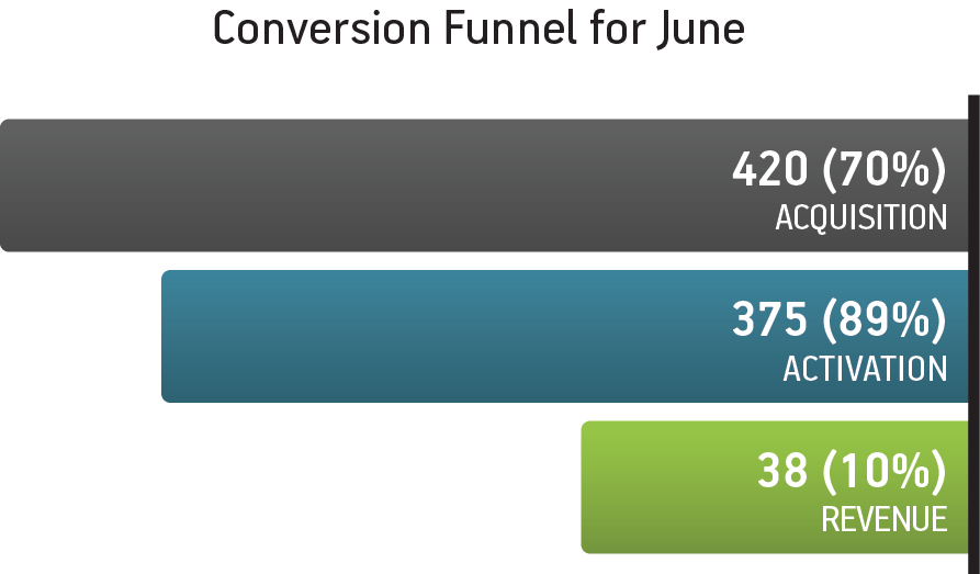
Figure 4-2. Simple funnel report
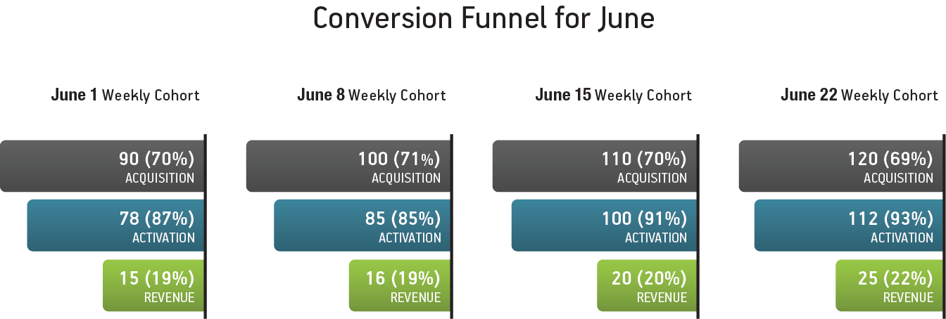
Figure 4-3. Weekly cohort (by join date)
You’ll notice immediately that while the acquisition and activation conversion numbers are close enough, the revenue conversion rates are very different.
- Dealing with traffic fluctuations
Since all the events are tied back to the users that generated them, cohort reports handle fluctuations in traffic correctly.
- Measuring progress (or not)
More important, though, the weekly cohort report visibly highlights significant changes in the metrics, which can then be tied back to specific activities done in a particular week.
- Segmenting funnels
Since cohort reports are inherently built around grouping users, they can be used to segment your funnels longitudinally around any property you track.
How to Build Your Conversion Dashboard
There are lots of third-party analytics products on the market. I have cut my teeth on Google Analytics, KISSmetrics, and Mixpanel. Each tool has its strengths and weaknesses, but unfortunately I haven’t found a single analytics solution (yet) that addresses all the needs I outlined earlier.2
Rather than getting bogged down on the specifics of each tool, I cover how I built my conversion dashboard from a functional perspective in the Appendix.
1 http://en.wikipedia.org/wiki/Cohort_study
2 USERcycle is my attempt at solving this problem.
Get Designing for Product Strategy now with the O’Reilly learning platform.
O’Reilly members experience books, live events, courses curated by job role, and more from O’Reilly and nearly 200 top publishers.

