1 Introduction
Web standards: friend or foe?
The standards process
Contrary to popular belief, the W3C (World Wide Web Consortium) does not “make” standards. Instead, it acts as a forum for interested parties to get together and do so, in its W3C Working Groups. Of course, the W3C is not a mere observer: it sets the ground rules and it oversees the process. But it’s not (primarily) W3C staff that actually write the specifications.

FIGURE 1.1 “Standards are like sausages: it’s better not to see them being made”
—Anonymous W3C WG member
CSS specifications, in particular, are written by the members of the CSS Working Group, often abbreviated as CSS WG. At the time of writing, the CSS WG includes 98 members, and its composition is as follows:
86 members from W3C member companies (88%)
7 Invited Experts, including yours truly (7%)
5 W3C staff members (5%)
As you might notice, the vast majority of WG members (88%) come from W3C member companies. These are companies—such as browser vendors, popular websites, research institutes, general technology companies, etc.—that have a vested interest in seeing web standards flourish. Their yearly membership dues represent the majority of the W3C’s funding, enabling the Consortium to distribute its specifications freely and openly, unlike other standards bodies that have to charge for them.
Invited Experts are web developers who have been asked to participate in the standards process, after demonstrating a continuous commitment to helping out, and a sufficient technical background to participate in the discussions.
Last, but not least, W3C staff members are people who actually work at the Consortium and facilitate communication between the WG and the W3C.
A widespread misconception among web developers is that the W3C creates standards from up high that the poor browsers then have to follow, whether they like them or not. However, this couldn’t be further from the truth: browser vendors have much more of a say than the W3C in what goes into standards, as evidenced by the numbers listed before.
Also contrary to popular belief, standards are not created in a vacuum, behind closed doors. The CSS WG is committed to transparency and all its communications are open to the public, inviting review and participation:
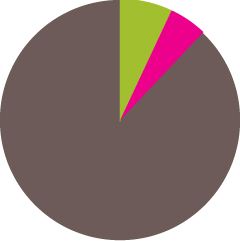
FIGURE 1.2 The composition of the CSS WG: Member companies
 Invited Experts
 W3C staff members
Most discussions happen in its mailing list, www-style (lists.w3.org/Archives/Public/www-style). www-style is publicly archived, and is open to participation from anyone.
There is a weekly telcon, with a duration of one hour. This is not open to participation by non-WG members, but is minuted in real time in the #css channel on the W3C’s IRC server (irc.w3.org/). These minutes are then cleaned up and posted to the mailing list a few days later.
There are also quarterly face-to-face meetings, which are also minuted in the same fashion as telcons. They are also often open to observation (auditing), after requesting permission from the WG chairs.
All this is part of the W3C process and has to do with decision making. However, the ones that are actually responsible for putting these decisions to writing (i.e., authoring the specifications) are the Spec Editors. Spec Editors might be W3C staff members, browser developers, interested Invited Experts, or member company employees who are doing it as a full-time job, paid by their companies to advance standards for the common good.
Each specification goes through multiple stages as it evolves from initial inception to maturity:
Interested in learning more? Elika Etemad (fantasai) has written a series of amazing articles on how the CSS WG operates (fantasai.inkedblade.net/weblog/2011/inside-csswg). Very highly recommended.
1. Editor’s Draft (ED): The first stage of a spec could be as messy as being just a collection of ideas by the spec editor. There are no requirements for this stage and no guarantee that it’s approved by the WG. However, this is also the first stage of every revision: all changes are first made in an ED, then published.
2. First Public Working Draft (FPWD): The first published version of a spec, after it’s deemed ready for public feedback by the WG.
3. Working Draft (WD): There are many WDs after the first one, each slightly better, incorporating feedback from the WG and the broader community. First implementations often start at this stage, but it’s not unheard of to have experimental implementations of earlier stage specs.
4. Candidate Recommendation (CR): This is considered a relatively stable version. Now it’s time for implementations and tests. A spec cannot advance past this stage without a full test suite and at least two independent implementations.
5. Proposed Recommendation (PR): Last chance for W3C member companies to express disagreement with the specification. This rarely happens, so it’s usually just a matter of time for every PR spec to move to the next, final stage.
6. Recommendation (REC): The final stage of a W3C specification.
One or two WG members have the role of being chairs. Chairs are responsible for organizing meetings, coordinating calls, timekeeping, and generally moderating the whole thing. Being chair is a very time-consuming and energy-draining role, and is frequently compared to herding cats. Of course, everyone involved in standards knows that such a comparison is moot: herding cats is actually considerably easier.

FIGURE 1.3 Chairing a W3C Working Group is frequently compared to herding cats
CSS3, CSS4, and other mythical creatures
CSS 1 was a very short and relatively simple specification, published in 1996 by Håkon Wium Lie and Bert Bos. It was so small that it was all included in a single HTML page, which required around 68 sheets of A4 paper to print.
CSS 2, published in 1998, was more strictly defined, and included much more power and two more spec editors: Chris Lilley and Ian Jacobs. At this point, the length of the specification had grown to 480 (!) printed pages and was already getting too big to be held in human memory in its entirety.
After CSS Level 2, the CSS WG realized that the language was getting too big to be contained in a single specification. Not only was it extremely unwieldy to read and edit, but it was also holding CSS back. Remember that for a specification to advance to the final stages, every single feature in it needs at least two independent implementations and exhaustive tests. This was no longer practical. Therefore, it was decided that going forward, CSS was going to be broken into multiple specifications (modules), each with its own versioning. Those that expand on features that were already present in CSS 2.1 would have a level number of 3. For example, some of these modules are:
CSS Syntax (w3.org/TR/css-syntax-3)
CSS Cascading and Inheritance (w3.org/TR/css-cascade-3)
CSS Color (w3.org/TR/css3-color)
Selectors (w3.org/TR/selectors)
CSS Backgrounds & Borders (w3.org/TR/css3-background)
CSS Values and Units (w3.org/TR/css-values-3)
CSS Text (w3.org/TR/css-text-3)
CSS Text Decoration (w3.org/TR/css-text-decor-3)
CSS Fonts (w3.org/TR/css3-fonts)
CSS Basic User Interface (w3.org/TR/css3-ui)
However, modules that introduce entirely new concepts start from Level 1. Here are a few examples:
CSS Transforms (w3.org/TR/css-transforms-1)
Compositing and Blending (w3.org/TR/compositing-1)
Filter Effects (w3.org/TR/filter-effects-1)
CSS Masking (w3.org/TR/css-masking-1)
CSS Flexible Box Layout (w3.org/TR/css-flexbox-1)
CSS Grid Layout (w3.org/TR/css-grid-1)
Despite the popularity of the “CSS3” buzzword, there is actually no specification defining such a thing, like there was for CSS 2.1 or its predecessors. Instead, what most authors are referring to is an arbitrary set of Level 3 specs, plus some Level 1 specs. Although there is some good degree of consensus among authors on which specs are included in “CSS3,” as CSS modules evolve at different rates over the years, it will become more and more difficult to refer to things like CSS3, CSS4, and so on and be universally understood.
A story of ice, fire, and vendor prefixes
In standards development, there is always a big catch-22: standards groups need input from developers to create specifications that address real development needs. However, developers are generally not interested in trying out things they can’t use in production. When experimental technologies get widely used in production, the WG is forced to stick with the early, experimental version of the technology, to avoid breaking several existing websites if they change it. Obviously, this completely negates the benefits of getting developers to try out early standards.
Over the years, many solutions have been proposed to address this conundrum, none of them perfect. The universally despised vendor prefixes were one of them. The idea was that every browser would be able to implement experimental (or even proprietary) features with their own prefix prepended to its name. The most common prefixes are -moz- for Firefox, -ms- for IE, -o- for Opera, and -webkit- for Safari and Chrome. Developers would be able to freely experiment with these prefixed features and provide feedback to the WG, which would then incorporate this feedback into the specs and slowly perfect the design of the feature. Because the final, standardized version would have a different name (no prefix), it wouldn’t collide with the existing uses of its prefixed counterparts.
Sounds great, right? Of course, as you probably know, the reality was quite different from the vision. When developers realized that these experimental, vendor-prefixed properties could make it so much easier to create effects that previously required messy workarounds, they started using them everywhere. Vendor-prefixed properties quickly became the CSS trend of the time. Tutorials were written, StackOverflow replies were given, and soon almost every self-respecting CSS developer was using them all over the place.
Eventually, authors realized that using only existing vendor prefixes meant they would have to go back to previous work and add new declarations every time another browser implemented their favorite cool new CSS feature. Not to mention how hard it became to keep up with which prefixes were needed for what feature. The solution? Add all possible vendor prefixes preemptively, including the unprefixed version at the end, to future-proof it. We ended up with code like the following:
-moz-border-radius: 10px;
-ms-border-radius: 10px;
-o-border-radius: 10px;
-webkit-border-radius: 10px;
border-radius: 10px;
Two of the declarations here are completely redundant: -ms-border-radius and -o-border-radius never existed in any browser, as IE and Opera implemented border-radius unprefixed from the get-go.
Obviously, repeating every declaration up to five times was tedious and unmaintainable. It was only a matter of time until tools were built to automate this:
Websites like CSS3, Please! (css3please.com) or pleeease (pleeease.io/playground.html) allow you to paste your unprefixed CSS code and get back CSS with all necessary prefixes added. Such apps were among the first ideas devised to automate vendor prefix addition, but are not very popular anymore, as using them incurs quite a lot of overhead compared to other solutions.
Autoprefixer (github.com/ai/autoprefixer) uses the database from Can I Use… (caniuse.com) to determine which prefixes to add to unprefixed code and compiles it locally, like a preprocessor.
My own -prefix-free (leaverou.github.io/prefixfree) performs feature testing in the browser to determine which prefixes are needed. The benefit is that it rarely needs updating, as it gets everything from the browser environment, including the list of properties.
Preprocessors like LESS (lesscss.org) or Sass (sass-lang.com) don’t offer any means of prefixing out of the box, but many authors create mixins for the features they prefix most often, and there are several libraries of such mixins in circulation.
Because authors were using the unprefixed version of features as a means to future-proof their code, it became impossible to change them. We were basically stuck with half-baked early specs that we could change in very limited ways. It didn’t take long for everyone involved to realize that vendor prefixes were an epic failure.
These days, vendor prefixes are rarely used for new experimental implementations. Instead, experimental features require config flags to be turned on, effectively preventing developers from using them in production, as you can’t really tell users to change their settings in order to view your website properly. Of course, this has the consequence that fewer authors get to play with experimental features, but we still get enough feedback, and arguably, better quality feedback, without the drawbacks of vendor prefixes. However, it will be a long time before the ripple effects of vendor prefixes stop haunting us all.
CSS coding tips
Minimize code duplication
Keeping code DRY and maintainable is one of the biggest challenges in software development, and that applies to CSS as well. In practice, one big component of maintainable code is minimizing the amount of edits necessary to make a change. For example, if to enlarge a button you need to make 10 edits in many different rules, chances are you will miss a few of them, especially if you are not the one who wrote the original code. Even if the edits are obvious, or you eventually find them, you have just wasted time that could be put to better use.
Furthermore, this is not just about future changes. Flexible CSS makes it easier to write CSS once, and then create variations with very little code, as there are only a few values you need to override. Let’s look at an example.
Take a look at the following CSS, which styles the button shown in Figure 1.4:

FIGURE 1.4 The button we are going to use in our example
padding: 6px 16px;
border: 1px solid #446d88;
background: #58a linear-gradient(#77a0bb, #58a);
border-radius: 4px;
box-shadow: 0 1px 5px gray;
color: white;
text-shadow: 0 -1px 1px #335166;
font-size: 20px;
line-height: 30px;
There are several issues with the maintainability of this code that we can fix. The low-hanging fruit is the font metrics. If we decide to change the font size (perhaps to create a variation that will be used for important, bigger buttons), we also need to adjust the line spacing, as they are both absolute values. Furthermore, the line spacing doesn’t reflect what its relationship is to the font size, so we would even need to perform calculations to figure out what it should be for a different font size. When values depend on each other, try to reflect their relationship in the code. In this case, the line spacing is 150% the font size. Therefore, it would be much more maintainable to show this in the code:
font-size: 20px;
line-height: 1.5;
While we’re at it, why did we specify the font size as an absolute length? Sure, absolute lengths are easy to work with, but they come back to bite you every single time you make changes. Now, if we decide to make the parent font size bigger, we would have to change every single rule in the stylesheet that uses absolute font measurements. It’s much better to use percentages or ems:
font-size: 125%; /* Assuming a 16px parent font size */
line-height: 1.5;
Now if I change the parent font size, the button will instantly become bigger. However, it will look quite different (Figure 1.5), because all other effects were designed for a smaller button and did not scale. We can make all the other effects scalable as well, by specifying any lengths in ems, so that they all depend on the font size. This way, we can control the size of the button in one place:
Here we wanted our font size and measurements to be relative to the parent font size, so we used ems. In some cases, you want them to be relative to the root font size (i.e., the font size of <html>), and ems result in complex calculations. In that case, you can use the rem unit. Relativity is an important feature in CSS, but you do have to think about what things should be relative to.
padding: .3em .8em;
border: 1px solid #446d88;
background: #58a linear-gradient(#77a0bb, #58a);
border-radius: .2em;
box-shadow: 0 .05em .25em gray;
color: white;
text-shadow: 0 -.05em .05em #335166;
font-size: 125%;
line-height: 1.5;

FIGURE 1.5 Enlarging the font size breaks other effects in our button (corner rounding being the most noticeable), as they are specified using absolute lengths
Now our larger button looks much more like a scaled version of the original (Figure 1.6). Notice that we still left some lengths as absolute values. It’s a judgment call which effects should scale with the button and which ones should stay the same. In this case, we wanted our border thickness to stay 1px regardless of the button dimensions.
However, making the button smaller or larger is not the only thing we might want to change. Colors are another big one. For example, what if we want to create a red Cancel button, or a green OK button? Currently, we would need to override four declarations (border-color, background, box-shadow, text-shadow), not to mention the hassle of recalculating all the different darker/lighter variants of our main color,  #58a, and figuring out how much lighter or darker each color is. Also, what if we want to place our button on a non-white background? Using
  gray for its shadow will only look as intended on a white background.

FIGURE 1.6 Now we can make our button larger, and all its effects scale too
We could easily eliminate this hassle by using semi-transparent white and black for lighter/darker variants, respectively, overlaid on our main color:
TIP! Use HSLA instead of RGBA for semi-transparent white, as it has slightly fewer characters and is quicker to type, due to the lack of repetition.
padding: .3em .8em;
border: 1px solid rgba(0,0,0,.1);
background: #58a linear-gradient(hsla(0,0%,100%,.2),
                                 transparent);
border-radius: .2em;
box-shadow: 0 .05em .25em rgba(0,0,0,.5);
color: white;
text-shadow: 0 -.05em .05em rgba(0,0,0,.5);
font-size: 125%;
line-height: 1.5;

FIGURE 1.7 All it took to create these color variations was changing the background color
Now all it takes to create variations with different colors is to override background-color (Figure 1.7):
button.cancel {
    background-color: #c00;
}

button.ok {
    background-color: #6b0;
}
Our button is already much more flexible. However, this example doesn’t demonstrate every opportunity to make your code more DRY. You will find a few more tips in the following sections.
Maintainability versus brevity
Sometimes, maintainability and brevity can be mutually exclusive. Even in the previous example, our final code is a bit longer than our original. Consider the following snippet to create a 10px thick border on every side of an element, except the left one:
border-width: 10px 10px 10px 0;
It’s only one declaration, but to change the border thickness we would need to make three edits. It would be much easier to edit as two declarations, and it’s arguably easier to read that way too:
border-width: 10px;
border-left-width: 0;
currentColor
In CSS Color Level 3 (w3.org/TR/css3-color), we got many new color keywords like  lightgoldenrodyellow, which aren’t that useful. However, we also got a special new color keyword, borrowed from SVG: currentColor. This does not correspond to a static color value. Instead, it always resolves to the value of the color property, effectively making it the first ever variable in CSS. A very limited variable, but a variable nevertheless.
Some would argue that the em unit was actually the first variable in CSS, as it referred to the value of font-size. Most percentages play a similar role, though in less exciting ways.
For example, let’s assume we want all of the horizontal separators (all <hr> elements) to automatically have the same color as the text. With currentColor, we could do this:
hr {
    height: .5em;
    background: currentColor;
}
You might have noticed similar behavior with many existing properties. For example, if you specify a border with no color, it automatically gets the text color. This is because currentColor is also the initial value of many CSS color properties: border-color, the text-shadow and box-shadow colors, outline-color, and others.
In the future, when we get functions to manipulate colors in native CSS, currentColor will become even more useful, as we will be able to use variations of it.
Inheritance
While most authors are aware of the inherit keyword, it is often forgotten. The inherit keyword can be used in any CSS property and it always corresponds to the computed value of the parent element (in pseudo-elements that is the element they are generated on). For example, to give form elements the same font as the rest of the page, you don’t need to re-specify it, just use inherit:
input, select, button { font: inherit; }
Similarly, to give hyperlinks the same color as the rest of the text, use inherit:
a { color: inherit; }
The inherit keyword can often be useful for backgrounds as well. For example, to create speech bubbles where the pointer automatically inherits the background and border (Figure 1.8):
.callout { position: relative; }

.callout::before {
    content: "";
    position: absolute;
    top: -.4em; left: 1em;
    padding: .35em;
    background: inherit;
    border: inherit;
    border-right: 0;
    border-bottom: 0;
    transform: rotate(45deg);
}
FIGURE 1.8 A speech bubble where the pointer gets the background color and border from the parent
Trust your eyes, not numbers
The human eye is far from being a perfect input device. Sometimes accurate measurements result in looking inaccurate and designs need to account for that. For example, it’s well known in visual design literature that our eyes don’t perceive something as being vertically centered when it is. Instead, it needs to be slightly above the geometrical middle to be perceived as such. See that phenomenon for yourself, in Figure 1.9.
Similarly, in type design, it is well known that round glyphs such as “O” need to be slightly larger than more rectangular glyphs, as we tend to perceive round shapes as smaller than they actually are. Check that out for yourself in Figure 1.10.
Such optical illusions are very common in any form of visual design, and need to be accounted for. An extremely common example is padding in containers with text. The issue is present regardless of the amount of text—it could be a word or several paragraphs. If we specify the same amount of padding on all four sides of a box, it actually ends up looking uneven, as Figure 1.11 demonstrates. The reason is that letterforms are much more straight on the sides than their top and bottom, so our eyes perceive that extra space as extra padding. Therefore, we need to specify less padding for the top and bottom sides if we want it to be perceived as being the same. You can see the difference this makes in Figure 1.12.

FIGURE 1.9 In the first rectangle, the brown square is mathematically vertically centered, but doesn’t look so; in the second one, it is actually placed slightly above the geometrical center, but it looks more centered to the human eye

FIGURE 1.10 The circle looks smaller, but its bounding box is exactly the same as the square
On Responsive Web Design
RWD (Responsive Web Design) has been all the rage over the past few years. However, the emphasis is often placed on how important it is for websites to be “responsive,” leaving a lot unsaid about what good RWD entails.
The common practice is testing a website in multiple resolutions and adding more and more media queries to fix the issues that arise. However, every media query adds overhead to future CSS changes, and they should not be added lightly. Every future edit to the CSS code requires checking whether any media queries apply, and potentially editing those too. This is often forgotten, resulting in breakage. The more media queries you add, the more fragile your CSS code becomes.

FIGURE 1.11 Specifying the same padding (.5em here) on all four sides of a container with text makes it look larger on the top and bottom sides
That is not to say that media queries are a bad practice. Used right, they can be indispensable. However, they should be a last resort, after every other attempt to make a website design flexible has failed, or when we want to completely change an aspect of the design in smaller/larger viewports (e.g., making the sidebar horizontal). The reason is that media queries do not fix issues in a continuous manner. They are all about specific thresholds (a.k.a. “breakpoints”), and unless the rest of the code is written to be flexible, media queries will only fix specific resolutions, essentially sweeping issues under the rug.

FIGURE 1.12 Specifying larger padding (here: .3em .7em) on the left and right side makes it look much more uniform
Of course, it goes without saying that media query thresholds should not be dictated by specific devices, but by the design itself. Not only because there are so many different devices (especially if we take future devices into account) that a website should look good at any possible resolution, but also because a website on the desktop might be viewed in a window of any size. If you are confident that your design works well in every possible viewport size, who cares about what resolution specific devices have?
TIP! Consider using ems in your media queries instead of pixels. This allows text zoom to trigger layout changes as necessary.
Following the principles described in the “Minimize code duplication” section on page 9 will also help with this, as you won’t have to override as many declarations in your media queries, essentially minimizing the overhead they cause.
Here are a few more tips to avoid needless media queries:
Use percentages instead of fixed widths. When that’s not possible, use viewport-relative units (vw, vh, vmin, vmax), which resolve to a fraction of the viewport width or height.
When you want a fixed width for larger resolutions, use max-width, not width, so it can still adapt to smaller ones without media queries.
Don’t forget to set a max-width of 100% for replaced elements such as img, object, video, and iframe.
In cases when a background image needs to cover an entire container, background-size: cover can help maintain that regardless of said container’s size. However, bear in mind that bandwidth is not unlimited, and it’s not always wise to include large images that are going to be scaled down via CSS in mobile designs.
When laying out images (or other elements) in a grid of rows and columns, let the number of columns be dictated by the viewport width. Flexible Box Layout (a.k.a. Flexbox) or display: inline-block and regular text wrapping can help with that.
When using multi-column text, specify column-width instead of column-count, so that you get one column only in small resolutions.
In general, the idea is to strive for liquid layouts and relative sizing between media query breakpoints. When a design is sufficiently flexible, making it responsive shouldn’t take more than a few short media queries. The designers of Basecamp wrote about this very matter in late 2010:
“As it turned out, making the layout work on a variety of devices was just a matter of adding a few CSS media queries to the finished product. The key to making it easy was that the layout was already liquid, so optimizing it for small screens meant collapsing a few margins to maximize space and tweaking the sidebar layout in the cases where the screen is too narrow to show two columns.”
—Experimenting with responsive design in Iterations (signalvnoise.com/posts/2661-experimenting-with-responsive-design-in-iterations)
If you find yourself needing a boatload of media queries to make your design adapt to smaller (or larger) screens, take a step back and reexamine your code structure, because in all likelihood, responsiveness is not the only issue there.
Use shorthands wisely
As you probably know, the following two lines of CSS are not equivalent:
background: rebeccapurple;
background-color: rebeccapurple;
The former is a shorthand and will always give you a  rebeccapurple background, whereas the element with the longhand (background-color) could end up with a pink gradient, a picture of a cat, or anything really, as there might also be a background-image declaration in effect. This is the problem when you mainly use longhands: you are not resetting all the other properties that could be affecting what you’re trying to accomplish.
You could of course try to set all the longhands and call it a day, but then you might forget some. Or the CSS WG might introduce more longhands in the future, and your code will have failed to reset those. Don’t be afraid of shorthands. It is good defensive coding and future-proofing to use them, unless we intentionally want to use cascaded properties for everything else, like we did for the colored button variants in the “Minimize code duplication” section on page 9.
Longhands are also very useful in combination with shorthands, to make code DRY-er in properties whose values are a comma-separated list, such as the background properties. This is best explained with an example:
background: url(tr.png) no-repeat top right / 2em 2em,
            url(br.png) no-repeat bottom right / 2em 2em,
            url(bl.png) no-repeat bottom left / 2em 2em;
Notice how the background-size and background-repeat values are repeated three times, despite being the same for every image. We can take advantage of CSS list expansion rules which say that if only one value is provided, it is expanded to apply to every item in the list, and move these repeated values to longhands:
background: url(tr.png) top right,
            url(br.png) bottom right,
            url(bl.png) bottom left;
background-size: 2em 2em;
background-repeat: no-repeat;
Now we can change the background-size and background-repeat with only one edit instead of three. You will see this technique used throughout the book.
Should I use a preprocessor?
You’ve probably heard of CSS preprocessors such as LESS (lesscss.org), Sass (sass-lang.com), or Stylus (stylus-lang.com/). They offer several conveniences for authoring CSS, such as variables, mixins, functions, rule nesting, color manipulation, and more.
Used properly, they can help keep code more flexible in a large project, when CSS itself proves too limited to let us do so. As much as we strive to code robust, flexible, DRY CSS, sometimes we just stumble on the limitations of the language. However, preprocessors also come with a few issues of their own:
You lose track of your CSS’ filesize and complexity. Concise, small code might compile to a CSS behemoth that is sent down the wires.
Debugging becomes harder, as the CSS you see in the developer tools is not the CSS you wrote. This is becoming less of an issue, as SourceMaps get more debugger support. SourceMaps are a cool new technology that aims to mitigate this issue by telling the browser what preprocessor CSS corresponds to what generated CSS, down to the line number.
They introduce some degree of latency in our development process. Even though they are generally fast, it still takes a second or so to compile your code to CSS, which you have to wait for before previewing its result.
With every abstraction, comes more effort required by someone to start working on our codebase. We either have to only collaborate with people fluent in the preprocessor dialect of our choice, or teach it to them. So we are either restricted in our choice of collaborators or need to spend extra time for training, both of which are suboptimal.
Let’s not forget the Law of Leaky Abstractions: “All non-trivial abstractions, to some degree, are leaky.” Preprocessors are written by humans, and like every non-trivial program humans have ever written, they have their own bugs, which can be very insidious as we rarely suspect that a preprocessor bug might be the culprit behind our CSS issues.
In addition to the issues listed here, preprocessors also pose the risk of making authors dependent on them, perpetuating their use even when unnecessary, such as in smaller projects or in the future, after their most popular features have been added to native CSS. Surprised? Yes, many preprocessor-inspired features have been making their way into pure CSS:
There is already a draft about variable-like custom properties, under the title of CSS Custom Properties for Cascading Variables (w3.org/TR/css-variables-1).
The function calc() from CSS Values & Units Level 3 not only is very powerful for performing calculations, but also very well supported, even today.
The color() function in CSS Color Level 4 (dev.w3.org/csswg/css-color) will provide means to manipulate colors.
There are several serious discussions in the CSS WG about nesting, and even a draft spec (ED) existed about it in the past.
Note that native features like these are generally much more powerful than the ones provided by preprocessors, as they are dynamic. For example, a preprocessor has no clue how to perform a calculation like 100% - 50px, because the value percentages resolve to is not known until the page is actually rendered. However, native CSS calc() has no trouble evaluating such expressions. Similarly, variable use like the following is not possible with preprocessor variables:
Don’t forget that native CSS features like these can be manipulated through scripting too. For example, you could use JS to change the value of a variable.
ul { --accent-color: purple; }
ol { --accent-color: rebeccapurple; }
li { background: var(--accent-color); }
Can you see what we did there? The background of list items in ordered lists will be  rebeccapurple, whereas the background of list items in unordered lists will be
  purple. Try doing that with a preprocessor! Of course, in this case, we could have just used descendant selectors, but the point of the example was to show how dynamic these variables will be.
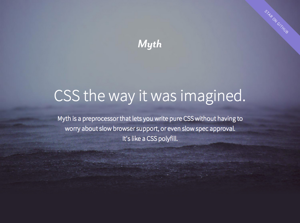
FIGURE 1.13 Myth (myth.io) is an experimental preprocessor that emulates these native CSS features, instead of introducing proprietary syntax, essentially acting like a CSS polyfill
Because most of the aforementioned native CSS features are not well supported today, in many cases using preprocessors is unavoidable if maintainability matters (and it should). My advice would be to start off every project with pure CSS, and when it starts being impossible to keep it DRY, switch to using a preprocessor then. To avoid becoming completely dependent on preprocessors or using them when they are not actually needed, their use needs to be a conscious decision, not a mindless first step performed by default in every new project.
In case you were wondering (and haven’t read the preface, tsktsk), the style of this book was authored in SCSS, although it started as pure CSS and only switched when the code grew too complex to be maintainable. Who said CSS and its preprocessors are only for the Web?
Get CSS Secrets now with the O’Reilly learning platform.
O’Reilly members experience books, live events, courses curated by job role, and more from O’Reilly and nearly 200 top publishers.

