7.7. Creating a Flexible Multicolumn Layout with Positioning
Problem
You want to create a four-column layout with columns that resize to the width of the browser as shown in Figure 7-15.
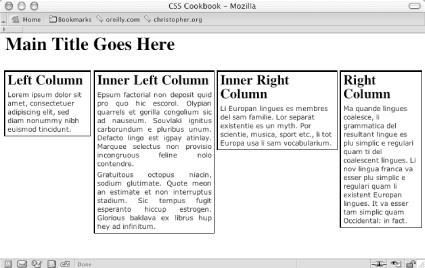
Figure 7-15. Four-column layout with percentage-based widths
Solution
First, mark up the content with div elements using
the id attributes that contain appropriate values
representing their placement on the page (see Figure 7-16):
<div id="header">
 [...]
</div>
<div id="columnLeft">
 [...]
</div>
<div id="columnInnerLeft">
 [...]
</div>
 [...]
<div id="columnInnerRight">
  [...]
</div>
 [...]
<div id="columnRight">
 [...]
</div>
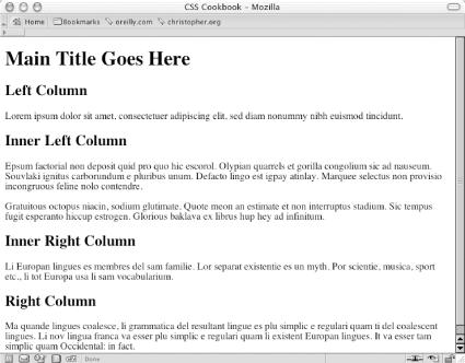
Figure 7-16. The default rendering of the content
Next, use the position property in each column,
setting the value to absolute while setting the
placement of the columns with the left and
top
properties:
#columnLeft {
 position: absolute;
 left:1%;
 width:20%;
 top: 4em;
 background:#fff;
}
#columnInnerLeft {
 position: absolute;
 left: 22%;
 width: 28%;
 top: 4em;
 background: #fff;
 text-align: justify;
 border-width: 0;
}
#columnInnerRight {
 position: absolute;
 left: 51%;
 width: 28%;
 top: 4em;
 background: #fff;
}
#columnRight {
 position: absolute;
 left: 80%;
 width: 19%;
 top: 4em;
 background: #fff;
}
Discussion
By setting the position property to
absolute you take the element completely out of the ...
Get CSS Cookbook now with the O’Reilly learning platform.
O’Reilly members experience books, live events, courses curated by job role, and more from O’Reilly and nearly 200 top publishers.

