Chapter 1. Communicating Data
âAs the cathedral is to its foundation so is an effective presentation of facts to the data.â
Thereâs something breathtaking about witnessing data communicated wellâitâs a lot like encountering an architectural wonder. Think of the first time you saw the video of Hans Rosling interacting with global development data on stage, or when you first viewed a well-designed New York Times visualization online. When data is communicated well, itâs easy to appreciate both the data itself and the delivery of that data at the same time. Those two elements can be fashioned together into an overall experience that makes you feel that you understand the world better, and that you want to do something with your newfound understanding.
On the other hand, think of a time when you suffered through a presentation at work that included poorly designed charts and graphs containing extraneous information, or all those infographics you wish you never laid eyes on that skewed the figures horribly and left you feeling dumber. Either the foundation was hopelessly cracked or the building itself was inexcusably shabby, or both. Not every building is a cathedral.
Whatâs the difference between these two types of experiences? Itâs a question of whether those who designed and delivered the message were adept at communicating data.
This is a book about just that. Communicating data is simply a special case of communicating in general (more about that in a minute)âone that incorporates quantitative statements about the universe. In this context, we arenât using the word âdataâ in the general sense of factual information, but in the more specific sense of âinformation in numerical form that can be digitally transmitted or processedââones and zeros in databases, spreadsheets, and tables.
This is also a book about using Tableau. This book will show you how to use Tableau to communicate data well, though you can apply the principles and methods covered in this book to using other tools. Itâs not intended to be an exhaustive Tableau manual, nor is it intended to guide you in the actual acquiring and storing of your data. While those are necessary steps, the goal of this book is to help you take all that data you have and convey its message with efficiency and impact.
A Step in the Process
How is âcommunicating dataâ distinct from the other steps in the overall process that begins with a question and ends with a shared insight? Figure 1-1 presents the overall data discovery process, and shows where communicating data fits in that process.
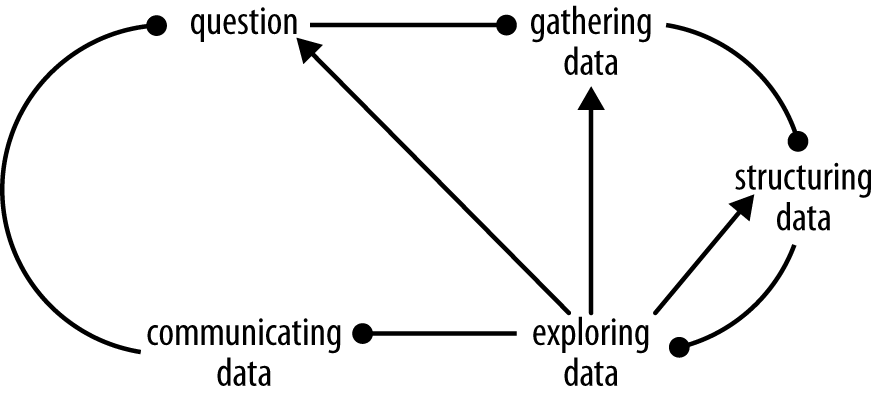
The highly iterative process often begins with a question, which can be specific (âwhich combination of products occurs the most often?â) or general (âwhat can we learn about historical sales of our products?â). The next step is gathering data if itâs available (e.g., historical sales). Then comes the often arduous process of structuring data, also called âdata mungingâ or âdata wrangling.â In this step, data is formatted, shaped, merged, converted, and otherwise manipulated into a form that is amenable to the next step, exploring data. In this step, the data is viewed and analyzed from a number of angles until one or more insights are gleaned. These insights form the message involved in communicating data, the step at which quantitative statements are shared with others. While this book primarily concerns this final step, it will also touch on the other steps in the process, as they contribute to the formation of the message to be communicated.
In order to examine the idea of communicating data in greater detail, letâs return to the birthplace of information theory: Bell Laboratories.
A Model of Communication
The year was 1949, and two employees at Bell LaboratoriesâClaude Elwood Shannon and his coauthor Warren Weaverâpublished a seminal article in the University of Illinois Press called The Mathematical Theory of Communication. In it, they introduced a model of communication systems in which an âinformation sourceâ selects a message and then a âtransmitter changes this message into the signal which is actually sent over the communication channel from the transmitter to the receiverâ (see Figure 1-2).
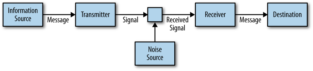
To illustrate the model, consider oral speech: the information source is the brain of a certain person; the transmitter is this personâs vocal system; the channel is the sound waves that travel as particles in the air collide; the receiver is the auditory system of a second person; and the destination is this second personâs brain. The noise source includes other sounds present at the time the first person speaks.
Shannon and Weaver describe how this model can apply to a wide variety of cases, including those in which the symbols are âwritten letters or words, or musical notes, or spoken words, or symphonic music, or pictures.â Put simply, the model describes the process of one mind attempting to affect another, and itâs the very essence of the human experience.
In this book, weâre dealing with the case in which the symbols communicated are abstract graphic representations of data in the form of charts, graphs, and maps: data visualizations. Viewing the communication of data in this conceptual framework is helpful because it reminds us of what we should be taking into account. Knowing how the system can fail is a key first step.
Three Types of Communication Problems
In order to begin to understand how we can communicate data well, itâs helpful to consider the types of communication problems that Shannon and Weaver identified:
- The technical problem
How accurately can the symbols of communication be transmitted?
- The semantic problem
How precisely do the transmitted symbols convey the desired meaning?
- The effectiveness problem
How effectively does the received meaning affect conduct in the desired way?
As far as technology has advanced since these problems were outlined, we still often suffer from technical problemsâinadequate screen resolution, broken audio, grainy video, poor print qualityâanything that results in the receiver receiving something different than what was originally crafted. Considering all the different devices, operating systems, and software the person on the receiving end could be using, it can be challenging to make sure the message itself is intact.
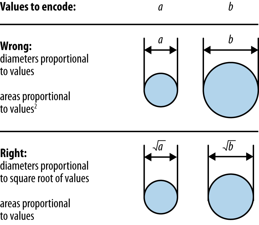
The semantic problem occurs when we encode the message using inappropriate visualization types, or when the symbols chosen wonât be understood by the person on the receiving end. For example, encoding a value using a circleâs diameter rather than its area will skew the perceived proportions (see Figure 1-3).
Another example of the semantic problem occurs when symbols are used that are only understood by a subset of all the audience members, such as the donkey and elephant icons that represent the Democratic and Republican parties of the American political system.
The effectiveness problem is the âso what?â problem, and it might be the most important. If everything falls into place, and the message is perfectly encoded, transmitted, decoded, and understood, but the recipient doesnât care, or doesnât take the desired action, then the communication ultimately failed.
Six Principles of Communicating Data
In order to address these three types of communication problems, Iâd like to propose six principles to consider when communicating data. They are numbered in the general order that they transpire, though itâs fully recognized that this process is highly iterative and rarely proceeds in a straight line. Communicating is a creative processâone that involves crafting and refining a messageâand as such it will necessarily involve many loops:
Know your goal
Use the right data
Select suitable visualizations
Design for aesthetics
Choose an effective medium and channel
Check the results
Letâs look at these principles in detail.
Principle #1: Know Your Goal
Itâs important to note that âinformationâ and the âmessageâ are not synonymous. Information is the set of all possible messages that can be selected by the information source. The message is what was selected from this set to be communicated. Why does this matter? In a world where information is increasing exponentially, choosing your message is an important first step.
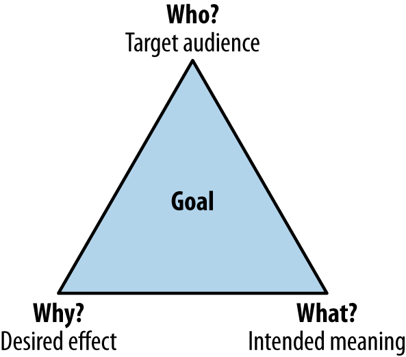
Before you choose your message, however, itâs critical to know your goal, which you can articulate by answering a few key questions up front (see Figure 1-4):
Who are you trying to communicate with? (target audience)
What do you want them to know? (intended meaning)
Why? What do you want them to do about it? (desired effect)
The answers to these questions may be very different for different disciplines. A data journalist working on a breaking story doesnât have the same goal as a business intelligence analyst working in a corporation. That they would communicate data differently shouldnât be surprising, and may be entirely appropriate.
The important part is articulating your goalâactually writing out the answers to the three questions just listed. If youâre not certain about the answer to any one of these questions, donât go any further until youâre sure. (And itâs OK if your sole purpose is to make someone laugh. You donât have to be trying to achieve world peace with every data message.)
Principle #2: Use the Right Data
As the saying goes, sometimes less is more. One of the most impactful examples of communicating data that Iâve ever seen involved the presentation of a single number: 14. That was the single data point shared with a group of managers assembled to discuss customer service within an organization. The group of managers came to learn that this number represented the number of times a particular customer had been transferred between departments during a single call to a helpline. It motivated an entire organization to revamp the customer experience.
Sometimes less is really less, though. While driving in the car, I heard a report on the radio in which a number of cities were compared based on the percentage of fish packages that were mislabeled. Digging into the data myself later that day, I found that the sample sizes were too small to infer much of anything about the relative mislabeling rates in the cities. A whole host of listeners were misled by the story at least as much as by the fish labels.
And more is often less. Itâs possible, and actually quite typical, to overwhelm the audience with data. Itâs easy to see why this happens: you worked hard to gather the data, and it feels like that data increases the weight of your message and lends additional credibility. But all that extra data only serves to drown out the message. Shannon and Weaver identified this problem: âif you overcrowd the capacity of the audience, you force a general and inescapable error and confusion.â In other words, if a data point doesnât add to your message, then it detracts from it.
The last and most important point about selecting data is that your message must be both ethical and based on sound epistemology. In other words: donât lie with statisticsâwe have enough of that to contend with already. Donât fall prey to the many and various forms of statistical and logical fallacies, such as mistaking correlation for causation, taking unreasonable inductive leaps, applying the Gaussian when it doesnât apply, inferring more than the sample size allows, and so on. These are just a few of the many icebergs to avoid (in this book, I hope to show you how to avoid some of them when you use Tableau).
Principle #3: Select Suitable Visualizations
Once youâve identified the data that youâll need to make your point, the next step is deciding how to encode the message. Encoding the data means converting the data values themselves into abstract graphical representations, like size or color or shape.
Knowing how the human mind makes use of different graphical displays of information to perform specific tasks is the key to avoiding the semantic problem (wherein the symbols donât convey the intended meaning precisely). Luckily for us, the last half-century has produced pioneers in the field of information visualization who have shed considerable light on this topic.
What type of data do you have?
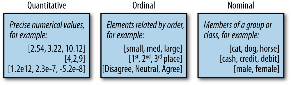
Tableauâs own Jock Mackinlay has produced a helpful framework for identifying the order of effectiveness of different encoding variables based on the type of data being used. First, letâs start with a description of the different types of data: quantitative, ordinal, and nominal (see Figure 1-5).
What are the most effective types of visualizations for your data type?
Once youâve identified what data type or types you will need to get your point across, you need to decide what variables you will use to encode the data (see Figure 1-6).
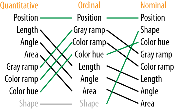
A few points are immediately obvious:
Position is the most effective form of encoding for all data types.
Length, angle, and area decrease in effectiveness from quantitative to ordinal to nominal.
Color hue increases in effectiveness from quantitative to ordinal to nominal.
Keeping this ranking in mind as you select your visualization type will help ensure you are crafting a message that will be easily decoded and understood by your audience.
If the overall quality of the communication were only affected by the ease of decoding, we would not need any more principles. In actuality, we also need to consider aesthetics, media and channel, and the actual impact.
Principle #4: Design for Aesthetics
Let me play devilâs advocate: Why consider aesthetics at all? Isnât any attempt to make a visualization âlook betterâ just chart junk or design fluff? Wonât graphic elements that arenât data just get it the way? Shouldnât the data itself be beautiful enough for readers?
I understand this viewpoint, I really do. Iâve seen plenty of attempts to beautify data visualizations that either distract the audience or, worse, distort the data so as to completely mislead the audience. We all agree that this result must be avoided. One way to avoid it is to banish all aesthetic elements forevermore. And yet, thatâs not a world Iâd want to live in, because there is a clear value to elegant design and what Willard Cope Brinton called âjudicious embellishment of chartsâ.
The value? Aesthetic elements can arouse interest and enhance memory. So long as they do so without overly hampering cognition, they can be used to achieve the goal.
There are a number of aesthetic elements of every data visualization, and a handful of common mistakes people make when creating them:
Poor color schemes
Distracting fonts
Many different fonts
Sloppy alignment
Vertical or angled labels
Dark background colors
Thick borders or grid lines
Useless images and clip art
Lazily accepting most software defaults
Consider Figure 1-7, which shows two charts that illustrate the growth of the number of possible moves in a chess game as the game progresses. The default Excel chart is on the left and a redesigned version is on the right.
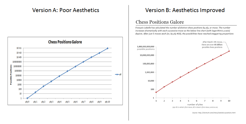
In both cases, itâs just a line on a log-linear scale, but which are you more likely to pay attention to? Aesthetics matters.
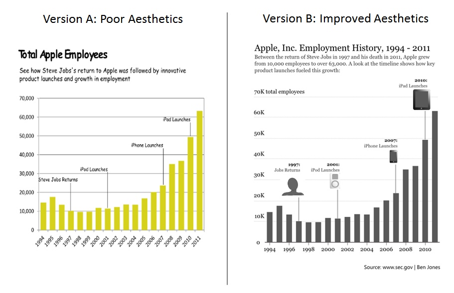
Figure 1-8 shows another example of poor design and improved design, this time showing the growth of employment at Apple after the return of Steve Jobs in 1997.
A little design goes a long way. If you know a good graphic artist, take her out for coffee and get her input. Design is a whole separate discipline that you could spend a lifetime learning about and perfecting, but paying even a small amount of attention to how your data visualizations look can mean the difference between being ignored and arousing interest, or between being quickly forgotten and being remembered for a while to come.
In this book, weâll cover how to address the aesthetics of visualizations created in Tableau.
Principle #5: Choose an Effective Medium and Channel
What form the message takes (medium) and how it gets delivered to the audience (channel) are critical elements of any data communication effort. Care needs to be taken in selecting the âhow,â the âwhen,â and the âwhereâ to improve the chances that your audience is reached and your goals are met.
Earlier, I referred to Hans Roslingâs famous presentation at TED in February of 2006: the animation of the GapMinder scatterplot, along with the narration and the pointing and arm waving, are key features of the communication effort. The data set he was presenting was complex, and the communication effort was also complex. He pulled it off, and the impact has been incredibly deep.
When you communicate data, there are a few choices to make about how you will do it:
Standalone graphics or narrated?
Static, interactive, animated, or combined graphics?
If narrated: recorded, live, or both?
If live: remote, in person, or both?
In all cases: broadcast, directed, or both?
The framework in Figure 1-9 shows how these choices typically relate in terms of effort, reach, and likely impact.

On the one hand, itâs obviously very simple and easy to create a static chart and send an email to a group of colleagues or publish it to the Web as a standalone graphic. This approach to communicating data could have a very deep impact on your target audience, but it most likely will not. Itâs also important to note that the cost in time and effort is very low.
On the other hand, narrating a combined set of static and dynamic graphics in person to a live audience is a very complex endeavor. A limited number of people will be present, but if you pull it off like Hans Rosling has, the impact could be enormous. The effort is high (and donât forget to rehearse).
These are both extreme examples of communicating data. The area in between these two extremes includes publishing blog posts that combine interactive data visualizations and detailed commentaryâsomething Tableau Public makes very easy to do.
As with anything, there is a trade-off between cost and impact at play here. If your target audience is a small firm in South Africa and the stakes are high, for example, getting on an airplane to walk them through the data may be a good investment. On the other hand, if youâd like as many people as possible in the general public to receive a data message, youâll have to find an effective way to broadcast the message. Knowing your goal, and knowing who makes up your target audience, informs these decisions.
Principle #6: Check the Results
It is a good habit in general to incorporate into your efforts feedback loops and checkpoints that help you gauge whether youâve achieved your intended results or not. This allows for course correction in the case of woefully unmet goals, or fine-tuning in the case of slight miscues.
There are a few questions to ask when you check the results. Weâll call this the âRUIâ:
- Reach
Did the audience even receive your message at all? Who did and who didnât?
- Understanding
Did the audience interpret the data message in the way you intended?
- Impact
Did the audience react in the way you wanted them to react?
Asking these questions will help you hone your message and communicate data better, and it also will show an appropriate degree of respect to your audience.
Summary
In this chapter, we considered the act of communicating data as an integral step in a larger data discovery process, and an important type of communication in general. We also considered three problems that can get in the way of communicating data wellâthe technical problem, the semantic problem, and the effectiveness problem. Lastly, we considered six principles to overcome these problems and achieve our goals. These six principles can be applied regardless of the tool or software used.
In the next chapter, weâll provide a general overview of one particular software tool for communicating data: Tableau.
Get Communicating Data with Tableau now with the O’Reilly learning platform.
O’Reilly members experience books, live events, courses curated by job role, and more from O’Reilly and nearly 200 top publishers.

