FIVE RULES FOR AVOIDING BAD GRAPHICS
There are a number of choices in presenting the soccer outcomes in graphical form. Many are poor choices; they hide information, make it difficult to discern actual values, or inefficiently use the space within the graphic. Open almost any newspaper and you will see a bar chart similar to Figure 10.1a, which illustrates the soccer data. In this section, we provide five important rules for generating effective graphics. Subsequent sections will augment this list with specific examples.
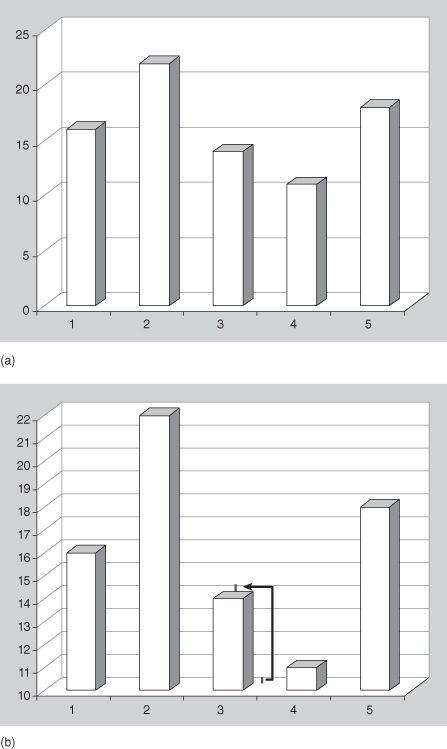
FIGURE 10.1. a. Total number of goals scored by Teams 1 through 5. The x-axis indicates the Team number and the y-axis indicates the number of goals scored by the respective team.Problem: The false third dimension makes it difficult to discern values. The number of goals for Team 3 appears to be 13 rather than the correct value of 14. b. Total number of goals scored by Teams 1 through 5. The x-axis indicates the Team number and the y-axis indicates the number of goals scored by the respective team.Problem: The false third dimension makes it difficult to discern values.Solution: Compute the vertical distance from the back-right bottom corner of a bar to the first vertical value. Transfer this value to the top of the back face of a bar. This height may then be compared to the added gridlines so that the correct value (14) may be inferred from the graphic.
Get Common Errors in Statistics (and How to Avoid Them), 4th Edition now with the O’Reilly learning platform.
O’Reilly members experience books, live events, courses curated by job role, and more from O’Reilly and nearly 200 top publishers.

