Avoiding catastrophe becomes the first principle in bringing color to information: Above all, do no harm.
COLOR IS ONE OF THE MOST ABUSED AND NEGLECTED tools in data visualization: we abuse it when we make poor color choices, and we neglect it when we rely on poor software defaults. Yet despite its historically poor treatment at the hands of engineers and end users alike, if used wisely, color is unrivaled as a visualization tool.
Most of us would think twice before walking outside in fluorescent red Underoos®. If only we were as cautious in choosing colors for infographics! The difference is that few of us design our own clothes, while we must all be our own infographics tailors in order to get colors that fit our purposes (at least until good palettes—like ColorBrewer—become commonplace).
While obsessing about how to implement color on the Dataspora Labs PitchFX viewer, I began with a basic motivating question: why use color in data graphics? We'll consider that question next.
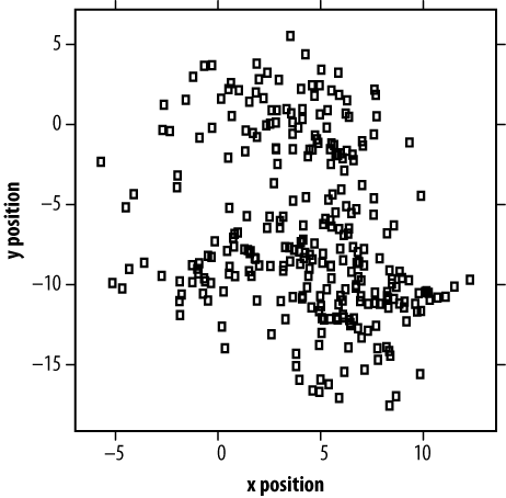
For a simple dataset, a single color is sufficient (even preferable). For example, Figure 4-1 shows a scatterplot of 287 pitches thrown by Major League pitcher Oscar Villarreal in 2008. With just two dimensions of data to describe—the x and y locations in the strike zone—black and white is sufficient. In fact, this scatterplot is a perfectly lossless representation of the dataset (assuming no data points overlap perfectly).
But what if we'd like to know more? For instance, what kinds of pitches (curveballs, fastballs) landed where? Or what was their speed? Visualizations occupy two dimensions, but the world they describe is rarely so confined.
The defining challenge of data visualization is projecting high-dimensional data onto a low-dimensional canvas. As a rule, one should never do the reverse (visualize more dimensions than already exist in the data).
Getting back to our pitching example, if we want to layer another dimension of data—pitch type—into our plot, we have several methods at our disposal:
Plotting symbols. We can vary the glyphs that we use (circles, triangles, etc.).
Small multiples. We can vary extra dimensions in space, creating a series of smaller plots.
Color. We can color our data, encoding extra dimensions inside a color space.
Which technique you employ in a visualization should depend on the nature of the data and the media of your canvas. I will describe these three by way of example.
In Figure 4-2, I've layered the categorical dimension of pitch type into our plot by using four different plotting symbols.
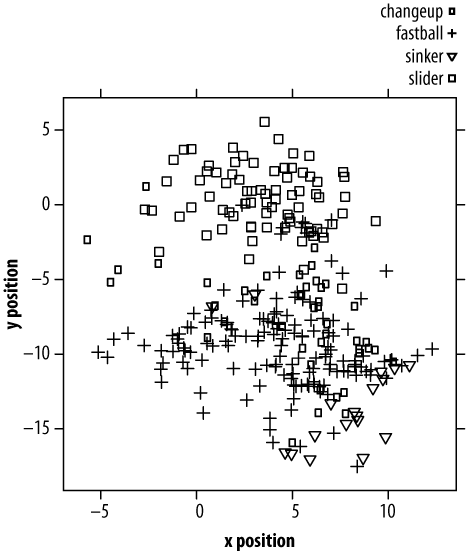
I consider this visualization an abject failure. There are two reasons why graphs like this one make our heads hurt: because distinguishing glyphs demands extra attention (versus what academics call "preattentively processed" cues like color), and because even after we've visually decoded the symbols, we must map those symbols to their semantic categories. (Admittedly, this can be mitigated with Chernoff faces or other iconic symbols, where the categorical mapping is self-evident).
While Edward Tufte has done much to promote the use of small multiples in information graphics, folding additional dimensions into a partitioned canvas has a distinguished pedigree. This technique has been employed everywhere from Galileo's sunspot illustrations to William Cleveland's trellis plots. And as Scott McCloud's unexpected tour de force on comics makes clear, panels of pictures possess a narrative power that a single, undivided canvas lacks.
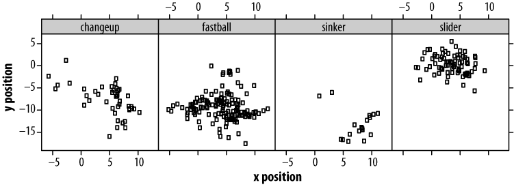
In Figure 4-3, plots of the four types of pitches that Oscar throws are arranged horizontally. By reducing our plot sizes, we've given up some resolution in positional information. But in return, patterns that were invisible in our first plot and obscured in our second (by varied symbols) are now made clear (Oscar throws his fastballs low, but his sliders high).
Multiplying plots in space works especially well on printed media, which can
display more than 10 times as many dots per square inch as a screen. Additional
plots can be arranged in both columns and rows, with the result being a matrix
of scatterplots (in R, see the splom
function).
In Figure 4-4, I've used color as a means of encoding a fourth dimension of our pitching data: the speed of pitches thrown. The palette I've chosen is a divergent palette that moves along one dimension (think of it as the "redness-blueness" dimension) in the Lab color space,[27] while maintaining a constant level of luminosity.
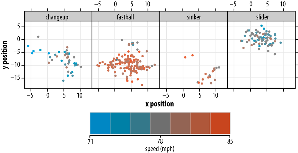
Figure 4-4. Location and pitch type, with pitch velocity indicated by a one-dimensional color palette
On the one hand, holding luminosity constant has advantages, because luminosity (similar to brightness) determines a color's visual impact. Bright colors pop, and dark colors recede. A color ramp that varies luminosity along with hue will highlight data points as an artifact of color choice.
On the other hand, luminosity—unlike hue—possesses an inherent order that hue lacks, making it suitable for mapping to quantitative (and not categorical) dimensions of data.
Because I am going to use luminosity to encode yet another dimension later, I decided to use hue for encoding speed here; it suits our purposes well enough. I chose only seven gradations of color, so I'm downsampling (in a lossy way) our speed data. Segmentation of our color ramp into many more colors would make it difficult to distinguish them.
I've also chosen to use filled circles as the plotting symbol in this version, as opposed to the open circles used in all the previous plots. This improves the perception of each pitch's speed via its color: small patches of color are less perceptible. However, a consequence of this choice—compounded by the decision to work with a series of smaller plots—is that more points overlap. Hence, we've further degraded some of the positional information. (We'll attempt to recover some of this information in just a moment.)
As compared to most print media, computer displays have fewer units of space but a broader color gamut. So, color is a compensatory strength.
For multidimensional data, color can convey additional dimensions inside a unit of space, and can do so instantly. Color differences can be detected within 200 milliseconds, before you're even conscious of paying attention (the "preattentive" concept I mentioned earlier).
But the most important reason to use color in multivariate graphics is that color is itself multidimensional. Our perceptual color space—however you slice it—is three-dimensioned.
We've now brought color to bear on our visualization, but we've only encoded a single dimension: speed. This leads us to another question.
In theory, yes—Colin Ware (2000) researched this exact question using red, blue, and green as the three axes. (There are other useful ways of dividing the color spectrum, as we will soon see.) In practice, though, it's difficult. It turns out that asking observers to assess the amount of "redness," "blueness," and "greenness" of points is possible, but doing so is not intuitive.
Another complicating factor is that a nontrivial fraction of the population has some form of colorblindness (also known as dichromacy, in contrast to normal trichromacy). This effectively reduces color perception to two dimensions.
And finally, the truth is that our sensation of color is not equal along all dimensions: there are fewer perceptible shades of yellow than there are "blues." It's thought that the closely related "red" and "green" receptors emerged via duplication of the single long wavelength receptor (useful for detecting ripe from unripe fruits, according to one just-so story).
Because of the high level of colorblindness in the population, and because of the challenge of encoding three dimensions in color, I believe color is best used to encode no more than two dimensions of data.
For the last iteration of our pitching plot data visualization, shown in Figure 4-5, I will introduce luminosity as a means of encoding the local density of points. This allows us to recover some of the data lost by increasing the sizes of our plotting symbols.
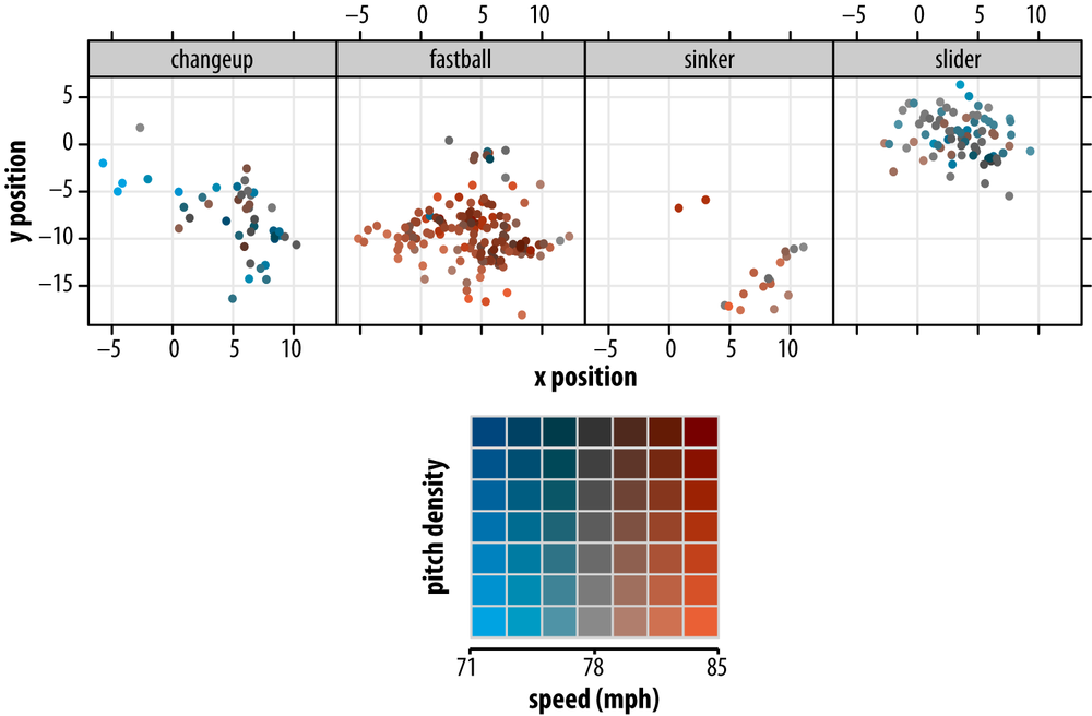
Figure 4-5. Location and pitch type, with pitch velocity and local density indicated by a two-dimensional color palette (see inset for details)
Here we have effectively employed a two-dimensional color palette, with blueness-redness varying along one axis to denote speed, luminosity varying along the other to denote local density. As detailed in the Methods section, these plots were created using the color space package in R, which provides the ability to specify colors in any of the major color spaces (RGB, HSV, Lab). Because the Lab color space varies chromaticity independently from luminosity, I chose it for creating this particular two-dimensional palette.
One final point about using luminosity is that observing colors in a data visualization involves overloading, in the programming sense. That is, we rely on cognitive functions that were developed for one purpose (seeing lions) and use them for another (seeing lines).
We can overload color any way we want, but whenever possible we should choose mappings that are natural. Mapping pitch density to luminosity feels right because the darker shadows in our pitch plots imply depth. Likewise, when sampling from the color space, we might as well choose colors found in nature. These are the palettes our eyes were gazing at for millions of years before the RGB color space showed up.
This discussion has focused on using static graphics in general, and color in particular, as a means of visualizing multivariate data. I've purposely neglected one very powerful dimension: time. The ability to animate graphics multiplies by several orders of magnitude the amount of information that can be packed into a visualization (a stunning example is Aaron Koblin's visualizations of U.S. and Canadian flight patterns, explored in Chapter 6). But packing that information into a time-varying data structure involves considerable effort, and animating data in a way that is informative, not simply aesthetically pleasing, remains challenging. Canonical forms of animated visualizations (equivalent to the histograms, box plots, and scatterplots of the static world) are still a ways off, but frameworks like Processing[28] are a promising start toward their development.
All of the visualizations here were developed using the R programming language and the Lattice graphics package. The R code for building a two-dimensional color palette follows:
## colorPalette.R
## builds an (m × n) 2D palette
## by mixing 2 hues (col1, col2)
## and across two luminosities (lum1,lum2)
## returns a matrix of the hex RGB values
makePalette <- function(col1,col2,lum1,lum2,m,n,...) {
    C <- matrix(data=NA,ncol=m,nrow=n)
    alpha <- seq(0,1,length.out=m)
    ## for each luminosity level (rows)
    lum <- seq(lum1,lum2,length.out = n)
    for (i in 1:n) {
         c1 <- LAB(lum[i], coords(col1)[2], coords(col1)[3])
         c2 <- LAB(lum[i], coords(col2)[2], coords(col2)[3])
         ## for each mixture level (columns)
         for (j in 1:m) {
             c <- mixcolor(alpha[j],c1,c2)
             hexc <- hex(c,fixup=TRUE)
             C[i,j] <- hexc
         }
    }
    return(C)
}

## plot a vector or matrix of RGB colors
plotPalette <- function(C,...) {
    if (!is.matrix(C)) {
        n <- 1
        C <- t(matrix(data=C))
    } else {
        n <- dim(C)[1]
    }
    plot(0, 0, type="n", xlim = c(0, 1), ylim = c(0, n), axes = FALSE,
            mar=c(0,0,0,0),...)

    ## helper function for plotting rectangles
    plotRectangle <- function(col, ybot=0, ytop=1, border = "light gray") {
        n <- length(col)
        rect(0:(n-1)/n, ybot, 1:n/n, ytop, col=col, border=border, mar=c(0,0,0,0))
    }

    for (i in 1:n) {
        plotRectangle(C[i,], ybot=i-1, ytop=i)
    }
}

## Let's put it all together.
## We make two colors in the LAB space, and then plot a 2D palette
## going from 60 to 25 luminosity values.
library(colorspace)
lightRed <- LAB(50,48,48)
lightBlue <- LAB(50,-48,-48)
C <- makePalette(col1=lightBlue, col2=lightRed, lum1=60, lum2=25, m=7, n=7)
plotPalette(C, xlab='speed', ylab='density')As this example has demonstrated, color—used thoughtfully and responsibly—can be an incredibly valuable tool in visualizing high-dimensional data. The final product—five-dimensional pitch plots for all available data for the 2008 season—can be explored via the PitchFX Django-driven web tool at Dataspora labs (http://labs.dataspora.com/gameday/).
Few, Stephen. 2006. Information Dashboard Design, Chapter 4. Sebastopol, CA: O'Reilly Media.
Ihaka, Ross. Lectures 12–14 on Information Visualization. Department of Statistics, University of Auckland. http://www.stat.auckland.ac.nz/~ihaka/120/lectures.html.
Sarkar, Deepayan. 2008. Lattice: Multivariate Data Visualization with R. New York: Springer-Verlag.
Tufte, Edward. 2001. Envisioning Information, Chapter 4. Cheshire, CT: Graphics Press.
Ware, Colin. 2000. Information Visualization, Chapter 4. San Francisco, CA: Morgan Kaufmann.
Get Beautiful Visualization now with the O’Reilly learning platform.
O’Reilly members experience books, live events, courses curated by job role, and more from O’Reilly and nearly 200 top publishers.

