Know How to Use Screen Resolution Data
Answer the question “Should we build pages for 1024 x 768 or 800 x 600 screen resolution?” using the data you already have.
One of the most common questions people ask when building web sites is whether designers should build for higher or lower screen resolutions. On one hand, we have professional web designers who want to build brilliant-looking designs unconstrained by low-resolution (e.g., 800 x 600) monitors. On the other hand, usability guidelines state unequivocally, “Thou shall not force the user to scroll horizontally!” What is a web designer to do?
Use Your Screen Resolutions Report
Any web measurement application worth its salt will have a screen resolution report similar to the one shown in Figure 5-6.
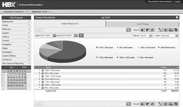
Figure 5-6. Screen resolution report
Any decision you make about your web site should be data-driven, right? So why not use screen resolution data to decide when to move to a 1024 pixel screen width! As you can see in Figure 5-6, less than 17 percent of the visitors used lower-resolution monitors; while this helps answer the question, you should also consider trending the data over time to develop a more complete view of when to make changes, based on historical and emerging trends.
So When Do We Switch Over?
Worldwide, the 800 x 600 browser share is still hovering around 30 percent. Unfortunately, you should never do anything that will negatively ...
Get Web Site Measurement Hacks now with the O’Reilly learning platform.
O’Reilly members experience books, live events, courses curated by job role, and more from O’Reilly and nearly 200 top publishers.

