Typography 101
People have been creating and arranging symbols for thousands of years. In the early days of print, text and symbol wrangling was handled by exacting craftsmen called typesetters, who lovingly hammered letterforms into metal plates and then physically set them onto printing presses (hence the phrase, setting type). With the advent of desktop publishing, however, everyone and their cocker spaniel started creating text. This has been both good and bad: It’s great that you can whip up your own yard sale signs, invitations, and posters; but, as you might suspect, the quality of typography has suffered since most folks lack professional training. Figure 14-1 shows examples of good and bad typography.
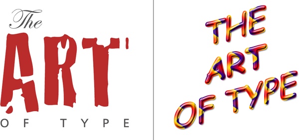
Figure 14-1. Left: When formatted well, text can be a beautiful and powerful form of art. Right: Done badly, text can be garish and difficult to read. The combination of Comic Sans (an overused, unsophisticated font) and multiple layer styles makes this innocent text hideous.
Some of the most frequent typographic offenses include:
Overusing decorative fonts and using too many fonts per design. Just because you have a ton of wacky fonts doesn’t mean you should use them—especially not all in one document.
Setting whole sentences in capital letters. All-capped text takes folks longer to read because they’re not used to it. Even worse, it tends to imply that you’re YELLING. That said, ...
Get Photoshop CC: The Missing Manual, 2nd Edition now with the O’Reilly learning platform.
O’Reilly members experience books, live events, courses curated by job role, and more from O’Reilly and nearly 200 top publishers.

