Columns
jQuery Mobile offers us some templates to define content to be shown in
columns, called layout grids. These grids act like a table without the
semantic problem of using table
(please, donât use table for anything
besides tabular data).
Warning
Remember that you are on a mobile device; columns should be used with care, only to place small elements such as buttons, links, or small items. If you are targeting tablets, you have more space for columns.
The layout grid method uses CSS classes to define grid areas and columns. We can define grids from two up to five columns. Each grid is invisible, uses the whole 100% width, and has no padding or margin defined.
To create a grid, just use a block container, typically a div, with a class of ui-grid-a for two
columns, ui-grid-b for three columns,
ui-grid-c for four columns and ui-grid-d for five columns. Every grid will
divide, by default, the width into equal-width columns.
Every cell should be a block container using ui-block-<letter>
with <letter> being from a to d being
the first to the fifth column on the grid.
Letâs try a basic two-column example using the HTML5 new element section, as we
can see in Figure 3-16:
<div data-role="content">
  <section class="ui-grid-a">
    <div class="ui-block-a">Column 1</div>
    <div class="ui-block-b">Column 2</div>
  </section>
</div>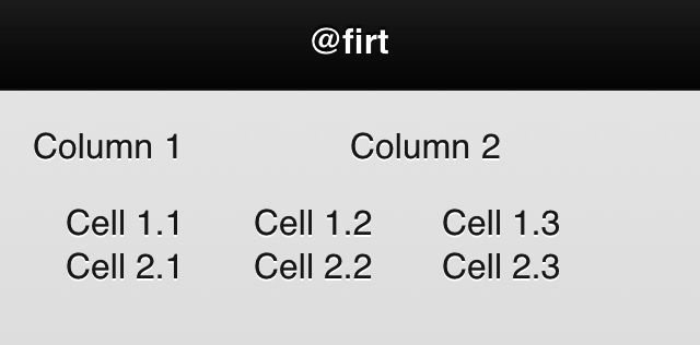
Figure 3-16. We can align elements in up to five equal-sized columns ...
Get jQuery Mobile: Up and Running now with the O’Reilly learning platform.
O’Reilly members experience books, live events, courses curated by job role, and more from O’Reilly and nearly 200 top publishers.

