Chapter 11. Layouts
Contrary to what the name implies, D3 layouts do not, in fact, lay anything out for you on the screen. The layout methods have no direct visual output. Rather, D3 layouts take data that you provide and remap or otherwise transform it, thereby generating new data that is more convenient for a specific visual task. It’s still up to you to take that new data and generate visuals from it.
Here is a complete list of all D3 layouts:
- Bundle
- Chord
- Cluster
- Force
- Histogram
- Pack
- Partition
- Pie
- Stack
- Tree
- Treemap
In this chapter, I introduce three of the most common: pie, stack, and force. Each layout performs a different function, and each has its own idiosyncrasies.
If you are curious about any of the other D3 layouts, check out the many examples on the D3 website, and be sure to reference the official API documentation on layouts.
Pie Layout
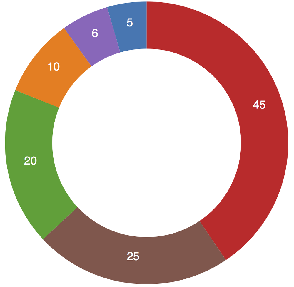
d3.layout.pie() might not be as delicious as it sounds, but it’s still worthy of your attention. Obviously, its typical use is for creating pie charts, like the example in Figure 11-1.

Feel free to open up the sample code for this in 01_pie.html and poke around.
To draw those pretty wedges, we need to know a number of measurements, including an inner and outer radius for each wedge, plus the starting and ending angles. The purpose of the pie layout is to take your data and calculate all those messy angles for you, sparing you from ever having to think about radians.
Remember radians? In case you don’t, here’s a quick refresher. Just as there are 360° in a circle, there are 2π radians. So π radians equals 180°, or half a circle. Most people find it easier to think in terms of degrees; computers prefer radians.
For this pie chart, let’s start, as usual, with a very simple dataset:
vardataset=[5,10,20,45,6,25];
We can define a default pie layout very simply as:
varpie=d3.layout.pie();
Then, all that remains is to hand off our data to the new pie() function, as in pie(dataset). Compare the datasets before and after in Figure 11-2.
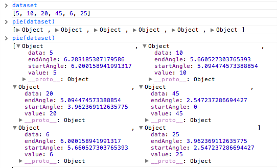
The pie layout takes our simple array of numbers and generates an array of objects, one object for each value. Each of those objects now has a few new values—most important, startAngle and endAngle. Wow, that was easy!
Now, to actually draw the wedges, we turn to d3.svg.arc(), a handy built-in function for drawing arcs as SVG path elements. We haven’t talked about paths yet, but they are SVG’s answer to drawing irregular forms. Anything that’s not a rect, circle, or another basic shape can be drawn as a path. The catch is, the syntax for defining path values is not particularly human-friendly. For example, here’s the code for the big, red wedge in Figure 11-1:
<pathfill="#d62728"d="M9.184850993605149e-15,-150A150,150 0 0,183.99621792063931,124.27644738657631L0,0Z"></path>
If you can understand that, then you don’t need this book.
The bottom line is, it’s best to let functions like d3.svg.arc() handle generating paths programatically. You don’t want to try writing this stuff out by hand.
Arcs are defined as custom functions, and they require inner and outer radius values:
varw=300;varh=300;varouterRadius=w/2;varinnerRadius=0;vararc=d3.svg.arc().innerRadius(innerRadius).outerRadius(outerRadius);
Here I’m setting the size of the whole chart to be 300 by 300 square. Then I’m setting the outerRadius to half of that, or 150. The innerRadius is zero. We’ll revisit innerRadius in a moment.
We’re ready to draw some wedges! First, we create the SVG element, per usual:
//Create SVG elementvarsvg=d3.select("body").append("svg").attr("width",w).attr("height",h);
Then we can create new groups for each incoming wedge, binding the pie-ified data to the new elements, and translating each group into the center of the chart, so the paths will appear in the right place:
//Set up groupsvararcs=svg.selectAll("g.arc").data(pie(dataset)).enter().append("g").attr("class","arc").attr("transform","translate("+outerRadius+", "+outerRadius+")");
Note that we’re saving a reference to each newly created g in a variable called arcs.
Finally, within each new g, we append a path. A paths path description is defined in the d attribute. So here we call the arc generator, which generates the path information based on the data already bound to this group:
//Draw arc pathsarcs.append("path").attr("fill",function(d,i){returncolor(i);}).attr("d",arc);
Oh, and you might be wondering where those colors are coming from. If you check out 01_pie.html, you’ll note this line:
varcolor=d3.scale.category10();
D3 has a number of handy ways to generate categorical colors. These might not be your favorite colors, but they are quick to drop into any visualization while you’re in the prototyping stage. d3.scale.category10() creates an ordinal scale with an output range of 10 different colors. (See the wiki for more information on these color scales as well as perceptually calibrated color palettes, based on research by Cynthia Brewer, that are included with D3.)
Lastly, we can generate text labels for each wedge:
arcs.append("text").attr("transform",function(d){return"translate("+arc.centroid(d)+")";}).attr("text-anchor","middle").text(function(d){returnd.value;});
Note that in text(), we reference the value with d.value instead of just d. This is because we bound the pie-ified data, so instead of referencing our original array (d), we have to reference the array of objects (d.value).
The only thing new here is arc.centroid(d). WTH? A centroid is the calculated center point of any shape, whether that shape is regular (like a square) or highly irregular (like an outline of the state of Maryland). arc.centroid() is a super-helpful function that calculates and returns the center point of any arc. We translate each text label element to each arc’s centroid, and that’s how we get the text labels to float right in the middle of each wedge.
Bonus tip: Remember how arc() required an innerRadius value? We can expand that to anything greater than zero, and our pie chart becomes a ring chart like the one shown in Figure 11-3:
varinnerRadius=w/3;
Check it out in 02_ring.html.
One more thing: The pie layout automatically reordered our data values from largest to smallest. Remember, we started with [ 5, 10, 20, 45, 6, 25 ], so the small value of 6 should have appeared between 45 and 25, but no—the layout sorted our values in descending order, so the chart began with 45 at the 12 o’clock position, and everything just goes clockwise from there.
Stack Layout
d3.layout.stack() converts two-dimensional data into “stacked” data; it calculates a baseline value for each datum, so you can “stack” layers of data on top of one another. This can be used to generate stacked bar charts, stacked area charts, and even streamgraphs (which are just stacked area charts but without the rigid starting baseline value of zero).
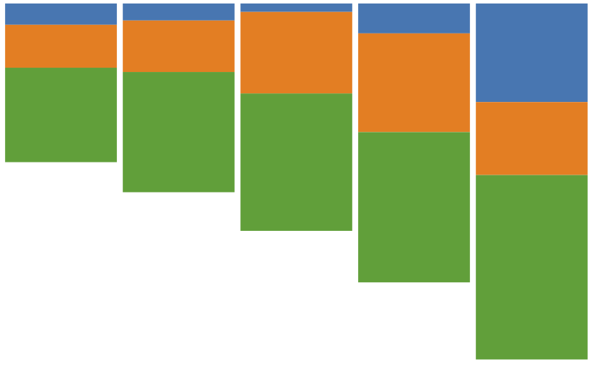
For example, we’ll start with the stacked bar chart in Figure 11-4.
Let’s say you had some data like this:
vardataset=[{apples:5,oranges:10,grapes:22},{apples:4,oranges:12,grapes:28},{apples:2,oranges:19,grapes:32},{apples:7,oranges:23,grapes:35},{apples:23,oranges:17,grapes:43}];
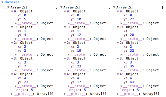
The first step is to rearrange that data into an array of arrays. Each array represents the data for one category (e.g., apples, oranges, or grapes). Within each category array, you’ll need an object for each data value, which itself must contain an x and a y value. The x in our case is just an ID number. The y is the actual data value:
vardataset=[[{x:0,y:5},{x:1,y:4},{x:2,y:2},{x:3,y:7},{x:4,y:23}],[{x:0,y:10},{x:1,y:12},{x:2,y:19},{x:3,y:23},{x:4,y:17}],[{x:0,y:22},{x:1,y:28},{x:2,y:32},{x:3,y:35},{x:4,y:43}]];
Our original dataset looks like Figure 11-5 in the console.
Then we initialize our stack layout function, and call it on dataset:
varstack=d3.layout.stack();stack(dataset);
Now the stacked data is shown in Figure 11-6.
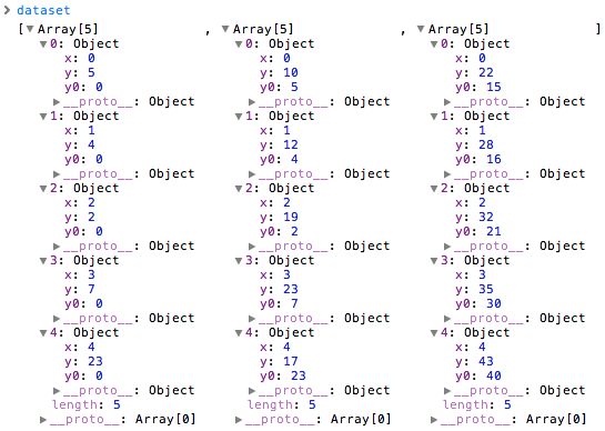
Can you spot the difference? In the stacked data, each object has been given a y0 value. This is the baseline value. Notice that the y0 baseline value is equal to the sum of all the y values in the preceding categories. For example, reading left to right across the top, the first object’s y value is 5, and its y0 is zero. To the right (in the oranges column), the first object has a y value of 10, and a y0 of 5. (Aha! That’s just the value of the first object’s y!) On the far right (in the grapes column), we see a y value of 22, and a y0 of 15 (which is just 5 + 10).
To “stack” elements visually, now we can reference each data object’s baseline value as well as its height. See all the code in 03_stacked_bar.html. (I leave it as an exercise to you to align the stacks against the bottom x-axis.) Here’s the critical excerpt:
varrects=groups.selectAll("rect").data(function(d){returnd;}).enter().append("rect").attr("x",function(d,i){returnxScale(i);}).attr("y",function(d){returnyScale(d.y0);}).attr("height",function(d){returnyScale(d.y);}).attr("width",xScale.rangeBand());
Note how for y and height we reference d.y0 and d.y, respectively.
Force Layout
Force-directed layouts are so-called because they use simulations of physical forces to arrange elements on the screen. Arguably, they are a bit overused, yet they make a great demo and just look so darn cool. Everyone wants to learn how to make one, so let’s talk about it.
Force layouts are typically used with network data. In computer science, this kind of dataset is called a graph. A simple graph is a list of nodes and edges. The nodes are entities in the dataset, and the edges are the connections between nodes. Some nodes will be connected by edges, and others won’t. Nodes are commonly represented as circles, and edges as lines. But of course the visual representation is up to you—D3 just helps manage all the mechanics behind the scenes.
The physical metaphor here is of particles that repel each other, yet are also connected by springs. The repelling forces push particles away from each other, preventing visual overlap, and the springs prevent them from just flying out into space, thereby keeping them on the screen where we can see them.
Figure 11-7 provides a visual preview of what we’re coding toward.

D3’s force layout expects us to provide nodes and edges separately, as arrays of objects. Here we have one dataset object that contains two elements, nodes and edges, each of which is itself an array of objects:
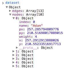
vardataset={nodes:[{name:"Adam"},{name:"Bob"},{name:"Carrie"},{name:"Donovan"},{name:"Edward"},{name:"Felicity"},{name:"George"},{name:"Hannah"},{name:"Iris"},{name:"Jerry"}],edges:[{source:0,target:1},{source:0,target:2},{source:0,target:3},{source:0,target:4},{source:1,target:5},{source:2,target:5},{source:2,target:5},{source:3,target:4},{source:5,target:8},{source:5,target:9},{source:6,target:7},{source:7,target:8},{source:8,target:9}]};
As usual for D3, you can store whatever data you like within these objects. Our nodes are simple—just names of people. The edges contain two values each: a source ID and a target ID. These IDs correspond to the nodes above, so ID number 3 is Donovan, for example. If 3 is connected to 4, then Donovan is connected to Edward.
The data shown is a bare minimum for using the force layout. You can add more information, and, in fact, D3 will itself add a lot more data to what we’ve provided, as we’ll see in a moment.
Here’s how to initialize a force layout:
varforce=d3.layout.force().nodes(dataset.nodes).links(dataset.edges).size([w,h]).start();
Again, this is just the bare minimum. We specify the nodes and links to be used, the size of the available space, and then call start() when we’re ready to go.
This generates a default force layout, but the default won’t be ideal for every dataset. As you would expect, there are all kinds of options for customization. See the API wiki for all the gory details. Here, I’ve increased the linkDistance (the length of the edges between connected nodes) as well as the negative charge between nodes, so they will repel each other more. (It’s not personal; I just want them to spread out a bit.)
varforce=d3.layout.force().nodes(dataset.nodes).links(dataset.edges).size([w,h]).linkDistance([50])// <-- New!.charge([-100])// <-- New!.start();
Next, we create an SVG line for each edge:
varedges=svg.selectAll("line").data(dataset.edges).enter().append("line").style("stroke","#ccc").style("stroke-width",1);
Note that I set all the lines to have the same stroke color and weight, but of course you could set this dynamically based on data (say, thicker or darker lines for “stronger” connections, or some other value).
Then, we create an SVG circle for each node:
varnodes=svg.selectAll("circle").data(dataset.nodes).enter().append("circle").attr("r",10).style("fill",function(d,i){returncolors(i);}).call(force.drag);
I set all circles to have the same radius, but each gets a different color fill, just because it’s prettier that way. Of course, these values could be set dynamically, too, for a more useful visualization.
You’ll notice the last line of code, which enabled drag-and-drop interaction. (Comment that out, and the user won’t be able to move nodes around.)
Lastly, we have to specify what happens when the force layout “ticks.” Yes, these ticks are different from the axis ticks addressed earlier, and definitely different from those little blood-sucking insects. Physics simulations use the word “tick” to refer to the passage of some amount of time, like the ticking second hand of a clock. For example, if an animation were running at 30 frames per second, you could have one tick represent 1/30th of a second. Then each time the simulation ticked, you’d see the calculations of motion update in real time. In some applications, it’s useful to run ticks faster than actual time. For example, if you were trying to model the effects of climate change on the planet 50 years from now, you wouldn’t want to wait 50 years to see the results, so you’d program the system to tick on ahead, faster than real time.
For our purposes, what you need to know is that D3’s force layout “ticks” forward through time, just like every other physics simulation. With each tick, the force layout adjusts the position values for each node and edge according to the rules we specified when the layout was first intialized. To see this progress visually, we need to update the associated elements—the lines and circles:
force.on("tick",function(){edges.attr("x1",function(d){returnd.source.x;}).attr("y1",function(d){returnd.source.y;}).attr("x2",function(d){returnd.target.x;}).attr("y2",function(d){returnd.target.y;});nodes.attr("cx",function(d){returnd.x;}).attr("cy",function(d){returnd.y;});});
This tells D3, “Okay, every time you tick, take the new x/y values for each line and circle and update them in the DOM.”
Wait a minute. Where did these x/y values come from? We had only specified names, sources, and targets!
D3 calculated those x/y values and appended them to the existing objects in our original dataset (see Figure 11-8). Go ahead and open up 04_force.html, and type dataset into the console. Expand any node or edge, and you’ll see lots of additional data that we didn’t provide. That’s where D3 stores the information it needs to continue running the physics simulation. With on("tick", …), we are just specifying how to take those updated coordinates and map them on to the visual elements in the DOM.
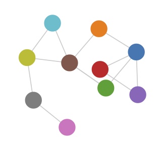
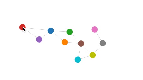
The final result, then, is the lovely entanglement displayed in Figure 11-9.
Again, you can run the final code youself in 04_force.html.
Note that each time you reload the page, the circles and lines spring to life, eventually resting in a state of equilibrium. But that final state of rest is different every time because there is an element of randomness to how the circles enter the stage. This illustrates the unpredictable nature of force-based layouts: they might be quite different each time you use them, and they rely on the data to provide structure. If your data is more structured, you might get a better visual result.
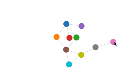
Interactivity can be useful for improving our view of the data. I don’t like how the edges overlap here, so I’ll drag the pink circle out and around (see Figure 11-10), then I’ll move the red one up and to the left (see Figure 11-11).
As a bonus, interactivity + physics simulation = irresistable demo. I can’t explain it, but it’s true. For some reason, we humans just love seeing real-world things replicated on screens.
Get Interactive Data Visualization for the Web now with the O’Reilly learning platform.
O’Reilly members experience books, live events, courses curated by job role, and more from O’Reilly and nearly 200 top publishers.

