Aliasing and Anti-Aliasing
The good news is that for centuries, typography has been a cornerstone of high aesthetic standards.
The bad news is that during those centuries, it never occurred to anyone that their work might need to be pixellated, as on an electronic display.
To make a long story extremely short, that means that most traditional typefaces look awful on-screen. This is caused by aliasing, which is described visually in Figure 12-4.
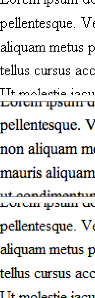
Figure 12-4. An illustration of aliasing and anti-aliasing applied to 16px/12pt Helvetica: (1) original against a pixel grid, (2) aliased, (3) anti-aliased at the OSX Medium setting, and (4) anti-aliased in ClearType/Vista
Aliasing approximates the strokes of a letterform, which leads to an obviously âblockyâ appearance. For this reason, fonts that are not designed to account for aliasing tend to look much differentâand frankly uglierâthan their print counterparts, an effect exacerbated by the fact that human eyesight is keyed to differences in brightness.
Anti-aliasing attempts to undo some of aliasingâs damage to the ideal appearance of on-screen lettering by smoothing edges, as shown in Figure 12-4. Anti-aliasing algorithms create regions along the edges of letters where the difference between foreground and background is interpolated gradually, which obscures the true degree of contrast and allows more of the typeâs hinting to ...
Get HTML & CSS: The Good Parts now with the O’Reilly learning platform.
O’Reilly members experience books, live events, courses curated by job role, and more from O’Reilly and nearly 200 top publishers.

