As we discussed in Data, once you know the âshapeâ of your data, you can encode its various dimensions with appropriate visual properties. Different visual properties varyâor may be modifiedâin different ways, which makes them good for encoding different types of data. Two key factors are whether a visual property is naturally ordered, and how many distinct values of this property the reader can easily differentiate. Natural ordering and number of distinct values will indicate whether a visual property is best suited to one of the main data types: quantitative, ordinal, categorical, or relational data. (Spatial data is another common data type, and is usually best represented with some kind of map.)
Whether a visual property has a natural ordering is determined by whether the mechanics of our visual system and the âsoftwareâ in our brains automaticallyâunintentionallyâassign an order, or ranking, to different values of that property. The âsoftwareâ that makes these judgments is deeply embedded in our brains and evaluates relative order independent of language, culture, convention, or other learned factors; itâs not optional and you canât[6] design around it.
For example, position has a natural ordering; shape doesnât. Length has a natural ordering; texture doesnât (but pattern density does). Line thickness or weight has a natural ordering; line style (solid, dotted, dashed) doesnât. Depending on the specifics of the visual property, its natural ordering may be well suited to representing quantitative differences (27, 33, 41), or ordinal differences (small, medium, large, enormous).
Natural orderings are not to be confused with properties for which we have learned or social conventions about their ordering. Social conventions are powerful, and you should be aware of them, but you cannot depend on them to be interpreted in the same way as naturally-ordered propertiesâwhich are not social and not learned, and the interpretation of which is not optional.
Hereâs a tricky one: Color (hue) is not naturally ordered in our brains. Brightness (lightness or luminance, sometimes called tint) and intensity (saturation) are, but color itself is not. We have strong social conventions about color, and there is an ordering by wavelength in the physical world, but color does not have a non-negotiable natural ordering built into the brain. You canât depend on everyone to agree that yellow follows purple in the way that you can depend on them to agree that four follows three.
The misuse of color to imply order is rampant; donât fall into this common trap. In contexts where youâre tempted to use âordered colorâ (elevation, heat maps, etc.), consider varying brightness along one, or perhaps two, axes. For example, elevation can be represented by increasing the darkness of browns, rather than cycling through the rainbow (see Figure 4-1[7] and Figure 4-2[8]).
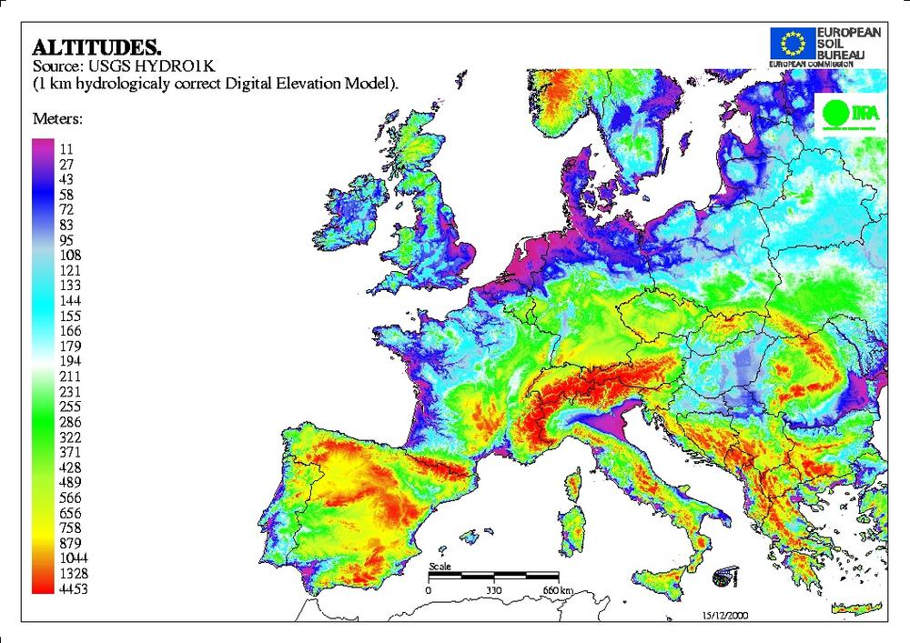
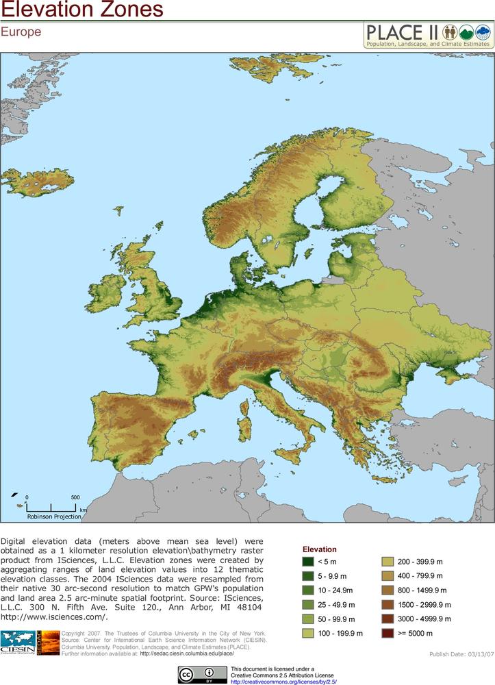
Figure 4-2. In this example the colors diverge from one point, clearly indicating low, medium, and high elevations.
Note
For help in choosing appropriate color palettes, a great tool is ColorBrewer2.0, at http://colorbrewer2.org.
The second main factor to consider when choosing a visual property is how many distinct values it has that your reader will be able to perceive, differentiate, and possibly remember. For example, there are a lot of colors in the world, but we canât tell them apart if theyâre too similar. We can more easily differentiate a large number of shapes, a huge number of positions, and an infinite number of numbers. When choosing a visual property, select one that has a number of useful differentiable values and an ordering similar to that of your data (see Figure 4-3).
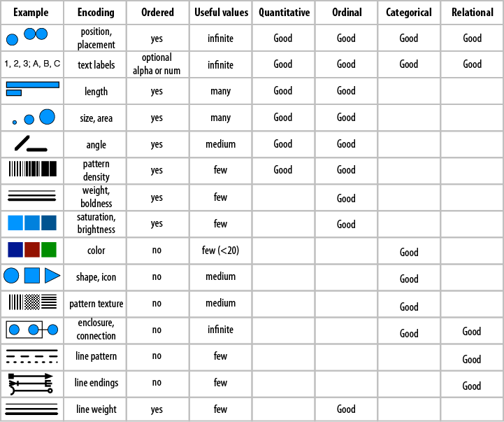
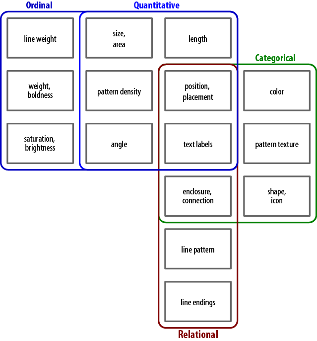
Figure 4-4 shows another way to think about visual properties, depending on what kind of data you need to encode. As you can see, many visual properties may be used to encode multiple data types. Position and placement, as well as text, can be used to encode any type of dataâwhich is why every visualization you design needs to begin with careful consideration of how youâll use them (see Chapter 5).
If you have the luxury of leftover, unused visual properties after youâve encoded the main dimensions of your data, consider using them to redundantly encode some existing, already-encoded data dimensions. The advantage of redundant encoding is that using more channels to get the same information into your brain can make acquisition of that information faster, easier, and more accurate.[9]
For example, if youâve got lines differentiated by ending (arrows, dots, etc.), consider also changing the line style (dotted, dashed, etc.) or color. If youâve got values encoded by placement, consider redundantly encoding the value with brightness, or grouping regions with color, as in Figure 4-5[10].
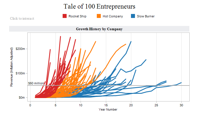
To be totally accurate, in Figure 4-5, adding color more strongly defined the groupings that werenât strongly defined before, but those groups are a subset of the information already provided by position. For that reason, in this case color adds slightly more informational value beyond mere redundancy.
It is worth noting that there are a lot of good default encodings and encoding conventions in the world, and with good reason. Designing new encoding formats can cost you a lot of time and effort, and may make your reader expend a lot of time and effort to learn. Knowing the expected defaults for your industry, data type, or reader can save you a lot of work when it comes to both figuring out how to best encode your data, and how to explain it to your readers. However, if we all used existing defaults all the time, not much progress would be made. So when should you use a default, and when should you innovate?
In writing, we often advise each other to stay away from clichés; donât use a pat phrase, but try to find new ways to say things instead. The reason is that we want the reader to think about what weâre saying, and clichés tend to make readers turn their brains off. In visualization, however, that kind of brainlessness can be a help instead of a hindranceâsince it makes comprehension more efficientâso conventions can be our friends.
Note
Purposely turning visual convention on its head may cause the readerâs brain to âthrow an exception,â if you will, and this technique can be used strategically; but please, use it sparingly.
The choice comes down to a basic cost-benefit analysis. What is the expense to you and your reader of creating and understanding a new encoding format, versus the value delivered by that format? If youâve got a truly superior solution (as evaluated by your reader, and not just your ego), then by all means, use it. But if your job can be done (or done well enough) with a default format, save everyone the effort and use a standard solution.
In Chapter 2, we discussed how important it is to recognize that you are creating a visualization for someone other than yourselfâand that the reader may show up with a mindset or way of viewing the world different from yours.
First, itâs important to point out that your audience will likely be composed of more than one reader. And as these people are all individuals, they may be as different from each other as they are from you, and will likely have very different backgrounds and levels of interest in your work. It may be impossible to take the preconceptions of all these readers into consideration at once. So choose the most important group, think of them as your core group, and design with them in mind. Where it is possible to appeal to more of your potential audience without sacrificing precision or efficiency, do so. But, going forward, let us be clear that when we say reader, what we really mean is a representative reader from within your core audience.
Okay, now that weâve cleared that up, letâs get specific about some facets of the readerâs mindset that you need to take into account.
When selecting the actual terms youâll use to label axes, tag visual elements, or title the piece (which creates the mental framework within which to view it), consider your readerâs vocabulary and familiarity with relevant jargon.
Is the reader from within your industry or outside of it? What about other readers outside of the core audience group?
Is it worth using an industry term for the sake of precision (knowing that the reader may have to look it up), or would a lay term work just as well?
Will the reader be able to decipher any unknown terms from context, or will a vocabulary gap obscure the meaning of all or part of the information presented?
These are the kinds of questions you should ask yourself. Each and every single word in your visualization needs to serve a specific purpose. For each one, ask yourself: why use this word in this place? Determine whether there is another word that would serve the purpose any better (or whether you can get away without one at all), and if so, make the change.
Related to this, consider any spelling preferences a reader might have. Especially within the English language, there may be more than one way to spell a word depending on which country one is in. Donât make the readerâs brain do extra work having to parse âsuperfluousâ or âmissingâ letters.
Another reader context to take into account is color choice. There is quite a bit of science about how our brains perceive and process color that is somewhat universal, as we saw earlier in this chapter. But itâs worth mentioning in the context of reader preconceptions the significant cultural associations that color can carry.
Depending on the culture in question, some colors may be lucky, some unlucky; some may carry positive or negative connotations; some may be associated with life events like weddings, funerals, or newborn children.
Some colors donât mean much on their own, but take on meaning when paired or grouped with other colors: in the United States, red and royal blue to Republicans and Democrats; pink and light blue often refer to boys and girls; red, yellow, and green to traffic signals. The colors red, white, and green may signal Christmas in Canada, but patriotism in Italy. The colors red, white, and blue are patriotic in multiple places: they will make both an American and a Frenchman think of home.
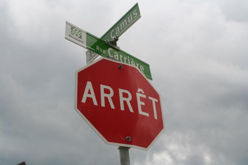
Colors may also take on special significance when paired with certain shapes. A red octagon means stop in many places (see Figure 4-6[11]), but not all.
Of course, we know that there are many variations in the way different people perceive color. This is commonly called color blindness but is more properly referred to as color vision deficiency or dyschromatopsia. A disorder of color vision may present in one of several specific ways.
Although prevalence estimates vary among experts and for different ethnic and national groups, about 7% of American men experience some kind of color perception disorder (women are much more rarely affected: about 0.4 percent in America).[12] Red-green deficiency is the most common by far, but yellow-blue deficiency also occurs. And there are lots of people who have trouble distinguishing between close colors like blue and purple.
Note
A great resource for help in choosing color palettes friendly to those with color blindness is the Color Laboratory at http://colorlab.wickline.org/colorblind/colorlab/. There you can select color swatches into a group (or enter custom RGB values) and simulate how they are perceived with eight types of dyschromatopsia. Note: the simulation assumes that you yourself have typical color vision.
Is the reader from a culture that reads left-to-right, right-to-left, or top-to-bottom? A personâs habitual reading patterns will determine their default eye movements over a page, and the order in which they will encounter the various visual elements in your design.
It will also affect what the reader perceives as âearlierâ and âlaterâ in a timeline, where the edge that is read from will be âearlierâ and time will be assumed to progress in the same direction as your reader typically reads text.
This may also pertain to geographic maps: many of us are used to seeing the globe split somewhere along the Pacific, with north oriented upward. This suits North Americans just fine, sinceâscanning from left to right and starting from the top of the pageâwe encounter our own country almost immediately. The convention came about thanks to European cartographers, who designed maps over hundreds of years with their own continent as the center of the world.
Occasionally, other map makers have chosen to orient the world map differently, often for the same purpose of displaying their homeland with prominence (such as Stuart McArthurâs âSouth-Up Map,â which puts his native Australia toward the center-top) or simply for the purpose of correcting the distortion effect that causes Europe to look bigger than it really is (such as R. Buckminster Fullerâs âDymaxion Mapâ).
As with so many suggestions in this chapter, a large factor in your success is making life easier for your reader, and thatâs largely based on making encodings as easy to decode as possible. One way to make decoding easy is to make your encodings of things and relationships as well aligned with the reality (or your readerâs reality) of those things and relationships as possible; this alignment is called compatibility. This can have many different aspects, including taking cues from the physical world and from cultural conventions.
Things in the world are full of inherent properties. These are physical properties that are not (usually) subject to interpretation or culture, but exist as properties you can point to or measure. Some things are larger than others, have specific colors, well-known locations, and other identifying characteristics. If your encodings conflict with or donât reflect these properties, if they are not compatible, youâre once again asking your reader to spend extra time decoding and wondering why things are âwrong;â why they donât look like theyâre expected to (for example, see the boats and airplanes in Figure 4-7).
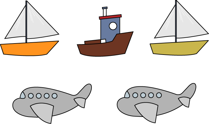
Figure 4-7. The visual placement of boats above airplanes is jarring, since they donât appear that way in the physical world.
Figure 4-8 shows an example from http://html5readiness.com/.
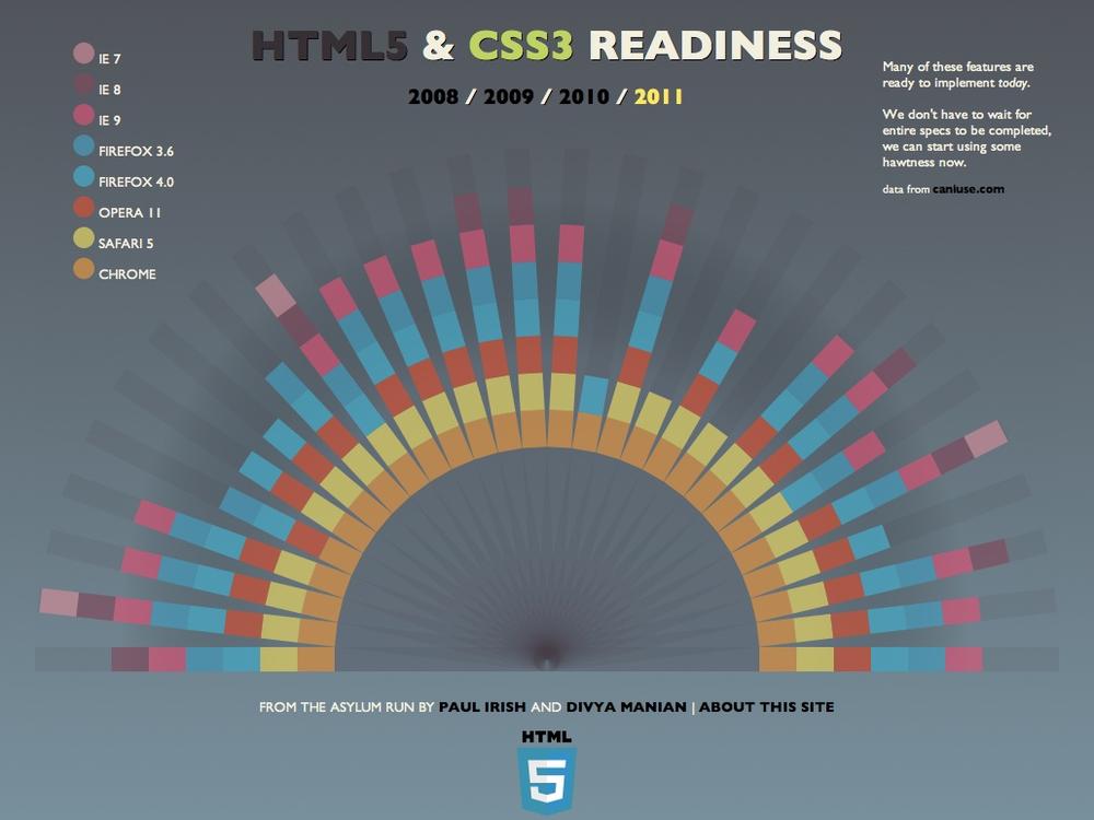
Notice how the colors theyâve chosen map to the browser icons, as shown in Figure 4-9.
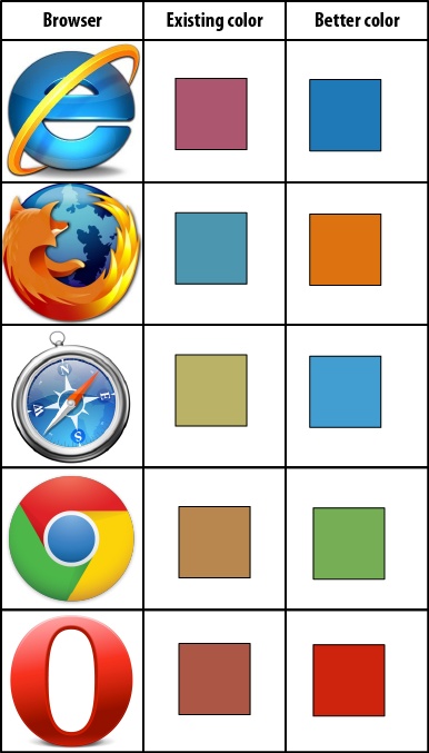
The encodings theyâve chosen arenât very compatible with the reality of the browsersâ icons and branding. IE, with a blue and yellow icon, is shown in shades of purple. Firefox, with a blue and orange icon, is shown in blueâwhich is fine, but curious, given the other browser icons that also contain blue and might be better contenders for the blue encoding. Safari, with a blue icon, is encoded with yellow. Chromeâwhich has red, blue, green, and yellow, but no orange in its iconâis orange. Opera, with its red icon and corresponding red label, has the only encoding that makes sense. An improved set of encodings that more closely match the reality of the browser icons shown in the last column of Figure 4-9.
Beyond physical or natural conventions, there are learned, cultural conventions that must also be respected. These may not be as easy to point to, but are no less important. Note that, as we advised in the section on natural ordering, you should not rely on social or cultural conventions to convey information. However, these conventions can be very powerful, and you should be aware that your reader brings them to the table. Making use of them, when possible, to reinforce your message will help you convey information efficiently. Avoid countering conventions where possible in order to avoid creating cognitive dissonance, a clash of habitual interpretation with the underlying message you are sending.
To use colors as an example of some of these learned conventions, red and green have strong connotations for bad and good, or stop and go. (See the Color section in Chapter 6 for more on common color associations.) Beyond color, consider cultural conventions about spatial representations, such as what left and right mean politically, or the significance of above and below. Also consider cultural conventions about the meaning or square versus round, and bright versus dark.
All sorts of metaphorical interpretations are culturally ingrained. An astute designer will think about these possible interpretations and work with them, rather than against them.
Direction is an interesting property to consider because it has both inherent and learned conventions. How many times have you looked at an emergency exit map in a hallway, and realized that the exit, displayed to the left on the map, was to your right in reality, because the map was upside down relative to the direction you were facing?[13] You may also run into maps that, for various reasons, donât put north at the top of the map. Even though the map may be fully accurate and not violating compatibility with physical reality, this violation of cultural convention can be enormously disorienting.
The human brain is amazingly good at identifying patterns in the world. We easily recognize similarity in shapes, position, sound, color, rhythm, language, behavior, and physical routine, just to name a few variables. This ability to recognize patterns is extremely powerful, as it enables us to identify stimuli that weâve encountered before, and predict behavior based on what happened the last time we encountered a similar stimulus pattern. This is the foundation of language, communication, and all learning. The ability to recognize patterns and learn from them allows us to notice and respond when we hear the sound of our name, to run down a set of stairs without hurting ourselves, and to salivate when we smell food cooking.
Consequently, we also notice violations of patterns. When a picture is crooked, a friend sounds troubled, a car is parked too far out into the street, or the mayonnaise smells wrong, the patterns we expect are being violated and we canât help but notice these exceptions. Flashing lights and safety vests are intentionally designed to stand out from the backgroundâwe notice them because they are exceptions to the norm.
Practically speaking, this pattern and pattern-violation recognition has two major implications for design. The first is that readers will notice patterns and assume they are intentional, whether you planned for the patterns to exist or not. The second is that when they perceive patterns, readers will also expect pattern violations to be meaningful.
As designers, we must be extremely deliberate about the patterns and pattern violations we create. Donât arbitrarily assign positions or colors or connections or fonts with no rhyme or reason to your choices, because your reader will always assume that you meant something by it. If you change the order or membership of a list of items, either in text or in placement, it will be perceived as meaningful. If you change the encoding of items, by position, shape, color, or other methods, it will be perceived as meaningful.
So how should you avoid the potential trap of implying meaning where none is intended? It all comes down to three simple rules.
Be consistent in membership, ordering, and other encodings.
Things that are the same should look the same.
Things that are different should look different.
These sound simple, and yet violations of these rules are everywhere. You can probably think of a few already, and will probably start to notice more examples in your daily life. Maintaining consistency and intention when encoding will greatly enhance the accessibility and efficiency of your visualization, and, as with any good habit, will make your life easier in the long run.
Just as we donât write PhD dissertations in sonnet form, or thank-you notes like legal briefs complete with footnote citations, itâs important that the structure of your visualization be appropriate to your data.
The structure of a visualization should reveal something about the underlying data. Take, for example, one of the most classic data visualizations: the Periodic Table of the Elements (Figure 4-10[14]). This is arguably one of the most elegant visualizations ever made. It takes a complex dataset and makes it simple, organized, and transparent. The elements are laid out in order by atomic number, and by wrapping the rows at strategic points, the table reveals that elements in various categories occur at regular intervals, or periods. The table makes it easier to understand the nature of each elementâboth individually, and in relation to the other elements we know of.
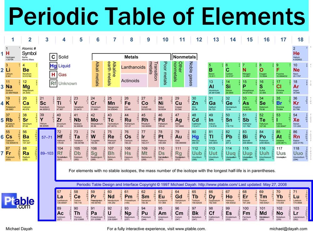
Perhaps because it is so elegant and iconic, the Periodic Table is also one of the most frequently imitated visualizations out there. Designers and satirists are constantly repurposing its familiar rows and columns to showcase collections of everything from typefaces to video game controllers, and, ironically, visualization methods. This phenomenon is a particular peeve to your authors precisely because it violates the important principle of selecting an appropriate structure. With the possible (yet questionable) exception of Andrew Plotkinâs Periodic Table of Desserts,[15] copycat designers are using a periodic structure to display data that is not periodic. They are just so many derivative attempts at cleverness.
Warning
If youâre using a particular structure just to be cute or clever, youâre doing it wrong.
If you are tempted to use a periodic table format for your non-periodic data, consider instead a two-axis scatter plot or table, where the axes are well matched to the important aspects of your data. This will lead you to a more accurate, and less derivative, final product.[16]
Note
For another chemistry-oriented example of a specific structure with an entirely different purpose, check out the Table of Nuclides: http://en.wikipedia.org/wiki/Table_of_nuclides
Beyond that, we must refer you to other tomes (we suggest the books by Yau and Kosslyn listed in Appendix A to begin with, and Bertin for more dedicated readers) to help you select just the right structure for your particular circumstance; as you can see from Figure 4-11, there are too many to address each one directly within the scope of this short book. But here are some general principles and common pitfalls to guide your selection process.C
If you intend to allow comparison of values, set the representations up in equivalent ways, and then put them close together. You wouldnât ask people to look at two versions of a photo in different rooms; youâd put them side-by-side. The same goes for visualizations, particularly with quantitative measures. If you want people to be able to meaningfully compare values, put them as near to each other as possible.
Another important comparison principle is that of preservation. Just as you would isolate variables in a clinical trial by comparing a test group to a control groupâwhich is similar to the test group except for one variableâyou need to isolate visual changes by preserving other conditions, so that the change may be easily and fairly interpreted.
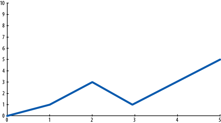
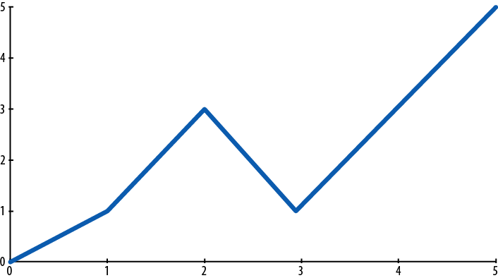
A good example of this is in comparing two graphs. Beware of what scales you use on your axes so that the reader can fairly interpret the graph data. If one graph has a scale of 0 to 10 and the other has a scale of 0 to 5 (Figure 4-11), the slopes displayed on the graphs will be very different for the same data. Using unequal scales for data you are attempting to compare makes comparison much more difficult.
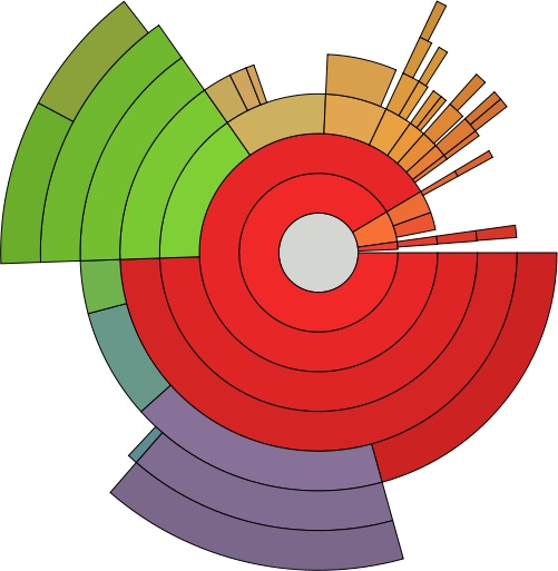
Some formats are just bad, and should never be used under any circumstances. Many of the formats that fall into this category do so because they distort proportion. There are certain things that our brains are and arenât good at: for example, we are terrible at comparing lengths of curved lines and the surface areas of irregularly-shaped fields. For this reason, concentric circle graphs (see, for example, http://michaelvandaniker.com/blog/2009/10/31/visualizing-historic-browser-statistics-with-axiis/) are one of the worst offenders in the world of data presentation structures.[17]
If I show you a section of the ring in the middle that represents a huge percentage, it still looks objectively shorter than a section of the outer ring that may represent a much smaller percentage. Also, having all of these lines wrapped in a circle makes it difficult to compare their lengths anyway. They only way you can really grasp the information represented in this graph is to read the percentage numbers in the labels. In this case, we may as well just have a table of numbersâit would be faster to read and easier to make comparisons with.
Similarly, the ringed pie graph format known as Nightingaleâs Rose (for its creator, Florenceâsee Figure 4-12), is almost completely useless. Comparing the areas of the sliced pie wedges is nearly impossible to do accurately. Line graphs or stacked bar graphs would have served much better.
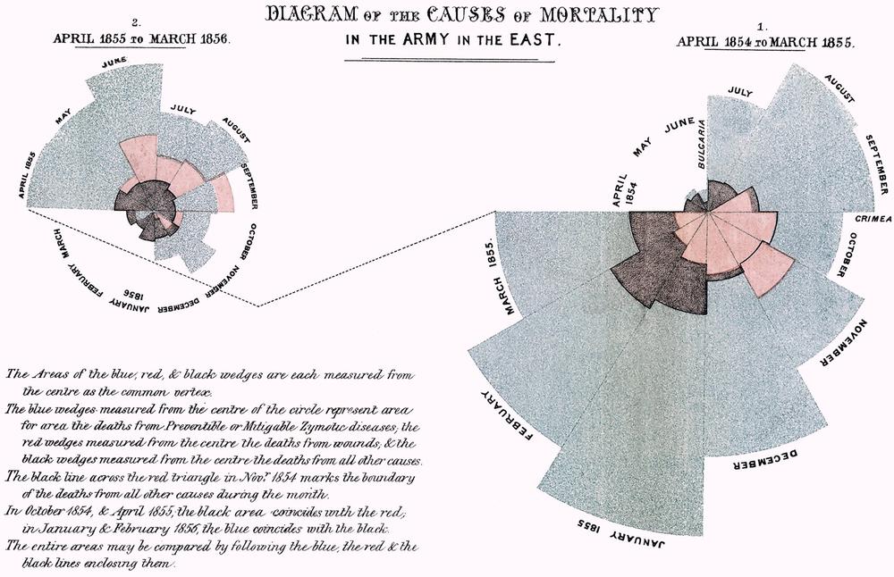
Unfortunately, this format continues to be reinvented in all sorts of modern contexts. See Figure 4-13 for an equally useless implementation using the same variously sized pie wedges.
There are bad formats, and then there are good formats frequently misused. Like the Periodic Table, pie graphs are useful for a very specific purpose, but quickly devolve into unhelpful parody when drafted into extended service.
The specialty of a pie graph is comparisonâspecifically, comparison of a few parts to a larger whole. Weâve already established above in our discussion of concentric circle graphs and Nightingaleâs Roses that the human brain is lousy at comparing the lengths and surface areas of curved or irregularly-shaped fields; pie graphs fall directly into this category.
Another common pitfall is the use of a geographic map for any and all data that includes a location dimension. Sometimes the use of a map will actually distort your messageâsuch as when the surface area of each region fails to correspond to your population data (see the section on physical reality in Chapter 5). If your data is tied to population but your display is based on regional size, the proportionally larger surface areas of some regions may inflate the appearance of trends in those regions. Consider using a table or bar graph instead.
Note
If you wish to show regional trends, remember that you donât have to position states or countries alphabetically; itâs okay to group them by region or along some other appropriate axis.
We talked about careful selection of visual content in Chapter 3, and will talk about selecting and applying encodings well in Chapter 6. But editing (in the sense of minimizing noise to maximize signal) is also a key concept to bear in mind for selecting a useful structure (and keeping it useful).
Consider Figure 4-14, which shows an organization chart developed in 2010 by the Joint Economic Committee minority, Republicans. The chart, titled âYour New Health Care System,â depicts the Democratic partyâs proposed health care system, and displays a bewildering array of new government agencies, regulations, and mandates, represented by a tangled web of shapes and lines.
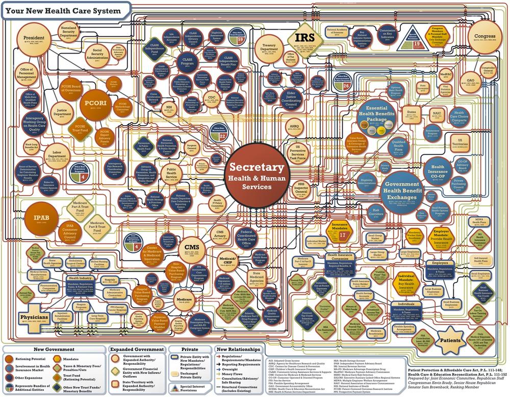
Itâs fairly obvious that political motivations dominated the design choices for this visualization; it clearly falls into the category of persuasive visualization (rather than informative). The chart itself doesnât leave the reader with any actual information other than, âWow, this system is complicated.â When we consider the title of the press release in which this was unveiledââAmericaâs New Health Care System Revealedââwe know those responsible to be disingenuous.
A citizen designer, Robert Palmer, took it upon himself to make a different, cleaner visual representation of the same proposed health care plan (Figure 4-15[18]). His chart is strikingly different from the one created by the Joint Economic Committee minority.
Palmer explained his motivation in an open letter to Rep. John Boehner (R-OH) on Flickr (http://www.flickr.com/photos/robertpalmer/3743826461/):
By releasing your chart, instead of meaningfully educating the public, you willfully obfuscated an already complicated proposal. There is no simple proposal to solve this problem. You instead chose to shout â12! 16! 37! 9! 24!â while we were trying to count something.[19]
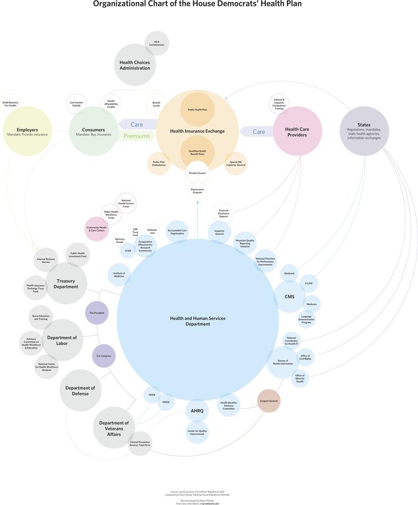
Figure 4-15. Palmerâs representation of the same healthcare plan doesnât oversimplify, but is much easier to parse.
There is no doubt that national healthcare is a complex matter, and this is evident in both designs. But Palmerâs rendition clearly aims to pare down that complexity to its essential nature, for the purpose of making things easier to understand, rather than purposefully clouding what is happening under the abstracted layer. This is the hallmark of effective editing.
Sometimes a designer will make the visualization more complicated than it need to be, not because he is trying to make the data look bad, but for precisely the opposite reason: he wants the data to look as good as possible. This is an equally bad mistake.
Your data is important and meaningful all on its own; you donât have to make it special by trying to get fancy. Every dot, line and word should serve a communicative purpose: if it is extraneous or outside the scope of the visualizationâs goals, it must go. Edit ruthlessly. Donât decorate your data.
[6] Or shouldnât try to: that way madness lies.
[7] European Soil Bureau. Copyright © 1995â2011, European Union. Used with stated authorization to reproduce, with acknowledgment. http://eusoils.jrc.ec.europa.eu/
[8] Center for International Earth Science Information Network (CIESIN) (2007). Copyright © 2007, The Trustees of Columbia University in the City of New York. Columbia University. Population, Landscape, and Climate Estimates (PLACE). Used under the Creative Commons Attribution License. http://sedac.ciesin.columbia.edu/place/
[9] Ware, Information Visualization: Perception for Design (Morgan Kaufmann), p. 179.
[10] Tableau Software Public Gallery. Copyright © 2003â2011 Tableau Software. http://www.tableausoftware.com/learn/gallery/company-performance
[11] Christian Caron (2011). Copyright © 2011, Christian Caron.
[12] Montgomery, Geoffrey, for Howard Hughes Medical Institute. Seeing, Hearing, and Smelling the World. Chevy Chase, MD: 1995.
[13] Your authors take particular interest in examining information design in the world, take every opportunity to do so, and hope that everyone else will start to do the same.
[14] Michael Dayah (1997). Copyright © 1997 Michael Dayah. http://www.ptable.com
[16] Astute readers will note that the periodic table is also a two-axis layout with carefully chosen axes that reflect, and facilitate access to, the relevant properties of the data.
[17] We care so much about this issue that we dedicate a section in Chapter 5 to good and bad uses of circular layouts.
[18] Robert Palmer (2010). Copyright © 2010, Robert Palmer. http://rp-network.com/
Get Designing Data Visualizations now with the O’Reilly learning platform.
O’Reilly members experience books, live events, courses curated by job role, and more from O’Reilly and nearly 200 top publishers.

