Slider
Slider is a bit more complicated than ProgressBar because it enables users to change the current value by moving its thumb through the range, with any number of optional ticks. The default appearance of Slider (with no ticks) is shown in Figure 14.3. The ToolTip shown while dragging or hovering can be disabled by setting IsThumbToolTipEnabled to false. Slider, like some controls from previous chapters, exposes a Header property that is typically set to a simple label.
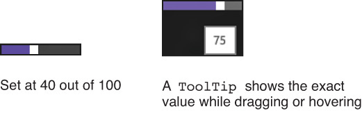
FIGURE 14.3 Slider looks like a ProgressBar, but it has a draggable thumb.
Users can also tap on the slider to make the thumb jump to the tapped location, or use the up ...
Get XAML Unleashed now with the O’Reilly learning platform.
O’Reilly members experience books, live events, courses curated by job role, and more from O’Reilly and nearly 200 top publishers.

