ToggleSwitch
Logically, ToggleSwitch is like a ToggleButton or its more well-known derived CheckBox control, just with a different default appearance that makes it look like a light switch, and with support for only two states (no indeterminate state). Figure 14.15 shows a simple ToggleSwitch with no properties set. The user can turn a ToggleSwitch on and off by tapping it or dragging the thumb.
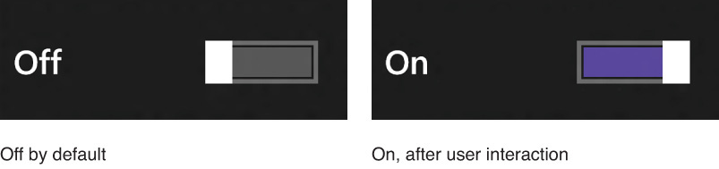
FIGURE 14.15 The ToggleSwitch is like a light switch that can be on or off.
ToggleSwitch exposes a Boolean IsOn property and raises a simple Toggled event when the value of IsOn changes.
ToggleSwitch has a standard Header property, and you can customize ...
Get XAML Unleashed now with the O’Reilly learning platform.
O’Reilly members experience books, live events, courses curated by job role, and more from O’Reilly and nearly 200 top publishers.

