ComboBox
The ComboBox control, shown in Figure 10.4 from the following XAML, enables users to select one item from a list:
<ComboBox> <ComboBoxItem>Small</ComboBoxItem> <ComboBoxItem>Medium</ComboBoxItem> <ComboBoxItem>Large</ComboBoxItem></ComboBox>
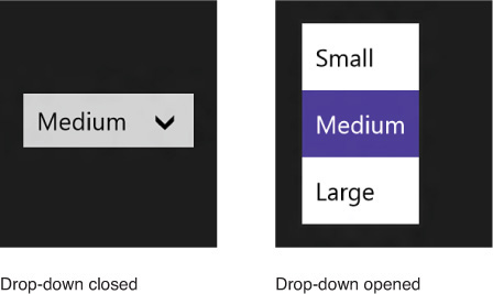
FIGURE 10.4 The ComboBox fits the selection of an item into a small space.
ComboBox is a popular control because it doesn’t occupy much space. It displays the current selection in a selection box, with the rest of the list shown on demand in a drop-down. The drop-down can be opened and closed by tapping the control or by pressing Alt+up arrow, Alt+down arrow, or ...
Get XAML Unleashed now with the O’Reilly learning platform.
O’Reilly members experience books, live events, courses curated by job role, and more from O’Reilly and nearly 200 top publishers.

