Creating the Style Sheets
The simplified example in this section demonstrates the basics of creating an all-purpose source document and targeted style sheets. In the real world, the documents and style sheets would no doubt be longer and more complex, but the core concepts are the same.
This simple, yet properly marked up, XHTML document (sample.html) is the source for both the screen version and the printed page, shown in Figure 36-1. The html and head elements have been omitted to save space, but they are implied.
<body>
<div id="printonly">
  <p><strong>LITTLECHAIR, Inc.</strong> | For more information, visit us at
  www.littlechair.com</p>
</div>

<div id="masthead">
    <img src="masthead.png">
</div>

<h1>Style Guides and Documentation</h1>
<p>I have found ... </p>
<!-- content continues -->
</body>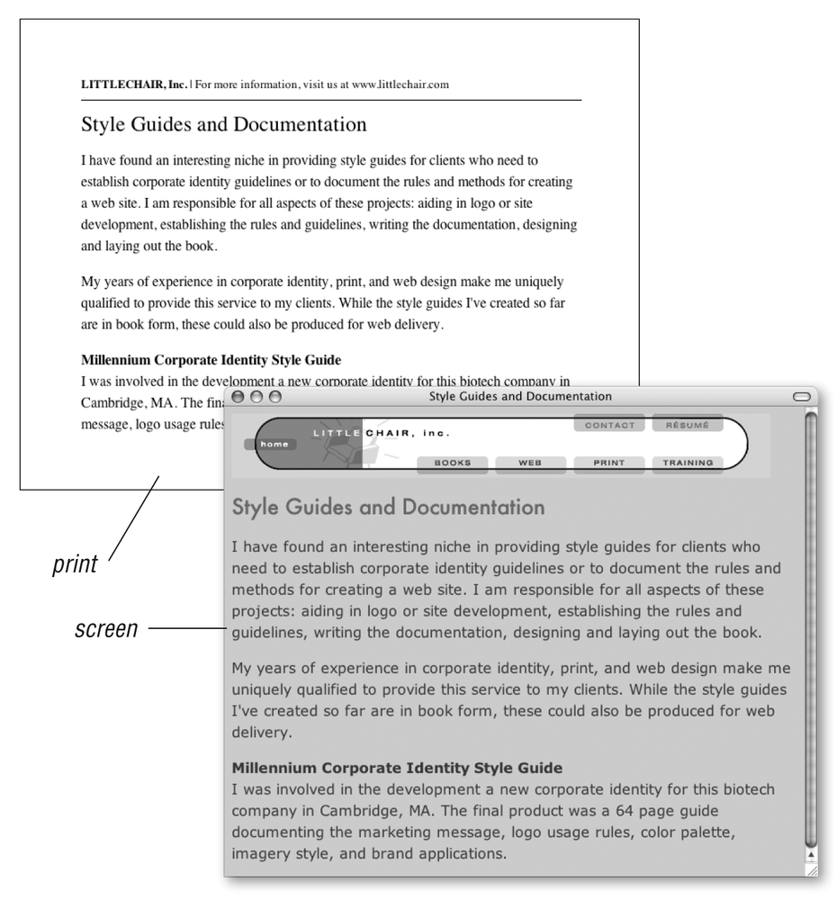
Figure 36-1. Media-specific style sheets at work
The style sheet used for the screen adds a background color to the page and formats the text in a way that is appropriate for web browsers, using relative measurements (ems and percentages). It also uses the display property to hide the div labeled printonly that contains identifying header information that is not needed on the web page. This style information is saved in an external style sheet called screen.css.
#printonly {display: none;} body {background: #CCC; color: #333; font: 95%;} h1 {font: 1.5em Futura, Verdana, sans-serif; color: #C03;} ...Get Web Design in a Nutshell, 3rd Edition now with the O’Reilly learning platform.
O’Reilly members experience books, live events, courses curated by job role, and more from O’Reilly and nearly 200 top publishers.

