Using Floats
The markup and styles in this example produce a page with a header area, a main column of content, a sidebar of links, and a footer for copyright information, as shown in Figure 24-2.
This markup provides the necessary elements for the two-column layout . The masthead and footer are optional and could be omitted for a minimal two-column structure.
    <div class="masthead">
    Masthead and headline
    </div>

    <div class="main">
    Main article
    </div>>

    <div class="sidebar">
    list of links
    </div>

    <div class="footer">
    copyright information
    </div>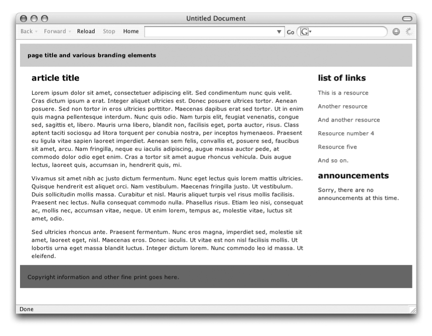
Figure 24-2. Two-column layout
The source document has been divided into four divs, one each for the masthead, content,
sidebar, and footer. The content has been placed before the sidebar in
the source document so that it is accessed first by users with
non-graphical browsers. That means that we can’t float the sidebar
because it will not float above the preceding block element to the top
of the page. Instead, the main content div is floated to the left and set to 70% of
the page width, and the sidebar div
flows around it. The style rules that take care of the floating are
provided here:
.masthead {
background:#CCC;
padding: 15px;}
.main {
float: left;
width: 70%margin-right: 3%; /* adds space between columns */
margin-left: 3%;}
.footer {
clear: left; /* starts the footer below the floated content */
padding: 15px;
background: #666Get Web Design in a Nutshell, 3rd Edition now with the O’Reilly learning platform.
O’Reilly members experience books, live events, courses curated by job role, and more from O’Reilly and nearly 200 top publishers.

