Keep It Simple and Lightweight
The problem with most layout tables in terms of accessibility is complexity. It is not uncommon for tables aiming to achieve pixel-precise layouts to use techniques such as:
Tables nested within tables, some many levels deep
Empty rows inserted for the sole purpose of establishing column widths
Table cells that contain only one-pixel GIFs used for spacing
Numerous spanned rows and columns
Repetitive presentational table attributes
These typically result in overly complicated table structures and bloated markup. Non-sighted users may become disoriented trying to navigate from cell to cell in an attempt to make sense of the content. The complexity and size of the source document isn’t doing any favors for visual browsers either.
An example of a typically convoluted table-based layout is shown in Figure 13-13 (another one of my own old-school designs). The borders have been enhanced to reveal the complexity of the table structure.
By contrast, responsible layout tables are simple and lightweight. The table in Figure 13-14 contains similar content to the example in Figure 13-13, but a single
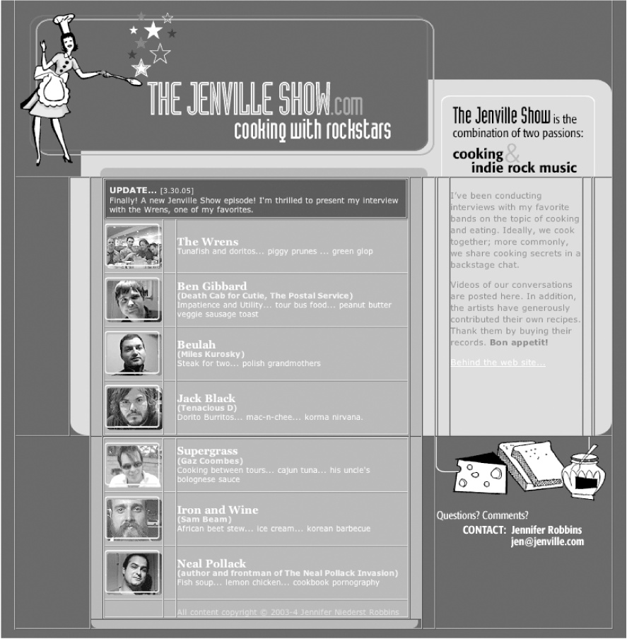
Figure 13-13. An overly complex nested table layout
stripped-down layout table is used to establish the basic grid structure of the page. The borders have been turned on to reveal the table structure. There are no nested tables, and every table cell is filled with real content. ...
Get Web Design in a Nutshell, 3rd Edition now with the O’Reilly learning platform.
O’Reilly members experience books, live events, courses curated by job role, and more from O’Reilly and nearly 200 top publishers.

