Preface
Several things converged to lead me to write this book. Iâm a huge science-fiction nerd. I fell in love with fantasy user interfacesâthe interfaces in movies and TV shows, often used as plot devices. When they are well done, they fit the needs of the actors perfectlyâat a glance immediately conveying a status, a transition, and then a new status. I looked for years for kits to help me make real interfaces that were more like these. As I got better at programming, I realized that it always makes sense to specifically design an interface for an aesthetic and a plot instead of relying on a general working toolkit that is themed. I resigned myself to the fact that the kit I was looking for wouldnât be forthcoming.
As I broke down fantasy user interfaces into common components and logic, I realized they werenât that complex, and lots of the components would be universally useful. These fantasy UIs did break a lot of rules, though. In order to show transitions in a plot, they show things changing. Data streams in and impacts the status. Entire sections move or transform in ways we typically would not do in a dashboard. The conventional wisdom on dashboards by people like Stephen Few is that they should convey status at a glance. That can be difficult to do when everything is moving and transforming simultaneously. There is real value outside the defined conventional wisdom on what to do for dashboards; it just fits a different need. If we quit comparing our interfaces to a dashboard that already has a set purpose, we can set new rules.
A recent example can be seen in the fantasy world of Westworld on HBO (see Figure P-1). They have mock user interfaces that represent the future of technology and show current information compared to thresholds and norms. It looks amazing and is inspiring as a goal to reach in working systems.
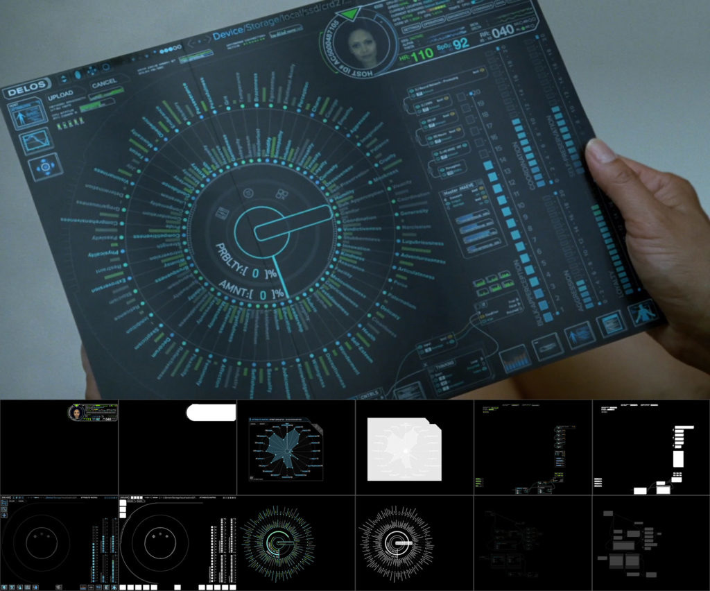
Figure P-1. A fantasy user interface from the show Westworld on HBO (source: http://www.vanschneider.com/behind-the-scenes-of-the-westworld-ui)
I have been working in technology for most of my life. I have seen a lot of problems solved by looking at raw data streaming by, but in the last 20+ years I havenât really seen this evolving. Logs, events, or messages are streamed in a console, and at most they are filtered and highlighted inline. You have to be looking at the screen at the moment something displays, and if you miss it, maybe it will show up in your daily reports tomorrow. This was OK for systems that might have a line in the console per minute, but it doesnât work for todayâs systems, where thousands per second are typical. Even at this volume, Iâve seen problems solved by glancing at streaming logs that would not be caught in daily reports, where the information is too abstracted and aggregated. After observing this pattern over the years, I want to make a viable solution that falls between the logs on the console and the at-a-glance dashboard.
Technology doesnât advance itself. What I really want is to be more interactive with systems. I want things like augmented reality to be practical, unobtrusive, and helpful. When I think of what that requires, I keep seeing things that are in the way, stepping stones that must be crossed before getting there. One of the major stepping stones technology seems to be skipping over is providing an understanding of what a system decides. When artificial intelligence is deciding something for me, I want to know why. The more times I look into why something was decided and can correct those assumptions, the more trust I have in a system. Netflix does a decent job of recommending shows, and it tells you why it recommends something and what the confidence level is, but you canât correct the algorithm. Itâs not interactive. It observes, does magic, and you see the results.
In order for us to progress beyond a certain point in technology, we are going to have to take a couple of steps back and correct this. We have to redesign some things to allow humans to be more collaborative partners in these decisions. This is difficult today because most systems decide things for you centrally. An algorithm is applied universally. If genre and language are the key factors in recommending similar movies, thatâs how itâs done for everyone. Thereâs nowhere that I know of where I can increase the weight of awesome fantasy user interfaces and novel spaceship design to find movies that might interest me. This level of customization requires the intelligence to be more individual, or multitiered.
The significance of being able to understand and alter machine decisions goes way beyond entertainment. AI algorithms thoroughly influence your perspective through the information you seeâthey determine the results of your Internet searches. When you access information online, security devices decide what information appears safe (with a very loose yet inflexible definition of âsafeâ). On the physical side of security, we have algorithms deciding who is on a watchlist and who might commit crimes. Similarly complex algorithms have not been permitted in the assessment of credit scores because they must be easily defensible in court. Thatâs the level of accountability and understanding all automated decisions need to reach.
Finally, I started developing my own tools and components to fit this niche area of data presentation I kept running across. After years of thought on the subject, I realized that it was something rarely explored. Most of the organizations I run into are overwhelmed by what they find in their daily reports. They arenât thinking about what they might improve by reacting faster to certain events and getting ahead of things. It takes some new perspectives, case studies, and more to take something like this from a novel idea to a practical solution. I hope that this book helps contribute toward that progression.
Who This Book Will Benefit
If you are a designer or developer who has any event-based data significant to your goals, you will find something of interest here. The topics ride the line between design and development because they are both integral in presenting comprehensible data.
If you are already trying to watch data by scrolling it in a console, or youâve given up on scrolling data in the console because it wasnât helping, this book will give you some approaches to explore.
If you are interested in creating a system for your needs that exposes whatâs occurring in an opaque process, this book will give you an idea of what you can do to improve your systemâs visibility.
How This Book Is Organized
This book is organized from the perspective of âhow to build it.â There are a lot of possible starting points. If you already have streaming data in a format ready to be shown, you might skip ahead to the chapters on presentation. Many organizations still havenât reached this point. They have data that is event-based by nature but no good way to connect to it. This book walks through those points as well, and everything in between. Some topics, like machine learning, are simply complementary and optional. Figure P-2 represents a logical progression of components and processes that are involved in visualizing streaming data to integrated analysts with automated processing in a complex system. This workflow is the the oultine for the order of the chapters in this book.
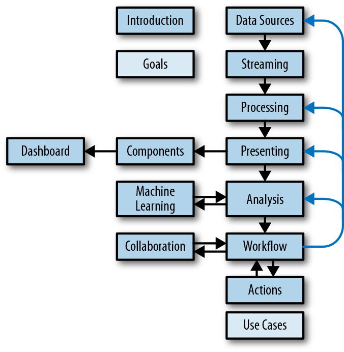
Figure P-2. Data flow of interactive streaming data visualizations
Conventions Used in This Book
The following typographical conventions are used in this book:
- Italic
-
Indicates new terms, URLs, email addresses, filenames, and file extensions.
Constant width-
Used for program listings, as well as within paragraphs to refer to program elements such as variable or function names, databases, data types, environment variables, statements, and keywords.
Using Code Examples
Supplemental material (code examples, exercises, etc.) is available for download at https://github.com/SuddenDevelopment/Visualizing-Streaming-Data.
This book is here to help you get your job done. In general, if example code is offered with this book, you may use it in your programs and documentation. You do not need to contact us for permission unless youâre reproducing a significant portion of the code. For example, writing a program that uses several chunks of code from this book does not require permission. Selling or distributing a CD-ROM of examples from OâReilly books does require permission. Answering a question by citing this book and quoting example code does not require permission. Incorporating a significant amount of example code from this book into your productâs documentation does require permission.
We appreciate, but do not require, attribution. An attribution usually includes the title, author, publisher, and ISBN. For example: âVisualizing Streaming Data by Anthony Aragues (OâReilly). Copyright 2018 Anthony Aragues, 978-1-492-03185-7.â
If you feel your use of code examples falls outside fair use or the permission given above, feel free to contact us at permissions@oreilly.com.
OâReilly Safari
Note
Safari (formerly Safari Books Online) is a membership-based training and reference platform for enterprise, government, educators, and individuals.
Members have access to thousands of books, training videos, Learning Paths, interactive tutorials, and curated playlists from over 250 publishers, including OâReilly Media, Harvard Business Review, Prentice Hall Professional, Addison-Wesley Professional, Microsoft Press, Sams, Que, Peachpit Press, Adobe, Focal Press, Cisco Press, John Wiley & Sons, Syngress, Morgan Kaufmann, IBM Redbooks, Packt, Adobe Press, FT Press, Apress, Manning, New Riders, McGraw-Hill, Jones & Bartlett, and Course Technology, among others.
For more information, please visit http://oreilly.com/safari.
How to Contact Us
Please address comments and questions concerning this book to the publisher:
- OâReilly Media, Inc.
- 1005 Gravenstein Highway North
- Sebastopol, CA 95472
- 800-998-9938 (in the United States or Canada)
- 707-829-0515 (international or local)
- 707-829-0104 (fax)
We have a web page for this book, where we list errata, examples, and any additional information. You can access this page at http://bit.ly/visualizing-streaming-data.
To comment or ask technical questions about this book, send email to bookquestions@oreilly.com.
For more information about our books, courses, conferences, and news, see our website at http://www.oreilly.com.
Find us on Facebook: http://facebook.com/oreilly
Follow us on Twitter: http://twitter.com/oreillymedia
Watch us on YouTube: http://www.youtube.com/oreillymedia
Acknowledgments
Bob Page thoughtfully reviewed everything I had on the subject in detail, lending his expertise on data in large businesses. He also introduced me to people who had a big impact on this material.
Antonio Figueiredo has a lot of real-world experience in making streaming data processing and visualization practical. His enthusiasm on the subject and general willingness to discuss everything related was a huge encouragement early on.
Sven Krasser is an old colleague and known expert in machine learning. It was through working with him that I saw the need to make people more interactive in the machine learning process.
Brett Meyer helped me explore the various ways that streaming data visualization would and would not make sense when applied to machine learning. His expertise helped me find the correct terms and understand their use in that field.
Georges Grinstein is a well-known expert in data visualization, including real-time and streaming data. He has an academic perspective on several things that I had not previously considered and showed me some interesting and relevant projects I wouldnât have been able to find on my own.
Casey Rosenthal created one of the most useful and relevant case studies that I was able to learn from outside my own experience. He was helpful in sharing those experiences as well as talking about where this niche area should go.
Weidong Yang basically makes a business out of the topic of this book. His company creates interactive installations that gather and present data in creative ways. He was helpful in sharing these experiences, but also helped validate that this topic has a current market.
Raffael Marty was the unintentional catalyst for my writing this book. I took a seminar of his on security data visualization; I enjoyed it and thought Iâd enjoy teaching a similar one someday.
Get Visualizing Streaming Data now with the O’Reilly learning platform.
O’Reilly members experience books, live events, courses curated by job role, and more from O’Reilly and nearly 200 top publishers.

