Parts of a Whole
This is proportions in their simplest form. You have a set of proportions that add up to 1 or a set of percentages that add up to 100 percent. You want to show the individual parts relative to the other parts but you also want to maintain the sense of a whole.
The Pie
Pie charts are the old standby. You see them everywhere these days, from business presentations to sites that use charts as a medium for jokes. The first known pie chart was published by William Playfair, who also invented the line graph and bar chart, in 1801. Smart guy.
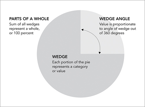
You know how they work. As shown in Figure 5-1, you start with a circle, which represents a whole, and then cut wedges, like you would a pie. Each wedge represents a part of the whole. Remember that last part, because a lot of beginners make this mistake. The percentage of all the wedges should add up to 100 percent. If the sum is anything else, you have done something wrong.
Figure 5-1: Pie chart generalized
Pie charts have developed a stigma for not being as accurate as bar charts or position-based visuals, so some think you should avoid them completely. It’s easier to judge length than it is to judge areas and angles. That doesn’t mean you have to completely avoid them though.
You can use the pie chart without any problems just as long you know its limitations. It’s simple. Keep your data organized, and don’t put too many wedges ...
Get Visualize This: The FlowingData Guide to Design, Visualization, and Statistics now with the O’Reilly learning platform.
O’Reilly members experience books, live events, courses curated by job role, and more from O’Reilly and nearly 200 top publishers.

